
Introduction
In the bustling world of "Pet's House," a virtual sanctuary for pet lovers, Taylor, a creative web designer, embarks on a journey to infuse life into the website.
This lab uses CSS animations and transitions to enhance the user experience, making the site informative, engaging and dynamic.Taylor aims to transform static elements into interactive features that captivate visitors, guiding them through a memorable journey in the digital realm of pet care.
Pseudo Element
In the navigation bar on the Pet page, when you hover over a navigation item, an underline appears for that navigation item.

Should we be thinking about how this effect is achieved, the show and the hide?
CSS's ::after pseudo-element is a powerful tool that allows developers to insert additional content or decorations after the content of a selected element. This method can be used for a variety of design and layout tasks, such as adding decorative elements, creating clear layout separations, or inserting content without modifying the HTML structure. Here's a tutorial on how to use the CSS ::after pseudo-element.
::after is a pseudo-element that allows you to insert additional content at the end of an element's content. This content is by default an inline element.
selector::after {
  /* CSS properties */
}
Use the content property to specify the content to be inserted. This can be text, images, or other CSS properties.
For example, add a red heart after the <p> element:
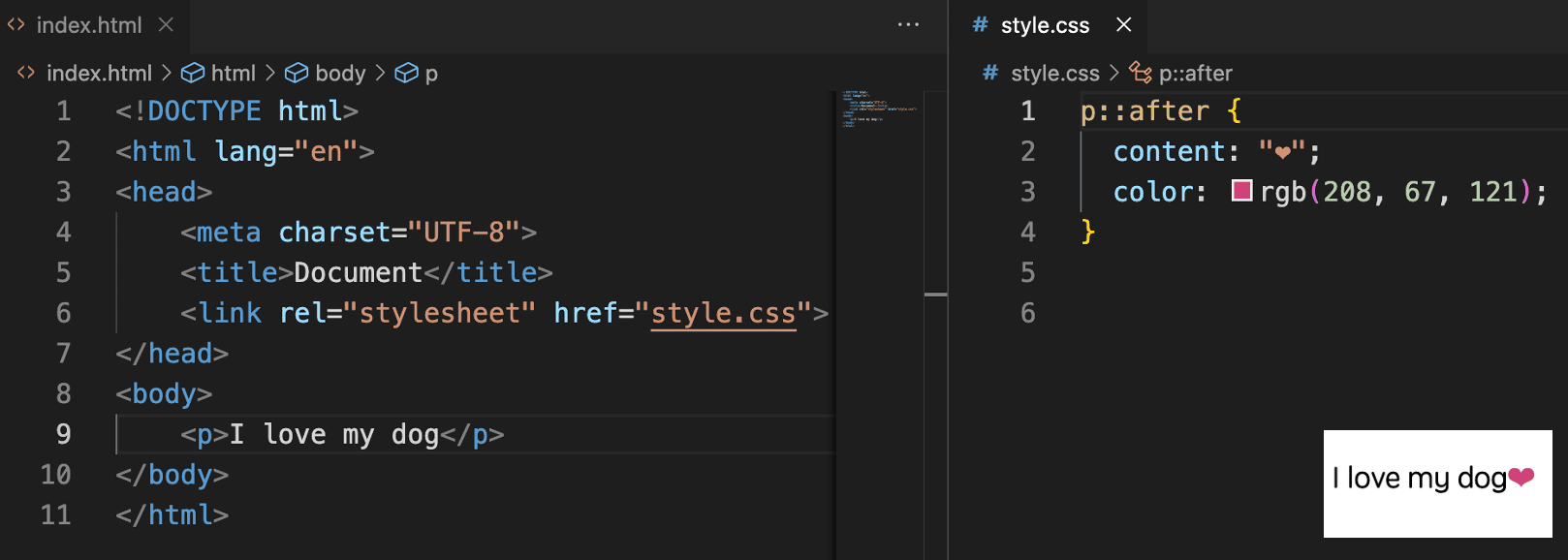
We can implement an underline effect using ::after by adding the following to the css:
.navigation li::after {
  content: "";
  position: absolute;
  width: 0;
  height: 2px;
  background-color: black;
}
Currently, nothing has changed on the page because the width is 0. Next, we'll use :hover to achieve the underline effect by changing the width to 100% when the party hovers over the element.
Pseudo Class
The CSS :hover pseudo-class selector is used to select elements that the mouse pointer hovers over. This allows developers to provide visual feedback for user interactions, such as changing colors, sizes, or adding animations, thereby enhancing the user experience.
selector:hover {
  /* CSS properties */
}
For example, to change the color of a <button> element when the mouse pointer hovers over it, you can use the following CSS:
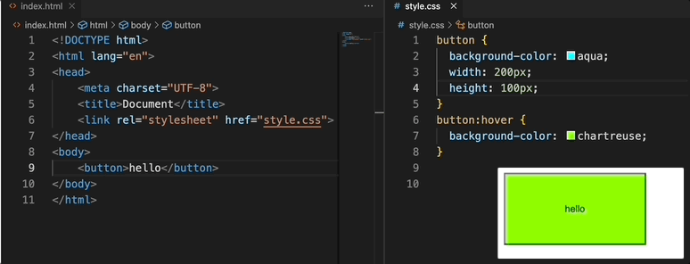
Now that we know how to use :hover, we can add the following to style.css:
.navigation li:hover::after {
  width: 100%;
}
Up to this point, the mouse has been achieved on the navigation items appear underline effect, however, careful students can find that the effect of the emergence of the effect of the downward sliding line of the effect of a smoother line, which is to introduce you to another CSS attributes.
Transition
CSS transitions allow you to add an effect when changing from one style to another, without using Flash animations or JavaScript. You can specify the duration of the transition, as well as the way the transition occurs through timing functions.
The CSS transition property is a shorthand for four transition-related properties:
transition-property: Specifies the name of the CSS property the transition effect is for.transition-duration: Defines the duration of the transition.transition-timing-function: Describes how the transition will proceed over its duration.transition-delay: Specifies a delay before the transition starts.
For example, the following CSS code defines a transition effect that changes the background color of an element from aqua to rgb(145, 255, 0) over 1 second:
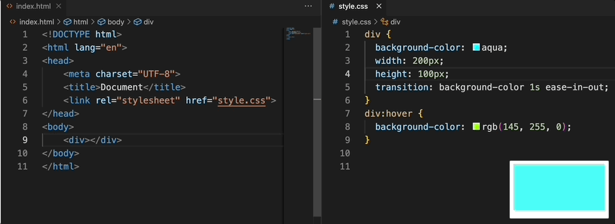
Now that we know how to use transition, we can add the following to style.css:
.navigation li::after {
  content: "";
  position: absolute;
  width: 0;
  height: 2px;
  background-color: black;
  transition: width 0.3s ease;
}
Opacity
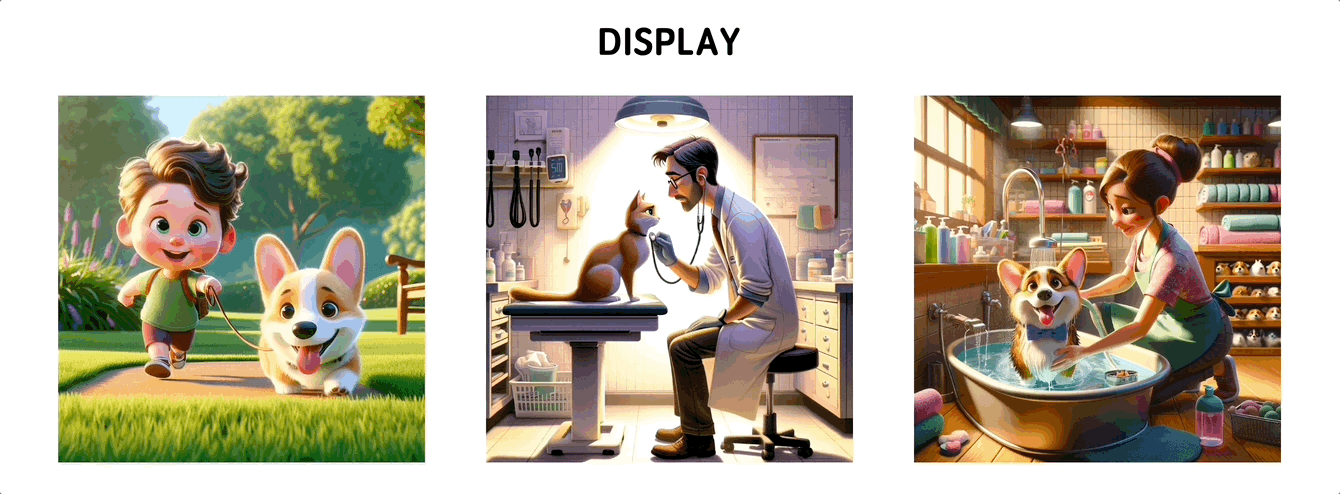
When you move the mouse over the image in the Display Area, the image will increase in transparency and text will appear underneath it.
The CSS opacity property is used to set the opacity level of an element. With this property, you can control the transparency of an element and its children, making the element fully transparent, fully opaque, or any level of opacity in between. The opacity values range from 0 (completely transparent) to 1 (completely opaque). This property is very useful for creating fading effects, emphasizing interactive elements, or designing interfaces with a sense of depth.
selector {
  opacity: value; /* Values range from 0 (completely transparent) to 1 (completely opaque) */
}
Now that we know how to use opacity, we can add the following to style.css:
.service figcaption {
  position: absolute;
  bottom: 0;
  left: 0;
  right: 0;
  background-color: rgba(0, 0, 0, 0.5);
  color: #fff;
  padding: 10px;
  opacity: 0;
}
.service figure:hover img {
  opacity: 0.5;
}
.service figure:hover figcaption {
  opacity: 1;
}
The effect of increased transparency is achieved. Next, we add some smoothing to the interaction.
Transform
The CSS Transform property allows you to rotate, scale, skew, or translate an element, thereby changing the element's shape and position without affecting the layout of the page. This is a powerful tool for creating dynamic visual effects and complex animations.
The Transform property includes the following functions:
rotate(): Rotates an element, with the parameter being the angle of rotation (e.g., rotate(45deg) for a 45-degree rotation).scale(): Scales an element, with the parameter being the scale factor (e.g., scale(2) for doubling the size).translate(): Translates an element, with the parameters being the distances to move along the X-axis and Y-axis (e.g., translate(50px, 100px) for moving 50px right and 100px down).skew(): Skews an element, with the parameters being the skew angles along the X-axis and Y-axis (e.g., skew(30deg, 20deg) for a 30-degree skew along the X-axis and a 20-degree skew along the Y-axis).
For example, move the <p> element 100 pixels to the right on the x-axis.
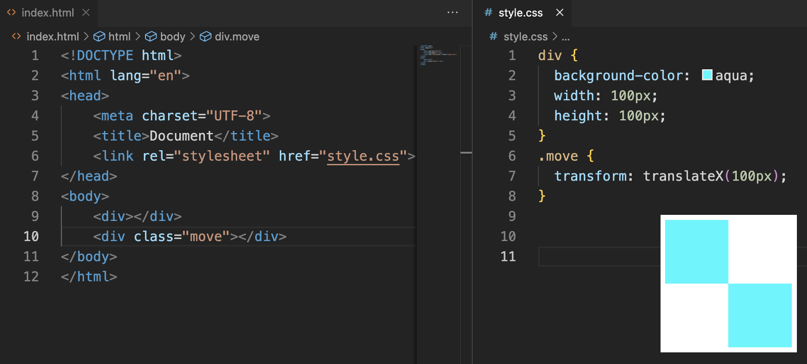
Now that we know how to use transform, we can add the following to style.css:
.service figcaption {
  position: absolute;
  bottom: 0;
  left: 0;
  right: 0;
  background-color: rgba(0, 0, 0, 0.5);
  color: #fff;
  padding: 10px;
  opacity: 0;
  transform: translateY(100%);
  transition:
    transform 0.5s ease,
    opacity 0.5s ease;
}
.service figure:hover figcaption {
  opacity: 1;
  transform: translateY(0%);
}
Z-Index
The CSS z-index property controls the vertical stacking order of elements on a page. When elements overlap, z-index determines which element should appear on top. It can only be applied to positioned elements, i.e., those with a position attribute value of relative, absolute, fixed, or sticky. The value of z-index can be positive, negative, or 0, where higher values mean the element will be placed on top of elements with lower values.
selector {
  position: relative | absolute | fixed | sticky;
  z-index: number;
}
For example, assuming there are two overlapping elements, we can use z-index to control which element appears on top:
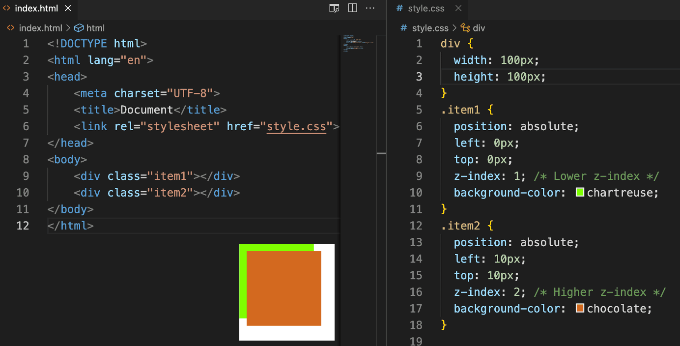
Now that we know how to use z-index, we can add the following to style.css:
header {
  position: fixed;
  display: flex;
  flex-direction: row;
  background-color: rgb(233, 174, 87);
  width: 100%;
  max-height: max-content;
  min-height: 1em;
  padding-top: 1%;
  padding-bottom: 1%;
  text-transform: uppercase;
  z-index: 1;
}
Implementing Keyframe Animations
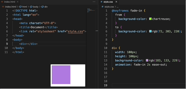
There is a fade-in animation on the welcome page when we enter the site.
CSS animations are a powerful tool that allows developers to create animated effects for web page elements without using JavaScript. With CSS animations, you can define a sequence of animations that transition an element from one style state to another.
CSS animations rely primarily on two key parts: the @keyframes rule and the animation properties.
@keyframesRule: Defines the keyframes in the animation sequence. Each keyframe describes the style of the animation at a specific moment.animationProperties: Apply the defined@keyframesto a selector and set the duration, delay, iteration count, and more for the animation.
For example:
Now that we know how to use animation, we can add the following to style.css:
@keyframes fade-in {
  0% {
    opacity: 0;
  }
  100% {
    opacity: 1;
  }
}
.title-text {
  width: 40%;
  text-align: center;
  color: black;
  margin: auto;
  padding: 0 20px;
  animation: fade-in;
  animation-duration: 8s;
}
.box-feature .cover-image {
  animation: fade-in;
  animation-duration: 5s;
}
Summary
In this lab, Taylor successfully applied CSS animations and transitions to the "Pet's House" website, creating a lively and interactive user experience. The journey from static pages to dynamic interactions demonstrates the power of subtle visual cues in enhancing website navigation and engagement. Through animations and transitions, Taylor has made the digital space of "Pet's House" more inviting and memorable for every visitor.


