
Introduction
In the bustling city of Petville, Jordan, a web developer, is tasked with redesigning the "Pet's House" website.
This lab creates a responsive and visually appealing layout for pet owners. The website must showcase services, about us, and contact information effectively across devices. Jordan decides to utilize Flexbox for its powerful layout capabilities.
Flexbox Basics and Display Property
To get started with Flexbox, you need to understand its basic concepts.
Imagine you're an interior designer, and your webpage is a big, empty room. Your job is to make this room both cozy and aesthetically pleasing. Enter Flexbox, your magic wand, helping you effortlessly place furniture (i.e., webpage elements). Whether it's a couch (main content) or a coffee table (supporting info), with Flexbox, you can ensure they're all perfectly positioned.
Before we get our hands dirty with Flexbox, let's quickly go over a few fundamental concepts:
- Flex Container: Think of it as your room, where you'll be placing various pieces of furniture.
- Flex Items: These are your pieces of furniture, like sofas, chairs, and coffee tables.
To start using Flexbox, you first need to declare a Flex container. It's like saying, "Alright, let's get this room decorated."
.container {
  display: flex;
}
Once you do this, all direct children of the .container class become Flex items, following the layout rules of Flexbox.
The display CSS property sets whether an element is treated as a block or inline box and the layout used for its children, such as flow layout, grid or flex.
We can use the display attribute to change the way in-line elements are laid out, for example:
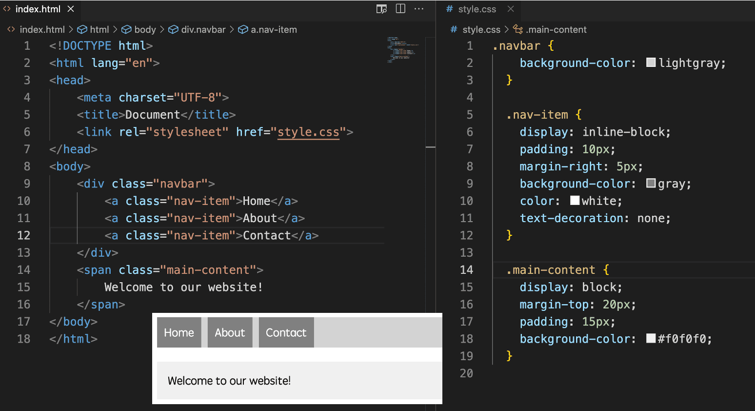
display: block gives elements their own space, while display: inline-block allows for a more flexible layout, letting elements sit next to each other but still control their dimensions.
Now that we know how display is used, we can add the following to style.css:
.navigation li {
  display: inline-block;
}
.navigation li a {
  text-decoration: none;
  color: black;
  padding: 10px;
  display: block;
}
form .form-content {
  display: block;
  padding: 0.8em 0;
}
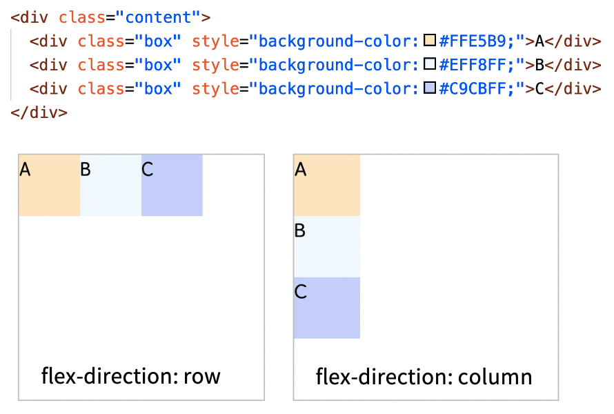
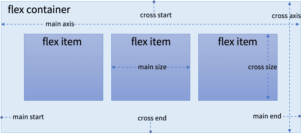
Main Axis and Cross Axis
In the realm of Flexbox, two concepts are crucial: main axis and cross axis. By default, the main axis is horizontal, and the cross axis is vertical, but this can be adjusted with the flex-direction property.
- Horizontal Main Axis:
flex-direction: row;(default) - Vertical Main Axis:
flex-direction: column;
For example:
Flex Items
Now, let's talk about how to position our furniture (Flex Items).
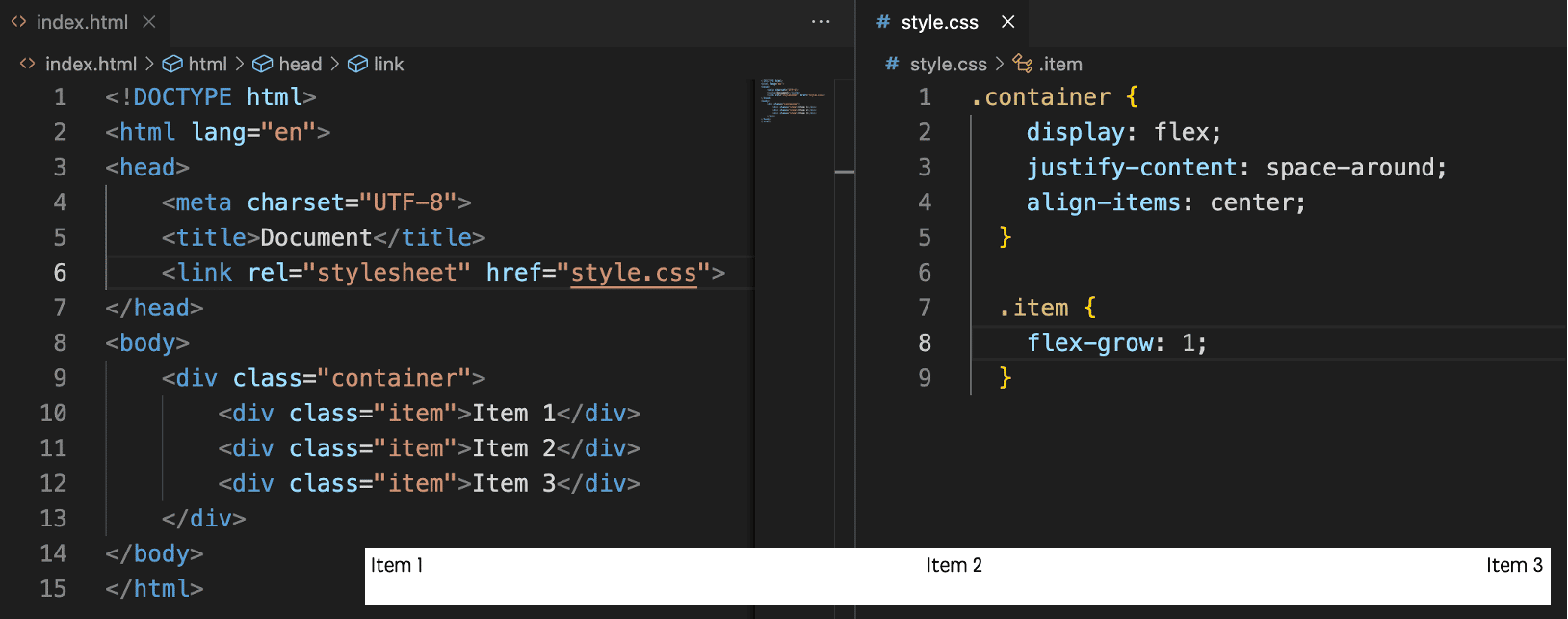
justify-content: This property controls how Flex items are distributed along the main axis. Imagine adjusting the distance between a sofa and chairs to ensure they're neither too far apart nor too close.align-items: This property decides how Flex items align along the cross axis. It's like ensuring all your paintings hang at the same level, making the room look tidy.flex-grow: Imagine you want your bookshelf to take up all or part of the remaining space. With this property, you can "grow" a piece of furniture (item) to fill up extra space.
Let's see Flexbox magic in action with a simple layout, consisting of a container and three items.What we want to do is center these three items horizontally within the container and ensure they're evenly distributed when there's enough space.
With this setup, our furniture (items) will be positioned just as we wished.
Flexbox is truly like magic, allowing us to arrange our webpages with unprecedented flexibility and ease. Now that you've mastered this magic, go ahead and give it a try! Create the "room" of your dreams!
To vividly demonstrate the magic of Flexbox, I'll generate an illustration showcasing a room with Flexbox layout, including furniture pieces (like a sofa, coffee table, and bookshelf) representing different Flex items. This will show how they're elegantly positioned in the room using Flexbox properties like justify-content and align-items.
To sum up, Flexbox is a one-dimensional layout model that allows you to easily align items horizontally or vertically, and it's perfect for creating responsive designs. Here are some key terms to know:
- Flex container: The parent element that contains the flex items.
- Flex item: An individual element within the flex container.
- Flex direction: Determines the main axis of the container.
- Flex wrap: Controls whether the items should wrap onto multiple lines or not.
- Justify content: Aligns the items along the main axis.
- Align items: Aligns the items along the cross axis.
Now that we know how to use Flexbox, we can add the following to style.css:
body {
  display: flex;
  flex-direction: column;
  letter-spacing: 2px;
  font-weight: 400;
  font-size: 1.2vw;
}
header {
  display: flex;
  flex-direction: row;
  background-color: rgb(233, 174, 87);
  width: 100%;
  max-height: max-content;
  min-height: 1em;
  padding-top: 1%;
  padding-bottom: 1%;
  text-transform: uppercase;
}
ul {
  list-style: none;
  display: flex;
  flex-direction: row;
}
.navigation-section {
  width: 70%;
}
section {
  display: flex;
  flex-direction: row;
  width: 100%;
  padding: 10% 0;
}
.story-sect {
  display: flex;
  flex-direction: row-reverse;
  background-color: rgb(233, 174, 87);
  color: #fff;
}
.samples {
  flex-direction: column;
  text-align: center;
}
footer {
  display: flex;
  flex-direction: row-reverse;
  height: 5em;
  width: 100%;
  color: #fff;
  background-color: rgb(239, 206, 157);
  text-transform: uppercase;
}
Summary
In this lab, Jordan successfully applied Flexbox to the "Pet's House" website, enhancing its layout's responsiveness and aesthetics. Through steps focused on the header, navigation, and main sections, the website now displays content efficiently across different devices. Flexbox proved to be an invaluable tool in creating dynamic and flexible layouts, showcasing its importance in modern web design.


