
Introduction
In "Pet's House," a virtual realm for pet enthusiasts, Alex, a web developer, embarks on a quest to revamp their service showcase using CSS Grid.
This lab aims to captivate users by presenting services in an organized, visually appealing manner. Alex's mission is to transform the "Display" section into a grid layout that highlights pet services with elegance and efficiency.
Position Property
The CSS position property is a powerful tool that allows developers to control the exact placement of elements on a page. It enables elements to be positioned based on their normal flow, relative to their parent element, relative to the viewport, or relative to their nearest scrolling ancestor.
Static Positioning
static is the default value for all elements, meaning that elements are laid out according to the normal document flow. Static positioned elements are not affected by top, right, bottom, or left properties.
When you want elements to follow the standard flow, static positioning is your best choice.
For example, there is an image of a robot on the left side of the page, and if we set this element to position:static, then when we scroll the page, this image will also scroll with the page flow.
<!doctype html>
<html lang="en">
  <head>
    <meta charset="UTF-8" />
    <meta name="viewport" content="width=device-width, initial-scale=1.0" />
    <title>Document</title>
    <style>
      .full-page-img {
        width: 100%;
        margin-left: 15%;
      }
      .box img {
        width: 90%;
      }
      .ad-l {
        position: static;
        top: 100px;
        left: 0;
        width: 150px;
      }
    </style>
  </head>
  <body>
    <img src="robot.png" class="ad-l" />
    <div class="full-page-img">
      <img src="page.png" />
    </div>
  </body>
</html>

Fixed Positioning
fixed positioning places an element relative to the browser window's viewport. The element will stay in the same place even if the page scrolls.
For making a navigation bar that is fixed at the top or bottom of the page.
For example, there is an image of a robot on the left side of the page, if we set this element to position:fixed, then when we scroll the page, this image will not disappear because of scrolling the page, the image will be in a fixed position.
<!DOCTYPE html>
<html lang="en">
  <head>
    <meta charset="UTF-8" />
    <meta name="viewport" content="width=device-width, initial-scale=1.0" />
    <title>Document</title>
    <style>
      .full-page-img {
        width: 100%;
        margin-left: 15%;
      }
      .box img {
        width: 90%;
      }
      .ad-l {
        position: fixed;
        top: 100px;
        left: 0;
        width: 150px;
      }
    </style>
  </head>
  <body>
    <img src="robot.png" class="ad-l" />
    <div class="full-page-img">
      <img src="page.png" />
    </div>
  </body>
</html>

Relative Positioning
relative positioning allows you to offset an element relative to its normal position. Even if offset, the element still occupies its original space.
When you need to slightly adjust the position of an element without affecting other parts of the layout.
For example, we moved the robot image on the left side of the page by a set number of pixels in the top and left directions relative to its normal position.
<!doctype html>
<html lang="en">
  <head>
    <meta charset="UTF-8" />
    <meta name="viewport" content="width=device-width, initial-scale=1.0" />
    <title>Document</title>
    <style>
      .box {
        width: 100%;
      }
      .box img {
        width: 90%;
      }
      .ad-l {
        position: relative;
        top: 70px;
        left: 70px;
      }
    </style>
  </head>
  <body>
    <img src="labby.png" class="ad-l" />
    <div class="box">
      <img src="page.png" />
    </div>
  </body>
</html>

Absolute Positioning
absolute positioning makes an element positioned relative to its nearest positioned ancestor if any, or otherwise relative to the initial containing block. It is removed from the document flow and does not occupy space.
When you need to create a floating element, such as a modal or dropdown menu.
<!doctype html>
<html lang="en">
  <head>
    <meta charset="UTF-8" />
    <meta name="viewport" content="width=device-width, initial-scale=1.0" />
    <title>Document</title>
    <style>
      .box {
        width: 100%;
      }
      .box img {
        width: 90%;
      }
      .ad-l {
        position: absolute;
        top: 70px;
        left: 70px;
      }
    </style>
  </head>
  <body>
    <img src="labby.png" class="ad-l" />
    <div class="box">
      <img src="page.png" />
    </div>
  </body>
</html>

Once you understand the usage of the position attribute, We can add the following to style.css:
header {
  position: fixed;
  display: flex;
  flex-direction: row;
  background-color: rgb(233, 174, 87);
  width: 100%;
  max-height: max-content;
  min-height: 1em;
  padding-top: 1%;
  padding-bottom: 1%;
  text-transform: uppercase;
}
.navigation li {
  position: relative;
  display: inline-block;
}
.service figure {
  position: relative;
}
.service figcaption {
  position: absolute;
  bottom: 0;
  left: 0;
  right: 0;
  background-color: rgba(0, 0, 0, 0.5);
  color: #fff;
  padding: 10px;
}
Grid Basic
In the previous lab, learning Flexbox, but the layout of the pet page, or not achieve the effect we want, so the next study another layout - Grid Layout.
CSS Grid Layout (Grid) is a grid-based layout system that allows developers to create responsive web page layouts. Grid can divide pages into major regions or define the layout of smaller components.
To use the Grid layout, you first need to set the display: grid; property on a container element.we can add the following to style.css:
.container {
  display: grid;
  padding: 0px;
  padding-top: 1em;
  width: 100%;
}
.services {
  width: 90%;
  display: grid;
  margin: 20px auto;
}
Defining Rows and Columns
Next, use the grid-template-columns and grid-template-rows properties to define the rows and columns in the container.
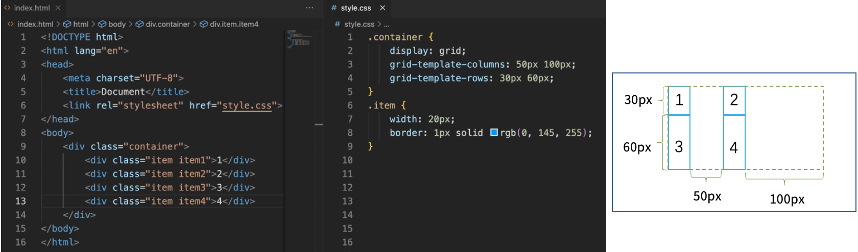
For example,.container sets up a grid display mode with specific dimensions for columns and rows:
display: grid;activates the grid layout for the container.grid-template-columns: 50px 100px;defines two columns where the first column is 50 pixels wide and the second column is 100 pixels wide.grid-template-rows: 30px 60px;defines two rows where the first row is 30 pixels high and the second row is 60 pixels high.
We can add the following to style.css:
.container {
  display: grid;
  grid-template-columns: 100%;
  padding: 0px;
  padding-top: 1em;
  width: 100%;
}
.services {
  width: 90%;
  display: grid;
  grid-template-columns: 2fr 2fr 2fr;
  margin: 20px auto;
}
The fr is a flexible length unit, representing a fraction of the available space in the grid container.
Grid Gap
The grid-gap property (now recommended to use gap, row-gap, and column-gap) can set the space between grid rows and columns.
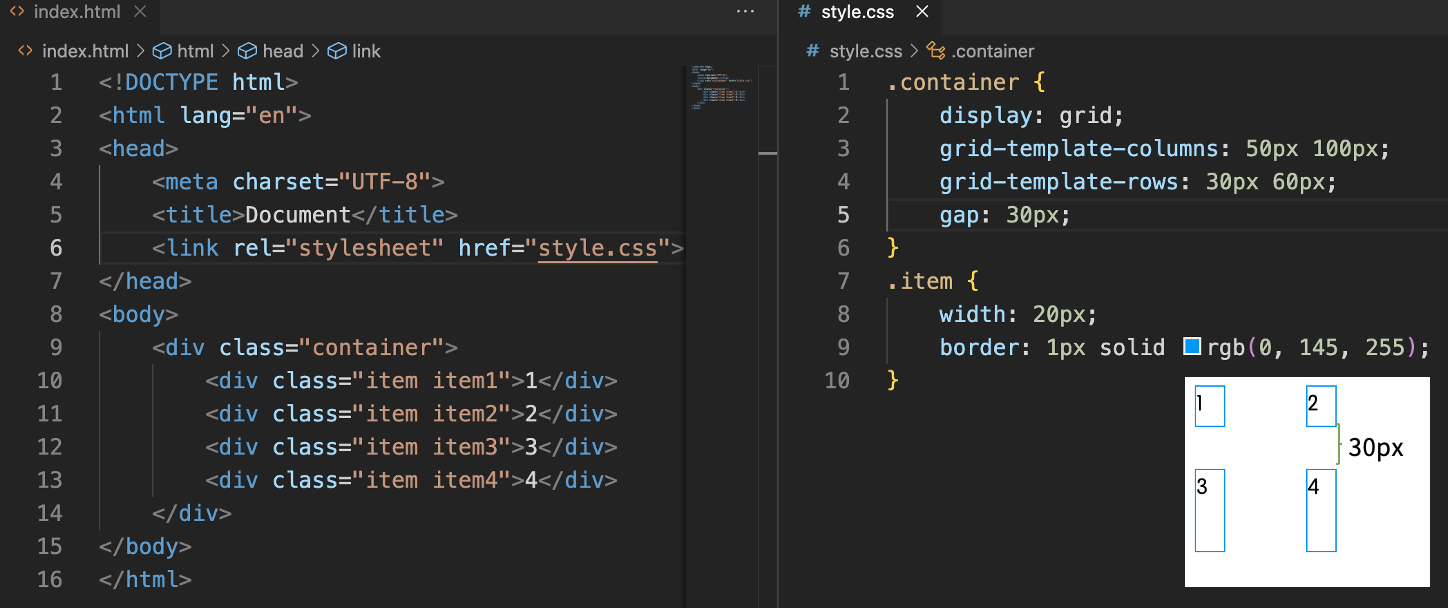
We can add the following to style.css:
.services {
  width: 90%;
  display: grid;
  grid-template-columns: 2fr 2fr 2fr;
  gap: 5%;
  margin: 20px auto;
}
Summary
In this lab, Alex successfully utilized CSS Grid to redesign the "Pet's House" display section, showcasing pet services in a structured, attractive grid layout. This approach not only improved the visual presentation but also demonstrated the flexibility and power of CSS Grid in web design.


