
Introduction
In this lab, we will create a 3D rotating cube using HTML and CSS. The cube will feature six uniquely colored faces and rotate continuously in 3D space, demonstrating the power of CSS 3D transforms and animations. This project serves as an excellent introduction to CSS 3D capabilities, allowing you to visualize how elements can be positioned and animated in three-dimensional space without requiring JavaScript.
Create the HTML Structure
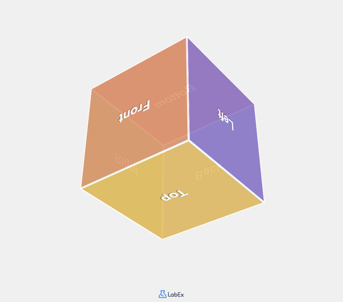
A 3D cube consists of six faces: front, back, left, right, top, and bottom. We need to create an HTML structure that allows us to position these faces in 3D space.
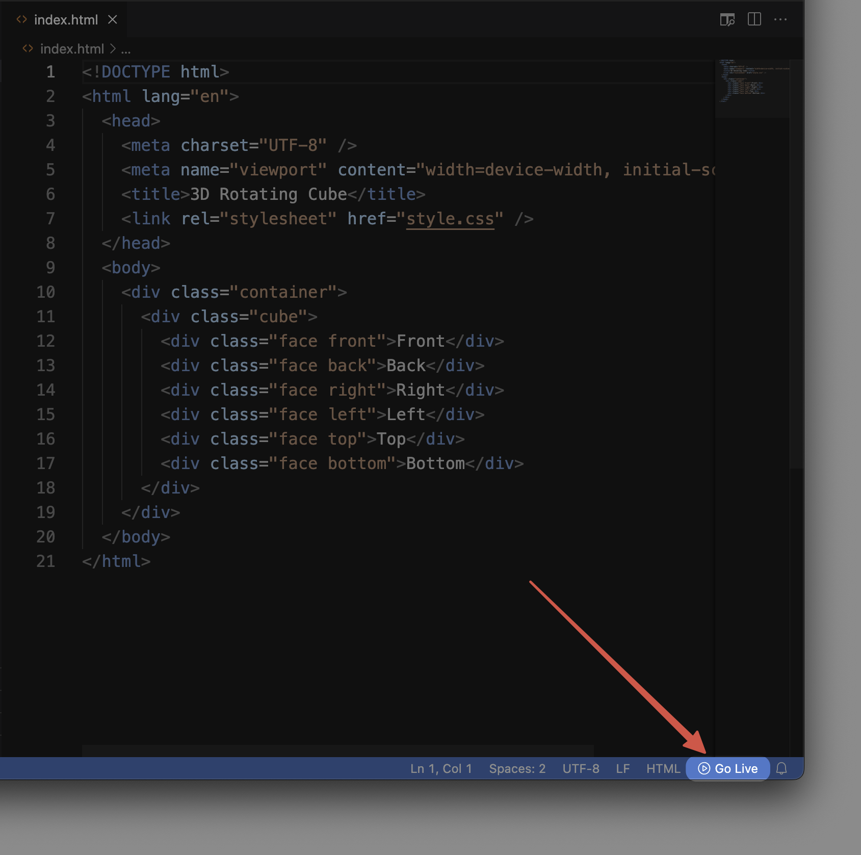
Let us open the index.html file in our project directory and add the necessary HTML code to create the cube structure.
- Open the WebIDE by navigating to the file explorer panel on the left side.
- Click on the
index.htmlfile to open it in the editor. - Copy and paste the following HTML code into the file:
<!doctype html>
<html lang="en">
  <head>
    <meta charset="UTF-8" />
    <meta name="viewport" content="width=device-width, initial-scale=1.0" />
    <title>3D Rotating Cube</title>
    <link rel="stylesheet" href="style.css" />
  </head>
  <body>
    <div class="container">
      <div class="cube">
        <div class="face front">Front</div>
        <div class="face back">Back</div>
        <div class="face right">Right</div>
        <div class="face left">Left</div>
        <div class="face top">Top</div>
        <div class="face bottom">Bottom</div>
      </div>
    </div>
  </body>
</html>
Let us understand this HTML structure:
- We start with the standard HTML5 document structure, including metadata and the title.
- We link to our CSS file (
style.css), which we will create in the next step. - In the body, we create a container
divthat will center our cube on the page. - Inside the container, we have a
cubediv that will become our 3D object. - Within the cube, we define six divs, each with the class
faceand an additional class identifying its position (front, back, etc.). - Each face contains text indicating its position to help us identify them.
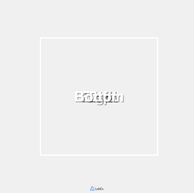
To see your current progress, look for the "Go Live" button at the bottom of the WebIDE and click it. This will start a local web server and open a browser tab displaying your page. Currently, you will only see the text for each face stacked on top of each other since we have not applied any styling yet.

In the next step, we will use CSS to transform these divs into the faces of a 3D cube.
Create Basic CSS Styles
Now that we have our HTML structure, we need to style it to create the foundation for our 3D cube. In this step, we will add the necessary CSS to create a container for our cube and style the cube faces.
- In the WebIDE, click on the
style.cssfile in the file explorer panel to open it. - Copy and paste the following CSS code into the file:
/* Basic reset and page styling */
* {
  margin: 0;
  padding: 0;
  box-sizing: border-box;
}

body {
  font-family: Arial, sans-serif;
  background-color: #f0f0f0;
  display: flex;
  justify-content: center;
  align-items: center;
  min-height: 100vh;
}

/* Container styling with perspective */
.container {
  perspective: 1000px;
  /* The perspective property defines how far the object is from the viewer */
  /* A smaller value creates a more intense 3D effect */
}

/* Cube container styles */
.cube {
  width: 200px;
  height: 200px;
  position: relative;
  transform-style: preserve-3d;
  /* This tells the browser that child elements should be positioned in 3D space */
}

/* Common styles for all faces */
.face {
  position: absolute;
  width: 200px;
  height: 200px;
  border: 2px solid white;
  display: flex;
  justify-content: center;
  align-items: center;
  font-size: 24px;
  font-weight: bold;
  color: white;
  text-shadow: 1px 1px 1px rgba(0, 0, 0, 0.5);
  opacity: 0.9;
}
Let us understand the CSS we just added:
- First, we apply a basic CSS reset to ensure consistent styling across browsers by setting margins and paddings to zero.
- We style the
bodyelement to center our cube vertically and horizontally on the page using flexbox. - The
.containerclass includes theperspectiveproperty, which is crucial for 3D effects. Think of it as setting how far away you are standing from the cube. A value of 1000px provides a moderate 3D effect. - The
.cubeclass defines the dimensions of our cube (200px × 200px) and usestransform-style: preserve-3d. This property is essential as it tells the browser that the child elements should be positioned in 3D space rather than flattened. - The
.faceclass contains styles shared by all six faces:position: absoluteallows the faces to be positioned in the same space- Each face has the same dimensions as the cube (200px × 200px)
- We use flexbox to center the text on each face
- We add white borders and text with a shadow for better visibility
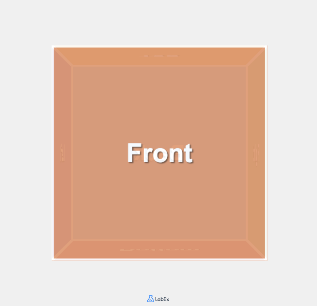
Now, if you refresh your "Go Live" browser tab, you should see some changes, but the faces are still stacked on top of each other. This is because we have not yet positioned them in 3D space. We will do that in the next step.
Position the Cube Faces in 3D Space
Now we need to position each face of the cube in 3D space. To create a cube, we need to place each face at a distance of half the cube's width (100px) from the center, in six different directions.
We will use CSS 3D transforms to achieve this:
translateZ()moves an element forward or backward along the Z-axisrotateX()rotates an element around the horizontal X-axisrotateY()rotates an element around the vertical Y-axis
Let us add the CSS to position each face:
- In the WebIDE, with
style.cssstill open, add the following CSS code to the end of the file:
/* Position each face of the cube */
.front {
  background-color: #ff8a65; /* Coral */
  transform: translateZ(100px);
  /* Moves the front face 100px towards the viewer */
}

.back {
  background-color: #4fc3f7; /* Light Blue */
  transform: rotateY(180deg) translateZ(100px);
  /* Rotates 180° around Y-axis and moves 100px forward */
}

.right {
  background-color: #81c784; /* Light Green */
  transform: rotateY(90deg) translateZ(100px);
  /* Rotates 90° right around Y-axis and moves 100px forward */
}

.left {
  background-color: #9575cd; /* Purple */
  transform: rotateY(-90deg) translateZ(100px);
  /* Rotates 90° left around Y-axis and moves 100px forward */
}

.top {
  background-color: #ffb74d; /* Orange */
  transform: rotateX(90deg) translateZ(100px);
  /* Rotates 90° upward around X-axis and moves 100px forward */
}

.bottom {
  background-color: #f06292; /* Pink */
  transform: rotateX(-90deg) translateZ(100px);
  /* Rotates 90° downward around X-axis and moves 100px forward */
}
Let us understand what this CSS does:
- We give each face a different background color to distinguish them visually.
- For each face, we apply a specific transformation to position it correctly:
- The front face is simply moved 100px toward the viewer along the Z-axis.
- The back face is rotated 180° around the Y-axis and moved 100px forward.
- The right face is rotated 90° clockwise around the Y-axis and moved 100px forward.
- The left face is rotated 90° counterclockwise around the Y-axis and moved 100px forward.
- The top face is rotated 90° upward around the X-axis and moved 100px forward.
- The bottom face is rotated 90° downward around the X-axis and moved 100px forward.
Now refresh your browser tab to see the changes. You should be able to see the front face of the cube. However, the cube is not rotating yet, so you cannot see the other faces. We will add the rotation animation in the next step.
How 3D Transforms Work:
- When we apply a
rotateY(90deg)transformation, we are essentially turning the element 90 degrees around the Y-axis (vertical axis), making it face to the right. - After rotating, when we apply
translateZ(100px), we are moving the element 100px forward in the direction it is now facing (which could be any direction depending on previous rotations). - By combining these transformations, we can place each face at the correct position and orientation to form a cube.
Add Animation to Make the Cube Rotate
Our cube is now properly constructed, but it is static. To make it more interesting, we will add an animation to make the cube rotate continuously in 3D space.
CSS animations allow us to create movement on web pages without using JavaScript. We will define a keyframe animation and apply it to our cube.
- In the WebIDE, add the following CSS code to the end of your
style.cssfile:
/* Define the rotation animation */
@keyframes rotate {
  0% {
    transform: rotateX(0deg) rotateY(0deg);
  }
  25% {
    transform: rotateX(90deg) rotateY(90deg);
  }
  50% {
    transform: rotateX(180deg) rotateY(180deg);
  }
  75% {
    transform: rotateX(270deg) rotateY(270deg);
  }
  100% {
    transform: rotateX(360deg) rotateY(360deg);
  }
}

/* Apply the animation to the cube */
.cube {
  width: 200px;
  height: 200px;
  position: relative;
  transform-style: preserve-3d;
  animation: rotate 20s infinite linear;
  /* 20s defines the duration of one complete rotation */
  /* infinite means the animation will repeat forever */
  /* linear means the animation speed is constant */
}
Let us understand this CSS:
The
@keyframesrule defines an animation namedrotate.- It specifies how the element should look at various stages of the animation.
- At 0%, the cube has no rotation.
- At 25%, the cube has rotated 90 degrees on both the X and Y axes.
- At 50%, the cube has rotated 180 degrees on both axes.
- At 75%, the cube has rotated 270 degrees on both axes.
- At 100%, the cube has completed a full 360-degree rotation on both axes.
We update the
.cubeselector to apply this animation:animation: rotate 20s infinite linearapplies therotateanimation.- The animation lasts 20 seconds per complete rotation.
- It repeats infinitely.
- The linear timing function ensures a constant rotation speed.
Now refresh your browser tab. You should see your cube rotating smoothly in 3D space, showing all six colored faces as it turns.
Understanding CSS Animations:
- CSS animations consist of two components: a style that describes the animation, and a set of keyframes that define the states of the animation at various time points.
- The animation property is a shorthand for several animation properties:
animation-name: Specifies the name of the @keyframes ruleanimation-duration: Specifies how long the animation should take to complete one cycleanimation-timing-function: Defines how the animation progresses through one cycleanimation-iteration-count: Specifies how many times the animation should repeat
You have now successfully created a rotating 3D cube using only HTML and CSS. This example demonstrates the power of CSS 3D transforms and animations for creating visually engaging web elements without requiring JavaScript.
Try experimenting with different animation durations, different rotation axes, or even adding additional transformations to see how they affect your cube.
Summary
Congratulations on completing the 3D Rotating Cube lab. In this lab, you have:
- Created an HTML structure with six faces for a 3D cube
- Applied CSS styling to position elements in 3D space
- Used CSS 3D transforms to place each face correctly in 3D space
- Added CSS animations to create a continuously rotating cube
This project has introduced you to several important CSS concepts:
- CSS 3D transforms (translate, rotate)
- The perspective property for 3D effects
- The transform-style property for preserving 3D positioning
- CSS keyframe animations
These concepts are powerful tools for creating engaging, interactive web interfaces without relying on JavaScript. You can apply these techniques to create various 3D elements, from simple rotating cards to complex 3D models.
As an extension to this project, you might consider:
- Adding hover effects to pause the animation when the user hovers over the cube
- Adding images or more complex content to each face
- Creating different animation paths by modifying the keyframes
- Experimenting with different sizes, colors, and rotation speeds
Remember that modern CSS is extremely powerful for creating visual effects, and many animations that previously required JavaScript can now be accomplished with CSS alone, resulting in better performance and simpler code.


