
Introduction
In this Lab, you'll learn how to create animated social sharing buttons using HTML and CSS3. These buttons use the Font Awesome library for the icons and are styled with CSS to provide a smooth hover transition effect. By the end of this guide, you'll have a set of beautiful, responsive social buttons that you can integrate into any website.
Icon Introduction
To use Font Awesome icons, simply use the prefix "fa" followed by the icon name.
The specific format is as follows: <i class="fa ICON_NAME"></i>
To introduce the required icons from the icon library, write the following code in the index.html file:
<!doctype html>
<html lang="en">
  <head>
    <meta charset="UTF-8" />
    <title>Animated Social Sharing Buttons</title>

    <!--Icon Library-->
    <link
      rel="stylesheet"
      href="https://cdn.jsdelivr.net/npm/font-awesome@4.7.0/css/font-awesome.min.css"
    />
  </head>
  <body>
    <div>
      <i class="fa fa-facebook"></i>
      <i class="fa fa-twitter"></i>
      <i class="fa fa-google"></i>
      <i class="fa fa-instagram"></i>
      <i class="fa fa-pinterest"></i>
    </div>
  </body>
</html>
The result is as follows:

Using pseudo-class selectors allows the style to change when the mouse hovers over the linked object. Therefore, we add an empty link to the icon, or you can link to the respective social homepages.
Pseudo-class syntax: selector:pseudo-class {property:value;}
a:hover {property:value;}sets the style displayed when the mouse hovers over the link.
Set the required class selectors to facilitate subsequent styling of the respective buttons.
<div class="social-btns">
  <a class="btn facebook" href="#"><i class="fa fa-facebook"></i></a>
  <a class="btn twitter" href="#"><i class="fa fa-twitter"></i></a>
  <a class="btn google" href="#"><i class="fa fa-google"></i></a>
  <a class="btn instagram" href="#"><i class="fa fa-instagram"></i></a>
  <a class="btn pinterest" href="#"><i class="fa fa-pinterest"></i></a>
</div>
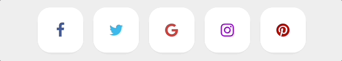
Effect Preview:

The Font Awesome icons turn blue because after applying the <a> tag, the default font color is blue.
Icon Style Setting
Before setting the icon style, we add the style.css stylesheet in the <head> tag of index.html.
<link rel="stylesheet" href="style.css" />
To standardize the overall style, set a global style in style.css.
/* Global style settings */
* {
  margin: 0;
  padding: 0;
}
a,
img {
  border: 0;
}
body {
  background: #eee;
}
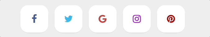
To beautify the vector icons provided by the Font Awesome font, let's first set their colors.
.social-btns .btn.facebook .fa {
  color: #3b5998;
}
.social-btns .btn.twitter .fa {
  color: #00aff0;
}
.social-btns .btn.google .fa {
  color: #dc4a38;
}
.social-btns .btn.instagram .fa {
  color: #bf00ff;
}
.social-btns .btn.pinterest .fa {
  color: #cc0000;
}
Effect Preview:

Next, we'll set the icon to instantly enlarge when touched and change its color. For the instant enlargement effect, we can use transform: scale(0.8) to reduce the icon to 80% of its original size, and when the touch event occurs, it is resized back to its original size using transform: scale(1).
Enter the following code in the style.css file:
.social-btns .btn .fa {
  /* Set the default link display style */
  -webkit-transform: scale(0.8);
  transform: scale(0.8);
}
.social-btns .btn:focus .fa, /* Select the focused button style */
.social-btns .btn:hover .fa {
  /* Set the mouse-over link display style */
  color: #fff; /* Change its color */
  -webkit-transform: scale(1);
  transform: scale(1);
}
.social-btns .btn .fa {
  /* Set the size and vertical alignment of the icons provided by Font Awesome */
  font-size: 38px;
  vertical-align: middle;
}
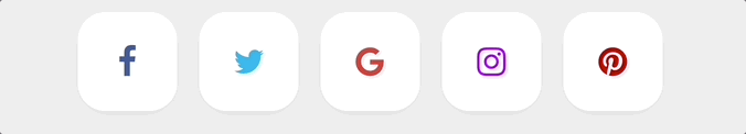
Effect Preview:

Button Style Setting
To layout the page, we center the buttons on the page, set them as block-level inline elements, and then beautify the buttons.
The display attribute specifies the type of element to generate:
display:inlinesets it as an inline element, sharing a row with other elements, i.e., not occupying a row exclusively.display:blocksets it as a block-level element and occupies a row exclusively.display:inline-blockcombines the above two methods to set it as a block-level element that does not occupy a row exclusively.
.social-btns {
  height: 90px;
  margin: 80px auto;
  font-size: 0;
  text-align: center; /* horizontally centering */
}
.social-btns .btn {
  display: inline-block; /* set the button as a block-level element that does not occupy a row exclusively */
  background-color: #fff;
  width: 90px;
  height: 90px;
  line-height: 90px; /* set line height */
  margin: 0 10px;
  text-align: center;
  position: relative; /* set to relative positioning */
  overflow: hidden; /* hide overflow content */
  border-radius: 28%; /* round the corners of the DIV */
  box-shadow: 0 5px 15px -5px rgba(0, 0, 0, 0.1); /* add shadow to the DIV element */
  opacity: 0.99; /* specify opacity. From 0.0 transparent to 1.0 completely opaque */
}
Effect Preview:
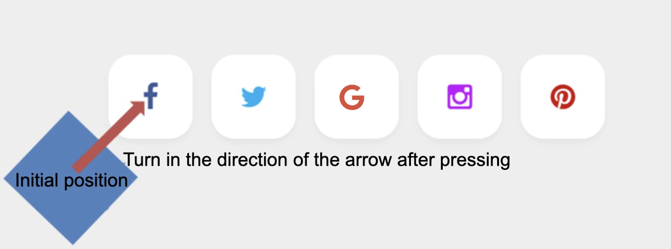
We find that when the button is touched, both the icon and the button background are white, which is not easy to see clearly. So, we need to set the touch style of the button background. First, we need to rotate the btn:before clockwise by 45° using transform: rotate(45deg). Then adjust the initial and final positions of btn:before.
before selector: Inserts new content before the content of the element.
.social-btns .btn:before {
  /*Set the top and left values before the content of each btn element, i.e. the position of the btn when not touched*/
  top: 90%;
  left: -110%;
}
.social-btns .btn:focus:before,
.social-btns .btn:hover:before {
  /*Adjusts the position of the button when touched*/
  top: -10%;
  left: -10%;
}
.social-btns .btn:before {
  content: "";
  width: 120%;
  height: 120%;
  position: absolute;
  /*Flip btn:before by 45° clockwise*/
  -webkit-transform: rotate(45deg);
  transform: rotate(45deg);
}
/*Set the btn:before color, i.e. the button's background color after touching*/
.social-btns .btn.facebook:before {
  background-color: #3b5998;
}
.social-btns .btn.twitter:before {
  background-color: #00aff0;
}
.social-btns .btn.instagram:before {
  background-color: #bf00ff;
}
.social-btns .btn.google:before {
  background-color: #dc4a38;
}
.social-btns .btn.pinterest:before {
  background-color: #cc0000;
}
Effect Preview:
Finally, we make transition adjustments to the buttons, mainly using the transition-timing-function attribute to set the speed curve of the transition effect to make it visually smoother.
transition-timing-function syntax:
<cubic-bezier-easing-function> =
  ease                                                |
  ease-in                                             |
  ease-out                                            |
  ease-in-out                                         |
  cubic-bezier( <number [0,1]> , <number> , <number [0,1]> , <number> )
Add the following style to style.css:
.social-btns .btn,
.social-btns .btn:before,
.social-btns .btn .fa {
  transition: all 0.35s; /* all styles 0.35 seconds easing */
  transition-timing-function: cubic-bezier(
    0.31,
    -0.105,
    0.43,
    1.59
  ); /* specify the speed of the transition effect */
}
Effect Preview:
Note:Please click on 'Go Live' in the bottom right corner to run the web service on port 8080. Then, you can refresh the Web 8080 Tab to preview the web page.
Knowledge Expansion
Not only can we set the effect when hovering over a hyperlink, but we can also use pseudo-class selectors to set effects for unvisited, visited, and selected hyperlinks.
a:link {attribute: value;}sets the effect for unvisited hyperlinks.a:visited {attribute: value;}sets the effect for visited hyperlinks.a:active {attribute: value;}sets the effect for selected hyperlinks.
Summary
In this Lab, we learned the following:
- Font Awesome icon library references
- CSS pseudo-class selectors
- CSS transform properties
- The display property
- before selector
This Lab uses CSS to transform a static icon into a button with dynamic effects.CSS can not only set up a uniform style for repetitive styles to improve the efficiency of web development, but also set up a variety of elements according to the needs of the web page to achieve the purpose of beautifying the web page and enhance the user's sense of use.


