Create a Pixel Art Animator with React

JavaScriptJavaScriptBeginner
Practice Now

Introduction

In this project, we'll walk you through building a simple Pixel Art Animator using React. By the end of this guide, you'll have a basic pixel art editor where you can draw your pixel art and see the resulting animation. This project is beginner-friendly and provides a fun way to dive into the world of React and pixel art!

👀 Preview
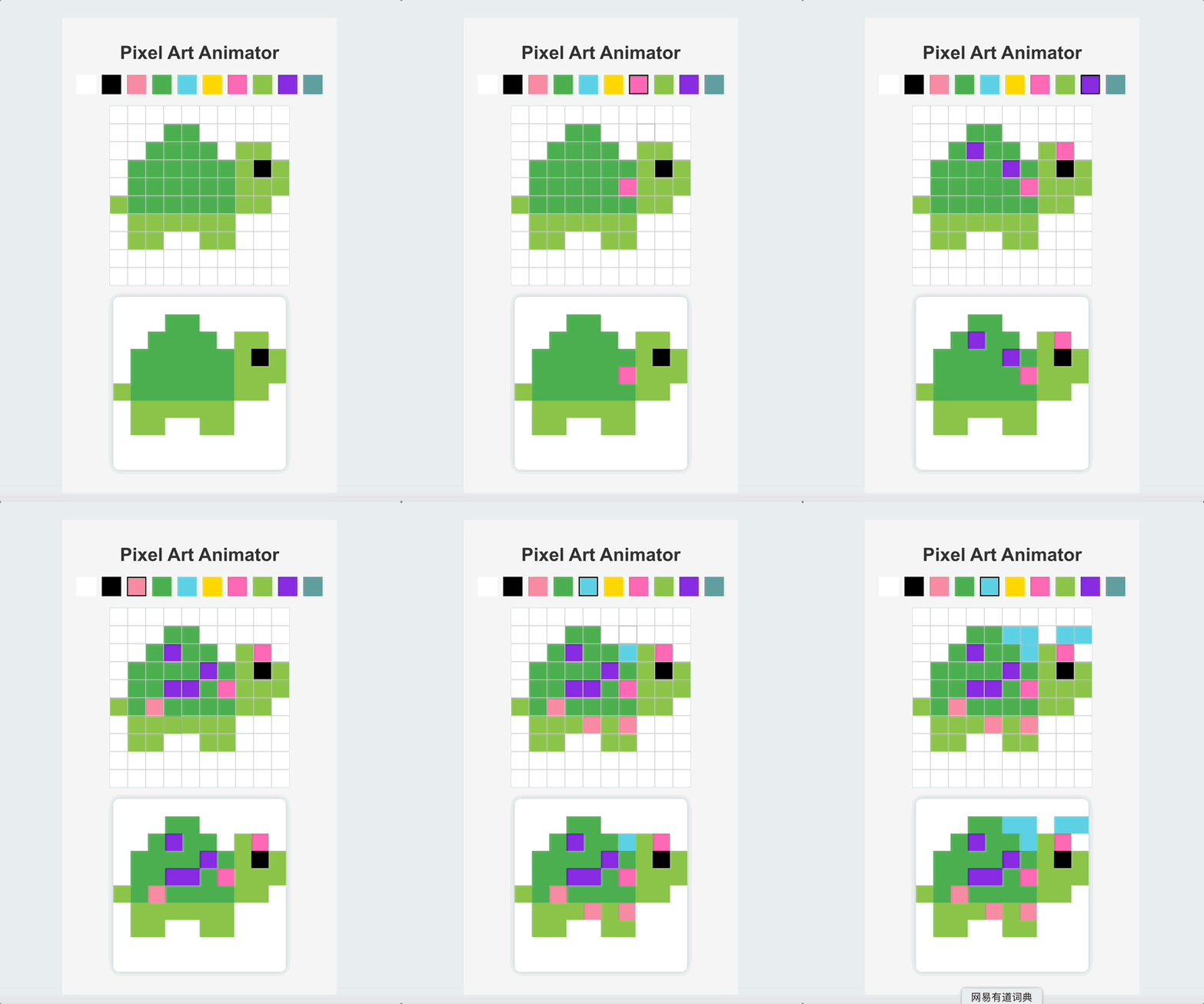
effect

🎯 Tasks

In this project, you will learn:

  • How to initialize a React project and install necessary dependencies.
  • How to create a color palette component for users to choose colors.
  • How to build a drawing grid to allow users to draw pixel art.
  • How to implement an art preview component to display the pixel art in progress.
  • How to combine all components in the main app.
  • How to style the application for improved user experience.

🏆 Achievements

After completing this project, you will be able to:

  • Set up a React project and install dependencies.
  • Create functional components in React.
  • Use React state and props to manage application data.
  • Handle events in React.
  • Style a React application using CSS.

Project Setup

Requirements:

  • Installing Dependencies in the new React project.

Functionality:

  • Initialize the project with the necessary dependencies and a basic project structure.

Steps:

  1. Open a terminal and Navigate to the project folder:

    cd react-pixel-art-animator

    You need to run this command under the project directory.

  2. Installing Dependencies in the Project:

    npm install

Design the Color Palette Component

Requirements:

  • Create a color palette from which users can choose colors.

Functionality:

  • Display a set of color options.
  • Allow users to select a color.

Steps:

// src/Palette.js
import React from "react";

const colors = [
  "#FFFFFF",
  "#000000",
  "#F78CA2",
  "#4caf50",
  "#5CD2E6",
  "#FFD700",
  "#FF69B4",
  "#8bc34a",
  "#8A2BE2",
  "#5F9EA0"
];

function Palette({ selectedColor, setSelectedColor }) {
  return (
    <div className="palette">
      {colors.map((color) => (
        <div
          key={color}
          className={`color-box ${color === selectedColor ? "selected" : ""}`}
          style={{ backgroundColor: color }}
          onClick={() => setSelectedColor(color)}
        ></div>
      ))}
    </div>
  );
}

export default Palette;

This component displays a row of color boxes, and the user can click on them to select a color.

✨ Check Solution and Practice

Building the Drawing Grid

Requirements:

  • Construct a grid where users can draw pixel art.

Functionality:

  • Render a grid layout.
  • Enable users to fill in grid squares with the selected color.

Steps:

// src/Grid.js
import React from "react";

function Grid({ grid, setGrid, selectedColor }) {
  const updatePixel = (rowIndex, colIndex) => {
    const newGrid = [...grid];
    newGrid[rowIndex][colIndex] = selectedColor;
    setGrid(newGrid);
  };

  return (
    <div className="grid">
      {grid.map((row, rowIndex) => (
        <div key={rowIndex} className="grid-row">
          {row.map((color, colIndex) => (
            <div
              key={colIndex}
              className="grid-pixel"
              style={{ backgroundColor: color }}
              onClick={() => updatePixel(rowIndex, colIndex)}
            ></div>
          ))}
        </div>
      ))}
    </div>
  );
}

export default Grid;

The grid component will allow users to draw pixel art by clicking on each square.

✨ Check Solution and Practice

Implementing the Art Preview

Requirements:

  • Display a preview of the pixel art that the user creates.

Functionality:

  • Render the user's pixel art as it's being created.

Steps:

// SpriteDisplay.js;
import React from "react";

function SpriteDisplay({ grid }) {
  return (
    <div className="sprite-display">
      {grid.map((row, rowIndex) => (
        <div key={rowIndex} className="sprite-row">
          {row.map((color, colIndex) => (
            <div
              key={colIndex}
              className="sprite-pixel"
              style={{ backgroundColor: color }}
            ></div>
          ))}
        </div>
      ))}
    </div>
  );
}

export default SpriteDisplay;
✨ Check Solution and Practice

Integrating Components into the Main App

Requirements:

  • Combine the Palette, Grid, and SpriteDisplay components.

Functionality:

  • Display the main application with integrated components.

Steps:

// App.js
import React, { useState } from "react";
import Palette from "./Palette";
import Grid from "./Grid";
import SpriteDisplay from "./SpriteDisplay";
import "./App.css";

const initialCatSprite = [
  [
    "#ffffff",
    "#ffffff",
    "#ffffff",
    "#ffffff",
    "#ffffff",
    "#ffffff",
    "#ffffff",
    "#ffffff",
    "#ffffff",
    "#ffffff"
  ],
  [
    "#ffffff",
    "#ffffff",
    "#ffffff",
    "#4caf50",
    "#4caf50",
    "#ffffff",
    "#ffffff",
    "#ffffff",
    "#ffffff",
    "#ffffff"
  ],
  [
    "#ffffff",
    "#ffffff",
    "#4caf50",
    "#4caf50",
    "#4caf50",
    "#4caf50",
    "#ffffff",
    "#8bc34a",
    "#8bc34a",
    "#ffffff"
  ],
  [
    "#ffffff",
    "#4caf50",
    "#4caf50",
    "#4caf50",
    "#4caf50",
    "#4caf50",
    "#4caf50",
    "#8bc34a",
    "#000000",
    "#8bc34a"
  ],
  [
    "#ffffff",
    "#4caf50",
    "#4caf50",
    "#4caf50",
    "#4caf50",
    "#4caf50",
    "#4caf50",
    "#8bc34a",
    "#8bc34a",
    "#8bc34a"
  ],
  [
    "#8bc34a",
    "#4caf50",
    "#4caf50",
    "#4caf50",
    "#4caf50",
    "#4caf50",
    "#4caf50",
    "#8bc34a",
    "#8bc34a",
    "#ffffff"
  ],
  [
    "#ffffff",
    "#8bc34a",
    "#8bc34a",
    "#8bc34a",
    "#8bc34a",
    "#8bc34a",
    "#8bc34a",
    "#ffffff",
    "#ffffff",
    "#ffffff"
  ],
  [
    "#ffffff",
    "#8bc34a",
    "#8bc34a",
    "#ffffff",
    "#ffffff",
    "#8bc34a",
    "#8bc34a",
    "#ffffff",
    "#ffffff",
    "#ffffff"
  ],
  [
    "#ffffff",
    "#ffffff",
    "#ffffff",
    "#ffffff",
    "#ffffff",
    "#ffffff",
    "#ffffff",
    "#ffffff",
    "#ffffff",
    "#ffffff"
  ],
  [
    "#ffffff",
    "#ffffff",
    "#ffffff",
    "#ffffff",
    "#ffffff",
    "#ffffff",
    "#ffffff",
    "#ffffff",
    "#ffffff",
    "#ffffff"
  ]
];

function App() {
  const [selectedColor, setSelectedColor] = useState("#000000");
  const [grid, setGrid] = useState(initialCatSprite);

  return (
    <div className="App">
      <h1>Pixel Art Animator</h1>
      <Palette
        selectedColor={selectedColor}
        setSelectedColor={setSelectedColor}
      />
      <Grid grid={grid} setGrid={setGrid} selectedColor={selectedColor} />
      <SpriteDisplay grid={grid} />
    </div>
  );
}

export default App;
✨ Check Solution and Practice

Styling the Application

Requirements:

  • Make the application visually appealing.

Functionality:

  • Style the app components for improved user experience.

Steps:

/*App.css*/
.App {
  display: flex;
  flex-direction: column;
  align-items: center;
  padding: 20px;
  font-family: "Arial", sans-serif;
  background-color: #f4f4f4;
}

h1 {
  color: #333;
  margin-bottom: 20px;
}

.palette {
  display: flex;
  margin-bottom: 20px;
}

.color-box {
  width: 30px;
  height: 30px;
  margin: 0 5px;
  border: 2px solid transparent;
  cursor: pointer;
  transition: border-color 0.2s;
}

.color-box:hover,
.color-box.selected {
  border-color: #000;
}

.grid {
  display: flex;
  flex-direction: column;
  margin-bottom: 20px;
}

.grid-row {
  display: flex;
}

.grid-pixel {
  width: 30px;
  height: 30px;
  border: 1px solid #ccc;
  cursor: pointer;
}

.grid-pixel:hover {
  border-color: #888;
}

.sprite-display {
  display: flex;
  flex-direction: column;
  margin-bottom: 20px;
  box-shadow: 0 0 10px rgba(0, 0, 0, 0.2);
  border-radius: 10px;
  overflow: hidden;
}

.sprite-row {
  display: flex;
}

.sprite-pixel {
  width: 30px;
  height: 30px;
}

/* Adjusting the overall size and space for a modern look */
body {
  margin: 0;
  padding: 0;
  height: 100vh;
  display: flex;
  justify-content: center;
  align-items: center;
  background-color: #e9ecef;
}
✨ Check Solution and Practice

Running the App

To run your App:

  1. Open your terminal or command prompt.

  2. Make sure you are in the project's root directory (where the package.json file is located).

  3. Start the development server:

    npm start

    You should now see a basic React app running in your browser at 8080 port. We'll build upon this base to create our App.

  4. The effect of the page is as follows:

    effect
✨ Check Solution and Practice

Summary

Congratulations! You've successfully built a basic Pixel Art Animator using React. You can now draw with pixels, pick colors from a palette, and preview your pixel art. As you continue your learning journey, consider adding more features like saving your pixel art to a database, implementing an undo-redo functionality, or even integrating animations.

Other JavaScript Tutorials you may like