
Introduction
In this project, you will learn how to implement a responsive layout for a website, similar to the official Gulp.js website. You will use media queries to adjust the layout and styles of the web page based on the screen size.
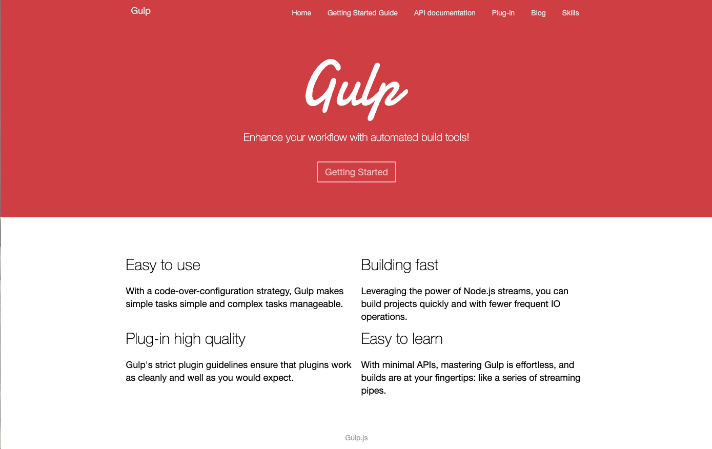
👀 Preview
🎯 Tasks
In this project, you will learn:
- How to add media query rules to the HTML file to create a responsive layout
- How to adjust the width and visibility of page elements based on different screen sizes
- How to test the responsive layout by resizing the browser window
🏆 Achievements
After completing this project, you will be able to:
- Implement a responsive web design using media queries
- Adjust layout and styles based on screen size
- Effectively test and optimize web pages for different devices and screen resolutions
Set Up the Project
In this step, you will set up the project and open the files in the editor.
Open the project folder, which contains the following files and directories:
├── css
├── imgs
├── js
└── index.html
Click on Go Live button in the bottom right corner of WebIDE, to run the project.
Next, open "Web 8080" on the top of the VM and manually refresh it to see the page.
Now you can see the static page of the Gulp website, which is not responsive yet. Change the window size manually, and you will see the following effect.
Add Media Queries
In this step, you will learn how to add media queries to the HTML file to make the page responsive.
- Open the
index.htmlfile in the code editor. - Find the first
<style>section in the<head>of the document. - Add the following media query rule under
/* TODO */in<style>:
/* TODO */
@media screen and (max-width: 1400px) {
  nav .content,
  main section {
    width: 900px !important;
  }
}

@media screen and (max-width: 900px) {
  nav .content,
  main section {
    width: 700px !important;
  }
}

@media screen and (max-width: 650px) {
  main section,
  main ul li {
    width: 100% !important;
  }

  nav .content .list {
    display: none;
  }

  nav .content .menu {
    display: block;
    position: absolute;
    right: 10px;
  }

  main ul li:nth-child(even) {
    margin-left: 0 !important;
  }
}
These media queries will apply specific styles to the page based on the screen width. The first media query sets the width of the content and main section to 900px when the screen width is less than or equal to 1400px. The second media query sets the width to 700px when the screen width is less than or equal to 900px. The third media query hides the navigation list, displays a menu icon, and sets the width of the main section and list items to 100% when the screen width is less than or equal to 650px.
Test the Responsive Layout
In this step, you will test the responsive design and make any necessary refinements.
- Save the
index.htmlfile. - Refresh the web page in the browser.
- Resize the browser window to different widths to see the responsive layout changes.
- Verify that the page layout matches the expected results shown in the provided images.
At this point, you have completed the implementation of the responsive layout for the Gulp.js website. The page should now adapt to different screen sizes as per the requirements.
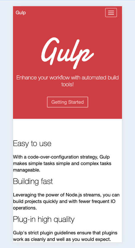
The finished mobile result is shown below:
Congratulations! You have successfully implemented a responsive layout for the Gulp.js website.
Summary
Congratulations! You have completed this project. You can practice more labs in LabEx to improve your skills.


