
はじめに
このチュートリアルでは、Python の Matplotlib ライブラリを使用して、x 軸の目盛りラベルをグラフの上部に移動する方法を学びます。デフォルトでは、Matplotlib は x 軸のラベルをグラフの下部に配置します。ただし、特にグラフが混雑している場合や、長いラベルが他の要素と重なる可能性がある場合には、視覚化を向上させるために上部に配置したいことがあります。
このテクニックは、グラフのスペースの使用を最適化し、読みやすさを向上させる必要があるデータ視覚化のシナリオで特に有用です。簡単なグラフを作成し、目盛りラベルの位置を段階的に操作する方法を学びます。
VM のヒント
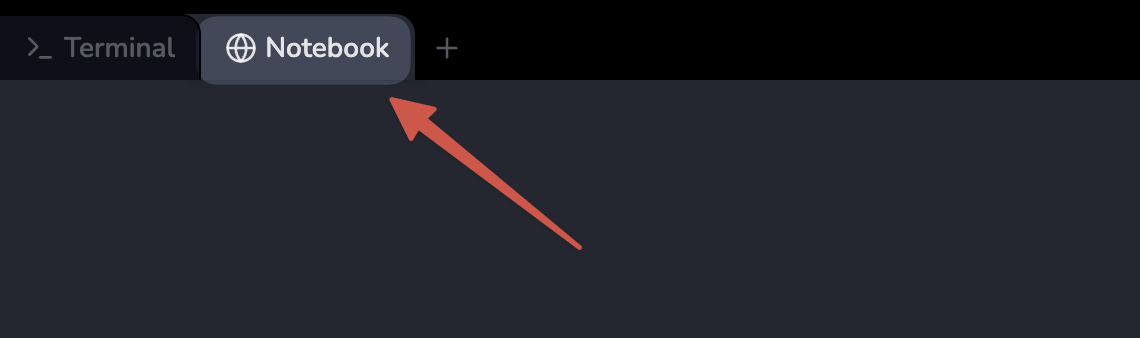
VM の起動が完了したら、左上隅をクリックして Notebook タブに切り替え、Jupyter Notebook を開いて練習を行ってください。
Jupyter Notebook の読み込みが完了するまで数秒待つ必要がある場合があります。Jupyter Notebook の制限により、操作の検証を自動化することはできません。
このチュートリアル中に何か問題が発生した場合は、いつでも Labby に相談してください。セッション終了後にフィードバックを提供していただければ、問題を迅速に解決できます。
Skills Graph
%%%%{init: {'theme':'neutral'}}%%%%
flowchart RL
matplotlib(("Matplotlib")) -.-> matplotlib/BasicConceptsGroup(["Basic Concepts"])
matplotlib(("Matplotlib")) -.-> matplotlib/PlottingDataGroup(["Plotting Data"])
matplotlib(("Matplotlib")) -.-> matplotlib/PlotCustomizationGroup(["Plot Customization"])
matplotlib/BasicConceptsGroup -.-> matplotlib/importing_matplotlib("Importing Matplotlib")
matplotlib/BasicConceptsGroup -.-> matplotlib/figures_axes("Understanding Figures and Axes")
matplotlib/BasicConceptsGroup -.-> matplotlib/saving_figures("Saving Figures to File")
matplotlib/PlottingDataGroup -.-> matplotlib/line_plots("Line Plots")
matplotlib/PlottingDataGroup -.-> matplotlib/fill_between("Fill Between Plots")
matplotlib/PlotCustomizationGroup -.-> matplotlib/titles_labels("Adding Titles and Labels")
matplotlib/PlotCustomizationGroup -.-> matplotlib/axis_ticks("Axis Ticks Customization")
matplotlib/PlotCustomizationGroup -.-> matplotlib/text_annotations("Text Annotations")
subgraph Lab Skills
matplotlib/importing_matplotlib -.-> lab-48991{{"X 軸の目盛りラベルを上部に移動する"}}
matplotlib/figures_axes -.-> lab-48991{{"X 軸の目盛りラベルを上部に移動する"}}
matplotlib/saving_figures -.-> lab-48991{{"X 軸の目盛りラベルを上部に移動する"}}
matplotlib/line_plots -.-> lab-48991{{"X 軸の目盛りラベルを上部に移動する"}}
matplotlib/fill_between -.-> lab-48991{{"X 軸の目盛りラベルを上部に移動する"}}
matplotlib/titles_labels -.-> lab-48991{{"X 軸の目盛りラベルを上部に移動する"}}
matplotlib/axis_ticks -.-> lab-48991{{"X 軸の目盛りラベルを上部に移動する"}}
matplotlib/text_annotations -.-> lab-48991{{"X 軸の目盛りラベルを上部に移動する"}}
end