
Introduction
In data visualization, it's often useful to display multiple plots in a single figure. This allows for easy comparison between different datasets or different views of the same data. Matplotlib provides a powerful and convenient way to create such figures using subplots.
The most common way to create subplots is with the plt.subplots() function. This function creates a figure and a grid of subplots in a single call, returning a Figure object and an array of Axes objects, which represent each individual subplot.
In this lab, you will learn how to:
- Create a figure containing multiple subplots.
- Plot data onto specific subplots.
- Adjust the layout to prevent plots from overlapping.
- Share axes between subplots for clearer comparisons.
You will write and execute Python scripts in the WebIDE. Since this environment doesn't support interactive GUI windows, you will save your plots as image files and view them directly in the editor.
Create figure and axes using plt.subplots()
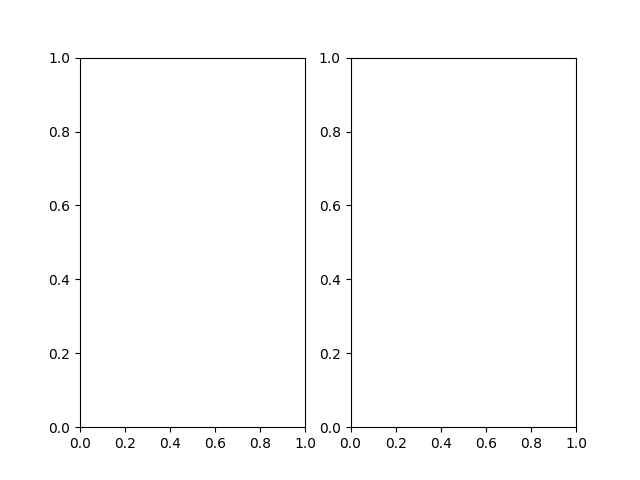
In this step, you will begin by creating a figure that contains two empty subplots arranged in one row and two columns. This is the foundational step for building multi-plot visualizations.
We will use the plt.subplots() function. When you call plt.subplots(nrows, ncols), it returns two items:
- A
Figureobject, which is the overall window or page that everything is drawn on. We usually assign it to a variable namedfig. - An array of
Axesobjects. EachAxesobject represents one of the subplots in the grid. You can access them by their index. For a(1, 2)grid, we can unpack this array into two variables,ax1andax2.
Let's write the code. Open the main.py file from the file explorer on the left and add the following content. This script will import the necessary libraries, create a figure with two subplots, and save it as an image file named plot1.png.
import matplotlib.pyplot as plt
import numpy as np

## Create a figure and a set of subplots.
## 1 row, 2 columns.
fig, (ax1, ax2) = plt.subplots(1, 2)

## Save the figure to a file.
## The file will be created in the /home/labex/project directory.
plt.savefig('plot1.png')

print("Figure saved as plot1.png")
Now, run the script from the terminal to generate the plot.
python3 main.py
You should see the following output in your terminal:
Figure saved as plot1.png
A new file named plot1.png will appear in the file explorer. Double-click it to view your first figure with two empty subplots.
Plot on first subplot using ax1.plot()
In this step, you will learn how to draw a plot on one of the specific Axes objects you created. Each Axes object has its own plotting methods, like plot(), bar(), scatter(), etc., which are similar to the functions in the main plt interface.
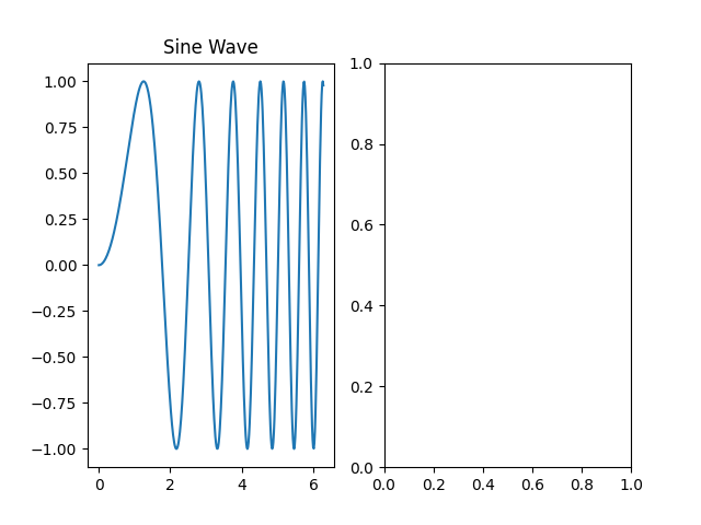
We will plot a simple sine wave on the first subplot, which is represented by the ax1 variable. We'll also add a title to this subplot using the set_title() method.
Update your main.py file with the following code. We are adding data generation using NumPy and then plotting it on ax1.
import matplotlib.pyplot as plt
import numpy as np

## Create some data
x = np.linspace(0, 2 * np.pi, 400)
y = np.sin(x ** 2)

## Create a figure and a set of subplots
fig, (ax1, ax2) = plt.subplots(1, 2)

## Plot on the first subplot (ax1)
ax1.plot(x, y)
ax1.set_title('Sine Wave')

## Save the figure to a new file
plt.savefig('plot2.png')

print("Figure saved as plot2.png")
Now, execute the updated script in the terminal.
python3 main.py
You will see this output:
Figure saved as plot2.png
A new file, plot2.png, is now in your project directory. Open it to see the result. The left subplot should now contain a sine wave plot, while the right one remains empty.
Plot on second subplot using ax2.plot()
In this step, you will complete the figure by adding a plot to the second subplot. The process is identical to the previous step, but this time you will call the plot() method on the ax2 object.
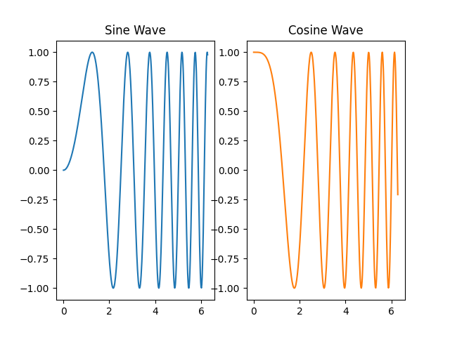
Let's plot a cosine wave on the second subplot to compare it with the sine wave. We will also give it a title.
Modify your main.py file to include plotting on the second axis.
import matplotlib.pyplot as plt
import numpy as np

## Create some data
x = np.linspace(0, 2 * np.pi, 400)
y1 = np.sin(x ** 2)
y2 = np.cos(x ** 2)

## Create a figure and a set of subplots
fig, (ax1, ax2) = plt.subplots(1, 2)

## Plot on the first subplot (ax1)
ax1.plot(x, y1)
ax1.set_title('Sine Wave')

## Plot on the second subplot (ax2)
ax2.plot(x, y2, 'tab:orange')
ax2.set_title('Cosine Wave')

## Save the figure to a new file
plt.savefig('plot3.png')

print("Figure saved as plot3.png")
In the code above, we added 'tab:orange' to the ax2.plot() call to change the line color, making the plots visually distinct.
Run the script again from the terminal.
python3 main.py
The output will be:
Figure saved as plot3.png
Now, open plot3.png. You will see a complete figure with two plots side-by-side. However, you might notice that the titles or axis labels could be a bit cramped. We'll fix that in the next step.
Adjust subplot layout using plt.tight_layout()
In this step, you will learn how to automatically adjust the spacing between subplots to prevent titles and labels from overlapping. Matplotlib provides a simple function for this: plt.tight_layout().
This function examines the bounding boxes of all the artists on the figure (like titles, labels, and the plots themselves) and adjusts the subplot parameters to make everything fit neatly without overlapping. It's good practice to call it right before you save or show your plot.
Let's add plt.tight_layout() to our script. Update main.py as follows:
import matplotlib.pyplot as plt
import numpy as np

## Create some data
x = np.linspace(0, 2 * np.pi, 400)
y1 = np.sin(x ** 2)
y2 = np.cos(x ** 2)

## Create a figure and a set of subplots
fig, (ax1, ax2) = plt.subplots(1, 2)

## Plot on the first subplot (ax1)
ax1.plot(x, y1)
ax1.set_title('Sine Wave')

## Plot on the second subplot (ax2)
ax2.plot(x, y2, 'tab:orange')
ax2.set_title('Cosine Wave')

## Adjust layout to prevent overlap
plt.tight_layout()

## Save the figure to a new file
plt.savefig('plot4.png')

print("Figure saved as plot4.png")
The only change is the addition of the plt.tight_layout() line. Now, run the script.
python3 main.py
Output:
Figure saved as plot4.png
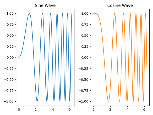
Open plot4.png and compare it with plot3.png. You should notice that the spacing between the two subplots has been optimized, providing a cleaner and more professional-looking figure.
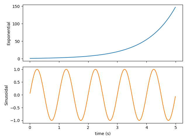
Share axes using sharex=True or sharey=True
In this step, you will learn how to create subplots that share a common axis. This is particularly useful when you are comparing datasets that have the same x- or y-scale. When axes are shared, zooming or panning on one subplot will automatically update the other. It also helps declutter the figure by removing redundant tick labels.
You can enable axis sharing by passing the sharex=True or sharey=True arguments to plt.subplots().
To demonstrate this, let's create a new script. Create a file named shared_axes.py in your project directory and add the following code. This example will create two subplots stacked vertically (nrows=2, ncols=1) that share the same x-axis.
import matplotlib.pyplot as plt
import numpy as np

## Create data
t = np.arange(0.01, 5.0, 0.01)
s1 = np.exp(t)
s2 = np.sin(2 * np.pi * t)

## Create a figure and two subplots that share the x-axis
fig, (ax1, ax2) = plt.subplots(2, 1, sharex=True)

## Plot on the first subplot
ax1.plot(t, s1, 'tab:blue')
ax1.set_ylabel('Exponential')

## Plot on the second subplot
ax2.plot(t, s2, 'tab:orange')
ax2.set_ylabel('Sinusoidal')
ax2.set_xlabel('time (s)')

## Adjust layout
plt.tight_layout()

## Save the figure
plt.savefig('plot5.png')

print("Figure saved as plot5.png")
Now, run this new script from the terminal.
python3 shared_axes.py
Output:
Figure saved as plot5.png
Open plot5.png. Notice that the x-axis tick labels are only present on the bottom subplot (ax2). This is because sharex=True automatically hides the inner x-axis labels to create a cleaner look. Both plots are perfectly aligned along the x-axis, making them easy to compare.
Summary
Congratulations on completing the lab! You have learned the essential techniques for creating and managing subplots in Matplotlib.
In this lab, you practiced:
- Using
plt.subplots()to create a figure with a grid of subplots. - Accessing individual
Axesobjects and using their methods to plot data. - Adding titles to specific subplots.
- Using
plt.tight_layout()to automatically adjust spacing and prevent overlapping elements. - Creating subplots with shared axes using
sharex=Truefor clearer data comparison and a cleaner figure.
These skills are fundamental for creating complex and informative data visualizations. You can now build figures that effectively compare multiple datasets in a single, coherent view.