Course in Matplotlib Skill Tree
Seaborn Data Visualization Basics
Beginner
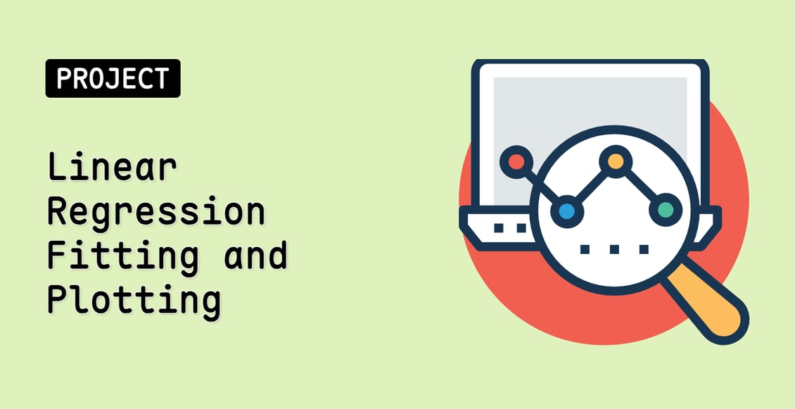
In this course, you will learn how to use Seaborn, a Python library for producing statistical graphics. You will learn how to use Seaborn's sophisticated visualization tools to analyze your data, create informative visualizations, and communicate your results with ease.
matplotlibpythondata-science
Teacher

Labby
Labby is the LabEx teacher.

Upgrade to Get Certificate
Join Our Discord and Learn Together
Join NowUser Reviews
" Doing great job for absolute beginners"
— KARTHIK RAJA
" the best dedicated website for enthusiastic students"
— Nisael Almond