
Introduction
In this lab, you will learn how to create and customize pie charts using Matplotlib, one of the most popular data visualization libraries in Python. A pie chart is a circular statistical graphic, which is divided into slices to illustrate numerical proportion.
You will start by preparing the data, then plot a basic pie chart, and progressively add features like an "explode" effect, percentage labels, and a shadow to make the chart more informative and visually appealing.
All operations will be performed within the LabEx WebIDE. You will write Python code in a file and execute it to generate chart images. Since the graphical display is not available in this environment, you will use plt.savefig() to save your charts as image files and then view them directly in the IDE.
Prepare labels and sizes lists
In this step, you will prepare the data required to plot a pie chart. A pie chart needs two main sets of data: the labels for each slice and the corresponding size or value of each slice.
First, let's create a Python script. In the WebIDE file explorer on the left, you will see a file named main.py inside the project directory. Double-click on it to open it in the editor.
Now, add the following code to main.py. This code defines two Python lists: labels for the categories and sizes for their respective proportions.
## Data for the pie chart
labels = ['Frogs', 'Hogs', 'Dogs', 'Logs']
sizes = [15, 30, 45, 10]
labels: A list of strings that will be used to label each slice of the pie chart.sizes: A list of numbers representing the value or proportion of each slice. The total of these values will represent the whole pie.
After adding the code, your main.py file should look like this. This script doesn't produce any output yet, but it sets up the necessary data for the next steps.
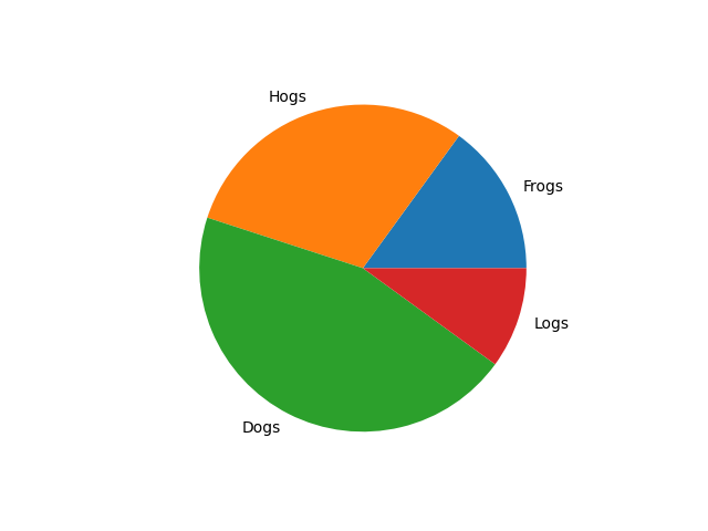
Plot pie chart using plt.pie(sizes, labels=labels)
In this step, you will use the data from the previous step to plot a basic pie chart. We will use the plt.pie() function from the Matplotlib library.
First, you need to import the matplotlib.pyplot module, which is conventionally imported with the alias plt. Then, you can call the plt.pie() function, passing your sizes and labels lists as arguments.
Since we cannot display a GUI window in this environment, we will save the chart to an image file using plt.savefig().
Update your main.py file with the following code:
import matplotlib.pyplot as plt

## Data for the pie chart
labels = ['Frogs', 'Hogs', 'Dogs', 'Logs']
sizes = [15, 30, 45, 10]

## Create a figure and a set of subplots
fig, ax = plt.subplots()

## Plot the pie chart
ax.pie(sizes, labels=labels)

## Save the figure to a file
plt.savefig('/home/labex/project/pie_chart.png')

print("Pie chart saved to pie_chart.png")
Now, let's run the script. Open a terminal in the WebIDE (you can use the + icon in the terminal panel or the Terminal > New Terminal menu) and execute the following command:
python3 main.py
You should see the following output in the terminal:
Pie chart saved to pie_chart.png
A new file named pie_chart.png will appear in your project directory. Double-click on pie_chart.png in the file explorer to open it and view your first pie chart.
Add explode effect using explode parameter
In this step, you will learn how to emphasize a particular slice of the pie chart by "exploding" it. This means offsetting it slightly from the center of the pie. This is achieved using the explode parameter in the pie() function.
The explode parameter takes a tuple or list of the same length as your sizes data. Each value in the tuple specifies the fraction of the radius with which to offset each wedge. A value of 0 means the slice stays in place, while a non-zero value like 0.1 will move it out.
Let's modify main.py to explode the 'Hogs' slice. We will also save the output to a new file, pie_chart_explode.png, to compare it with the previous one.
Update your main.py file with the following code:
import matplotlib.pyplot as plt

## Data for the pie chart
labels = ['Frogs', 'Hogs', 'Dogs', 'Logs']
sizes = [15, 30, 45, 10]
explode = (0, 0.1, 0, 0)  ## only "explode" the 2nd slice (i.e. 'Hogs')

## Create a figure and a set of subplots
fig, ax = plt.subplots()

## Plot the pie chart with explode effect
ax.pie(sizes, explode=explode, labels=labels)

## Save the figure to a file
plt.savefig('/home/labex/project/pie_chart_explode.png')

print("Pie chart with explode effect saved to pie_chart_explode.png")
Now, run the updated script from the terminal:
python3 main.py
You will see this output:
Pie chart with explode effect saved to pie_chart_explode.png
A new file pie_chart_explode.png is now in your project directory. Open it to see the 'Hogs' slice slightly separated from the rest of the pie.

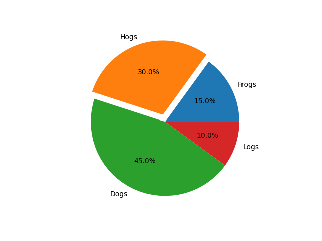
Display percentages using autopct='%1.1f%%'
In this step, you will add percentage labels to each slice to make the chart more informative. This can be done using the autopct parameter.
The autopct parameter accepts a format string that determines how the percentage value for each slice is displayed. For example, '%1.1f%%' will format the number as a floating-point number with one decimal place, followed by a percent sign. The %% at the end is necessary to display a literal % symbol.
Let's update main.py to include percentages. We will save the result to pie_chart_percent.png.
import matplotlib.pyplot as plt

## Data for the pie chart
labels = ['Frogs', 'Hogs', 'Dogs', 'Logs']
sizes = [15, 30, 45, 10]
explode = (0, 0.1, 0, 0)  ## only "explode" the 2nd slice (i.e. 'Hogs')

## Create a figure and a set of subplots
fig, ax = plt.subplots()

## Plot the pie chart with explode and percentage
ax.pie(sizes, explode=explode, labels=labels, autopct='%1.1f%%')

## Save the figure to a file
plt.savefig('/home/labex/project/pie_chart_percent.png')

print("Pie chart with percentages saved to pie_chart_percent.png")
Run the script again from your terminal:
python3 main.py
The output will be:
Pie chart with percentages saved to pie_chart_percent.png
Now, open pie_chart_percent.png from the file explorer. You will see that each slice now has its percentage value displayed on it.
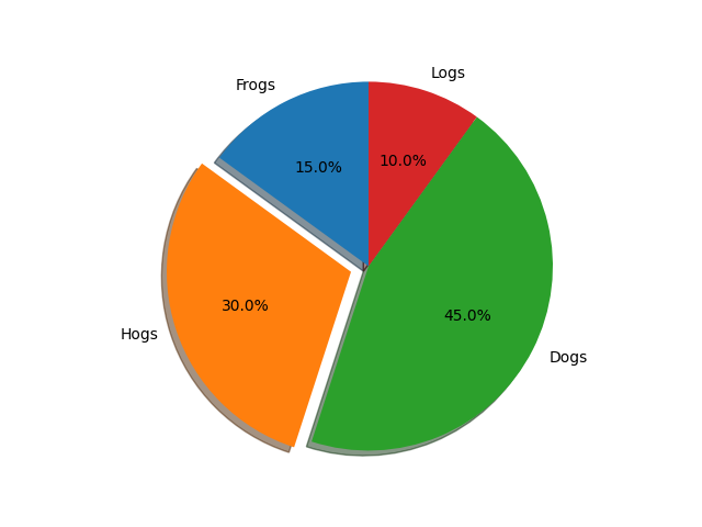
Set shadow using shadow=True
In this final step, you will add a shadow to the pie chart to give it a bit of a 3D look. This is easily done by setting the shadow parameter to True.
Let's combine all the features we've learned: explode, autopct, and shadow. We will save the final chart as pie_chart_final.png.
Update your main.py file with the complete code:
import matplotlib.pyplot as plt

## Data for the pie chart
labels = ['Frogs', 'Hogs', 'Dogs', 'Logs']
sizes = [15, 30, 45, 10]
explode = (0, 0.1, 0, 0)  ## only "explode" the 2nd slice (i.e. 'Hogs')

## Create a figure and a set of subplots
fig, ax = plt.subplots()

## Plot the final pie chart with all features
ax.pie(sizes, explode=explode, labels=labels, autopct='%1.1f%%',
        shadow=True, startangle=90)

## Equal aspect ratio ensures that pie is drawn as a circle.
ax.axis('equal')

## Save the figure to a file
plt.savefig('/home/labex/project/pie_chart_final.png')

print("Final pie chart saved to pie_chart_final.png")
In this final version, we also added startangle=90 to rotate the starting point of the pie chart by 90 degrees counter-clockwise, and ax.axis('equal') to ensure the pie chart is drawn as a perfect circle.
Execute the script one last time:
python3 main.py
The output will be:
Final pie chart saved to pie_chart_final.png
Open pie_chart_final.png to see your completed, fully-featured pie chart with an exploded slice, percentage labels, and a shadow.
Summary
Congratulations on completing the lab! You have successfully learned how to create and customize pie charts using Matplotlib in Python.
In this lab, you have learned to:
- Prepare data (labels and sizes) for a pie chart.
- Plot a basic pie chart using
plt.pie(). - Save a Matplotlib plot to an image file using
plt.savefig(). - Emphasize a slice using the
explodeparameter. - Display percentage values on slices using the
autopctparameter. - Add a visual 3D effect with the
shadow=Trueparameter.
You are now equipped with the fundamental skills to create informative and visually appealing pie charts for your data visualization projects.