
Introduction
Matplotlib is a powerful Python library for creating static, animated, and interactive visualizations. While creating a basic plot is straightforward, customizing it is key to making your data clear, understandable, and visually appealing.
In this lab, you will start with a simple line plot and progressively customize it. You will learn how to change the line color, add markers to data points, modify the line style, add a title to your plot, and adjust the axis limits.
Since this lab environment uses a WebIDE, we cannot display plots in a separate GUI window. Instead, we will save every plot as an image file using plt.savefig(). You can then view the generated image directly within the IDE.
Let's get started!
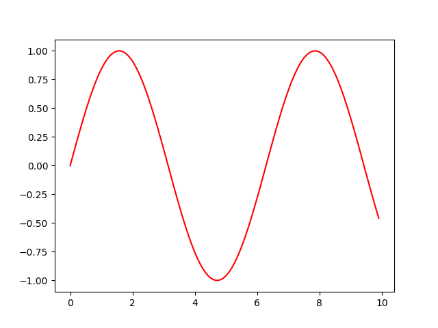
Plot line with custom color using plt.plot(color='red')
In this step, you will learn how to change the color of a line in your plot. By default, Matplotlib cycles through a predefined set of colors. However, you can easily specify a color of your choice using the color parameter in the plt.plot() function.
First, let's create a basic plot of a sine wave. We will use NumPy to generate the data points.
Open the main.py file located in the ~/project directory in the file explorer on the left. Replace its content with the following code. This code will plot a sine wave and color it red.
import matplotlib.pyplot as plt
import numpy as np

## Generate data for the plot
x = np.arange(0, 10, 0.1)
y = np.sin(x)

## Plot the data with a custom color
plt.plot(x, y, color='red')

## Save the plot to a file
plt.savefig('/home/labex/project/plot_color.png')

print("Plot saved as plot_color.png")
After you have updated the main.py file, save it. Now, run the script from the terminal at the bottom of the IDE:
python3 main.py
You should see the following output in the terminal:
Plot saved as plot_color.png
A new file named plot_color.png will appear in the ~/project directory. Double-click on it to open and view your first customized plot. You will see a red sine wave.
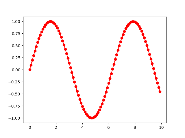
Add markers using plt.plot(marker='o')
In this step, you will add markers to your data points. Markers are useful for highlighting the exact location of each data point on the line, which can be especially helpful when the data points are sparse.
You can add markers using the marker parameter in the plt.plot() function. There are many marker styles available, such as 'o' for circles, 'x' for crosses, and '*' for stars.
Let's modify the main.py file to add circle markers to our plot. We will also change the output filename to plot_marker.png to keep our progress from the previous step.
Update the main.py file with the following code:
import matplotlib.pyplot as plt
import numpy as np

## Generate data for the plot
x = np.arange(0, 10, 0.1)
y = np.sin(x)

## Plot the data with a custom color and marker
plt.plot(x, y, color='red', marker='o')

## Save the plot to a new file
plt.savefig('/home/labex/project/plot_marker.png')

print("Plot saved as plot_marker.png")
Save the file and run the script again in the terminal:
python3 main.py
The terminal will show this output:
Plot saved as plot_marker.png
Now, find the new file plot_marker.png in the file explorer and double-click it. You will see that the red line now has small circles at each data point.
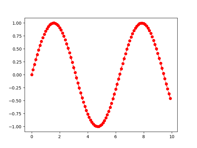
Set line style using plt.plot(linestyle='--')
In this step, you'll learn to change the style of the line itself. The default is a solid line, but you can change it to a dashed line, a dotted line, or others to differentiate between multiple lines on the same plot or simply for aesthetic reasons.
This is done using the linestyle parameter (or its shorthand ls). Common styles include '--' for dashed, ':' for dotted, and '-.' for dash-dot.
Let's update our plot to use a dashed line. Modify the main.py file as shown below. We will also change the output filename to plot_linestyle.png.
import matplotlib.pyplot as plt
import numpy as np

## Generate data for the plot
x = np.arange(0, 10, 0.1)
y = np.sin(x)

## Plot the data with custom color, marker, and line style
plt.plot(x, y, color='red', marker='o', linestyle='--')

## Save the plot to a new file
plt.savefig('/home/labex/project/plot_linestyle.png')

print("Plot saved as plot_linestyle.png")
Save the changes and execute the script from your terminal:
python3 main.py
You will see the confirmation message:
Plot saved as plot_linestyle.png
Open the newly created plot_linestyle.png file. You'll notice the line connecting the markers is now dashed instead of solid.
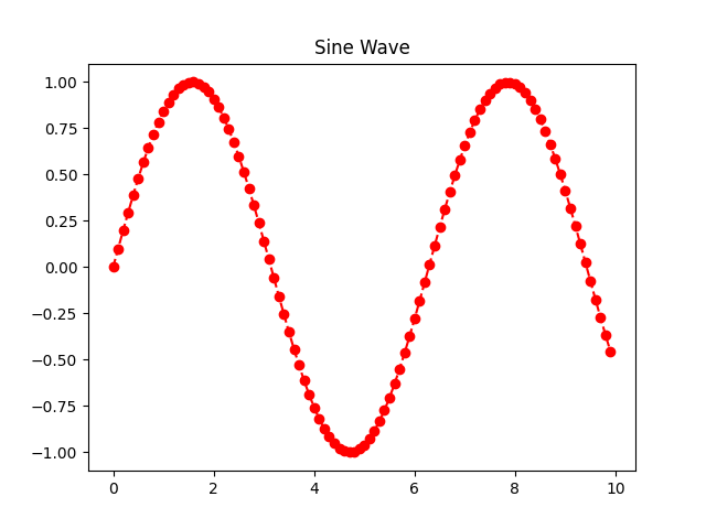
Add title using plt.title()
A plot without a title can be ambiguous. It's crucial to give your plots a descriptive title so that viewers can immediately understand what the plot represents. In Matplotlib, you can add a title using the plt.title() function.
In this step, you will add the title "Sine Wave" to your plot. This function is called before saving the figure.
Modify your main.py file to include the plt.title() call. The new output file will be plot_title.png.
import matplotlib.pyplot as plt
import numpy as np

## Generate data for the plot
x = np.arange(0, 10, 0.1)
y = np.sin(x)

## Plot the data with customizations
plt.plot(x, y, color='red', marker='o', linestyle='--')

## Add a title to the plot
plt.title('Sine Wave')

## Save the plot to a new file
plt.savefig('/home/labex/project/plot_title.png')

print("Plot saved as plot_title.png")
Save the file and run the script:
python3 main.py
The output will be:
Plot saved as plot_title.png
Open plot_title.png to see your plot. It should now have the title "Sine Wave" displayed at the top.
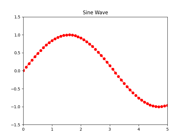
Adjust axis limits using plt.xlim() and plt.ylim()
Sometimes, you may want to focus on a specific region of your plot or add some padding around the data. You can control the range of the x and y axes using the plt.xlim() and plt.ylim() functions, respectively.
In this final step, we will adjust the axes to "zoom in" on a part of the sine wave. We'll set the x-axis to range from 0 to 5 and the y-axis from -1.5 to 1.5. This will give our plot some vertical padding.
Update your main.py file with the final version of the code. The output will be saved to plot_final.png.
import matplotlib.pyplot as plt
import numpy as np

## Generate data for the plot
x = np.arange(0, 10, 0.1)
y = np.sin(x)

## Plot the data with customizations
plt.plot(x, y, color='red', marker='o', linestyle='--')

## Add a title
plt.title('Sine Wave')

## Adjust the axis limits
plt.xlim(0, 5)
plt.ylim(-1.5, 1.5)

## Save the final plot to a file
plt.savefig('/home/labex/project/plot_final.png')

print("Plot saved as plot_final.png")
Save the file and run the script for the last time:
python3 main.py
You will get the final confirmation:
Plot saved as plot_final.png
Now, open plot_final.png. Compare it with the previous plots. You will see that the x-axis now ends at 5, and there is more space above and below the sine wave because of the new y-axis limits.
Summary
Congratulations on completing this lab! You have successfully learned how to customize a basic Matplotlib line plot to make it more informative and visually appealing.
In this lab, you practiced:
- Changing the line color using the
colorparameter inplt.plot(). - Adding data point markers with the
markerparameter. - Setting the line style using the
linestyleparameter. - Adding a descriptive title with the
plt.title()function. - Adjusting the axis ranges with
plt.xlim()andplt.ylim().
These are fundamental skills for creating professional-quality plots for data analysis and presentation. Feel free to experiment further by trying different colors, markers, and line styles, or by adding labels to the x and y axes using plt.xlabel() and plt.ylabel().