
Introduction
Bar charts are a fundamental tool in data visualization, used to compare values across different categories. They represent data with rectangular bars where the length of the bar is proportional to the value it represents.
In this lab, you will learn how to use the Matplotlib library in Python to create bar charts. You will start by preparing data, then create both vertical and horizontal bar charts, customize their appearance with colors, and finally add a legend to make your chart more informative. All plotting will be done by writing Python scripts and saving the charts as image files, which you can then view directly in the LabEx environment.
Prepare categories and values lists
In this step, you will begin by setting up the basic data for our bar chart. A bar chart requires two main components: a list of categories for the axis and a corresponding list of numerical values that determine the size of the bars.
We will use a simple dataset representing monthly sales figures. First, open the main.py file located in the ~/project directory from the file explorer on the left.
Now, add the following Python code to the main.py file. This code imports the necessary Matplotlib library and defines our data.
import matplotlib.pyplot as plt

## Data for the bar chart
categories = ['Jan', 'Feb', 'Mar', 'Apr', 'May']
values = [320, 450, 500, 480, 600]
Let's break down this code:
import matplotlib.pyplot as plt: This line imports thepyplotmodule from thematplotliblibrary and gives it the conventional aliasplt. We will usepltto call plotting functions.categories = ['Jan', 'Feb', 'Mar', 'Apr', 'May']: This list contains the labels for our x-axis. Each string represents a category.values = [320, 450, 500, 480, 600]: This list contains the numerical data corresponding to each category. For example, the sales for 'Jan' are 320.
After adding the code, save the main.py file. In the next step, we will use this data to create our first bar chart.
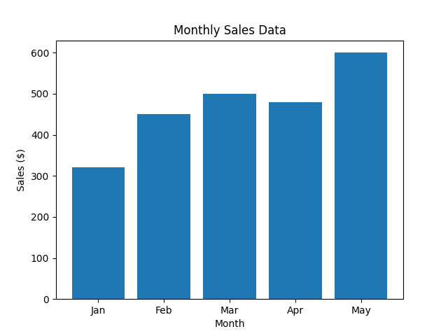
Create vertical bar chart using plt.bar()
In this step, you will use the data you prepared to create a vertical bar chart. The primary function for this is plt.bar(). This function takes the categories for the x-axis and their corresponding values for the y-axis to draw the bars.
Add the following lines of code to the end of your main.py file. This new code will generate the chart, add labels and a title, and save it as an image file.
## Create the bar chart
plt.bar(categories, values)

## Add title and labels
plt.title('Monthly Sales Data')
plt.xlabel('Month')
plt.ylabel('Sales ($)')

## Save the plot to a file
plt.savefig('/home/labex/project/vertical_bar_chart.png')

print("Vertical bar chart saved as vertical_bar_chart.png")
Here's an explanation of the new code:
plt.bar(categories, values): This is the core function that creates the bar chart. It maps thecategorieslist to the x-axis and thevalueslist to the height of the bars on the y-axis.plt.title(),plt.xlabel(),plt.ylabel(): These functions add a title to the chart and labels to the x and y axes, respectively, making the chart easier to understand.plt.savefig(...): Since we are in a non-GUI environment, we cannot display the chart directly withplt.show(). Instead,plt.savefig()saves the generated chart to a file. We are saving it asvertical_bar_chart.pngin the~/projectdirectory.
Now, run your script from the terminal:
python3 main.py
You should see the following output:
Vertical bar chart saved as vertical_bar_chart.png
A new file named vertical_bar_chart.png will appear in your file explorer. Double-click it to see your first bar chart!
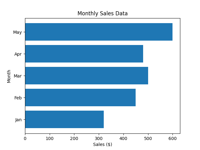
Create horizontal bar chart using plt.barh()
In this step, you will learn how to create a horizontal bar chart. This is useful when you have long category labels that might overlap on a vertical chart. Matplotlib provides the plt.barh() function for this purpose, which works similarly to plt.bar() but draws bars horizontally.
Modify your main.py file to use plt.barh() instead of plt.bar(). Note that for plt.barh(), the parameters are y (categories) and width (values). We also need to swap the xlabel and ylabel.
Replace the plotting section of your main.py file with the following code:
## Create the horizontal bar chart
plt.barh(categories, values)

## Add title and labels
plt.title('Monthly Sales Data')
plt.xlabel('Sales ($)')
plt.ylabel('Month')

## Save the plot to a file
plt.savefig('/home/labex/project/horizontal_bar_chart.png')

print("Horizontal bar chart saved as horizontal_bar_chart.png")
The full main.py should now look like this:
import matplotlib.pyplot as plt

## Data for the bar chart
categories = ['Jan', 'Feb', 'Mar', 'Apr', 'May']
values = [320, 450, 500, 480, 600]

## Create the horizontal bar chart
plt.barh(categories, values)

## Add title and labels
plt.title('Monthly Sales Data')
plt.xlabel('Sales ($)')
plt.ylabel('Month')

## Save the plot to a file
plt.savefig('/home/labex/project/horizontal_bar_chart.png')

print("Horizontal bar chart saved as horizontal_bar_chart.png")
Now, run the updated script from the terminal:
python3 main.py
You will see this output:
Horizontal bar chart saved as horizontal_bar_chart.png
Check your project directory for the new file horizontal_bar_chart.png and open it to view your horizontal bar chart.
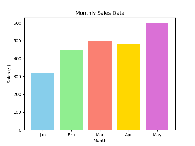
Customize bar colors using color parameter
In this step, you will enhance your bar chart by adding colors. Matplotlib makes it easy to change the color of the bars using the color parameter in the plt.bar() or plt.barh() function. You can set a single color for all bars or provide a list of colors to color each bar individually.
Let's go back to the vertical bar chart and give each bar a different color. Modify your main.py file to include a list of colors and pass it to the plt.bar() function.
Your main.py file should be updated to look like this:
import matplotlib.pyplot as plt

## Data for the bar chart
categories = ['Jan', 'Feb', 'Mar', 'Apr', 'May']
values = [320, 450, 500, 480, 600]
colors = ['skyblue', 'lightgreen', 'salmon', 'gold', 'orchid']

## Create the bar chart with custom colors
plt.bar(categories, values, color=colors)

## Add title and labels
plt.title('Monthly Sales Data')
plt.xlabel('Month')
plt.ylabel('Sales ($)')

## Save the plot to a file
plt.savefig('/home/labex/project/colored_bar_chart.png')

print("Colored bar chart saved as colored_bar_chart.png")
In this code:
- We defined a
colorslist, where each color name corresponds to a bar in the chart. - We passed this list to the
colorparameter inplt.bar(categories, values, color=colors). - We changed the output filename to
colored_bar_chart.pngto avoid overwriting our previous work.
Execute the script from the terminal:
python3 main.py
The output will be:
Colored bar chart saved as colored_bar_chart.png
Open the newly created colored_bar_chart.png file to see your colorful bar chart.
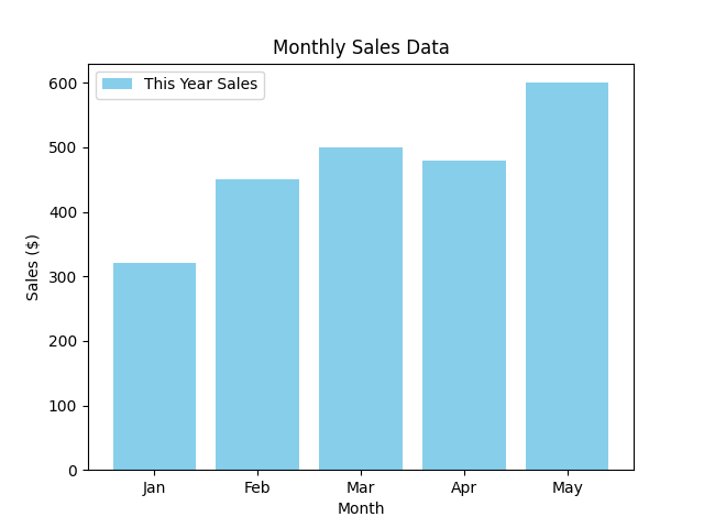
Add legend using plt.legend()
In this final step, you will learn how to add a legend to your chart. A legend is crucial for explaining what different elements in a chart represent, especially when you are plotting multiple datasets.
To add a legend, you first need to specify a label for your plot data. Then, you call the plt.legend() function to display the legend on the chart.
Let's modify the main.py script to include a label for our sales data and then render the legend.
Update your main.py file with the following code:
import matplotlib.pyplot as plt

## Data for the bar chart
categories = ['Jan', 'Feb', 'Mar', 'Apr', 'May']
values = [320, 450, 500, 480, 600]

## Create the bar chart with a label
plt.bar(categories, values, color='skyblue', label='This Year Sales')

## Add title and labels
plt.title('Monthly Sales Data')
plt.xlabel('Month')
plt.ylabel('Sales ($)')

## Add the legend
plt.legend()

## Save the plot to a file
plt.savefig('/home/labex/project/bar_chart_with_legend.png')

print("Bar chart with legend saved as bar_chart_with_legend.png")
Here are the changes:
- In
plt.bar(), we added thelabel='This Year Sales'parameter. This assigns a name to our dataset. - We added the
plt.legend()call. This function finds all the labeled elements on the plot and creates a legend box. - We are using a single color
'skyblue'for simplicity and saving the final chart asbar_chart_with_legend.png.
Run the script one last time:
python3 main.py
You will see the final confirmation message:
Bar chart with legend saved as bar_chart_with_legend.png
Now, open bar_chart_with_legend.png from the file explorer. You will see your bar chart complete with a legend, which correctly identifies the bars as "This Year Sales".
Summary
Congratulations on completing this lab! You have successfully learned the fundamentals of creating and customizing bar charts with Matplotlib.
In this lab, you have learned how to:
- Prepare data (categories and values) for plotting.
- Create a vertical bar chart using
plt.bar(). - Create a horizontal bar chart using
plt.barh(). - Customize the appearance of bars using the
colorparameter. - Add a descriptive legend to your chart using the
labelparameter and theplt.legend()function.
These skills are essential for any data analysis or visualization task. You can now create clear and effective bar charts to compare categorical data. Feel free to experiment further with other Matplotlib features to create even more sophisticated plots.