
Introduction
In this lab, you will be introduced to Tailwind CSS, a highly popular, utility-first CSS framework. Unlike traditional CSS where you write custom classes, Tailwind provides low-level utility classes that you can compose directly in your HTML to build any design. You will learn how to set up Tailwind via a CDN and apply basic utility classes to style a simple web page element for background, text, padding, and layout. By the end, you'll have a hands-on understanding of the power and speed of utility-first CSS.
The necessary index.html file has been created for you in the ~/project directory. You will focus on modifying this file to apply Tailwind styles.
Add Tailwind CSS CDN link to HTML head
In this step, you will add Tailwind CSS to your project. For quick setups and learning purposes, the easiest way is to use the Tailwind CSS CDN. This involves adding a single <script> tag to your HTML file's <head> section.
Why no CSS file? Unlike traditional CSS frameworks, Tailwind CSS is utility-first. Instead of writing CSS rules in external files, you'll apply pre-built utility classes directly in your HTML. This approach eliminates the need for custom CSS files entirely.
Official Documentation: For complete Tailwind CSS reference, visit: https://tailwindcss.com/docs
First, open the index.html file located in the ~/project directory using the file explorer on the left side of the WebIDE.
Now, add the following <script> tag inside the <head> section of your index.html file.
<script src="https://cdn.tailwindcss.com"></script>
After adding the line, your index.html file should look like this:
<!doctype html>
<html lang="en">
  <head>
    <meta charset="UTF-8" />
    <meta name="viewport" content="width=device-width, initial-scale=1.0" />
    <title>Tailwind CSS Lab</title>
    <!-- Tailwind CSS CDN will be added here -->
    <script src="https://cdn.tailwindcss.com"></script>
  </head>
  <body>
    <div>Hello, Tailwind!</div>
  </body>
</html>
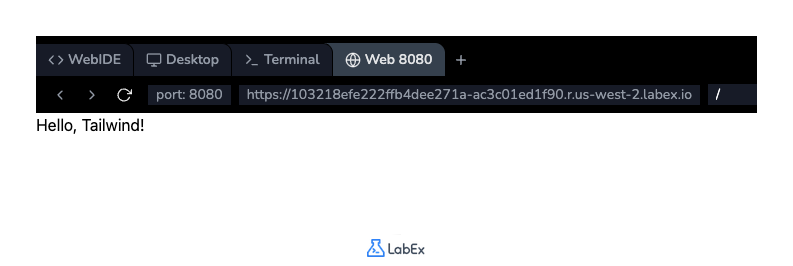
Save the file by pressing Ctrl+S. Although you won't see any visual changes yet, Tailwind's utility classes are now available to use in your project. You can open the Web 8080 tab to see the unstyled page.
Apply bg-blue-500 class for background color
In this step, you will apply your first Tailwind utility class to change the background color of the <div> element. Tailwind uses a bg-{color}-{shade} naming convention for background colors.
We will use the bg-blue-500 class, which applies a medium-blue background.
Open the index.html file again if it's not already open. Locate the <div> element and add class="bg-blue-500" to it.
<div class="bg-blue-500">Hello, Tailwind!</div>
Your full index.html file should now look like this:
<!doctype html>
<html lang="en">
  <head>
    <meta charset="UTF-8" />
    <meta name="viewport" content="width=device-width, initial-scale=1.0" />
    <title>Tailwind CSS Lab</title>
    <script src="https://cdn.tailwindcss.com"></script>
  </head>
  <body>
    <div class="bg-blue-500">Hello, Tailwind!</div>
  </body>
</html>
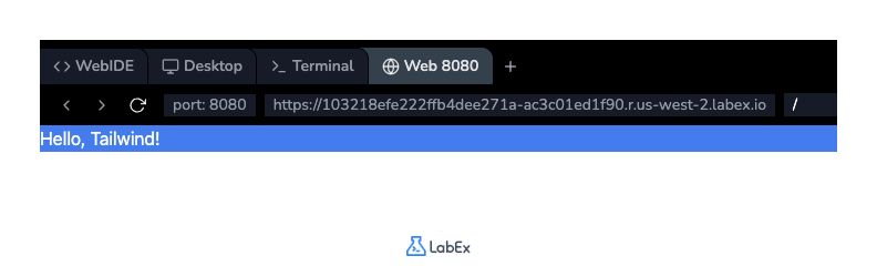
Save the file (Ctrl+S) and switch to the Web 8080 tab. You should now see the text "Hello, Tailwind!" inside a box with a blue background.
Unlike previous labs where you write CSS rules in external files, Tailwind provides pre-built utility classes that you apply directly in HTML. No custom CSS writing required - just compose utilities like bg-blue-500, text-white, and p-4 to build designs.
Key advantages:
- Faster development: Style directly in HTML without switching files
- Rapid prototyping: Build layouts instantly with utility classes
- Consistent design: Standardized spacing, colors, and sizing scales
- Responsive built-in: Mobile-first responsive utilities included
- AI friendly: Tailwind is designed to be used with AI tools like ChatGPT, making it easier to generate code.
Use text-white class for text color
In this step, you'll change the text color to make it more readable against the blue background. Tailwind's text color utilities follow a text-{color} pattern. To make the text white, you will use the text-white class.
Reference: https://tailwindcss.com/docs/text-color
You can add multiple classes to an element by separating them with a space inside the class attribute.
Modify the <div> in your index.html file to include the text-white class.
<div class="bg-blue-500 text-white">Hello, Tailwind!</div>
The order of classes within the class attribute does not matter.
After the change, your index.html file's body will look like this:
<body>
  <div class="bg-blue-500 text-white">Hello, Tailwind!</div>
</body>
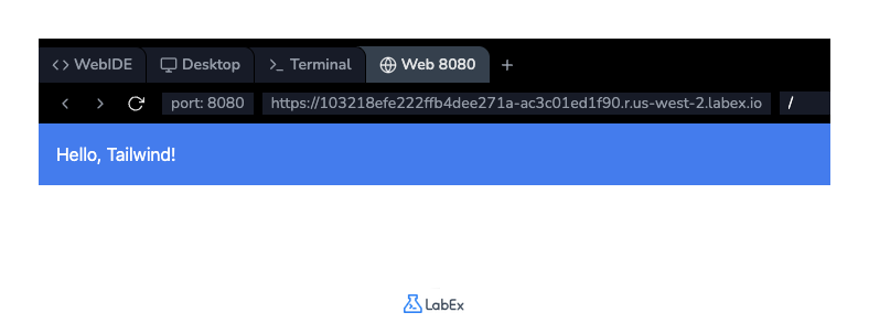
Save the file (Ctrl+S) and check the Web 8080 tab. The text "Hello, Tailwind!" should now be white, providing better contrast with the blue background.
Implement p-4 class for padding
In this step, you will add some internal spacing, or padding, to the <div> element. This will prevent the text from touching the edges of the blue box. Tailwind provides padding utilities with the p-{size} format.
Reference: https://tailwindcss.com/docs/padding
We will use the p-4 class, which applies a medium amount of padding (1rem or 16px by default) to all four sides of the element.
Add the p-4 class to the class attribute of your <div> element in index.html.
<div class="bg-blue-500 text-white p-4">Hello, Tailwind!</div>
Your index.html file's body should now be:
<body>
  <div class="bg-blue-500 text-white p-4">Hello, Tailwind!</div>
</body>
Save the file (Ctrl+S) and refresh the Web 8080 tab. You will notice that there is now space between the text and the border of the blue box, making the design look cleaner.
Add flex justify-center classes for layout
In this final step, you will center the styled <div> element on the page. You can achieve this using Tailwind's Flexbox utilities.
To do this, you will apply classes to the <body> tag to make it a flex container and center its content.
flex: This class appliesdisplay: flexto the element.justify-center: This class centers the flex items along the main axis (horizontally by default).h-screen: This class sets the element's height to 100% of the viewport height, which is necessary for vertical centering to work (though we are only doing horizontal centering here, it's good practice for full-page layouts).
Modify the <body> tag in your index.html file to add these classes.
<body class="flex justify-center h-screen">
  <div class="bg-blue-500 text-white p-4">Hello, Tailwind!</div>
</body>
Your complete index.html file will now look like this:
<!DOCTYPE html>
<html lang="en">
  <head>
    <meta charset="UTF-8" />
    <meta name="viewport" content="width=device-width, initial-scale=1.0" />
    <title>Tailwind CSS Lab</title>
    <script src="https://cdn.tailwindcss.com"></script>
  </head>
  <body class="flex justify-center h-screen">
    <div class="bg-blue-500 text-white p-4">Hello, Tailwind!</div>
  </body>
</html>
Save the file (Ctrl+S) and view the result in the Web 8080 tab. Your styled box should now be horizontally centered on the page.
Summary
Congratulations on completing the lab! You have successfully taken your first steps into the world of Tailwind CSS. In this lab, you learned how to integrate Tailwind into an HTML file using its CDN. You then practiced the core concept of a utility-first framework by applying several classes directly to your HTML elements. You are now familiar with using utilities for background color (bg-blue-500), text color (text-white), padding (p-4), and Flexbox layout (flex, justify-center, h-screen). This foundational knowledge will help you build more complex and responsive designs with speed and consistency.


