
Introduction
Welcome to the CSS Layout Basics lab! In this hands-on session, you will explore the fundamentals of CSS Flexbox, a powerful layout model that provides an efficient way to arrange, align, and distribute space among items in a container.
Throughout this lab, you will work with a pre-configured HTML file (index.html) and a CSS file (style.css). Your task will be to modify the style.css file to manipulate the layout of elements on the page. You can see your changes in real-time by switching to the Web 8080 tab in the lab environment.
You will learn how to:
- Initialize a flex container.
- Align items along the main axis using
justify-content. - Align items along the cross axis using
align-items. - Change the layout direction with
flex-direction. - Allow items to wrap onto multiple lines using
flex-wrap.
Let's get started!
Set display flex on a container element
In this step, you will begin by transforming a standard block-level element into a flex container. This is the foundational step for creating any flexbox layout.
The display: flex; property is applied to a parent element (the container) to enable a flex context for all of its direct children (the items). Once applied, the children automatically arrange themselves into a row.
First, open the style.css file from the file explorer on the left side of your screen.
Next, locate the .container CSS rule. Add the display: flex; property inside this rule.
.container {
  border: 2px solid #333;
  padding: 10px;
  margin-top: 20px;
  background-color: #f0f0f0;
  /* We will add flex properties here */
  display: flex;
}
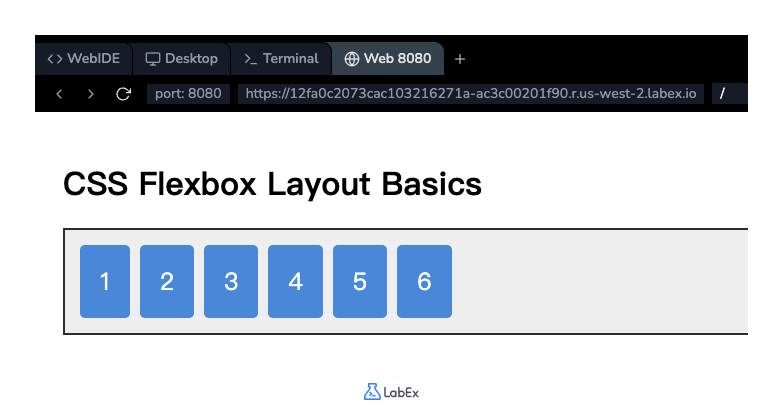
After adding the code, save the file. Now, switch to the Web 8080 tab to see the result. You will notice that the numbered boxes, which were previously stacked vertically, are now arranged horizontally in a single row.
Use justify-content property space-between
In this step, you will learn how to control the alignment of items along the main axis (horizontally, by default) using the justify-content property. This property helps distribute the extra free space in the container.
We will use the space-between value, which distributes the items evenly. The first item is positioned at the start of the container, the last item is at the end, and the remaining space is distributed equally between the items.
In your style.css file, add the justify-content: space-between; property to the .container rule.
.container {
  border: 2px solid #333;
  padding: 10px;
  margin-top: 20px;
  background-color: #f0f0f0;
  display: flex;
  justify-content: space-between;
}
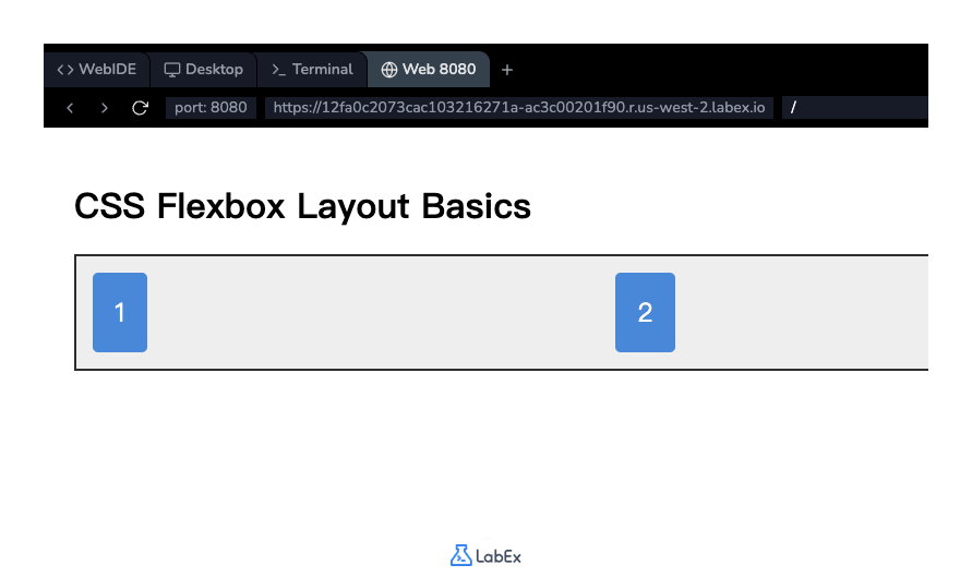
Save the file and check the Web 8080 tab. You will see that the flex items are now spread out across the full width of the container, with equal spacing between them.
Apply align-items property center
In this step, you will learn to align items along the cross axis (vertically, by default) using the align-items property.
To see the effect of vertical alignment, we first need to give our container some height. Then, we will use the center value for align-items to vertically center the items within the container.
In your style.css file, add a height and the align-items: center; property to the .container rule.
.container {
  border: 2px solid #333;
  padding: 10px;
  margin-top: 20px;
  background-color: #f0f0f0;
  display: flex;
  justify-content: space-between;
  height: 200px;
  align-items: center;
}
Save the file and view the result in the Web 8080 tab. The container is now taller, and all the flex items are perfectly centered in the middle of the vertical space.
Implement flex-direction property column
In this step, you will change the direction of the main axis from horizontal to vertical using the flex-direction property.
By default, the flex direction is row. By setting it to column, you can stack the flex items vertically. When you change the flex direction to column, the main axis becomes vertical and the cross axis becomes horizontal. This means justify-content will now control vertical alignment, and align-items will control horizontal alignment.
In your style.css file, add the flex-direction: column; property to the .container rule.
.container {
  border: 2px solid #333;
  padding: 10px;
  margin-top: 20px;
  background-color: #f0f0f0;
  display: flex;
  justify-content: space-between;
  height: 400px; /* Let's increase height for better visualization */
  align-items: center;
  flex-direction: column;
}
Note: We've increased the height to 400px to better see the effect of justify-content in a column layout.
Save the file and observe the changes in the Web 8080 tab. The items are now stacked in a single column. Notice how justify-content: space-between now adds space vertically between the items, and align-items: center centers them horizontally.
Add flex-wrap property wrap for wrapping
In this final step, you will learn how to handle cases where the flex items overflow their container. The flex-wrap property allows items to wrap onto a new line instead of shrinking or overflowing.
To demonstrate this, we will revert to a row-based layout and set a fixed width on the container that is too narrow to hold all items in one line.
First, let's clean up the .container rule by removing the properties from the previous steps (justify-content, align-items, flex-direction, and height). Then, add a fixed width and the flex-wrap: wrap; property.
Update your .container rule in style.css to look like this:
.container {
  border: 2px solid #333;
  padding: 10px;
  margin-top: 20px;
  background-color: #f0f0f0;
  display: flex;
  width: 450px; /* Set a fixed width to force wrapping */
  flex-wrap: wrap;
}
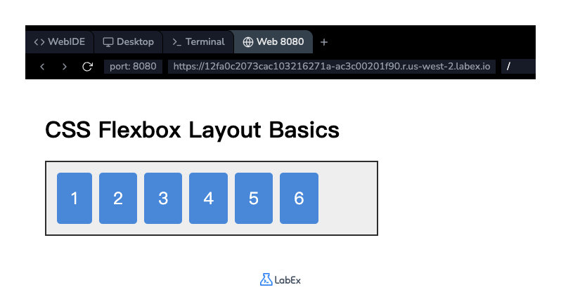
Save the file and refresh the Web 8080 tab. You will see that the flex items that don't fit on the first line have wrapped onto a second line. This is essential for creating responsive layouts that adapt to different screen sizes.
Summary
Congratulations on completing the CSS Layout Basics lab! You have successfully learned the core concepts of CSS Flexbox and applied them to create flexible and responsive layouts.
In this lab, you have practiced:
display: flex;: To create a flex container.justify-content: To align items along the main axis.align-items: To align items along the cross axis.flex-direction: To define the direction of the main axis (row or column).flex-wrap: To allow items to wrap onto multiple lines.
These properties are the building blocks of modern web design. We encourage you to continue experimenting with different values for these properties to further solidify your understanding of Flexbox.


