
Introduction
In this lab, you will learn the fundamentals of building a machine learning model using one of the most popular Python libraries, scikit-learn. We will focus on Linear Regression, a basic yet powerful algorithm used for predicting a continuous value, like a price or a temperature.
Our goal is to build a model that can predict median housing prices in California districts. We will use the California housing dataset, which is conveniently included with scikit-learn.
Throughout this lab, you will learn to:
- Load a dataset from
scikit-learn. - Prepare and split the data for training and testing.
- Create and train a Linear Regression model.
- Use the trained model to make predictions.
- Visualize the results to understand model performance.
You will perform all tasks within the WebIDE. Let's get started!
Load California housing dataset with datasets.fetch_california_housing()
In this step, we will begin by loading the dataset for our model. scikit-learn comes with several built-in datasets, which are great for learning and practice. We will use the California housing dataset.
First, we need to create a Python script. A file named main.py has already been created for you in the ~/project directory. You can find it in the file explorer on the left side of the WebIDE.
Open main.py and add the following code. This code imports the necessary libraries (fetch_california_housing from sklearn.datasets and pandas) and loads the dataset. We will use pandas to convert the data into a DataFrame, which is a tabular data structure that is easy to view and manipulate.
Please add the following code to main.py:
import pandas as pd
from sklearn.datasets import fetch_california_housing

## Load the California housing dataset
california = fetch_california_housing()

## Create a DataFrame
california_df = pd.DataFrame(california.data, columns=california.feature_names)
california_df['MedHouseVal'] = california.target

## Print the first 5 rows of the DataFrame
print("California Housing Dataset:")
print(california_df.head())
Now, let's run the script to see the output. Open a terminal in the WebIDE (you can use the "Terminal" -> "New Terminal" menu) and execute the following command:
python3 main.py
You should see the first five rows of the dataset printed to the console. The MedHouseVal column is our target variable, representing the median house value for California districts, expressed in hundreds of thousands of dollars ($100,000).
California Housing Dataset:
   MedInc  HouseAge  AveRooms  AveBedrms  Population  AveOccup  Latitude  Longitude  MedHouseVal
0  8.3252      41.0  6.984127   1.023810       322.0  2.555556     37.88    -122.23        4.526
1  8.3014      21.0  6.238137   0.971880      2401.0  2.109842     37.86    -122.22        3.585
2  7.2574      52.0  8.288136   1.073446       496.0  2.802260     37.85    -122.24        3.521
3  5.6431      52.0  5.817352   1.073059       558.0  2.547945     37.85    -122.25        3.413
4  3.8462      52.0  6.281853   1.081081       565.0  2.181467     37.85    -122.25        3.422
Split data into train and test using train_test_split from sklearn.model_selection
In this step, we will prepare our data for the training process. A crucial part of machine learning is to evaluate the model on data it has never seen before. To do this, we split our dataset into two parts: a training set and a testing set. The model will learn from the training set, and we will use the testing set to see how well it performs.
First, we need to separate our features (the input variables, X) from our target (the value we want to predict, y). In our case, X will be all columns except MedHouseVal, and y will be the MedHouseVal column.
Then, we will use the train_test_split function from sklearn.model_selection to perform the split.
Append the following code to your main.py file.
from sklearn.model_selection import train_test_split

## Prepare the data
X = california_df.drop('MedHouseVal', axis=1)  ## Features (input variables)
y = california_df['MedHouseVal']  ## Target variable (what we want to predict)

## Split the data into training and testing sets
## test_size=0.2: Reserve 20% of data for testing, 80% for training
## random_state=42: Ensures reproducible splits (same result every run)
X_train, X_test, y_train, y_test = train_test_split(X, y, test_size=0.2, random_state=42)

## Print the shapes of the new datasets to confirm the split
print("\n--- Data Split ---")
print("X_train shape:", X_train.shape)  ## Training features
print("X_test shape:", X_test.shape)    ## Test features
print("y_train shape:", y_train.shape)  ## Training target values
print("y_test shape:", y_test.shape)    ## Test target values
Now, run the script again from the terminal:
python3 main.py
You will see the shapes of the newly created training and testing sets printed below the DataFrame. This confirms that the data has been split correctly.
--- Data Split ---
X_train shape: (16512, 8)
X_test shape: (4128, 8)
y_train shape: (16512,)
y_test shape: (4128,)
Initialize LinearRegression model from sklearn.linear_model
In this step, we will create our Linear Regression model. scikit-learn makes this incredibly simple. We just need to import the LinearRegression class from the sklearn.linear_model module and then create an instance of it.
This instance is an object that contains the linear regression algorithm. Linear regression finds the best-fit line through the data points, using the formula: y = mx + b, where m are coefficients (weights) for each feature, and b is the intercept. Here we use default parameters which work well for most basic cases.
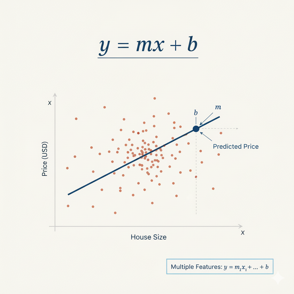 Figure 1: Linear regression formula y = mx + b, where m is the slope and b is the intercept
Append the following code to your main.py file. This will import the LinearRegression class and create a model object.
from sklearn.linear_model import LinearRegression

## Initialize the Linear Regression model
model = LinearRegression()

## Print the model to confirm it's created
print("\n--- Model Initialized ---")
print(model)
Run your main.py script again from the terminal:
python3 main.py
The output will now include a line showing the LinearRegression object. This confirms that the model has been successfully initialized.
--- Model Initialized ---
LinearRegression()
Fit model with model.fit(X_train, y_train)
In this step, we will train our model. This process is often called "fitting" the model to the data. During fitting, the model learns the relationships between the features (X_train) and the target variable (y_train). For linear regression, this means finding the optimal coefficients for each feature to best predict the target.
We will use the fit() method of our model object, passing our training data as arguments.
Append the following code to your main.py file.
## Fit (train) the model on the training data
## The fit() method learns the relationship between features (X_train) and target (y_train)
## It calculates optimal coefficients for each feature and the intercept using least squares optimization
model.fit(X_train, y_train)

## After fitting, the model has learned the coefficients and intercept.
## The intercept represents the predicted value when all features are zero
print("\n--- Model Trained ---")
print("Intercept:", model.intercept_)
Now, execute the script from the terminal:
python3 main.py
After the script runs, you will see a new section in the output showing the intercept of the linear regression model. The intercept is the value of the prediction when all feature values are zero. Seeing a numerical value here confirms that the model has been successfully trained on the data.
--- Model Trained ---
Intercept: -37.023277706064185
Predict on test data with model.predict(X_test)
In this final step, we will use our trained model to make predictions. This is the ultimate goal of building a predictive model. We will use the test data (X_test), which the model has not seen during training, to evaluate its performance.
We will use the predict() method of our trained model object, passing the test features (X_test) as the argument. The method will return an array of predicted values for the target variable.
Append the following code to your main.py file.
## Make predictions on the test data
## The predict() method uses the learned coefficients and intercept to calculate predictions
## Formula: prediction = intercept + (coeff1 * feature1) + (coeff2 * feature2) + ...
predictions = model.predict(X_test)

## Print the first 5 predictions (values are in $100,000 units)
print("\n--- Predictions ---")
print(predictions[:5])
Now, run the complete script one last time from the terminal:
python3 main.py
The output will now include the first five predicted house prices for the test set. These values are what our model thinks the median house values should be, based on the features in X_test. You can conceptually compare these predictions to the actual values in y_test to gauge the model's accuracy.
--- Predictions ---
[0.71912284 1.76401657 2.70965883 2.83892593 2.60465725]
Congratulations! You have successfully built, trained, and used a linear regression model with scikit-learn.
Visualize the model predictions using matplotlib.pyplot.scatter()
In this final step, we will create a visualization to better understand our model's performance. Visualization is crucial in machine learning as it helps us see patterns and relationships that might not be obvious from raw numbers.
We will create a scatter plot that compares the actual house prices (y_test) with our model's predictions. This type of plot is called a "predictions vs actual" scatter plot. If our model were perfect, all points would lie on a diagonal line (45-degree line) where predicted values equal actual values.
We will use matplotlib to create this visualization and save it as an image file.
Append the following code to your main.py file:
import matplotlib.pyplot as plt

## Create a scatter plot comparing actual vs predicted values
plt.figure(figsize=(10, 6))
plt.scatter(y_test, predictions, alpha=0.5, color='blue', edgecolors='black')

## Add a diagonal line showing perfect predictions (where predicted = actual)
plt.plot([y_test.min(), y_test.max()], [y_test.min(), y_test.max()],
         'r--', linewidth=2, label='Perfect Prediction')

## Add labels and title
plt.xlabel('Actual House Prices ($100,000)')
plt.ylabel('Predicted House Prices ($100,000)')
plt.title('Linear Regression: Actual vs Predicted House Prices')
plt.legend()
plt.grid(True, alpha=0.3)

## Save the plot to a file
plt.savefig('housing_predictions.png', dpi=300, bbox_inches='tight')
plt.close()

print("\n--- Visualization Complete ---")
print("Plot saved to housing_predictions.png")
Now, run the complete script from the terminal:
python3 main.py
You will see a confirmation message that the plot has been saved.
--- Visualization Complete ---
Plot saved to housing_predictions.png
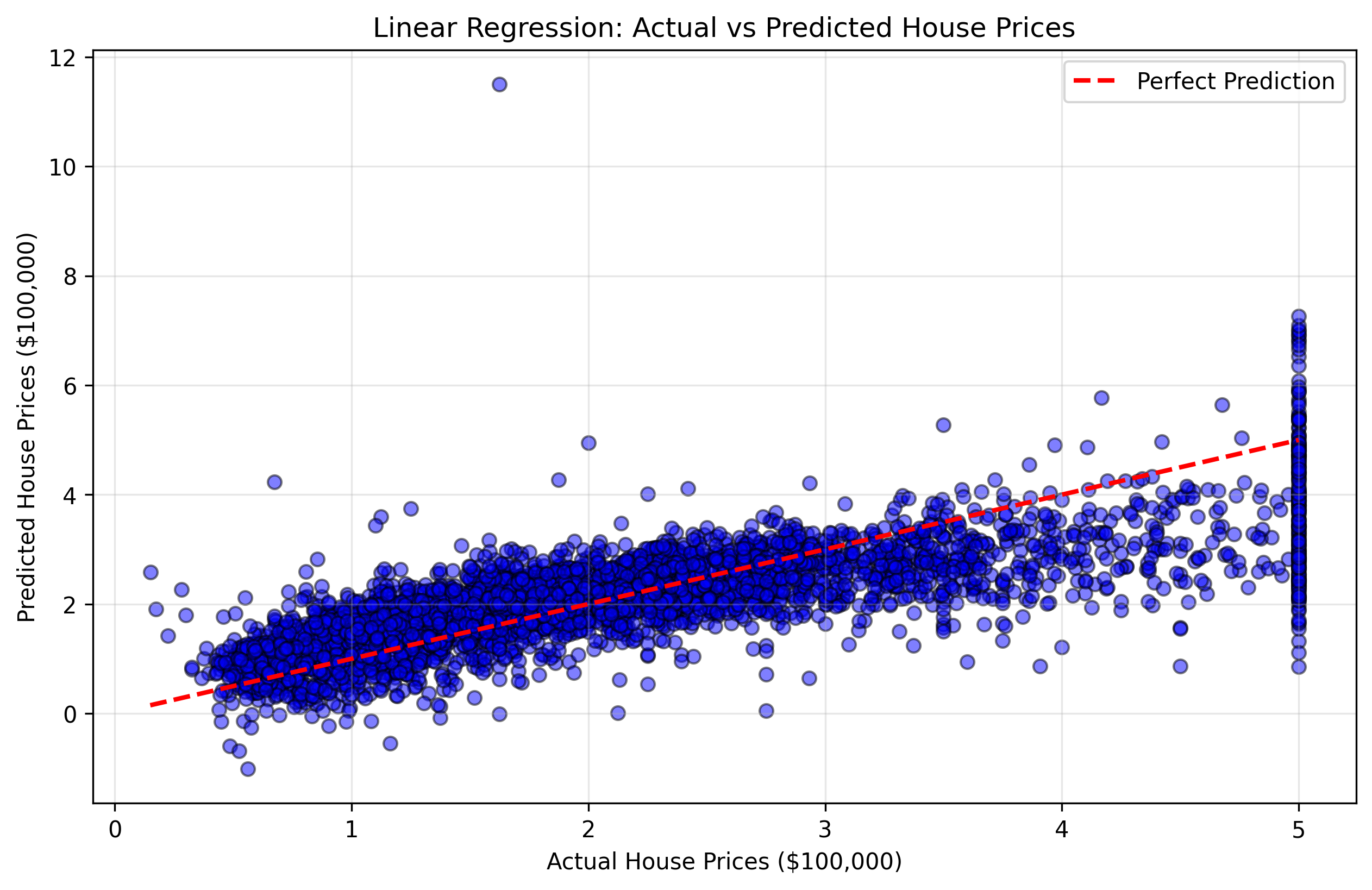 Figure 2: Scatter plot showing actual vs predicted house prices. Points closer to the red diagonal line indicate better predictions.
This visualization will help you understand:
- Points near the diagonal line: Good predictions where the model was accurate
- Points far from the diagonal line: Poor predictions where the model made larger errors
- Overall pattern: Whether the model tends to over-predict or under-predict certain price ranges
You can double-click the housing_predictions.png file in the file explorer to view your visualization.
Congratulations! You have successfully built, trained, tested, and visualized a linear regression model with scikit-learn.
Summary
In this lab, you have completed the entire workflow for building a basic machine learning model using scikit-learn.
You started by loading the California housing dataset and preparing it using pandas. Then, you learned the importance of splitting your data into training and testing sets and performed the split using train_test_split.
Following that, you initialized a LinearRegression model, trained it on your training data using the fit() method, used the trained model to make predictions on unseen test data with the predict() method, and finally visualized the results to understand your model's performance.
This lab provides a solid foundation in scikit-learn. From here, you can explore more advanced topics such as:
- Model evaluation: Calculate metrics like Mean Squared Error (MSE) or R-squared to measure model accuracy
- Data visualization: Create more advanced plots like residual plots, feature importance charts, or correlation matrices
- Feature scaling: Standardize or normalize features for better performance
- Regularization: Use Ridge or Lasso regression to prevent overfitting
- Cross-validation: More robust evaluation using k-fold cross-validation
- Other algorithms: Try Random Forest, Support Vector Machines, or Neural Networks