Introduction
In data visualization, sometimes you may want to add a logo, watermark, or other image elements to your plots. This tutorial demonstrates how to overlay an image on a Matplotlib plot by placing it in front of the plot content and making it semi-transparent.
You will learn how to use the figimage method from the matplotlib.figure.Figure class to position an image on your plot, and the imread method from the matplotlib.image module to load image data.
By the end of this tutorial, you will be able to create professional-looking visualizations with custom image overlays that can be useful for branding, watermarking, or enhancing the visual appeal of your data presentations.
VM Tips
After the VM startup is done, click the top left corner to switch to the Notebook tab to access Jupyter Notebook for practice.
 Sometimes, you may need to wait a few seconds for Jupyter Notebook to finish loading. The validation of operations cannot be automated because of limitations in Jupyter Notebook.
If you face issues during learning, feel free to ask Labby. Provide feedback after the session, and we will promptly resolve the problem for you.
Creating a Jupyter Notebook and Importing Required Libraries
In the first cell of your notebook, enter the following code to import the necessary libraries:
import matplotlib.pyplot as plt
import numpy as np
import matplotlib.cbook as cbook
import matplotlib.image as image
Let's understand what each of these libraries does:
matplotlib.pyplot(aliased asplt): A collection of functions that make matplotlib work like MATLAB, providing a convenient interface for creating plots.numpy(aliased asnp): A fundamental package for scientific computing in Python, which we'll use for data manipulation.matplotlib.cbook: A collection of utility functions for matplotlib, including functions to get sample data.matplotlib.image: A module for image-related functionality in matplotlib, which we'll use to read and display images.
Run the cell by clicking the "Run" button at the top of the notebook or by pressing Shift+Enter.
This cell execution should complete without any output, indicating that all libraries were successfully imported.
Loading and Examining the Image
Now that we have imported our libraries, we need to load the image that we want to overlay on our plot. Matplotlib provides some sample images that we can use for practice.
- Create a new cell in your notebook and enter the following code:
## Load the sample image
with cbook.get_sample_data('logo2.png') as file:
    im = image.imread(file)

## Display information about the image
print(f"Image shape: {im.shape}")
print(f"Image data type: {im.dtype}")

## Display the image
plt.figure(figsize=(4, 4))
plt.imshow(im)
plt.axis('off')  ## Hide axis
plt.title('Matplotlib Logo')
plt.show()
This code does the following:
- Uses
cbook.get_sample_data()to load a sample image named 'logo2.png' from Matplotlib's sample data collection. - Uses
image.imread()to read the image file into a NumPy array. - Prints information about the image dimensions and data type.
- Creates a figure and displays the image using
plt.imshow(). - Hides the axis ticks and labels with
plt.axis('off'). - Adds a title to the figure.
- Displays the figure using
plt.show().
- Run the cell by pressing Shift+Enter.
The output should display information about the image and show the Matplotlib logo. The image shape indicates the dimensions of the image (height, width, color channels), and the data type tells us how the image data is stored.
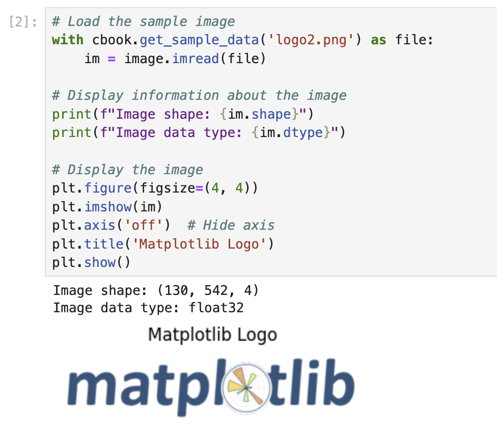
This step is important because it helps us understand the image we'll be using as an overlay. We can see its appearance and dimensions, which will be useful when deciding how to position it on our plot.
Creating a Basic Plot with Random Data
Before we add our image overlay, we need to create a plot that will serve as the base for our visualization. Let's create a simple bar chart using random data.
- Create a new cell in your notebook and enter the following code:
## Create a figure and axes for our plot
fig, ax = plt.subplots(figsize=(10, 6))

## Set a random seed for reproducibility
np.random.seed(19680801)

## Generate random data
x = np.arange(30)  ## x-axis values (0 to 29)
y = x + np.random.randn(30)  ## y-axis values (x plus random noise)

## Create a bar chart
bars = ax.bar(x, y, color='#6bbc6b')  ## Green bars

## Add grid lines
ax.grid(linestyle='--', alpha=0.7)

## Add labels and title
ax.set_xlabel('X-axis Label')
ax.set_ylabel('Y-axis Label')
ax.set_title('Bar Chart with Random Data')

## Display the plot
plt.tight_layout()
plt.show()
This code does the following:
- Creates a figure and axes with a specific size using
plt.subplots(). - Sets a random seed to ensure we get the same random values each time we run the code.
- Generates 30 x-values (0 through 29) and corresponding y-values (x plus random noise).
- Creates a bar chart with green bars using
ax.bar(). - Adds grid lines to the plot with
ax.grid(). - Adds labels for the x-axis, y-axis, and a title for the plot.
- Uses
plt.tight_layout()to adjust spacing for better appearance. - Displays the plot using
plt.show().
- Run the cell by pressing Shift+Enter.
The output should display a bar chart with green bars representing the random data. The x-axis shows integers from 0 to 29, and the y-axis shows the corresponding values with random noise added.
This plot will be the foundation on which we'll overlay our image in the next step. Notice how we've stored the figure object in the variable fig and the axes object in the variable ax. We'll need these variables to add our image overlay.
Overlaying the Image on the Plot
Now that we have created our base plot, let's overlay the image on it. We'll use the figimage method to add the image to the figure, and we'll make it semi-transparent so that the plot underneath remains visible.
- Create a new cell in your notebook and enter the following code:
## Create a figure and axes for our plot (same as before)
fig, ax = plt.subplots(figsize=(10, 6))

## Set a random seed for reproducibility
np.random.seed(19680801)

## Generate random data
x = np.arange(30)  ## x-axis values (0 to 29)
y = x + np.random.randn(30)  ## y-axis values (x plus random noise)

## Create a bar chart
bars = ax.bar(x, y, color='#6bbc6b')  ## Green bars

## Add grid lines
ax.grid(linestyle='--', alpha=0.7)

## Add labels and title
ax.set_xlabel('X-axis Label')
ax.set_ylabel('Y-axis Label')
ax.set_title('Bar Chart with Image Overlay')

## Load the image
with cbook.get_sample_data('logo2.png') as file:
    im = image.imread(file)

## Overlay the image on the plot
## Parameters:
## - im: the image data
## - 25, 25: x and y position in pixels from the bottom left
## - zorder=3: controls the drawing order (higher numbers are drawn on top)
## - alpha=0.5: controls the transparency (0 = transparent, 1 = opaque)
fig.figimage(im, 25, 25, zorder=3, alpha=0.5)

## Display the plot
plt.tight_layout()
plt.show()
This code combines what we did in the previous steps and adds the figimage method to overlay our image on the plot. Here's a breakdown of the figimage parameters:
im: The image data as a NumPy array.25, 25: The x and y positions in pixels from the bottom left corner of the figure.zorder=3: Controls the drawing order. Higher numbers are drawn on top of elements with lower numbers.alpha=0.5: Controls the transparency of the image. A value of 0 is completely transparent, and 1 is completely opaque.
- Run the cell by pressing Shift+Enter.
The output should show the same bar chart as before, but now with the Matplotlib logo overlaid at the bottom left corner. The logo should be semi-transparent, allowing the plot underneath to remain visible.
- Let's experiment with different positions and transparency levels. Create a new cell and enter the following code:
## Create a figure and axes for our plot
fig, ax = plt.subplots(figsize=(10, 6))

## Set a random seed for reproducibility
np.random.seed(19680801)

## Generate random data
x = np.arange(30)
y = x + np.random.randn(30)

## Create a bar chart
bars = ax.bar(x, y, color='#6bbc6b')
ax.grid(linestyle='--', alpha=0.7)
ax.set_xlabel('X-axis Label')
ax.set_ylabel('Y-axis Label')
ax.set_title('Bar Chart with Centered Image Overlay')

## Load the image
with cbook.get_sample_data('logo2.png') as file:
    im = image.imread(file)

## Get figure dimensions
fig_width, fig_height = fig.get_size_inches() * fig.dpi

## Calculate center position (this is approximate)
x_center = fig_width / 2 - im.shape[1] / 2
y_center = fig_height / 2 - im.shape[0] / 2

## Overlay the image at the center with higher transparency
fig.figimage(im, x_center, y_center, zorder=3, alpha=0.3)

## Display the plot
plt.tight_layout()
plt.show()
This code places the image in the center of the figure with a higher transparency level (alpha=0.3), making it more suitable as a watermark.
- Run the cell by pressing Shift+Enter.
The output should show the bar chart with the logo centered and more transparent than before, creating a watermark effect.
Creating a Reusable Function for Image Overlays
To make our code more reusable, let's create a function that can add an image overlay to any Matplotlib figure. This way, we can easily apply the same effect to different plots.
- Create a new cell in your notebook and enter the following code:
def add_image_overlay(fig, image_path, x_pos=25, y_pos=25, alpha=0.5, zorder=3):
    """
    Add an image overlay to a matplotlib figure.

    Parameters:
    -----------
    fig : matplotlib.figure.Figure
        The figure to add the image to
    image_path : str
        Path to the image file
    x_pos : int
        X position in pixels from the bottom left
    y_pos : int
        Y position in pixels from the bottom left
    alpha : float
        Transparency level (0 to 1)
    zorder : int
        Drawing order (higher numbers are drawn on top)

    Returns:
    --------
    fig : matplotlib.figure.Figure
        The figure with the image overlay
    """
    ## Load the image
    with cbook.get_sample_data(image_path) as file:
        im = image.imread(file)

    ## Add the image to the figure
    fig.figimage(im, x_pos, y_pos, zorder=zorder, alpha=alpha)

    return fig

## Example usage: Create a scatter plot with an image overlay
fig, ax = plt.subplots(figsize=(10, 6))

## Set a random seed for reproducibility
np.random.seed(19680801)

## Generate random data for a scatter plot
x = np.random.rand(50) * 10
y = np.random.rand(50) * 10

## Create a scatter plot
ax.scatter(x, y, s=100, c=np.random.rand(50), cmap='viridis', alpha=0.7)
ax.grid(linestyle='--', alpha=0.7)
ax.set_xlabel('X-axis Label')
ax.set_ylabel('Y-axis Label')
ax.set_title('Scatter Plot with Image Overlay')

## Add the image overlay using our function
add_image_overlay(fig, 'logo2.png', x_pos=50, y_pos=50, alpha=0.4)

## Display the plot
plt.tight_layout()
plt.show()
This code defines a function called add_image_overlay that:
- Takes parameters for the figure, image path, position, transparency, and z-order.
- Loads the specified image.
- Adds the image to the figure using
figimage. - Returns the modified figure.
After defining the function, we demonstrate its use by creating a scatter plot with random data and adding the Matplotlib logo as an overlay.
- Run the cell by pressing Shift+Enter.
The output should show a scatter plot with randomly positioned and colored points, and the Matplotlib logo overlaid at position (50, 50) with 40% opacity.
- Let's try one more example with a line plot. Create a new cell and enter the following code:
## Example usage: Create a line plot with an image overlay
fig, ax = plt.subplots(figsize=(10, 6))

## Generate data for a line plot
x = np.linspace(0, 10, 100)
y = np.sin(x)

## Create a line plot
ax.plot(x, y, linewidth=2, color='#d62728')
ax.grid(linestyle='--', alpha=0.7)
ax.set_xlabel('X-axis Label')
ax.set_ylabel('Y-axis Label')
ax.set_title('Sine Wave with Image Overlay')
ax.set_ylim(-1.5, 1.5)

## Add the image overlay using our function
## Place it in the bottom right corner
fig_width, fig_height = fig.get_size_inches() * fig.dpi
with cbook.get_sample_data('logo2.png') as file:
    im = image.imread(file)
    x_pos = fig_width - im.shape[1] - 50  ## 50 pixels from the right edge

add_image_overlay(fig, 'logo2.png', x_pos=x_pos, y_pos=50, alpha=0.6)

## Display the plot
plt.tight_layout()
plt.show()
This code creates a line plot showing a sine wave, and adds the Matplotlib logo in the bottom right corner of the plot.
- Run the cell by pressing Shift+Enter.
The output should show a line plot of a sine wave with the Matplotlib logo overlaid in the bottom right corner at 60% opacity.
These examples demonstrate how our add_image_overlay function can be used to easily add image overlays to different types of plots, making it a versatile tool for customizing visualizations.
Summary
In this tutorial, you learned how to overlay images on Matplotlib plots to create watermarks, logos, or other visual elements that enhance your visualizations. Here's a summary of what we covered:
Importing Libraries: We started by importing the necessary libraries for working with Matplotlib plots and images.
Loading and Examining Images: We learned how to load images using the
imreadfunction and how to inspect their properties.Creating Base Plots: We created different types of plots (bar charts, scatter plots, and line plots) to serve as the foundation for our image overlays.
Overlaying Images: We used the
figimagemethod to place images on our plots, controlling their position, transparency, and drawing order.Creating a Reusable Function: We developed a reusable function to make it easier to add image overlays to any Matplotlib figure.
The skills you learned in this tutorial can be applied to:
- Adding watermarks to plots for copyright protection
- Including logos for branding in visualizations
- Creating custom background elements for aesthetically pleasing charts
- Combining images with data visualizations for presentations and reports
You can continue experimenting with different types of plots, images, positions, and transparency levels to create unique and professional-looking visualizations that meet your specific needs.