Introduction
When visualizing financial data, it is essential to format the axes appropriately with currency symbols. Matplotlib is a powerful Python library for creating visualizations, but by default, it does not display currency symbols on the axes.
In this lab, we will learn how to customize a Matplotlib plot to display dollar signs on the y-axis labels. This skill is valuable when working with financial data, sales figures, budgets, or any other datasets that require currency formatting.
VM Tips
After the VM startup is complete, click the top left corner to switch to the Notebook tab to access Jupyter Notebook for practice.
You may need to wait a few seconds for Jupyter Notebook to finish loading. The validation of operations cannot be automated because of limitations in Jupyter Notebook.
If you encounter any issues during the lab, feel free to ask Labby. Please provide feedback after the session, and we will promptly resolve any problems for you.
Setting Up Libraries and Creating Sample Data
In this first step, we will import the necessary libraries and create sample financial data for our plot. We need to import both Matplotlib for visualization and NumPy for data generation.
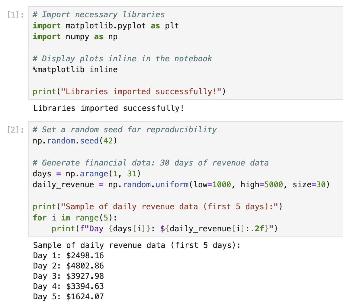
In the first cell of your notebook, enter and run the following code to import the required libraries:
## Import necessary libraries
import matplotlib.pyplot as plt
import numpy as np

## Display plots inline in the notebook
%matplotlib inline

print("Libraries imported successfully!")
After running the code (press Shift+Enter), you should see the output:
Libraries imported successfully!
Now, let's create some sample financial data to visualize. Financial data often represents values over time, so we'll create a simple dataset that might represent daily revenue over a period of time.
In a new cell, add and run the following code:
## Set a random seed for reproducibility
np.random.seed(42)

## Generate financial data: 30 days of revenue data
days = np.arange(1, 31)
daily_revenue = np.random.uniform(low=1000, high=5000, size=30)

print("Sample of daily revenue data (first 5 days):")
for i in range(5):
    print(f"Day {days[i]}: ${daily_revenue[i]:.2f}")
After running this code, you will see the first 5 days of our sample revenue data:
Sample of daily revenue data (first 5 days):
Day 1: $3745.40
Day 2: $3992.60
Day 3: $2827.45
Day 4: $4137.54
Day 5: $1579.63
This sample data represents daily revenue values between $1,000 and $5,000 for a 30-day period. We'll use this data to create our plot in the next step.
Creating a Basic Financial Plot
Now that we have our data ready, let's create a basic plot to visualize the daily revenue. We'll start with a simple line plot that shows the revenue trend over the 30-day period.
In a new cell in your notebook, add and run the following code:
## Create a figure and axes
fig, ax = plt.subplots(figsize=(10, 6))

## Plot the daily revenue data
ax.plot(days, daily_revenue, marker='o', linestyle='-', color='blue', linewidth=2, markersize=6)

## Add labels and title
ax.set_xlabel('Day', fontsize=12)
ax.set_ylabel('Revenue', fontsize=12)
ax.set_title('Daily Revenue Over 30 Days', fontsize=14, fontweight='bold')

## Add grid for better readability
ax.grid(True, linestyle='--', alpha=0.7)

## Display the plot
plt.tight_layout()
plt.show()

print("Basic plot created successfully!")
After running this code, you should see a line plot showing the daily revenue trend. It should look something like this (actual values may vary slightly due to random generation):
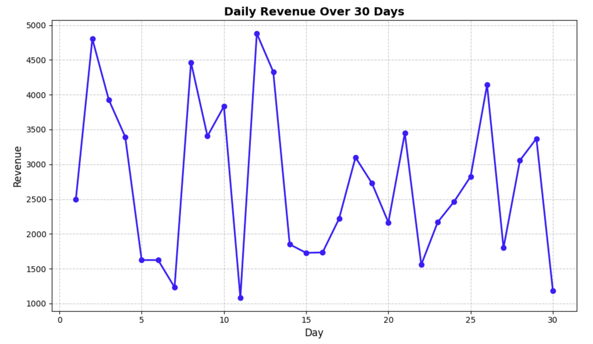
Let's break down what we did in this code:
fig, ax = plt.subplots(figsize=(10, 6))- Created a figure and axes with a size of 10×6 inchesax.plot(days, daily_revenue, ...)- Plotted our data with days on the x-axis and revenue on the y-axisax.set_xlabel(),ax.set_ylabel(),ax.set_title()- Added labels and a title to our plotax.grid()- Added a grid to make the data easier to readplt.tight_layout()- Adjusted the padding to ensure everything fits nicelyplt.show()- Displayed the plot
Notice that the y-axis currently shows plain numbers without dollar signs. In the next step, we'll modify our plot to display proper currency formatting on the y-axis.
Formatting Y-Axis Labels with Dollar Signs
Now that we have our basic plot, let's format the y-axis labels to display dollar signs. This will make our financial data more readable and professionally presented.
To format the tick labels on the y-axis, we'll use Matplotlib's ticker module, which provides various formatting options. Specifically, we'll use the StrMethodFormatter class to create a custom formatter for our y-axis.
In a new cell in your notebook, add and run the following code:
## Import the necessary module for formatting
import matplotlib.ticker as ticker

## Create a figure and axes
fig, ax = plt.subplots(figsize=(10, 6))

## Plot the daily revenue data
ax.plot(days, daily_revenue, marker='o', linestyle='-', color='blue', linewidth=2, markersize=6)

## Format y-axis with dollar signs
formatter = ticker.StrMethodFormatter('${x:,.2f}')
ax.yaxis.set_major_formatter(formatter)

## Add labels and title
ax.set_xlabel('Day', fontsize=12)
ax.set_ylabel('Revenue ($)', fontsize=12)
ax.set_title('Daily Revenue Over 30 Days', fontsize=14, fontweight='bold')

## Add grid for better readability
ax.grid(True, linestyle='--', alpha=0.7)

## Display the plot
plt.tight_layout()
plt.show()

print("Plot with dollar-formatted y-axis created!")
After running this code, you should see a new plot with dollar signs on the y-axis labels.
Let's explain the key part of this code:
formatter = ticker.StrMethodFormatter('${x:,.2f}')
ax.yaxis.set_major_formatter(formatter)
Here's what this formatting string does:
$- Adds a dollar sign at the beginning of each label{x:,.2f}- Formats the number with:,- Comma as a thousands separator (e.g., 1,000 instead of 1000).2f- Two decimal places (e.g., $1,234.56)
This formatter applies to all the major tick labels on the y-axis. Notice how the plot now clearly indicates that the values are in dollars, making it much more appropriate for financial data visualization.
Enhancing the Plot for Better Financial Data Visualization
Now that we have the basic currency formatting in place, let's enhance our plot further to make it more useful for financial data analysis. We'll add several improvements:
- A horizontal line showing the average daily revenue
- Annotations highlighting the maximum and minimum revenue days
- Customized tick parameters for better readability
- A more descriptive title and legend
In a new cell in your notebook, add and run the following code:
## Import the necessary module for formatting
import matplotlib.ticker as ticker

## Create a figure and axes
fig, ax = plt.subplots(figsize=(12, 7))

## Plot the daily revenue data
ax.plot(days, daily_revenue, marker='o', linestyle='-', color='blue',
        linewidth=2, markersize=6, label='Daily Revenue')

## Calculate statistics
avg_revenue = np.mean(daily_revenue)
max_revenue = np.max(daily_revenue)
min_revenue = np.min(daily_revenue)
max_day = days[np.argmax(daily_revenue)]
min_day = days[np.argmin(daily_revenue)]

## Add a horizontal line for average revenue
ax.axhline(y=avg_revenue, color='r', linestyle='--', alpha=0.7,
           label=f'Average Revenue: ${avg_revenue:.2f}')

## Format y-axis with dollar signs
formatter = ticker.StrMethodFormatter('${x:,.2f}')
ax.yaxis.set_major_formatter(formatter)

## Customize tick parameters
ax.tick_params(axis='both', which='major', labelsize=10)
ax.yaxis.set_major_locator(ticker.MaxNLocator(nbins=10))
ax.xaxis.set_major_locator(ticker.MultipleLocator(base=5))

## Add annotations for max and min revenue
ax.annotate(f'Max: ${max_revenue:.2f}', xy=(max_day, max_revenue),
            xytext=(max_day+1, max_revenue+200),
            arrowprops=dict(facecolor='black', shrink=0.05, width=1.5))

ax.annotate(f'Min: ${min_revenue:.2f}', xy=(min_day, min_revenue),
            xytext=(min_day+1, min_revenue-200),
            arrowprops=dict(facecolor='black', shrink=0.05, width=1.5))

## Add labels and title
ax.set_xlabel('Day of Month', fontsize=12)
ax.set_ylabel('Revenue ($)', fontsize=12)
ax.set_title('Daily Revenue Analysis - 30 Day Period', fontsize=14, fontweight='bold')

## Set x-axis limits to show a bit of padding
ax.set_xlim(0, 31)

## Add grid for better readability
ax.grid(True, linestyle='--', alpha=0.7)

## Add legend
ax.legend(loc='upper right', fontsize=10)

## Display the plot
plt.tight_layout()
plt.show()

print("Enhanced financial plot created successfully!")
After running this code, you should see a much more informative plot with:
- Dollar sign formatting on the y-axis
- A horizontal red dashed line showing the average revenue
- Annotations pointing to the maximum and minimum revenue days
- Cleaner tick marks with better spacing
- A legend showing what each element represents
Let's explain some of the new elements:
ax.axhline()- Adds a horizontal line at the specified y-value (in this case, our average revenue)ax.yaxis.set_major_locator()- Controls how many tick marks appear on the y-axisax.xaxis.set_major_locator()- Sets the x-axis to show ticks at intervals of 5 daysax.annotate()- Adds text annotations with arrows pointing to specific data pointsax.legend()- Adds a legend explaining the different elements on the plot
These enhancements make the plot much more useful for financial analysis by highlighting key statistics and making the data easier to interpret.
Saving the Plot and Creating a Reusable Function
In this final step, we'll create a reusable function to generate currency-formatted plots and save our visualization to a file. This approach makes it easy to apply the same formatting to different financial datasets in the future.
In a new cell in your notebook, add and run the following code:
def create_currency_plot(x_data, y_data, title='Financial Data',
                         xlabel='X-Axis', ylabel='Amount ($)',
                         filename=None, show_stats=True):
    """
    Create a plot with currency formatting on the y-axis.

    Parameters:
    -----------
    x_data : array-like
        Data for the x-axis
    y_data : array-like
        Data for the y-axis (currency values)
    title : str
        Title of the plot
    xlabel : str
        Label for the x-axis
    ylabel : str
        Label for the y-axis
    filename : str, optional
        If provided, save the plot to this filename
    show_stats : bool
        Whether to show statistics (average, min, max)

    Returns:
    --------
    fig, ax : tuple
        The figure and axes objects
    """
    ## Import the necessary module for formatting
    import matplotlib.ticker as ticker

    ## Create a figure and axes
    fig, ax = plt.subplots(figsize=(12, 7))

    ## Plot the data
    ax.plot(x_data, y_data, marker='o', linestyle='-', color='blue',
            linewidth=2, markersize=6, label='Data')

    if show_stats:
        ## Calculate statistics
        avg_value = np.mean(y_data)
        max_value = np.max(y_data)
        min_value = np.min(y_data)
        max_x = x_data[np.argmax(y_data)]
        min_x = x_data[np.argmin(y_data)]

        ## Add a horizontal line for average value
        ax.axhline(y=avg_value, color='r', linestyle='--', alpha=0.7,
                   label=f'Average: ${avg_value:.2f}')

        ## Add annotations for max and min values
        ax.annotate(f'Max: ${max_value:.2f}', xy=(max_x, max_value),
                    xytext=(max_x+1, max_value+200),
                    arrowprops=dict(facecolor='black', shrink=0.05, width=1.5))

        ax.annotate(f'Min: ${min_value:.2f}', xy=(min_x, min_value),
                    xytext=(min_x+1, min_value-200),
                    arrowprops=dict(facecolor='black', shrink=0.05, width=1.5))

    ## Format y-axis with dollar signs
    formatter = ticker.StrMethodFormatter('${x:,.2f}')
    ax.yaxis.set_major_formatter(formatter)

    ## Customize tick parameters
    ax.tick_params(axis='both', which='major', labelsize=10)

    ## Add labels and title
    ax.set_xlabel(xlabel, fontsize=12)
    ax.set_ylabel(ylabel, fontsize=12)
    ax.set_title(title, fontsize=14, fontweight='bold')

    ## Add grid for better readability
    ax.grid(True, linestyle='--', alpha=0.7)

    ## Add legend
    if show_stats:
        ax.legend(loc='best', fontsize=10)

    ## Adjust layout
    plt.tight_layout()

    ## Save the plot if filename is provided
    if filename:
        plt.savefig(filename, dpi=300, bbox_inches='tight')
        print(f"Plot saved as '{filename}'")

    return fig, ax

## Use our function to create and save a plot
fig, ax = create_currency_plot(
    days,
    daily_revenue,
    title='Monthly Revenue Report',
    xlabel='Day of Month',
    ylabel='Daily Revenue ($)',
    filename='revenue_plot.png'
)

## Display the plot
plt.show()

print("Function created and plot saved successfully!")
After running this code, you should see:
- A similar plot to what we created in the previous step, but generated using our custom function
- A message confirming that the plot has been saved to a file named
revenue_plot.png
The function we created:
- Takes data for x and y axes
- Allows customization of labels and title
- Has an option to save the plot to a file
- Can show or hide statistics like average, min, and max
- Returns the figure and axes objects for further customization if needed
This reusable function makes it easy to create consistently formatted financial plots in the future. You can simply call this function with different datasets, and it will handle all the currency formatting and statistical annotations automatically.
To verify that our plot was saved correctly, let's check if the file exists:
import os
if os.path.exists('revenue_plot.png'):
    print("Plot file exists! Size:", os.path.getsize('revenue_plot.png'), "bytes")
else:
    print("Plot file was not saved correctly.")
You should see a message confirming that the file exists and its size.
Congratulations! You have successfully learned how to format plots with dollar signs and create professional-looking financial visualizations using Matplotlib.
Summary
In this lab, we learned how to create financial plots with proper currency formatting using Matplotlib. We covered several important concepts:
- Generating and working with sample financial data
- Creating basic plots with Matplotlib
- Formatting y-axis labels with dollar signs using the
StrMethodFormatterclass - Enhancing plots with statistics, annotations, and improved styling
- Creating a reusable function for generating consistent currency-formatted plots
These skills are essential for anyone working with financial data visualization, as they allow you to create professional and informative charts that clearly communicate monetary values.
The techniques you learned can be applied to various financial datasets such as:
- Sales and revenue reports
- Budget analysis
- Investment performance tracking
- Cost analysis
- Expense tracking
By properly formatting your axes with currency symbols, you make your visualizations more intuitive and professional, enhancing the effectiveness of your data communication.