
Introduction
Welcome to the lab on Matplotlib Scatter Plots! Scatter plots are a fundamental tool in data visualization, used to display values for typically two variables for a set of data. They are excellent for observing relationships or correlations between variables.
In this lab, you will use the Matplotlib library in Python to create scatter plots. You will learn how to:
- Generate data arrays using NumPy.
- Create a basic scatter plot with
plt.scatter(). - Customize the appearance of the plot, including marker size and color.
- Add a grid to improve readability.
All your work will be done in the WebIDE environment. You will write Python code in a file and run it from the terminal. Since this environment is non-interactive, you will save your plots to an image file using plt.savefig() instead of displaying them with plt.show().
Let's get started!
Generate x and y data arrays
In this step, you will create the data that we'll use for our scatter plot. A scatter plot requires at least two arrays of data of the same length: one for the x-axis coordinates and one for the y-axis coordinates. We will use the NumPy library, which is a standard for numerical operations in Python.
First, open the main.py file from the file explorer on the left panel of the WebIDE. This is where you will write all your code for this lab.
Now, add the following code to main.py to import NumPy and create two simple data arrays.
import numpy as np

## Data for plotting
x = np.array([5, 7, 8, 7, 2, 17, 2, 9, 4, 11, 12, 9, 6])
y = np.array([99, 86, 87, 88, 111, 86, 103, 87, 94, 78, 77, 85, 86])
Let's break down the code:
import numpy as np: This line imports the NumPy library and gives it the conventional aliasnp.x = np.array([...]): This creates a NumPy array namedxcontaining our data points for the horizontal axis.y = np.array([...]): This creates a NumPy array namedycontaining our data points for the vertical axis.
Your main.py file should now contain this code. In the next step, we will use this data to create our first plot.
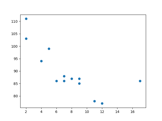
Plot scatter using plt.scatter(x, y)
In this step, you will create a basic scatter plot using the data you generated. We will use the matplotlib.pyplot module, which provides a simple interface for creating plots.
First, you need to import matplotlib.pyplot. Then, you can use the plt.scatter() function to create the plot. Finally, you must save the plot to a file. As mentioned in the introduction, we cannot use plt.show() to display the plot directly in this environment. Instead, we will use plt.savefig() to save it as an image.
Update your main.py file with the following code. Add the new lines below the existing code.
import numpy as np
import matplotlib.pyplot as plt

## Data for plotting
x = np.array([5, 7, 8, 7, 2, 17, 2, 9, 4, 11, 12, 9, 6])
y = np.array([99, 86, 87, 88, 111, 86, 103, 87, 94, 78, 77, 85, 86])

## Create scatter plot
plt.scatter(x, y)

## Save the plot to a file
plt.savefig('/home/labex/project/scatter_plot.png')

print("Scatter plot saved to scatter_plot.png")
Code explanation:
import matplotlib.pyplot as plt: Imports the plotting module and gives it the standard aliasplt.plt.scatter(x, y): This is the core function. It takes thexandyarrays and plots each pair of(x, y)values as a point.plt.savefig('/home/labex/project/scatter_plot.png'): This function saves the current figure to a file namedscatter_plot.pngin your~/projectdirectory.
Now, run your script from the terminal at the bottom of the WebIDE:
python3 main.py
You should see the following output in the terminal:
Scatter plot saved to scatter_plot.png
A new file named scatter_plot.png will appear in the file explorer on the left. Double-click it to view your first scatter plot!
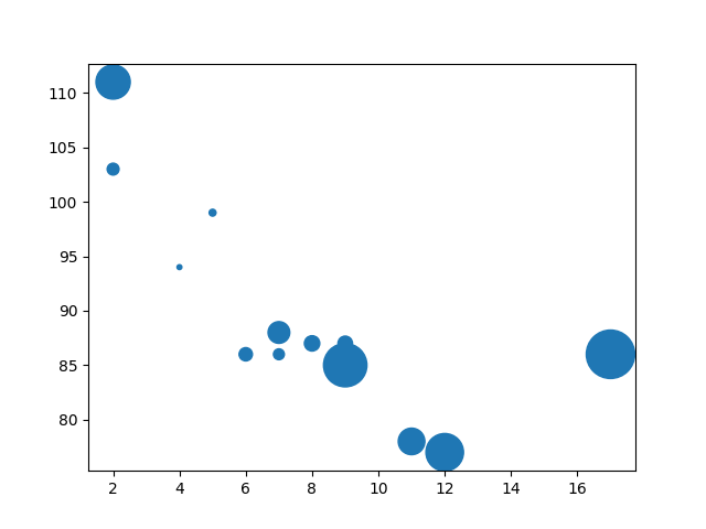
Customize marker size using s parameter
In this step, you'll learn how to customize the size of the markers (the points) in your scatter plot. The plt.scatter() function has an optional parameter s that controls the marker size.
You can provide a single number to make all markers the same size, or you can provide an array of numbers (with the same length as your x and y data) to specify a unique size for each marker. Let's try the latter to make the plot more interesting.
Modify your main.py file. We will create a sizes array and pass it to the s parameter in the plt.scatter() function.
import numpy as np
import matplotlib.pyplot as plt

## Data for plotting
x = np.array([5, 7, 8, 7, 2, 17, 2, 9, 4, 11, 12, 9, 6])
y = np.array([99, 86, 87, 88, 111, 86, 103, 87, 94, 78, 77, 85, 86])
sizes = np.array([20, 50, 100, 200, 500, 1000, 60, 90, 10, 300, 600, 800, 75])

## Create scatter plot with custom sizes
plt.scatter(x, y, s=sizes)

## Save the plot to a file
plt.savefig('/home/labex/project/scatter_plot_sizes.png')

print("Scatter plot with custom sizes saved to scatter_plot_sizes.png")
In the updated code, we added a sizes array and modified the plt.scatter() call to plt.scatter(x, y, s=sizes). Now, each point will be plotted with its corresponding size from the sizes array.
Run the script again to see the changes:
python3 main.py
After the script finishes, open scatter_plot_sizes.png again. You will notice that the markers now have different sizes, making the plot more visually informative.
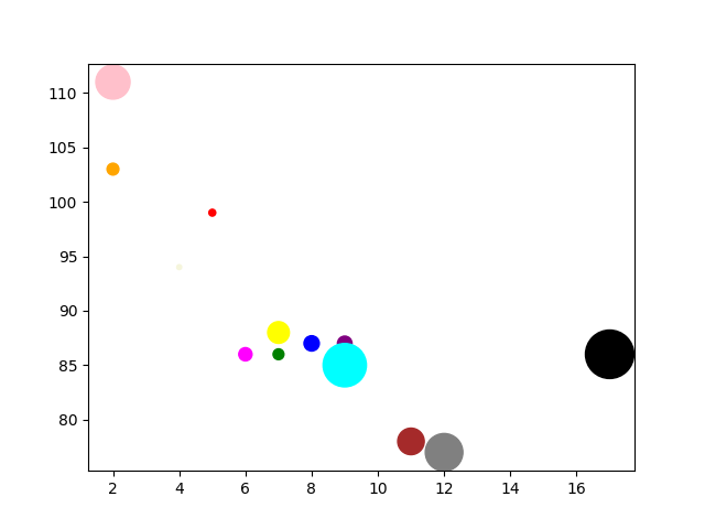
Change marker color using c parameter
In this step, we will customize the color of the markers. Similar to the size, you can control the color using the c parameter in the plt.scatter() function.
You can pass a single color name (e.g., 'red') to make all markers the same color, or you can pass an array of colors to give each marker a specific color. Let's assign a unique color to each point.
Update your main.py file to include a colors array and pass it to the c parameter.
import numpy as np
import matplotlib.pyplot as plt

## Data for plotting
x = np.array([5, 7, 8, 7, 2, 17, 2, 9, 4, 11, 12, 9, 6])
y = np.array([99, 86, 87, 88, 111, 86, 103, 87, 94, 78, 77, 85, 86])
sizes = np.array([20, 50, 100, 200, 500, 1000, 60, 90, 10, 300, 600, 800, 75])
colors = np.array(["red", "green", "blue", "yellow", "pink", "black", "orange", "purple", "beige", "brown", "gray", "cyan", "magenta"])

## Create scatter plot with custom sizes and colors
plt.scatter(x, y, s=sizes, c=colors)

## Save the plot to a file
plt.savefig('/home/labex/project/scatter_plot_colors.png')

print("Scatter plot with custom colors saved to scatter_plot_colors.png")
We've now added a colors array containing color names and updated the function call to plt.scatter(x, y, s=sizes, c=colors).
Execute the script from the terminal:
python3 main.py
Open scatter_plot_colors.png one more time. You will see a colorful scatter plot where each point has a different size and color, as defined in our arrays.
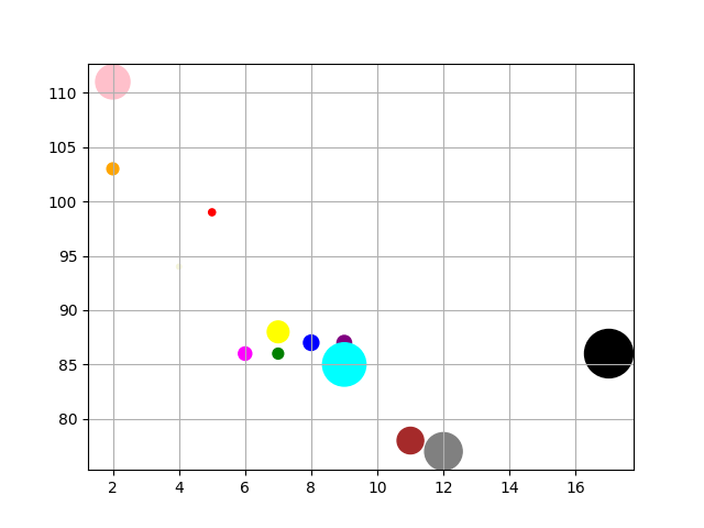
Add grid using plt.grid()
In this final step, you will add a grid to your scatter plot. A grid can make it easier to read the values of the data points on the axes.
Adding a grid in Matplotlib is very straightforward. You just need to call the plt.grid() function before you save the plot. By default, plt.grid(True) will display the grid.
Let's add this to our script. Modify main.py to include the plt.grid() call.
import numpy as np
import matplotlib.pyplot as plt

## Data for plotting
x = np.array([5, 7, 8, 7, 2, 17, 2, 9, 4, 11, 12, 9, 6])
y = np.array([99, 86, 87, 88, 111, 86, 103, 87, 94, 78, 77, 85, 86])
sizes = np.array([20, 50, 100, 200, 500, 1000, 60, 90, 10, 300, 600, 800, 75])
colors = np.array(["red", "green", "blue", "yellow", "pink", "black", "orange", "purple", "beige", "brown", "gray", "cyan", "magenta"])

## Create scatter plot
plt.scatter(x, y, s=sizes, c=colors)

## Add a grid
plt.grid(True)

## Save the plot to a file
plt.savefig('/home/labex/project/scatter_plot_grid.png')

print("Scatter plot with grid saved to scatter_plot_grid.png")
We added plt.grid(True) right before plt.savefig(). This tells Matplotlib to draw a grid on the plot.
Run the final version of your script:
python3 main.py
Now, check the scatter_plot_grid.png image. Your plot should now have a grid in the background, completing our customized scatter plot.
Summary
Congratulations on completing the lab! You have successfully learned the basics of creating and customizing scatter plots with Matplotlib.
In this lab, you practiced:
- Generating data for plotting using NumPy.
- Creating a basic scatter plot with
plt.scatter(). - Customizing marker sizes using the
sparameter. - Changing marker colors using the
cparameter. - Adding a grid to the plot with
plt.grid(). - Saving your plots to a file with
plt.savefig().
These are essential skills for data visualization in Python. You can now create informative and visually appealing scatter plots to explore relationships in your data. To continue your learning, you could explore adding titles and labels, using different marker styles, or applying colormaps for more advanced visualizations.