
Introduction
In this project, you will learn how to create a responsive web design that adapts to different screen sizes. The goal is to develop a webpage that provides a comfortable user experience for both desktop and mobile users.
👀 Preview
🎯 Tasks
In this project, you will learn:
- How to set up the initial layout for the menu and content sections
- How to implement the responsive design using media queries
- How to test and refine the responsive design to ensure a seamless experience
🏆 Achievements
After completing this project, you will be able to:
- Create a responsive web design that adapts to different screen sizes
- Develop a user-friendly mobile interface, including a collapsible menu
- Apply best practices for testing and iterating on a responsive web design
Set Up the Project
In this step, you will set up the project and open the files in the editor.
Open the project folder, which contains the following files and directories:
├── css
│   └── style.css
├── images
│   ├── 1.png
│   └── 2.png
├─── js
│    └── jQuery.min.js
└─── index.html
Among them:
index.htmlis the main page.css/style.cssis the file where the styles need to be supplemented.js/jQuery.min.jsis the jQuery library file.imagesis the image folder.
Click on Go Live button in the bottom right corner of WebIDE, to run the project.
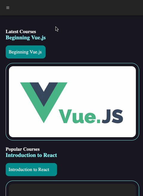
Next, open the "Web 8080" on the top of the VM and manually refresh the page to see the following effect in your browser:
Implement the Responsive Design
In this step, you will learn how to implement the responsive design for the webpage.
- Add the following CSS rule to the bottom of the
css/style.cssfile:
@media (max-width: 800px) {
  .menu {
    height: 54px;
    line-height: 54px;
    margin-bottom: 25px;
  }

  .icon-menu {
    color: #a0a0a0;
    margin-left: 20px;
    display: inline-block !important;
  }

  .icon-menu:hover {
    color: white;
    cursor: pointer;
  }

  .collapse {
    display: none;
  }

  input[type="checkbox"]:checked ~ .collapse {
    display: flex;
    flex-direction: column;
    background-color: #252525;
  }

  .dropdown:hover ul {
    display: flex;
    flex-direction: column;
  }

  .row {
    margin-top: 20px;
    display: flex;
    flex-wrap: wrap;
  }

  .box {
    margin-bottom: 15px;
  }

  #tutorials img {
    margin: 0;
  }
}
This CSS code sets up the responsive design for the webpage. It includes styles for the mobile-side layout, including the menu button, expanded menu, and content layout.
The key changes are:
- The menu height and line-height are set to 54px to match the mobile design.
- The menu button (
.icon-menu) is displayed and styled. - The
.collapseclass is used to hide the menu items by default, and is shown when the menu button is clicked. - The
.rowand.boxstyles are updated to display the content in a single column layout on mobile. - The
#tutorials imgmargin is removed to fit the mobile layout.
- Save the
css/style.cssfile and refresh the webpage. You should now see the responsive design in action, with the mobile layout displayed when the screen width is less than 800px.
Test and Refine the Responsive Design
In this step, you will test the responsive design and make any necessary refinements.
- Open the webpage in your browser and resize the window to different widths to ensure the layout adjusts correctly.
- Test the menu button functionality on the mobile layout, ensuring the menu items are displayed when the button is clicked.
- Inspect the content layout on both the desktop and mobile views, making sure the images, text, and spacing look good.
- If you find any issues or areas for improvement, update the CSS in the
css/style.cssfile and refresh the page to see the changes.
Remember, responsive web design is an iterative process, so don't be afraid to experiment and refine the design until you're satisfied with the results.
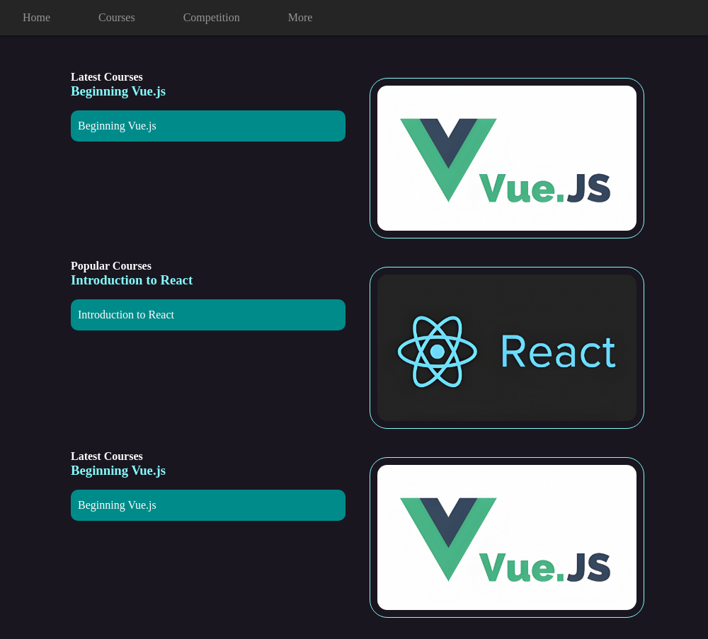
The finished mobile result is shown below:
Summary
Congratulations! You have completed this project. You can practice more labs in LabEx to improve your skills.


