Project in CSS Skill Tree
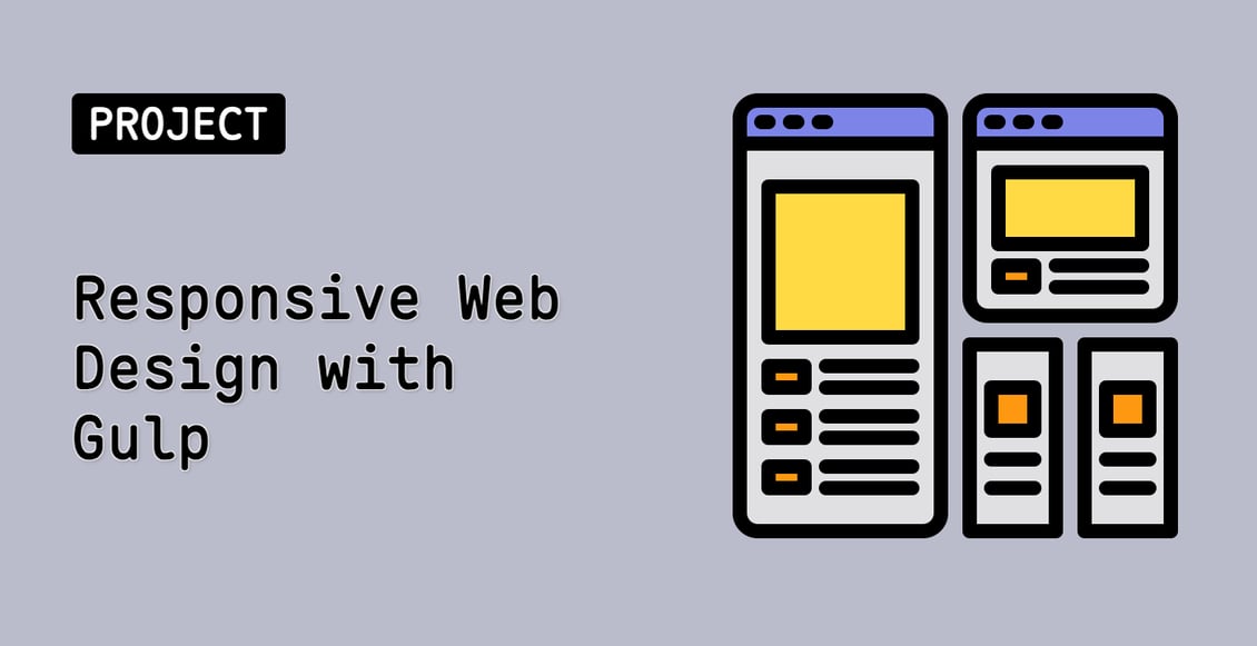
Responsive Web Design with Gulp
Beginner
In this project, you will learn how to implement a responsive layout for a website, similar to the official Gulp.js website. You will use media queries to adjust the layout and styles of the web page based on the screen size.
cssweb-development
Teacher

Labby
Labby is the LabEx teacher.
Upgrade to Get Certificate
Join Our Discord and Learn Together
Join NowUser Reviews
" I'm begin we code to do some project for myself in I'm really understand those basics. So guys you all did a grateful job . you have all my respect. "
— D. Fabio Maurice
" Il est super pratique et bien conçu. Excellent , chapeau au concepteur."
— yannick paul Boka