Project in CSS Skill Tree
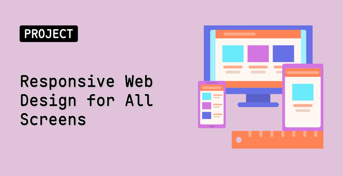
Responsive Web Design for All Screens
Beginner
In this project, you will learn how to create a responsive web design that adapts to different screen sizes. The goal is to develop a webpage that provides a comfortable user experience for both desktop and mobile users.
cssweb-development
Teacher

Labby
Labby is the LabEx teacher.
Upgrade to Get Certificate
Join Our Discord and Learn Together
Join NowUser Reviews
" it's good with a hand on work so it feels vary good"
— Bhagavath A
" Very impressive, thank you for the amazing learning material"
— Vinay Prabhakar