
Introduction
In this project, you will learn how to implement an attribute-based atomic flex layout using CSS. Atomic CSS is a popular CSS construction method that simplifies the writing of CSS by using attribute-based styles.
👀 Preview
🎯 Tasks
In this project, you will learn:
- How to implement an attribute-based atomic flex layout using CSS
- How to style the individual flex items within the flex layout
🏆 Achievements
After completing this project, you will be able to:
- Use attribute-based CSS to create a flexible layout
- Style the individual elements within a flex layout
- Understand the benefits of using atomic CSS for efficient and maintainable CSS development
Set Up the Project Structure
Atomic CSS is a recently very popular CSS construction method, and attribute-based (Attributify) atomic CSS further simplifies the writing of CSS.
For example, traditionally we implement flex by creating a class identifier on the element, and then selecting the element through the selector in CSS:
<style>
  .box {
    display: flex;
  }
</style>
<div class="box"></div>
With attributed atomic CSS, we can do the same thing in the following way.
<div flex></div>
To get started, open the experiment environment, and the directory structure is as follows:
├── css
│   └── style.css
└── index.html
Where:
css/style.cssis the style file where the code needs to be supplemented.index.htmlis the main page.
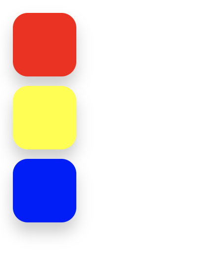
Click "Go Live" in the bottom right corner to open port 8080 to preview the index.html page in the browser, the effect will be as follows:
Implement Attribute-Based Atomic Flex Layout
In this step, you will learn how to implement an attribute-based atomic flex layout using CSS.
- Open the
css/style.cssfile. - Locate the
/* TODO */section in the CSS file. - Add the following CSS rule to implement the attribute-based atomic flex layout:
[flex="~ col"] {
  display: flex;
  flex-direction: column;
}
This rule targets the div element with the flex="~ col" attribute and applies the necessary styles to create a vertical flex layout.
The display: flex property sets the element to use the flex layout, and the flex-direction: column property sets the flex direction to be vertical.
- Save the
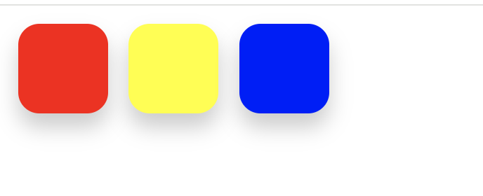
style.cssfile. - Go back to your browser and refresh the page. You should see the following effect:
Summary
Congratulations! You have completed this project. You can practice more labs in LabEx to improve your skills.


