Introduction
In this tutorial, we will learn how to move the x-axis tick labels to the top of the plot using Python's Matplotlib library. By default, Matplotlib places x-axis labels at the bottom of the plot. However, sometimes we might want to place them at the top for better visualization, especially when dealing with crowded plots or long labels that might overlap with other elements.
This technique is particularly useful in data visualization scenarios where you need to optimize the use of space and improve readability of your plots. We will create a simple plot and learn how to manipulate the position of the tick labels step by step.
VM Tips
After the VM startup is complete, click the top left corner to switch to the Notebook tab to access Jupyter Notebook for practice.
You may need to wait a few seconds for Jupyter Notebook to finish loading. Due to limitations in Jupyter Notebook, the validation of operations cannot be automated.
If you encounter any issues during this tutorial, feel free to ask Labby. Please provide feedback after the session so we can promptly address any problems.
Understanding Matplotlib and Creating a Notebook
In this first step, we will learn about Matplotlib and create a new Jupyter notebook for our visualization task.
What is Matplotlib?
Matplotlib is a comprehensive library for creating static, animated, and interactive visualizations in Python. It provides an object-oriented API for embedding plots into applications and is widely used for data visualization by scientists, engineers, and data analysts.
Create a New Notebook
In the first cell of your notebook, let's import the Matplotlib library. Type the following code and run the cell by pressing Shift+Enter:
import matplotlib.pyplot as plt
import numpy as np

## Check the Matplotlib version
print(f"NumPy version: {np.__version__}")
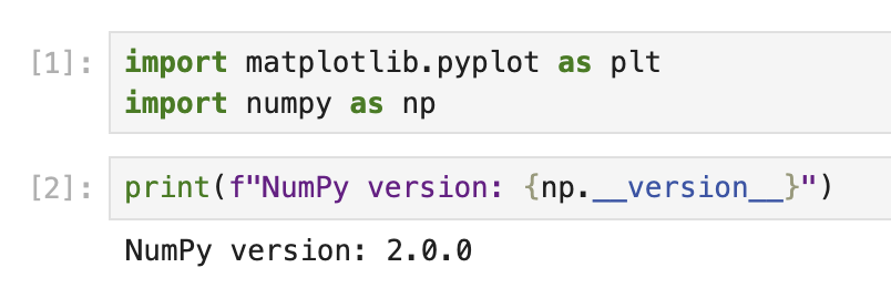
When you run this code, you should see output similar to:
NumPy version: 2.0.0
The exact version number may vary depending on your environment.
Now we have Matplotlib imported and ready to use. The plt is a conventional alias used for the pyplot module, which provides a MATLAB-like interface for creating plots.
Creating a Basic Plot with Default Settings
Now that we have Matplotlib imported, let's create a simple plot with default settings to understand how the axes and tick labels are positioned by default.
Understanding Matplotlib Components
In Matplotlib, plots consist of several components:
- Figure: The overall container for the plot
- Axes: The area where data is plotted with its own coordinate system
- Axis: The number-line-like objects that define the coordinate system
- Ticks: The marks on the axes that denote specific values
- Tick Labels: The text labels that indicate the value at each tick
By default, x-axis tick labels appear at the bottom of the plot.
Creating a Simple Plot
In a new cell in your notebook, let's create a simple line plot:
## Create a figure and a set of axes
fig, ax = plt.subplots(figsize=(8, 5))

## Generate some data
x = np.arange(0, 10, 1)
y = np.sin(x)

## Plot the data
ax.plot(x, y, marker='o', linestyle='-', color='blue', label='sin(x)')

## Add a title and labels
ax.set_title('A Simple Sine Wave Plot')
ax.set_xlabel('X-axis')
ax.set_ylabel('Y-axis (sin(x))')

## Add a grid and legend
ax.grid(True, linestyle='--', alpha=0.7)
ax.legend()

## Display the plot
plt.show()

print("Notice that the x-axis tick labels are at the bottom of the plot by default.")
When you run this code, you will see a sine wave plot with the x-axis tick labels at the bottom of the plot, which is the default position in Matplotlib.
Take a moment to observe how the plot is structured and where the tick labels are positioned. This understanding will help us appreciate the changes we make in the next step.
Moving the X-Axis Tick Labels to the Top
Now that we understand the default positioning of tick labels, let's move the x-axis tick labels to the top of the plot.
Understanding Tick Parameters
Matplotlib provides the tick_params() method to control the appearance of ticks and tick labels. This method allows us to:
- Show/hide ticks and tick labels
- Change their position (top, bottom, left, right)
- Adjust their size, color, and other properties
Creating a Plot with X-Axis Tick Labels at the Top
Let's create a new plot with the x-axis tick labels moved to the top:
## Create a new figure and a set of axes
fig, ax = plt.subplots(figsize=(8, 5))

## Generate some data
x = np.arange(0, 10, 1)
y = np.cos(x)

## Plot the data
ax.plot(x, y, marker='s', linestyle='-', color='green', label='cos(x)')

## Move the x-axis tick labels to the top
ax.tick_params(
    axis='x',         ## Apply changes to the x-axis
    top=True,         ## Show ticks on the top side
    labeltop=True,    ## Show tick labels on the top side
    bottom=False,     ## Hide ticks on the bottom side
    labelbottom=False ## Hide tick labels on the bottom side
)

## Add a title and labels
ax.set_title('Cosine Wave with X-Axis Tick Labels at the Top')
ax.set_xlabel('X-axis (now at the top!)')
ax.set_ylabel('Y-axis (cos(x))')

## Add a grid and legend
ax.grid(True, linestyle='--', alpha=0.7)
ax.legend()

## Display the plot
plt.show()

print("Now the x-axis tick labels are at the top of the plot!")
When you run this code, you will see a cosine wave plot with the x-axis tick labels at the top of the plot.
Notice how the tick_params() method is used with several parameters:
axis='x': Specifies that we want to modify the x-axistop=Trueandlabeltop=True: Makes ticks and labels visible on the topbottom=Falseandlabelbottom=False: Hides ticks and labels on the bottom
This gives us a clean view of the data with x-axis labels positioned at the top rather than the bottom.
Customizing the Plot Further
Now that we have moved the x-axis tick labels to the top, let's further customize our plot to make it more visually appealing and informative.
Advanced Plot Customization Techniques
Matplotlib offers numerous options for customizing plots. Let's explore some of these options:
## Create a new figure and a set of axes
fig, ax = plt.subplots(figsize=(10, 6))

## Generate some data with more points for a smoother curve
x = np.linspace(0, 2*np.pi, 100)
y1 = np.sin(x)
y2 = np.cos(x)

## Plot multiple datasets
ax.plot(x, y1, linewidth=2, color='blue', label='sin(x)')
ax.plot(x, y2, linewidth=2, color='red', label='cos(x)')

## Fill the area between curves
ax.fill_between(x, y1, y2, where=(y1 > y2), alpha=0.3, color='green', interpolate=True)
ax.fill_between(x, y1, y2, where=(y1 <= y2), alpha=0.3, color='purple', interpolate=True)

## Move the x-axis tick labels to the top
ax.tick_params(
    axis='x',
    top=True,
    labeltop=True,
    bottom=False,
    labelbottom=False
)

## Customize tick labels
ax.set_xticks(np.arange(0, 2*np.pi + 0.1, np.pi/2))
ax.set_xticklabels(['0', 'π/2', 'π', '3π/2', '2π'])

## Add title and labels with custom styles
ax.set_title('Sine and Cosine Functions with Customized X-Axis Labels at the Top',
             fontsize=14, fontweight='bold', pad=20)
ax.set_xlabel('Angle (radians)', fontsize=12)
ax.set_ylabel('Function Value', fontsize=12)

## Add a grid and customize its appearance
ax.grid(True, linestyle='--', alpha=0.7, which='both')

## Customize the axis limits
ax.set_ylim(-1.2, 1.2)

## Add a legend with custom location and style
ax.legend(loc='upper right', fontsize=12, framealpha=0.8)

## Add annotations to highlight important points
ax.annotate('Maximum', xy=(np.pi/2, 1), xytext=(np.pi/2, 1.1),
            arrowprops=dict(facecolor='black', shrink=0.05, width=1.5),
            fontsize=10, ha='center')

## Display the plot
plt.tight_layout()  ## Adjust spacing for better appearance
plt.show()

print("We have created a fully customized plot with x-axis tick labels at the top!")
When you run this code, you will see a much more elaborate and professional-looking plot with:
- Two curves (sine and cosine)
- Colored regions between the curves
- Custom tick labels (using π notation)
- Annotations pointing to key features
- Better spacing and styling
Notice how we've kept the x-axis tick labels at the top using the tick_params() method but enhanced the plot with additional customizations.
Understanding the Customizations
Let's break down some of the key customizations we added:
fill_between(): Creates colored regions between the sine and cosine curvesset_xticks()andset_xticklabels(): Customize the tick positions and labelstight_layout(): Automatically adjusts plot spacing for better appearanceannotate(): Adds text with an arrow pointing to a specific point- Customized fonts, colors, and styles for various elements
These customizations demonstrate how you can create visually appealing and informative plots while keeping the x-axis tick labels at the top.
Saving and Sharing Your Plot
The final step is to save your customized plot so you can include it in reports, presentations, or share it with others.
Saving Plots in Different Formats
Matplotlib allows you to save plots in various formats including PNG, JPG, PDF, SVG, and more. Let's learn how to save our plot in different formats:
## Create a plot similar to our previous customized one
fig, ax = plt.subplots(figsize=(10, 6))

## Generate data
x = np.linspace(0, 2*np.pi, 100)
y1 = np.sin(x)
y2 = np.cos(x)

## Plot the data
ax.plot(x, y1, linewidth=2, color='blue', label='sin(x)')
ax.plot(x, y2, linewidth=2, color='red', label='cos(x)')

## Move the x-axis tick labels to the top
ax.tick_params(
    axis='x',
    top=True,
    labeltop=True,
    bottom=False,
    labelbottom=False
)

## Customize tick labels
ax.set_xticks(np.arange(0, 2*np.pi + 0.1, np.pi/2))
ax.set_xticklabels(['0', 'π/2', 'π', '3π/2', '2π'])

## Add title and labels
ax.set_title('Plot with X-Axis Labels at the Top', fontsize=14)
ax.set_xlabel('X-axis at the top')
ax.set_ylabel('Y-axis')

## Add grid and legend
ax.grid(True)
ax.legend()

## Save the figure in different formats
plt.savefig('plot_with_top_xlabels.png', dpi=300, bbox_inches='tight')
plt.savefig('plot_with_top_xlabels.pdf', bbox_inches='tight')
plt.savefig('plot_with_top_xlabels.svg', bbox_inches='tight')

## Show the plot
plt.show()

print("The plot has been saved in PNG, PDF, and SVG formats in the current directory.")
When you run this code, the plot will be saved in three different formats:
- PNG: A raster image format good for web and general use
- PDF: A vector format ideal for publications and reports
- SVG: A vector format excellent for web and editable graphics
The files will be saved in the current working directory of your Jupyter notebook.
Understanding the Save Parameters
Let's examine the parameters used with savefig():
dpi=300: Sets the resolution (dots per inch) for raster formats like PNGbbox_inches='tight': Automatically adjusts the figure boundaries to include all elements without unnecessary whitespace
Viewing the Saved Files
You can view the saved files by navigating to the file browser in Jupyter:
- Click on the "Jupyter" logo at the top left
- In the file browser, you should see the saved image files
- Click on any file to view or download it
Additional Plot Export Options
For more control over the saved plot, you can customize the figure size, adjust the background, or change the DPI according to your needs:
## Control the background color and transparency
fig.patch.set_facecolor('white')  ## Set figure background color
fig.patch.set_alpha(0.8)          ## Set background transparency

## Save with custom settings
plt.savefig('custom_background_plot.png',
            dpi=400,              ## Higher resolution
            facecolor=fig.get_facecolor(),  ## Use the figure's background color
            edgecolor='none',     ## No edge color
            bbox_inches='tight',  ## Tight layout
            pad_inches=0.1)       ## Add a small padding

print("A customized plot has been saved with specialized export settings.")
This demonstrates how to save plots with precise control over the output format and appearance.
Summary
In this tutorial, we learned how to move x-axis tick labels from their default position at the bottom to the top of the plot using Matplotlib. This technique can be useful when working with plots that have long labels or when you need to optimize the use of space.
We covered the following key points:
- Understanding the basics of Matplotlib and its components including figures, axes, and tick labels
- Creating simple plots with default settings to observe the standard placement of x-axis tick labels
- Using the
tick_params()method to move the x-axis tick labels to the top of the plot - Enhancing the plot with additional customizations to make it more informative and visually appealing
- Saving plots in various formats for sharing and publication
This knowledge allows you to create more readable and professional visualizations, especially when dealing with complex datasets or when working with plots that have specific layout requirements.
To further your learning, you might explore other Matplotlib customization options, such as:
- Creating subplots with different tick label positions
- Customizing the appearance of ticks and tick labels (color, font, size, etc.)
- Working with different types of plots like bar charts, scatter plots, or histograms with custom tick positions
The flexibility of Matplotlib allows for extensive customization to suit your specific visualization needs.