
はじめに
棒グラフは、異なるカテゴリ間の値を比較するために使用される、データ視覚化における基本的なツールです。棒グラフは、値に比例した長さを持つ長方形の棒でデータを表現します。
この実験では、Python の Matplotlib ライブラリを使用して棒グラフを作成する方法を学びます。まずデータの準備を行い、次に縦棒グラフと横棒グラフの両方を作成し、色で外観をカスタマイズし、最後に凡例を追加してグラフをより分かりやすくします。すべてのプロットは Python スクリプトを記述して行われ、グラフは画像ファイルとして保存されます。これらの画像ファイルは、LabEx 環境で直接表示できます。
カテゴリと値のリストを準備する
このステップでは、棒グラフの基本的なデータ設定から始めます。棒グラフには、軸のカテゴリのリストと、棒のサイズを決定する対応する数値のリストという、2 つの主要なコンポーネントが必要です。
月ごとの売上データを使用した簡単なデータセットを使用します。まず、左側のファイルエクスプローラーから ~/project ディレクトリにある main.py ファイルを開きます。
次に、main.py ファイルに以下の Python コードを追加します。このコードは、必要な Matplotlib ライブラリをインポートし、データを定義します。
import matplotlib.pyplot as plt

## Data for the bar chart
categories = ['Jan', 'Feb', 'Mar', 'Apr', 'May']
values = [320, 450, 500, 480, 600]
このコードを詳しく見てみましょう。
import matplotlib.pyplot as plt: この行は、matplotlibライブラリからpyplotモジュールをインポートし、慣例的なエイリアスpltを付けます。プロット関数を呼び出す際にpltを使用します。categories = ['Jan', 'Feb', 'Mar', 'Apr', 'May']: このリストには、x 軸のラベルが含まれています。各文字列はカテゴリを表します。values = [320, 450, 500, 480, 600]: このリストには、各カテゴリに対応する数値データが含まれています。「Jan」の売上は 320 です。
コードを追加した後、main.py ファイルを保存します。次のステップでは、このデータを使用して最初の棒グラフを作成します。
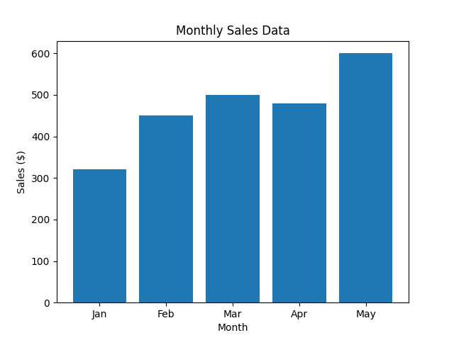
plt.bar() を使用して縦棒グラフを作成する
このステップでは、準備したデータを使用して縦棒グラフを作成します。これに使用する主な関数は plt.bar() です。この関数は、x 軸のカテゴリとそれに対応する y 軸の値を指定して棒を描画します。
以下のコード行を main.py ファイルの末尾に追加してください。この新しいコードは、グラフを生成し、ラベルとタイトルを追加し、画像ファイルとして保存します。
## Create the bar chart
plt.bar(categories, values)

## Add title and labels
plt.title('Monthly Sales Data')
plt.xlabel('Month')
plt.ylabel('Sales ($)')

## Save the plot to a file
plt.savefig('/home/labex/project/vertical_bar_chart.png')

print("Vertical bar chart saved as vertical_bar_chart.png")
新しいコードの説明は以下の通りです。
plt.bar(categories, values): これは棒グラフを作成する中心的な関数です。categoriesリストを x 軸に、valuesリストを y 軸の棒の高さにマッピングします。plt.title(),plt.xlabel(),plt.ylabel(): これらの関数は、それぞれグラフにタイトルを付け、x 軸と y 軸にラベルを追加し、グラフを理解しやすくします。plt.savefig(...): GUI 環境ではないため、plt.show()でグラフを直接表示することはできません。代わりに、plt.savefig()は生成されたグラフをファイルに保存します。ここでは、~/projectディレクトリにvertical_bar_chart.pngとして保存しています。
次に、ターミナルからスクリプトを実行します。
python3 main.py
以下の出力が表示されるはずです。
Vertical bar chart saved as vertical_bar_chart.png
vertical_bar_chart.png という名前の新しいファイルがファイルエクスプローラーに表示されます。それをダブルクリックして、最初の棒グラフを確認してください!
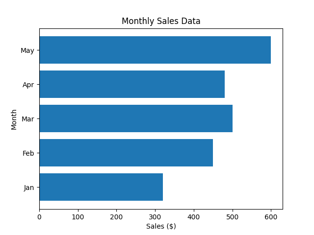
plt.barh() を使用して横棒グラフを作成する
このステップでは、横棒グラフの作成方法を学びます。これは、縦棒グラフでは重なってしまう可能性のある長いカテゴリラベルがある場合に便利です。Matplotlib はこの目的のために plt.barh() 関数を提供しており、これは plt.bar() と同様に機能しますが、棒を水平方向に描画します。
main.py ファイルを修正して、plt.bar() の代わりに plt.barh() を使用します。plt.barh() の場合、パラメータは y (カテゴリ) と width (値) であることに注意してください。また、xlabel と ylabel を入れ替える必要があります。
main.py ファイルのプロット部分を以下のコードに置き換えてください。
## Create the horizontal bar chart
plt.barh(categories, values)

## Add title and labels
plt.title('Monthly Sales Data')
plt.xlabel('Sales ($)')
plt.ylabel('Month')

## Save the plot to a file
plt.savefig('/home/labex/project/horizontal_bar_chart.png')

print("Horizontal bar chart saved as horizontal_bar_chart.png")
これで、main.py 全体は以下のようになります。
import matplotlib.pyplot as plt

## Data for the bar chart
categories = ['Jan', 'Feb', 'Mar', 'Apr', 'May']
values = [320, 450, 500, 480, 600]

## Create the horizontal bar chart
plt.barh(categories, values)

## Add title and labels
plt.title('Monthly Sales Data')
plt.xlabel('Sales ($)')
plt.ylabel('Month')

## Save the plot to a file
plt.savefig('/home/labex/project/horizontal_bar_chart.png')

print("Horizontal bar chart saved as horizontal_bar_chart.png")
次に、更新されたスクリプトをターミナルから実行します。
python3 main.py
以下の出力が表示されます。
Horizontal bar chart saved as horizontal_bar_chart.png
プロジェクトディレクトリで新しいファイル horizontal_bar_chart.png を確認し、開いて横棒グラフを表示してください。
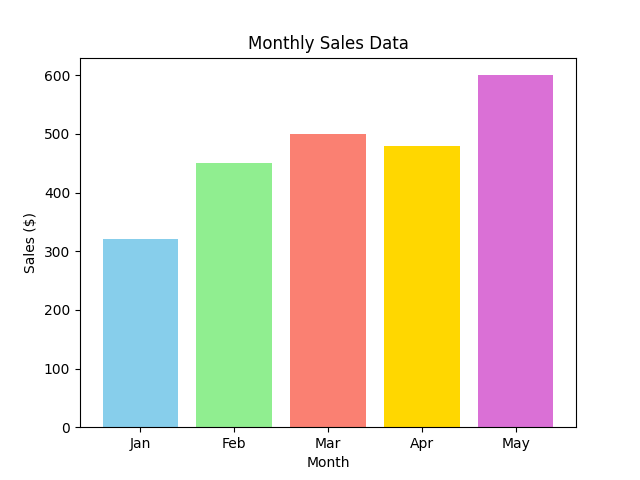
color パラメータを使用して棒の色をカスタマイズする
このステップでは、グラフに色を追加して棒グラフを強化します。Matplotlib では、plt.bar() または plt.barh() 関数の color パラメータを使用して、棒の色を簡単に変更できます。すべての棒に単一の色を設定することも、各棒を個別に色付けするために色のリストを提供することもできます。
縦棒グラフに戻り、各棒に異なる色を付けましょう。main.py ファイルを更新して色のリストを含め、それを plt.bar() 関数に渡します。
main.py ファイルは次のように更新する必要があります。
import matplotlib.pyplot as plt

## Data for the bar chart
categories = ['Jan', 'Feb', 'Mar', 'Apr', 'May']
values = [320, 450, 500, 480, 600]
colors = ['skyblue', 'lightgreen', 'salmon', 'gold', 'orchid']

## Create the bar chart with custom colors
plt.bar(categories, values, color=colors)

## Add title and labels
plt.title('Monthly Sales Data')
plt.xlabel('Month')
plt.ylabel('Sales ($)')

## Save the plot to a file
plt.savefig('/home/labex/project/colored_bar_chart.png')

print("Colored bar chart saved as colored_bar_chart.png")
このコードでは:
- グラフの各棒に対応する色のリストである
colorsリストを定義しました。 - このリストを
plt.bar(categories, values, color=colors)のcolorパラメータに渡しました。 - 前の作業を上書きしないように、出力ファイル名を
colored_bar_chart.pngに変更しました。
ターミナルからスクリプトを実行します。
python3 main.py
出力は次のようになります。
Colored bar chart saved as colored_bar_chart.png
新しく作成された colored_bar_chart.png ファイルを開いて、カラフルな棒グラフを確認してください。
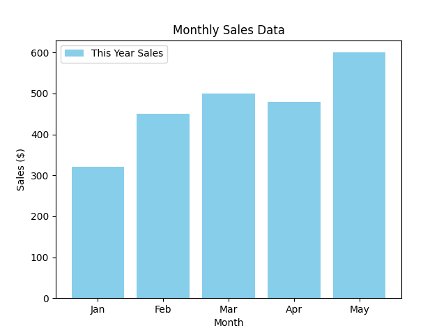
plt.legend() を使用して凡例を追加する
この最終ステップでは、グラフに凡例を追加する方法を学びます。凡例は、特に複数のデータセットをプロットしている場合に、グラフ内の異なる要素が何を表しているかを説明するために不可欠です。
凡例を追加するには、まずプロットデータに label を指定する必要があります。次に、plt.legend() 関数を呼び出して、グラフに凡例を表示します。
main.py スクリプトを修正して、売上データにラベルを追加し、凡例を表示しましょう。
main.py ファイルを以下のコードに更新してください。
import matplotlib.pyplot as plt

## Data for the bar chart
categories = ['Jan', 'Feb', 'Mar', 'Apr', 'May']
values = [320, 450, 500, 480, 600]

## Create the bar chart with a label
plt.bar(categories, values, color='skyblue', label='This Year Sales')

## Add title and labels
plt.title('Monthly Sales Data')
plt.xlabel('Month')
plt.ylabel('Sales ($)')

## Add the legend
plt.legend()

## Save the plot to a file
plt.savefig('/home/labex/project/bar_chart_with_legend.png')

print("Bar chart with legend saved as bar_chart_with_legend.png")
変更点は以下の通りです。
plt.bar()にlabel='This Year Sales'パラメータを追加しました。これにより、データセットに名前が割り当てられます。plt.legend()の呼び出しを追加しました。この関数は、プロット上のすべてのラベル付き要素を見つけて凡例ボックスを作成します。- 簡単にするために単一の色
'skyblue'を使用し、最終的なグラフをbar_chart_with_legend.pngとして保存しています。
スクリプトを最後にもう一度実行します。
python3 main.py
最終確認メッセージが表示されます。
Bar chart with legend saved as bar_chart_with_legend.png
ファイルエクスプローラーから bar_chart_with_legend.png を開いてください。凡例が追加され、棒が正しく「This Year Sales」として識別されている棒グラフが表示されます。
まとめ
この実験を完了した皆さん、おめでとうございます!Matplotlib を使用した棒グラフの作成とカスタマイズの基本を習得しました。
この実験では、以下のことを学びました。
- プロット用のデータ(カテゴリと値)の準備。
plt.bar()を使用した縦棒グラフの作成。plt.barh()を使用した横棒グラフの作成。colorパラメータを使用した棒の外観のカスタマイズ。labelパラメータとplt.legend()関数を使用したグラフへの説明的な凡例の追加。
これらのスキルは、あらゆるデータ分析または可視化タスクに不可欠です。これで、カテゴリデータを比較するための明確で効果的な棒グラフを作成できます。さらに高度なプロットを作成するために、他の Matplotlib の機能も自由に試してみてください。