
はじめに
このステップバイステップのプロジェクトでは、HTML、CSS、JavaScript を使って、現代的で視覚的に魅力的な費用分担アプリケーションを作成します。このアプリケーションを使えば、グループ内の人々の間で費用を分担し、誰が誰に何を借りているかを計算できます。最初から始めて、プロジェクトを段階的に構築する各ステップをカバーします。
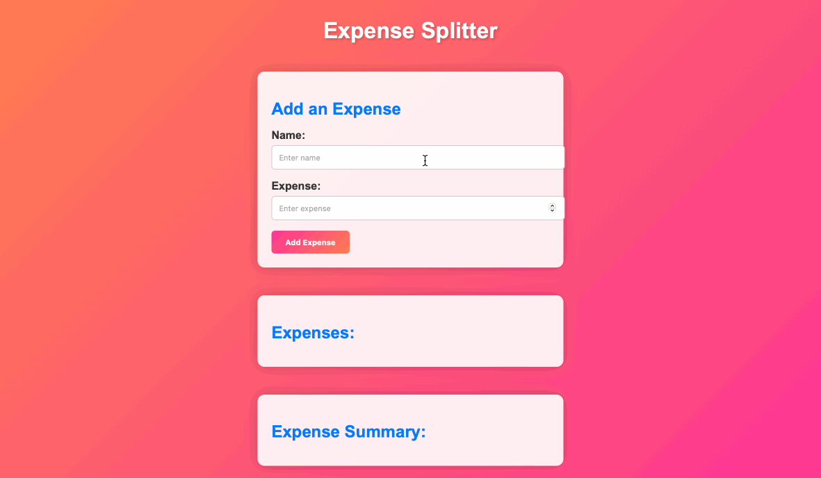
👀 プレビュー
🎯 タスク
このプロジェクトで学ぶことは以下の通りです。
- HTML と CSS を使ってレスポンシブな Web ページレイアウトを作成する方法
- JavaScript を使って費用と残高を計算するためのインタラクティブ機能を実装する方法
- Web ページを現代的で視覚的に魅力的なデザインにスタイリッシングする方法
- 費用の追加と結果の動的表示のためのユーザー入力を処理する方法
- データの正確性を保証し、問題を防止するためのエラーハンドリングを実装する方法
🏆 成果
このプロジェクトを完了すると、以下のことができるようになります。
- プロジェクトファイルを作成し、Web アプリケーションの基本構造をセットアップする
- 費用分担アプリの HTML 構造を構築し、入力フィールドとプレースホルダを含める
- CSS を使って Web アプリケーションをスタイリッシングし、現代的でカラフルなデザインを実現する
- 費用の追加、費用リストの更新、費用の要約を計算するための JavaScript 機能を実装する
- アプリをインタラクティブにするためのイベントリスナーを追加する
- 費用の追加や要約の更新など、特定のタスクを実行するための JavaScript 関数を作成する
HTML 構造を作成する
要件:
index.htmlの<body>内に、アプリケーションの HTML 構造を作成する。- 費用の追加、費用リストの表示、費用の要約の表示用のプレースホルダを含める。
機能:
- 入力フィールドとボタンを備えたアプリケーションの視覚的構造を作成する。
手順:
index.html を開き、HTML 構造を以下のように更新する。
<!-- <body> タグの中 -->

<div class="container">
  <h1>費用分担アプリ</h1>

  <div class="input-card">
    <h2>費用を追加する</h2>
    <div class="input-group">
      <label for="name">名前:</label>
      <input type="text" id="name" placeholder="名前を入力" />
    </div>
    <div class="input-group">
      <label for="expense">費用:</label>
      <input type="number" id="expense" placeholder="費用を入力" />
    </div>
    <button id="addExpense">費用を追加する</button>
  </div>

  <div class="expense-card">
    <h2>費用:</h2>
    <ul id="expenses"></ul>
  </div>

  <div class="summary-card">
    <h2>費用の要約:</h2>
    <ul id="summary"></ul>
  </div>
</div>
CSS でアプリをスタイリッシュにする
要件:
styles.cssに、アプリをスタイリッシングするための CSS ルールを追加する。- CSS を使って現代的でカラフルなデザインを作成する。
機能:
CSS スタイルを適用して、アプリを視覚的に魅力的にする。
手順:
styles.css を開き、以下の CSS コードを追加する。
body {
  font-family: Arial, sans-serif;
  background: linear-gradient(135deg, #ff7f50, #ff3399);
  margin: 0;
  padding: 0;
  color: #333;
}

.container {
  display: flex;
  flex-direction: column;
  align-items: center;
  min-height: 100vh;
  padding: 20px;
}

h1 {
  font-size: 2rem;
  margin: 20px 0;
  color: #fff;
  text-shadow: 2px 2px 4px rgba(0, 0, 0, 0.2);
}

.input-card,
.expense-card,
.summary-card {
  background: rgba(255, 255, 255, 0.9);
  box-shadow: 0px 0px 20px rgba(0, 0, 0, 0.2);
  border-radius: 10px;
  padding: 20px;
  margin: 20px 0;
  width: 100%;
  max-width: 400px;
  text-align: left;
}

.input-card h2,
.expense-card h2,
.summary-card h2 {
  color: #007bff;
  font-size: 1.5rem;
  margin-bottom: 15px;
}

.input-group {
  margin-bottom: 15px;
}

label {
  display: block;
  margin-bottom: 5px;
  font-weight: bold;
}

input[type="text"],
input[type="number"] {
  width: 100%;
  padding: 10px;
  border: 1px solid #ccc;
  border-radius: 5px;
}

button {
  background: linear-gradient(135deg, #ff3399, #ff7f50);
  color: #fff;
  padding: 10px 20px;
  border: none;
  border-radius: 5px;
  cursor: pointer;
  font-weight: bold;
  transition: background 0.3s ease;
}

button:hover {
  background: linear-gradient(135deg, #ff7f50, #ff3399);
}

ul {
  list-style: none;
  padding: 0;
  margin: 0;
}

li {
  margin-bottom: 10px;
}

/* カード用のアニメーション */
@keyframes fade-in {
  from {
    opacity: 0;
    transform: translateY(-10px);
  }

  to {
    opacity: 1;
    transform: translateY(0);
  }
}

.input-card,
.expense-card,
.summary-card {
  animation: fade-in 0.5s ease;
}
イベントリスナーを追加する
さて、JavaScript を使って費用分担アプリに機能を追加する時が来ました。費用の追加、費用リストの更新、費用の要約の計算を行います。
要件:
- HTML 内のボタンにイベントリスナーを追加する。
- ユーザーがアプリと対話する際に、イベントリスナーが適切なアクションをトリガーすることを確認する。
機能:
- ボタンクリックを監視することでアプリをインタラクティブにする。
手順:
script.js を開き、ボタンクリックを処理するために以下のコードを追加する。
// "費用を追加する" ボタンのイベントリスナー
document.getElementById("addExpense").addEventListener("click", addExpense);
addExpense 関数を実装する
要件:
script.jsにaddExpenseという名前の JavaScript 関数を作成する。- この関数は入力フィールドから値を抽出し、それらを検証し、費用を配列に追加する必要がある。
機能:
- ユーザーにアプリに費用を追加できるようにする。
手順:
script.js を開き、以下のコードを追加する。
const expenses = [];
// addExpense 関数を実装する
function addExpense() {
  const name = document.getElementById("name").value;
  const amount = parseFloat(document.getElementById("expense").value);

  if (name && amount) {
    // 費用を expenses 配列に追加する
    expenses.push({ name, amount });

    // 費用リストと要約を更新する
    updateExpenseList();
    document.getElementById("name").value = "";
    document.getElementById("expense").value = "";
  }
}
updateExpenseList 関数を実装する
要件:
script.jsにupdateExpenseListという名前の JavaScript 関数を作成する。- この関数は、Web ページに表示される費用リストを更新する必要がある。
機能:
- ユーザーが費用を追加すると、Web ページに費用のリストを表示する。
手順:
script.js を開き、以下のコードを追加する。
// updateExpenseList 関数を実装する
function updateExpenseList() {
  const expensesList = document.getElementById("expenses");
  expensesList.innerHTML = "";

  for (const expense of expenses) {
    const li = document.createElement("li");
    li.textContent = `${expense.name}: $${expense.amount.toFixed(2)}`;
    expensesList.appendChild(li);
  }

  // updateSummary 関数を呼び出す
  updateSummary();
}
updateSummary 関数を実装する
要件:
script.jsにupdateSummaryという名前の JavaScript 関数を作成する。- この関数は、誰が誰に何を借金しているかを含む費用の要約を計算して表示する必要がある。
機能:
- ユーザーに費用の要約の概要を提供する。
手順:
script.js を開き、以下のコードを追加する。
// updateSummary 関数を実装する
function updateSummary() {
  const summaryList = document.getElementById("summary");
  summaryList.innerHTML = "";

  const totalExpense = expenses.reduce(
    (total, expense) => total + expense.amount,
    0
  );
  const averageExpense = totalExpense / expenses.length;

  for (const expense of expenses) {
    const balance = expense.amount - averageExpense;
    const li = document.createElement("li");

    if (balance > 0) {
      li.textContent = `${expense.name} owes $${balance.toFixed(2)} to others.`;
    } else if (balance < 0) {
      li.textContent = `${expense.name} is owed $${(-balance).toFixed(
        2
      )} by others.`;
    } else {
      li.textContent = `${expense.name} is settled up.`;
    }

    summaryList.appendChild(li);
  }
}
updateSummary 関数を実装する
- Web ブラウザで
index.htmlを開く。
- 費用を追加し、費用リストと要約が正しく更新されることを確認することでアプリをテストする。
- ページの表示は以下の通りである。
まとめ
このプロジェクトでは、現代的な費用分担 Web アプリを段階的に構築しました。プロジェクトファイルを作成し、HTML 構造を設定し、CSS スタイルを追加し、JavaScript 機能を実装しました。このアプリでは、現在、費用を追加し、費用リストを表示し、費用の要約を確認できます。さらに、スタイルをカスタマイズし、機能を追加することで、アプリの機能性と外観を向上させることができます。