简介
在本教程中,你将学习如何使用 Python 的 Matplotlib 库将 x 轴刻度标签移动到图表的顶部。默认情况下,Matplotlib 会将 x 轴标签放置在图表的底部。然而,有时为了获得更好的可视化效果,你可能希望将它们放置在顶部,特别是在处理数据密集的图表或可能与其他元素重叠的长标签时。
这种技术在数据可视化场景中特别有用,你可以通过它优化空间利用并提高图表的可读性。我们将创建一个简单的图表,并逐步学习如何操作刻度标签的位置。
虚拟机使用提示
虚拟机启动完成后,点击左上角切换到 Notebook 标签页,即可访问 Jupyter Notebook 进行练习。
你可能需要等待几秒钟,直到 Jupyter Notebook 加载完成。由于 Jupyter Notebook 的限制,操作验证无法实现自动化。
如果你在本教程中遇到任何问题,请随时向 Labby 寻求帮助。请在课程结束后提供反馈,以便我们及时解决任何问题。
了解 Matplotlib 并创建 Notebook
在第一步中,你将了解 Matplotlib 并创建一个新的 Jupyter Notebook 来完成可视化任务。
什么是 Matplotlib?
Matplotlib 是一个用于在 Python 中创建静态、动态和交互式可视化图表的综合库。它提供了面向对象的 API,可将图表嵌入到应用程序中,被科学家、工程师和数据分析师广泛用于数据可视化。
创建新的 Notebook
在 Notebook 的第一个单元格中,让我们导入 Matplotlib 库。输入以下代码,然后按 Shift + Enter 运行该单元格:
import matplotlib.pyplot as plt
import numpy as np

## Check the Matplotlib version
print(f"NumPy version: {np.__version__}")
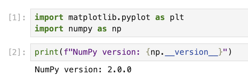
运行此代码时,你应该会看到类似以下的输出:
NumPy version: 2.0.0
确切的版本号可能会因你的环境而异。
现在,你已经成功导入了 Matplotlib 并可以使用它了。plt 是 pyplot 模块的常用别名,它提供了类似 MATLAB 的接口来创建图表。
使用默认设置创建基本图表
既然你已经导入了 Matplotlib,那么让我们使用默认设置创建一个简单的图表,以了解默认情况下坐标轴和刻度标签的位置。
了解 Matplotlib 组件
在 Matplotlib 中,图表由多个组件组成:
- Figure(图形):图表的整体容器
- Axes(坐标轴):使用自身坐标系绘制数据的区域
- Axis(轴):定义坐标系的类似数轴的对象
- Ticks(刻度):坐标轴上表示特定值的标记
- Tick Labels(刻度标签):指示每个刻度处数值的文本标签
默认情况下,x 轴刻度标签显示在图表的底部。
创建简单图表
在 Notebook 的新单元格中,让我们创建一个简单的折线图:
## Create a figure and a set of axes
fig, ax = plt.subplots(figsize=(8, 5))

## Generate some data
x = np.arange(0, 10, 1)
y = np.sin(x)

## Plot the data
ax.plot(x, y, marker='o', linestyle='-', color='blue', label='sin(x)')

## Add a title and labels
ax.set_title('A Simple Sine Wave Plot')
ax.set_xlabel('X-axis')
ax.set_ylabel('Y-axis (sin(x))')

## Add a grid and legend
ax.grid(True, linestyle='--', alpha=0.7)
ax.legend()

## Display the plot
plt.show()

print("Notice that the x-axis tick labels are at the bottom of the plot by default.")
运行此代码时,你将看到一个正弦波图表,x 轴刻度标签位于图表底部,这是 Matplotlib 中的默认位置。
花点时间观察图表的结构以及刻度标签的位置。这种理解将有助于你理解下一步所做的更改。
将 X 轴刻度标签移至顶部
既然你已经了解了刻度标签的默认位置,那么让我们把 x 轴刻度标签移到图表的顶部。
了解刻度参数
Matplotlib 提供了 tick_params() 方法来控制刻度和刻度标签的外观。该方法允许你:
- 显示/隐藏刻度和刻度标签
- 更改它们的位置(顶部、底部、左侧、右侧)
- 调整它们的大小、颜色和其他属性
创建 X 轴刻度标签位于顶部的图表
让我们创建一个新的图表,将 x 轴刻度标签移到顶部:
## Create a new figure and a set of axes
fig, ax = plt.subplots(figsize=(8, 5))

## Generate some data
x = np.arange(0, 10, 1)
y = np.cos(x)

## Plot the data
ax.plot(x, y, marker='s', linestyle='-', color='green', label='cos(x)')

## Move the x-axis tick labels to the top
ax.tick_params(
    axis='x',         ## Apply changes to the x-axis
    top=True,         ## Show ticks on the top side
    labeltop=True,    ## Show tick labels on the top side
    bottom=False,     ## Hide ticks on the bottom side
    labelbottom=False ## Hide tick labels on the bottom side
)

## Add a title and labels
ax.set_title('Cosine Wave with X-Axis Tick Labels at the Top')
ax.set_xlabel('X-axis (now at the top!)')
ax.set_ylabel('Y-axis (cos(x))')

## Add a grid and legend
ax.grid(True, linestyle='--', alpha=0.7)
ax.legend()

## Display the plot
plt.show()

print("Now the x-axis tick labels are at the top of the plot!")
运行此代码时,你将看到一个余弦波图表,x 轴刻度标签位于图表的顶部。
注意 tick_params() 方法是如何使用多个参数的:
axis='x':指定要修改 x 轴top=True和labeltop=True:使顶部的刻度和标签可见bottom=False和labelbottom=False:隐藏底部的刻度和标签
这样,你就能清晰地看到数据,并且 x 轴标签位于顶部而非底部。
进一步自定义图表
既然你已经将 x 轴刻度标签移到了顶部,那么让我们进一步自定义图表,使其更具视觉吸引力和信息性。
高级图表自定义技巧
Matplotlib 提供了众多自定义图表的选项。让我们来探索其中一些选项:
## Create a new figure and a set of axes
fig, ax = plt.subplots(figsize=(10, 6))

## Generate some data with more points for a smoother curve
x = np.linspace(0, 2*np.pi, 100)
y1 = np.sin(x)
y2 = np.cos(x)

## Plot multiple datasets
ax.plot(x, y1, linewidth=2, color='blue', label='sin(x)')
ax.plot(x, y2, linewidth=2, color='red', label='cos(x)')

## Fill the area between curves
ax.fill_between(x, y1, y2, where=(y1 > y2), alpha=0.3, color='green', interpolate=True)
ax.fill_between(x, y1, y2, where=(y1 <= y2), alpha=0.3, color='purple', interpolate=True)

## Move the x-axis tick labels to the top
ax.tick_params(
    axis='x',
    top=True,
    labeltop=True,
    bottom=False,
    labelbottom=False
)

## Customize tick labels
ax.set_xticks(np.arange(0, 2*np.pi + 0.1, np.pi/2))
ax.set_xticklabels(['0', 'π/2', 'π', '3π/2', '2π'])

## Add title and labels with custom styles
ax.set_title('Sine and Cosine Functions with Customized X-Axis Labels at the Top',
             fontsize=14, fontweight='bold', pad=20)
ax.set_xlabel('Angle (radians)', fontsize=12)
ax.set_ylabel('Function Value', fontsize=12)

## Add a grid and customize its appearance
ax.grid(True, linestyle='--', alpha=0.7, which='both')

## Customize the axis limits
ax.set_ylim(-1.2, 1.2)

## Add a legend with custom location and style
ax.legend(loc='upper right', fontsize=12, framealpha=0.8)

## Add annotations to highlight important points
ax.annotate('Maximum', xy=(np.pi/2, 1), xytext=(np.pi/2, 1.1),
            arrowprops=dict(facecolor='black', shrink=0.05, width=1.5),
            fontsize=10, ha='center')

## Display the plot
plt.tight_layout()  ## Adjust spacing for better appearance
plt.show()

print("We have created a fully customized plot with x-axis tick labels at the top!")
运行此代码时,你将看到一个更加精致、专业的图表,它具有以下特点:
- 两条曲线(正弦和余弦)
- 曲线之间的彩色区域
- 自定义刻度标签(使用 π 符号)
- 指向关键特征的注释
- 更好的间距和样式
注意,你使用 tick_params() 方法将 x 轴刻度标签保持在顶部,同时通过额外的自定义增强了图表的效果。
理解自定义设置
让我们详细分析一下添加的一些关键自定义设置:
fill_between():在正弦和余弦曲线之间创建彩色区域set_xticks()和set_xticklabels():自定义刻度位置和标签tight_layout():自动调整图表间距,以获得更好的外观annotate():添加带有箭头指向特定点的文本- 对各种元素进行字体、颜色和样式的自定义
这些自定义设置展示了你如何在将 x 轴刻度标签保持在顶部的同时,创建出具有视觉吸引力和信息性的图表。
保存并分享你的图表
最后一步是保存你自定义的图表,这样你就可以将其包含在报告、演示文稿中,或者与他人分享。
以不同格式保存图表
Matplotlib 允许你以多种格式保存图表,包括 PNG、JPG、PDF、SVG 等。让我们学习如何以不同格式保存图表:
## Create a plot similar to our previous customized one
fig, ax = plt.subplots(figsize=(10, 6))

## Generate data
x = np.linspace(0, 2*np.pi, 100)
y1 = np.sin(x)
y2 = np.cos(x)

## Plot the data
ax.plot(x, y1, linewidth=2, color='blue', label='sin(x)')
ax.plot(x, y2, linewidth=2, color='red', label='cos(x)')

## Move the x-axis tick labels to the top
ax.tick_params(
    axis='x',
    top=True,
    labeltop=True,
    bottom=False,
    labelbottom=False
)

## Customize tick labels
ax.set_xticks(np.arange(0, 2*np.pi + 0.1, np.pi/2))
ax.set_xticklabels(['0', 'π/2', 'π', '3π/2', '2π'])

## Add title and labels
ax.set_title('Plot with X-Axis Labels at the Top', fontsize=14)
ax.set_xlabel('X-axis at the top')
ax.set_ylabel('Y-axis')

## Add grid and legend
ax.grid(True)
ax.legend()

## Save the figure in different formats
plt.savefig('plot_with_top_xlabels.png', dpi=300, bbox_inches='tight')
plt.savefig('plot_with_top_xlabels.pdf', bbox_inches='tight')
plt.savefig('plot_with_top_xlabels.svg', bbox_inches='tight')

## Show the plot
plt.show()

print("The plot has been saved in PNG, PDF, and SVG formats in the current directory.")
运行此代码时,图表将以三种不同格式保存:
- PNG:一种光栅图像格式,适用于网页和一般用途
- PDF:一种矢量格式,非常适合出版物和报告
- SVG:一种矢量格式,非常适合网页和可编辑图形
这些文件将保存在你的 Jupyter 笔记本的当前工作目录中。
理解保存参数
让我们来看看 savefig() 使用的参数:
dpi=300:为 PNG 等光栅格式设置分辨率(每英寸点数)bbox_inches='tight':自动调整图形边界,以包含所有元素,且无多余空白
查看保存的文件
你可以通过导航到 Jupyter 的文件浏览器来查看保存的文件:
- 点击左上角的“Jupyter”徽标
- 在文件浏览器中,你应该能看到保存的图像文件
- 点击任何文件即可查看或下载
其他图表导出选项
为了更精确地控制保存的图表,你可以根据需要自定义图形大小、调整背景或更改 DPI:
## Control the background color and transparency
fig.patch.set_facecolor('white')  ## Set figure background color
fig.patch.set_alpha(0.8)          ## Set background transparency

## Save with custom settings
plt.savefig('custom_background_plot.png',
            dpi=400,              ## Higher resolution
            facecolor=fig.get_facecolor(),  ## Use the figure's background color
            edgecolor='none',     ## No edge color
            bbox_inches='tight',  ## Tight layout
            pad_inches=0.1)       ## Add a small padding

print("A customized plot has been saved with specialized export settings.")
这展示了如何精确控制输出格式和外观来保存图表。
总结
在本教程中,你学习了如何使用 Matplotlib 将 x 轴刻度标签从默认的底部位置移动到图表的顶部。当处理带有长标签的图表或需要优化空间使用时,这种技术非常有用。
我们涵盖了以下关键点:
- 了解 Matplotlib 的基础知识及其组件,包括图形(figure)、坐标轴(axes)和刻度标签
- 创建具有默认设置的简单图表,以观察 x 轴刻度标签的标准位置
- 使用
tick_params()方法将 x 轴刻度标签移动到图表的顶部 - 通过额外的自定义来增强图表,使其更具信息性和视觉吸引力
- 以各种格式保存图表,以便分享和发布
这些知识使你能够创建更易读、更专业的可视化图表,特别是在处理复杂数据集或有特定布局要求的图表时。
为了进一步学习,你可以探索 Matplotlib 的其他自定义选项,例如:
- 创建具有不同刻度标签位置的子图
- 自定义刻度和刻度标签的外观(颜色、字体、大小等)
- 处理不同类型的图表,如条形图、散点图或直方图,并自定义刻度位置
Matplotlib 的灵活性允许进行广泛的自定义,以满足你特定的可视化需求。