
介绍
在数据可视化中,在一个图中显示多个图表通常很有用。这可以方便地比较不同的数据集或同一数据的不同视图。Matplotlib 提供了一种强大而便捷的方式来创建此类图表,即使用子图(subplots)。
创建子图最常用的方法是使用 plt.subplots() 函数。此函数在一个调用中创建图形(figure)和子图网格(grid of subplots),并返回一个 Figure 对象和一个 Axes 对象数组,每个对象代表一个单独的子图。
在本实验(Lab)中,你将学习如何:
- 创建一个包含多个子图的图形。
- 在特定的子图上绘制数据。
- 调整布局以防止图表重叠。
- 在子图之间共享坐标轴(axes)以进行更清晰的比较。
你将在 WebIDE 中编写和执行 Python 脚本。由于此环境不支持交互式 GUI 窗口,你将把图表保存为图像文件,并在编辑器中直接查看它们。
使用 plt.subplots() 创建图形和坐标轴
在此步骤中,你将首先创建一个包含两个空子图的图形,这两个子图排列为一行两列。这是构建多图可视化的基础步骤。
我们将使用 plt.subplots() 函数。当你调用 plt.subplots(nrows, ncols) 时,它会返回两个项:
- 一个
Figure对象,这是绘制所有内容的总窗口或页面。我们通常将其赋值给一个名为fig的变量。 - 一个
Axes对象数组。每个Axes对象代表网格中的一个子图。你可以通过其索引来访问它们。对于一个(1, 2)的网格,我们可以将此数组解包到两个变量ax1和ax2中。
让我们编写代码。打开左侧文件浏览器中的 main.py 文件,并添加以下内容。此脚本将导入必要的库,创建一个带有两个子图的图形,并将其保存为名为 plot1.png 的图像文件。
import matplotlib.pyplot as plt
import numpy as np

## Create a figure and a set of subplots.
## 1 row, 2 columns.
fig, (ax1, ax2) = plt.subplots(1, 2)

## Save the figure to a file.
## The file will be created in the /home/labex/project directory.
plt.savefig('plot1.png')

print("Figure saved as plot1.png")
现在,从终端运行脚本以生成图表。
python3 main.py
你将在终端中看到以下输出:
Figure saved as plot1.png
一个名为 plot1.png 的新文件将出现在文件浏览器中。双击它即可查看包含两个空子图的第一个图形。
使用 ax1.plot() 在第一个子图上绘图
在此步骤中,你将学习如何在创建的特定 Axes 对象之一上绘制图表。每个 Axes 对象都有自己的绘图方法,例如 plot()、bar()、scatter() 等,这些方法与主 plt 接口中的函数类似。
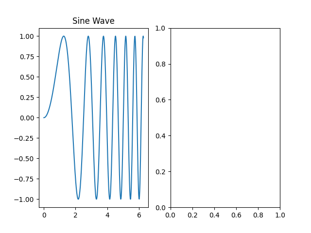
我们将在第一个子图上绘制一个简单的正弦波,该子图由 ax1 变量表示。我们还将使用 set_title() 方法为该子图添加标题。
使用以下代码更新你的 main.py 文件。我们将使用 NumPy 生成数据,然后将其绘制在 ax1 上。
import matplotlib.pyplot as plt
import numpy as np

## Create some data
x = np.linspace(0, 2 * np.pi, 400)
y = np.sin(x ** 2)

## Create a figure and a set of subplots
fig, (ax1, ax2) = plt.subplots(1, 2)

## Plot on the first subplot (ax1)
ax1.plot(x, y)
ax1.set_title('Sine Wave')

## Save the figure to a new file
plt.savefig('plot2.png')

print("Figure saved as plot2.png")
现在,在终端中执行更新后的脚本。
python3 main.py
你将看到此输出:
Figure saved as plot2.png
一个名为 plot2.png 的新文件现在位于你的项目目录中。打开它以查看结果。左侧的子图现在应该包含一个正弦波图,而右侧的子图仍然是空的。
使用 ax2.plot() 在第二个子图上绘图
在此步骤中,你将通过在第二个子图上添加一个图表来完成图形的绘制。这个过程与上一步相同,但这次你将对 ax2 对象调用 plot() 方法。
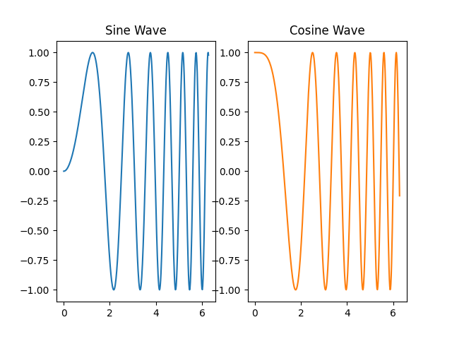
让我们在第二个子图上绘制一个余弦波,并将其与正弦波进行比较。我们还将为其添加一个标题。
修改你的 main.py 文件,以包含在第二个坐标轴上的绘图。
import matplotlib.pyplot as plt
import numpy as np

## Create some data
x = np.linspace(0, 2 * np.pi, 400)
y1 = np.sin(x ** 2)
y2 = np.cos(x ** 2)

## Create a figure and a set of subplots
fig, (ax1, ax2) = plt.subplots(1, 2)

## Plot on the first subplot (ax1)
ax1.plot(x, y1)
ax1.set_title('Sine Wave')

## Plot on the second subplot (ax2)
ax2.plot(x, y2, 'tab:orange')
ax2.set_title('Cosine Wave')

## Save the figure to a new file
plt.savefig('plot3.png')

print("Figure saved as plot3.png")
在上面的代码中,我们在 ax2.plot() 调用中添加了 'tab:orange' 来更改线条颜色,使图表在视觉上更具区分度。
再次从终端运行脚本。
python3 main.py
输出将是:
Figure saved as plot3.png
现在,打开 plot3.png。你将看到一个完整的图形,其中包含并排的两个图表。但是,你可能会注意到标题或坐标轴标签可能有些拥挤。我们将在下一步解决这个问题。
使用 plt.tight_layout() 调整子图布局
在此步骤中,你将学习如何自动调整子图之间的间距,以防止标题和标签重叠。Matplotlib 提供了一个简单的函数来实现此目的:plt.tight_layout()。
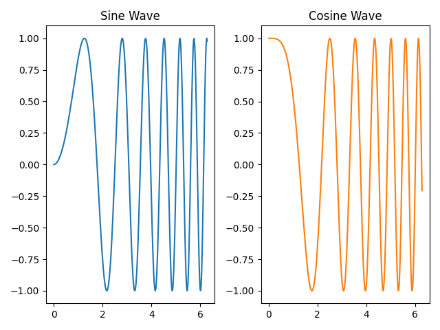
此函数会检查图形上所有元素的边界框(例如标题、标签和图表本身),并调整子图参数,使所有内容都能整齐地排列而不重叠。在保存或显示图表之前调用它是一个好习惯。
让我们将 plt.tight_layout() 添加到我们的脚本中。按如下方式更新 main.py:
import matplotlib.pyplot as plt
import numpy as np

## Create some data
x = np.linspace(0, 2 * np.pi, 400)
y1 = np.sin(x ** 2)
y2 = np.cos(x ** 2)

## Create a figure and a set of subplots
fig, (ax1, ax2) = plt.subplots(1, 2)

## Plot on the first subplot (ax1)
ax1.plot(x, y1)
ax1.set_title('Sine Wave')

## Plot on the second subplot (ax2)
ax2.plot(x, y2, 'tab:orange')
ax2.set_title('Cosine Wave')

## Adjust layout to prevent overlap
plt.tight_layout()

## Save the figure to a new file
plt.savefig('plot4.png')

print("Figure saved as plot4.png")
唯一的改动是添加了 plt.tight_layout() 这一行。现在,运行脚本。
python3 main.py
输出:
Figure saved as plot4.png
打开 plot4.png 并将其与 plot3.png 进行比较。你应该会注意到两个子图之间的间距得到了优化,从而使图形看起来更整洁、更专业。
使用 sharex=True 或 sharey=True 共享坐标轴
在此步骤中,你将学习如何创建共享公共坐标轴的子图。当你比较具有相同 x 轴或 y 轴比例的数据集时,这尤其有用。当坐标轴共享时,在一个子图上进行缩放或平移会自动更新另一个子图。它还可以通过移除冗余的刻度标签来帮助整理图形。
你可以通过将 sharex=True 或 sharey=True 参数传递给 plt.subplots() 来启用坐标轴共享。
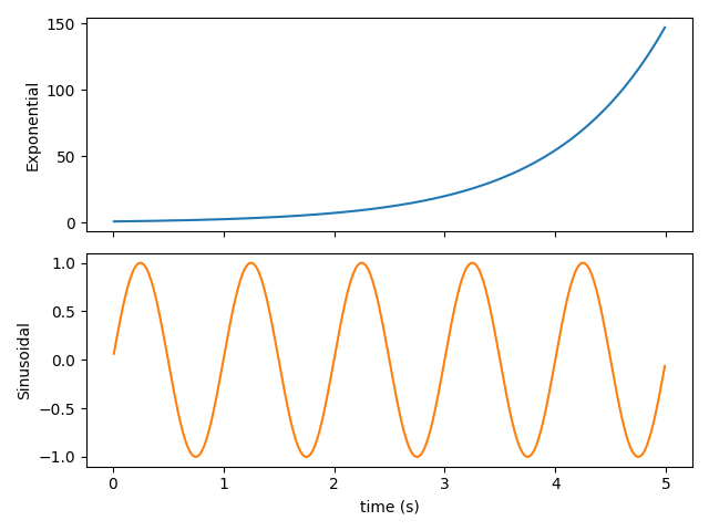
为了演示这一点,让我们创建一个新脚本。在你的项目目录中创建一个名为 shared_axes.py 的文件,并添加以下代码。此示例将创建两个垂直堆叠的子图(nrows=2, ncols=1),它们共享相同的 x 轴。
import matplotlib.pyplot as plt
import numpy as np

## Create data
t = np.arange(0.01, 5.0, 0.01)
s1 = np.exp(t)
s2 = np.sin(2 * np.pi * t)

## Create a figure and two subplots that share the x-axis
fig, (ax1, ax2) = plt.subplots(2, 1, sharex=True)

## Plot on the first subplot
ax1.plot(t, s1, 'tab:blue')
ax1.set_ylabel('Exponential')

## Plot on the second subplot
ax2.plot(t, s2, 'tab:orange')
ax2.set_ylabel('Sinusoidal')
ax2.set_xlabel('time (s)')

## Adjust layout
plt.tight_layout()

## Save the figure
plt.savefig('plot5.png')

print("Figure saved as plot5.png")
现在,从终端运行这个新脚本。
python3 shared_axes.py
输出:
Figure saved as plot5.png
打开 plot5.png。请注意,x 轴刻度标签仅显示在底部子图(ax2)上。这是因为 sharex=True 会自动隐藏内部的 x 轴标签,以获得更整洁的外观。两个图表在 x 轴上完美对齐,便于比较。
总结
恭喜你完成了本次实验!你已经掌握了在 Matplotlib 中创建和管理子图的基本技术。
在本次实验中,你练习了:
- 使用
plt.subplots()创建带有子图网格的图形。 - 访问单个
Axes对象并使用其方法绘制数据。 - 为特定子图添加标题。
- 使用
plt.tight_layout()自动调整间距并防止元素重叠。 - 使用
sharex=True创建共享坐标轴的子图,以实现更清晰的数据比较和更整洁的图形。
这些技能对于创建复杂且信息丰富的可视化至关重要。你现在可以构建能够在一个连贯视图中有效比较多个数据集的图形。