
介绍
条形图是数据可视化中的基本工具,用于比较不同类别的值。它们用矩形条表示数据,条的长度与其表示的值成正比。
在本实验中,你将学习如何使用 Python 中的 Matplotlib 库来创建条形图。你将从准备数据开始,然后创建垂直和水平条形图,用颜色自定义它们的外观,最后添加图例使你的图表更具信息量。所有绘图都将通过编写 Python 脚本完成,并将图表保存为图像文件,你可以在 LabEx 环境中直接查看这些文件。
准备类别和值列表
在此步骤中,你将开始为我们的条形图设置基本数据。条形图需要两个主要组件:用于坐标轴的类别列表和决定条形大小的相应数值列表。
我们将使用一个代表月度销售数据的简单数据集。首先,从左侧的文件浏览器中打开位于 ~/project 目录下的 main.py 文件。
现在,将以下 Python 代码添加到 main.py 文件中。此代码导入了必要的 Matplotlib 库并定义了我们的数据。
import matplotlib.pyplot as plt

## Data for the bar chart
categories = ['Jan', 'Feb', 'Mar', 'Apr', 'May']
values = [320, 450, 500, 480, 600]
让我们分解一下这段代码:
import matplotlib.pyplot as plt: 此行从matplotlib库导入pyplot模块,并为其赋予约定俗成的别名plt。我们将使用plt来调用绘图函数。categories = ['Jan', 'Feb', 'Mar', 'Apr', 'May']: 此列表包含我们 x 轴的标签。每个字符串代表一个类别。values = [320, 450, 500, 480, 600]: 此列表包含与每个类别对应的数值数据。例如,'Jan' 的销售额为 320。
添加代码后,保存 main.py 文件。在下一步中,我们将使用这些数据创建我们的第一个条形图。
使用 plt.bar() 创建垂直条形图
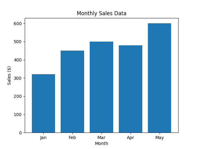
在此步骤中,你将使用准备好的数据创建垂直条形图。主要使用的函数是 plt.bar()。此函数接收 x 轴的类别及其对应的 y 轴值来绘制条形。
将以下代码行添加到你的 main.py 文件末尾。这段新代码将生成图表,添加标签和标题,并将其保存为图像文件。
## Create the bar chart
plt.bar(categories, values)

## Add title and labels
plt.title('Monthly Sales Data')
plt.xlabel('Month')
plt.ylabel('Sales ($)')

## Save the plot to a file
plt.savefig('/home/labex/project/vertical_bar_chart.png')

print("Vertical bar chart saved as vertical_bar_chart.png")
以下是对新代码的解释:
plt.bar(categories, values): 这是创建条形图的核心函数。它将categories列表映射到 x 轴,将values列表映射到 y 轴上条形的高度。plt.title(),plt.xlabel(),plt.ylabel(): 这些函数分别向图表添加标题以及 x 轴和 y 轴的标签,使图表更易于理解。plt.savefig(...): 由于我们处于非 GUI 环境中,无法直接使用plt.show()显示图表。相反,plt.savefig()将生成的图表保存到文件中。我们将其保存为~/project目录下的vertical_bar_chart.png。
现在,在终端中运行你的脚本:
python3 main.py
你应该会看到以下输出:
Vertical bar chart saved as vertical_bar_chart.png
一个名为 vertical_bar_chart.png 的新文件将出现在你的文件浏览器中。双击它即可查看你的第一个条形图!
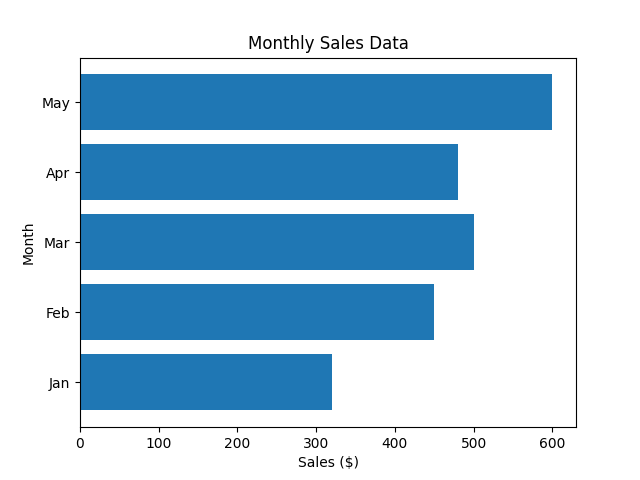
使用 plt.barh() 创建水平条形图
在此步骤中,你将学习如何创建水平条形图。当你拥有可能在垂直图表中重叠的长类别标签时,这会很有用。Matplotlib 为此提供了 plt.barh() 函数,其工作方式类似于 plt.bar(),但会水平绘制条形。
修改你的 main.py 文件,使用 plt.barh() 替换 plt.bar()。请注意,对于 plt.barh(),参数是 y(类别)和 width(值)。我们还需要交换 xlabel 和 ylabel。
将你的 main.py 文件中的绘图部分替换为以下代码:
## Create the horizontal bar chart
plt.barh(categories, values)

## Add title and labels
plt.title('Monthly Sales Data')
plt.xlabel('Sales ($)')
plt.ylabel('Month')

## Save the plot to a file
plt.savefig('/home/labex/project/horizontal_bar_chart.png')

print("Horizontal bar chart saved as horizontal_bar_chart.png")
完整的 main.py 现在应该如下所示:
import matplotlib.pyplot as plt

## Data for the bar chart
categories = ['Jan', 'Feb', 'Mar', 'Apr', 'May']
values = [320, 450, 500, 480, 600]

## Create the horizontal bar chart
plt.barh(categories, values)

## Add title and labels
plt.title('Monthly Sales Data')
plt.xlabel('Sales ($)')
plt.ylabel('Month')

## Save the plot to a file
plt.savefig('/home/labex/project/horizontal_bar_chart.png')

print("Horizontal bar chart saved as horizontal_bar_chart.png")
现在,在终端中运行更新后的脚本:
python3 main.py
你将看到此输出:
Horizontal bar chart saved as horizontal_bar_chart.png
在你的项目目录中检查新文件 horizontal_bar_chart.png,然后打开它以查看你的水平条形图。
使用 color 参数自定义条形图颜色
在此步骤中,你将通过添加颜色来增强你的条形图。Matplotlib 使你能够轻松地使用 plt.bar() 或 plt.barh() 函数中的 color 参数来更改条形的颜色。你可以为所有条形设置一种颜色,或者提供一个颜色列表来单独为每个条形着色。
让我们回到垂直条形图,为每个条形设置不同的颜色。修改你的 main.py 文件,包含一个颜色列表,并将其传递给 plt.bar() 函数。
你的 main.py 文件应更新为如下所示:
import matplotlib.pyplot as plt

## Data for the bar chart
categories = ['Jan', 'Feb', 'Mar', 'Apr', 'May']
values = [320, 450, 500, 480, 600]
colors = ['skyblue', 'lightgreen', 'salmon', 'gold', 'orchid']

## Create the bar chart with custom colors
plt.bar(categories, values, color=colors)

## Add title and labels
plt.title('Monthly Sales Data')
plt.xlabel('Month')
plt.ylabel('Sales ($)')

## Save the plot to a file
plt.savefig('/home/labex/project/colored_bar_chart.png')

print("Colored bar chart saved as colored_bar_chart.png")
在此代码中:
- 我们定义了一个
colors列表,其中每个颜色名称对应图表中的一个条形。 - 我们将此列表传递给
plt.bar(categories, values, color=colors)中的color参数。 - 我们将输出文件名更改为
colored_bar_chart.png,以避免覆盖我们之前的工作。
在终端中执行脚本:
python3 main.py
输出将是:
Colored bar chart saved as colored_bar_chart.png
打开新创建的 colored_bar_chart.png 文件,查看你多彩的条形图。
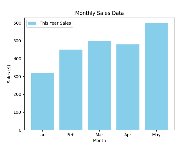
使用 plt.legend() 添加图例
在最后一步中,你将学习如何为图表添加图例。图例对于解释图表中不同元素代表的含义至关重要,尤其是在绘制多个数据集时。
要添加图例,你首先需要为你的绘图数据指定一个 label。然后,调用 plt.legend() 函数将图例显示在图表上。
让我们修改 main.py 脚本,为我们的销售数据添加一个标签,然后渲染图例。
将你的 main.py 文件更新为以下代码:
import matplotlib.pyplot as plt

## Data for the bar chart
categories = ['Jan', 'Feb', 'Mar', 'Apr', 'May']
values = [320, 450, 500, 480, 600]

## Create the bar chart with a label
plt.bar(categories, values, color='skyblue', label='This Year Sales')

## Add title and labels
plt.title('Monthly Sales Data')
plt.xlabel('Month')
plt.ylabel('Sales ($)')

## Add the legend
plt.legend()

## Save the plot to a file
plt.savefig('/home/labex/project/bar_chart_with_legend.png')

print("Bar chart with legend saved as bar_chart_with_legend.png")
以下是更改之处:
- 在
plt.bar()中,我们添加了label='This Year Sales'参数。这为我们的数据集分配了一个名称。 - 我们添加了
plt.legend()调用。此函数会查找图表上所有带标签的元素,并创建一个图例框。 - 为简单起见,我们使用了单一颜色
'skyblue',并将最终图表保存为bar_chart_with_legend.png。
最后一次运行脚本:
python3 main.py
你将看到最终的确认消息:
Bar chart with legend saved as bar_chart_with_legend.png
现在,从文件浏览器中打开 bar_chart_with_legend.png。你将看到你的条形图,其中包含一个图例,正确地将条形标识为“This Year Sales”。
总结
恭喜你完成了本次实验!你已成功掌握了使用 Matplotlib 创建和自定义条形图的基础知识。
在本次实验中,你学习了如何:
- 准备绘图数据(类别和值)。
- 使用
plt.bar()创建垂直条形图。 - 使用
plt.barh()创建水平条形图。 - 使用
color参数自定义条形的样式。 - 使用
label参数和plt.legend()函数为图表添加描述性图例。
这些技能对于任何数据分析或可视化任务都至关重要。你现在可以创建清晰有效的条形图来比较分类数据。欢迎尝试更多 Matplotlib 的功能,以创建更复杂的图表。