
介绍
在这个项目中,你将学习如何创建一个 Swiper 轮播网页应用程序,该应用程序具有视觉上吸引人的轮播布局,并带有宇宙主题的内容。该应用程序将允许用户浏览不同的幻灯片,并查看有关宇宙的有趣事实的卡片。
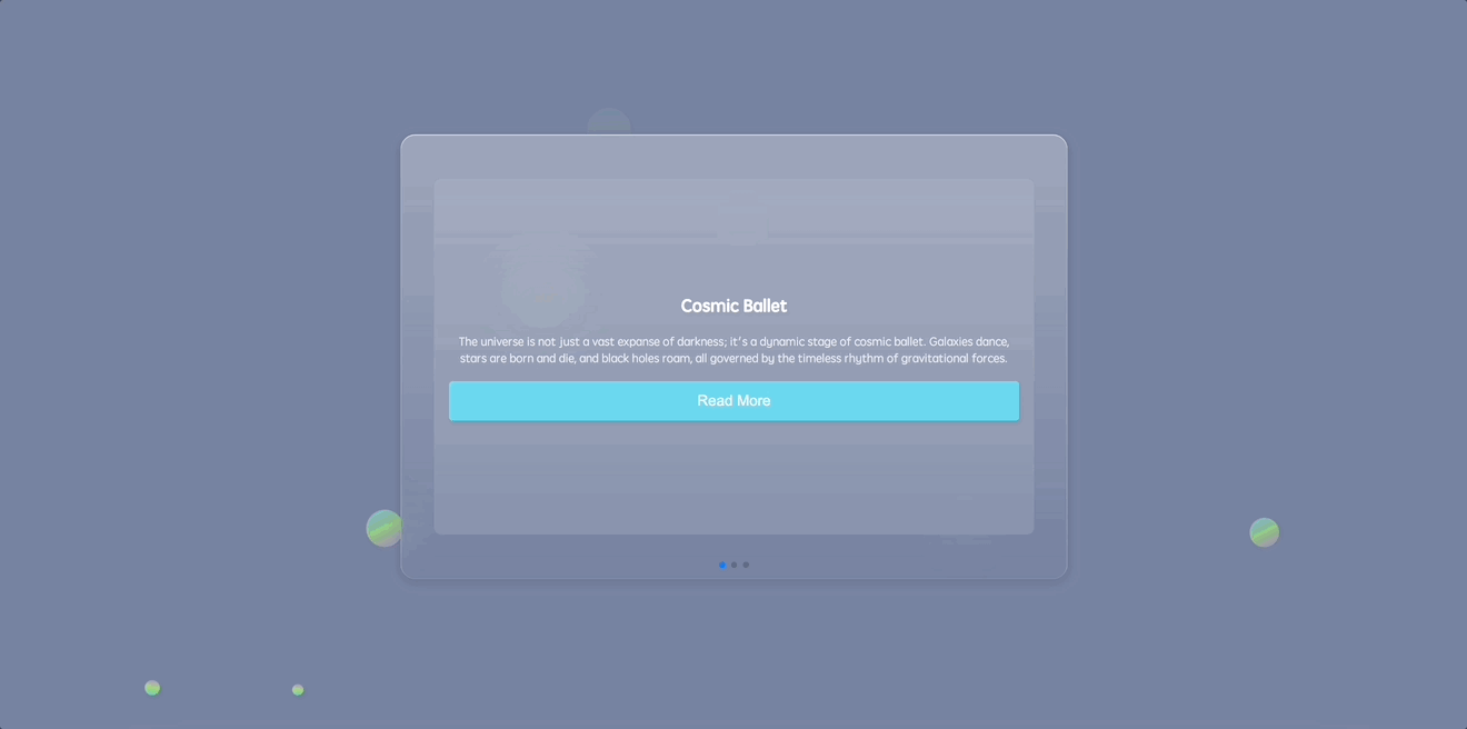
以下是 Swiper 轮播的预览:
🎯 任务
在这个项目中,你将学习:
- 如何构建网页应用程序的 HTML 骨架
- 如何将 Swiper 轮播嵌入到 HTML 结构中
- 如何在应用程序的背景中添加圆圈和动画浮动圆圈
- 如何实现基础 CSS 重置,以确保在不同浏览器上的样式一致
- 如何为应用程序的主要部分和内容容器设置样式
- 如何设计并为背景中的浮动圆圈设置动画
- 如何为 Swiper 轮播及其组件设置样式
- 如何使用 JavaScript 初始化 Swiper 轮播
🏆 成果
完成这个项目后,你将能够:
- 创建一个具有宇宙主题内容的视觉上吸引人的 Swiper 轮播网页应用程序
- 为网页应用程序实现 HTML 结构和布局
- 应用 CSS 样式和动画来增强用户界面
- 使用 JavaScript 初始化并配置 Swiper 轮播
构建 HTML 骨架
要求:
- 嵌入必要的元标签以定义字符集和视口设置。
- 链接到外部样式表和脚本。
功能:
- 生成一个基础的 HTML 布局以供后续构建。
步骤:
<!doctype html>
<html lang="en">
  <head>
    <meta charset="UTF-8" />
    <meta name="viewport" content="width=device-width, initial-scale=1.0" />
    <title>Swiper轮播</title>
    <link rel="stylesheet" href="./style.css" />
    <link
      rel="stylesheet"
      href="https://cdn.jsdelivr.net/npm/swiper@8/swiper-bundle.min.css"
    />
  </head>
  <body>
    <!-- 部分 -->
    <script src="https://cdnjs.cloudflare.com/ajax/libs/Swiper/8.4.5/swiper-bundle.min.js"></script>
    <!-- 接下来我们将插入 Swiper 轮播结构 -->
    <!-- 脚本:Swiper 库和我们的自定义逻辑 -->
    <script src="./script.js"></script>
  </body>
</html>
将轮播图嵌入 HTML
要求:
- 在 HTML 中有一个结构位置来容纳轮播的内容。
- 用于导航的分页元素。
功能:
- 嵌入一个可以设置样式并使其具有交互性的轮播布局。
步骤:
在 index.html 的<body>标签内追加以下内容:
<section>
  <div class="content">
    <div class="swiper">
      <div class="swiper-container">
        <div class="swiper-wrapper">
          <div class="swiper-slide">
            <div class="card">
              <h1>宇宙之舞</h1>
              <p>
                宇宙并非仅仅是一片广袤的黑暗;它是宇宙之舞的动态舞台。星系在舞动,恒星诞生又消亡,黑洞四处游弋,这一切都受引力永恒节奏的支配。
              </p>
              <button class="read-more">阅读更多</button>
            </div>
          </div>
          <div class="swiper-slide">
            <div class="card">
              <h1>黑暗秘密</h1>
              <p>
                尽管宇宙中有璀璨的恒星和星系,但它隐藏的比揭示的更多。暗物质和暗能量,无形且神秘,构成了宇宙的
                95%,维系着宇宙并推动其膨胀。
              </p>
              <button class="read-more">阅读更多</button>
            </div>
          </div>
          <div class="swiper-slide">
            <div class="card">
              <h1>时间的相对性</h1>
              <p>
                在广袤的宇宙中,时间是相对的。在像黑洞这样的大质量物体附近,时间似乎会变慢。在那里感觉像几分钟的时间,在其他地方可能相当于几年,这使得宇宙成为时间弹性的舞台。
              </p>
              <button class="read-more">阅读更多</button>
            </div>
          </div>
        </div>
        <!-- 添加分页 -->
        <div class="swiper-pagination"></div>
      </div>
    </div>
  </div>
</section>
将圆形嵌入 HTML
要求:
- 为了得到许多圆形气泡,添加
<ul>和<li>。
功能:
- 许多不同大小的气泡在页面背景中进行动画显示。
步骤:
<section>
  <!--轮播内容...-->
  <ul class="circles">
    <li></li>
    <li></li>
    <li></li>
    <li></li>
    <li></li>
    <li></li>
    <li></li>
    <li></li>
    <li></li>
    <li></li>
  </ul>
</section>
实现基础 CSS 重置
要求:
- 在不同浏览器上实现一致的外观。
- 重置浏览器默认的边距、内边距和盒尺寸。
功能:
- 消除任何浏览器默认样式,以确保我们的样式在各种浏览器上保持一致。
步骤:
*,
*::before,
*::after {
  margin: 0;
  padding: 0;
  box-sizing: border-box;
}
设计主要部分和内容容器的样式
要求:
- 一个占据整个视口的主要部分。
- 一个具有特定尺寸和样式且视觉上吸引人的内容容器。
功能:
- 对主要部分和内容容器进行样式设计,使其两者都居中对齐,并赋予它们宇宙主题的外观。
步骤:
section {
  position: relative;
  display: flex;
  justify-content: center;
  align-items: center;
  background: #7883a1;
  min-height: 100vh;
  overflow: hidden;
}

.content {
  display: flex;
  flex-direction: row;
  justify-content: center;
  align-items: center;
  background: linear-gradient(
    180deg,
    rgba(255, 255, 255, 0.28) 0%,
    rgba(255, 255, 255, 0) 100%
  );
  backdrop-filter: blur(30px);
  border-radius: 20px;
  width: min(900px, 100%);
  z-index: 10;
}
设计动画浮动圆圈
要求:
- 为主要部分设置动态背景。
- 有随时间移动并改变外观的浮动圆圈。
功能:
- 用动画渐变圆圈丰富背景,这些圆圈悬浮、旋转并改变不透明度,以增强用户参与度。
步骤:
.circles {
  position: absolute;
  top: 0;
  left: 0;
  width: 100%;
  height: 100%;
  overflow: hidden;
}

.circles li {
  position: absolute;
  display: block;
  list-style: none;
  width: 20px;
  height: 20px;
  background-color: #0f75c3;
  background-image: linear-gradient(
    225deg,
    #67d0f6 0%,
    #a7ec67 50%,
    #c27ee4 100%
  );
  animation: animate 10s linear infinite;
  bottom: -150px;
}

.circles li:nth-child(1) {
  left: 25%;
  width: 50px;
  height: 50px;
  animation-delay: 0s;
}

.circles li:nth-child(2) {
  left: 10%;
  width: 20px;
  height: 20px;
  animation-delay: 2s;
  animation-duration: 10s;
}

.circles li:nth-child(3) {
  left: 70%;
  width: 30px;
  height: 30px;
  animation-delay: 4s;
}

.circles li:nth-child(4) {
  left: 40%;
  width: 60px;
  height: 60px;
  animation-delay: 0s;
  animation-duration: 15s;
}

.circles li:nth-child(5) {
  left: 65%;
  width: 20px;
  height: 20px;
  animation-delay: 0s;
}

.circles li:nth-child(6) {
  left: 75%;
  width: 25px;
  height: 25px;
  animation-delay: 3s;
}

.circles li:nth-child(7) {
  left: 35%;
  width: 80px;
  height: 80px;
  animation-delay: 7s;
}

.circles li:nth-child(8) {
  left: 50%;
  width: 25px;
  height: 25px;
  animation-delay: 15s;
  animation-duration: 35s;
}

.circles li:nth-child(9) {
  left: 20%;
  width: 15px;
  height: 15px;
  animation-delay: 2s;
  animation-duration: 35s;
}

.circles li:nth-child(10) {
  left: 85%;
  width: 40px;
  height: 40px;
  animation-delay: 0s;
  animation-duration: 10s;
}

@keyframes animate {
  0% {
    transform: translateY(0) rotate(0deg);
    opacity: 1;
    border-radius: 100%;
  }

  100% {
    transform: translateY(-1000px) rotate(720deg);
    opacity: 0;
    border-radius: 100%;
  }
}
为滑动轮播添加样式
要求:
- 一个用户友好的轮播图结构。
- 时尚的幻灯片和易于导航的内容卡片。
功能:
- 美化轮播图及其组件,确保它们响应式、直观且美观。
步骤:
.swiper-slide {
  display: flex;
  justify-content: center;
  align-items: center;
}

.swiper {
  width: 100%;
  /* 调整为占据其容器的整个宽度 */
  height: 600px;
  /* 调整后的高度 */
  padding: 50px 0;
  display: flex;
  justify-content: center;
  align-items: center;
}

.swiper-container {
  width: 90%;
  /* 调整为占据其容器大部分宽度 */
  height: 80%;
  /* 调整为占据其容器大部分高度 */
}

.card {
  background: rgba(255, 255, 255, 0.1);
  padding: 20px;
  border-radius: 10px;
  text-align: center;
  width: 100%;
  /* 调整为占据整个宽度 */
  height: 100%;
  /* 调整为占据整个高度 */
  display: flex;
  flex-direction: column;
  justify-content: center;
  /* 垂直居中卡片内容 */
}

.card h1 {
  margin-bottom: 20px;
  font-size: 1.5em;
  color: #fff;
}

.card p {
  margin-bottom: 20px;
  color: rgba(255, 255, 255, 0.8);
}

.read-more {
  background-color: #6bd6ee;
  font-size: 20px;
  border: none;
  border-radius: 5px;
  color: #fff;
  padding: 15px 15px;
  cursor: pointer;
  transition: background-color 0.3s;
}

.read-more:hover {
  background-color: #9bd92f;
}
初始化滑动轮播
要求:
- 一个能响应用户输入的轮播图。
- 幻灯片之间的平滑过渡。
- 用于导航的功能性分页。
功能:
- 使用 JavaScript 为轮播图注入活力,实现内容卡片之间的动态过渡和导航。
步骤:
const swiper = new Swiper(".swiper-container", {
  speed: 400,
  spaceBetween: 100,
  pagination: {
    el: ".swiper-pagination",
    clickable: true
  }
});
运行应用程序
- 在网页浏览器中打开
index.html。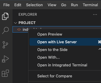
- 通过添加费用并验证费用列表和摘要是否正确更新来测试应用程序。
- 页面效果如下:
总结
恭喜你!你现在已经从零开始打造了一个出色的轮播图。这个项目带你一步步完成了设置必要文件、雕琢 HTML 结构、编织详细的 CSS 样式、融入 JavaScript 魔法,最后启动项目的过程。你可以在此基础上进行扩展,比如添加更多幻灯片、定制设计或融入更多轮播图功能。继续加油,编码愉快!


