
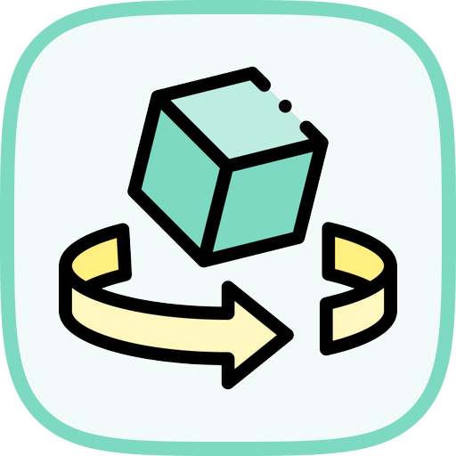
介绍
在这个实验中,我们将使用 HTML 和 CSS 创建一个 3D 旋转立方体。该立方体将有六个颜色各异的面,并在 3D 空间中持续旋转,展示 CSS 3D 变换和动画的强大功能。这个项目是了解 CSS 3D 能力的绝佳入门,让你在不使用 JavaScript 的情况下,直观了解元素如何在三维空间中定位和实现动画效果。
创建 HTML 结构
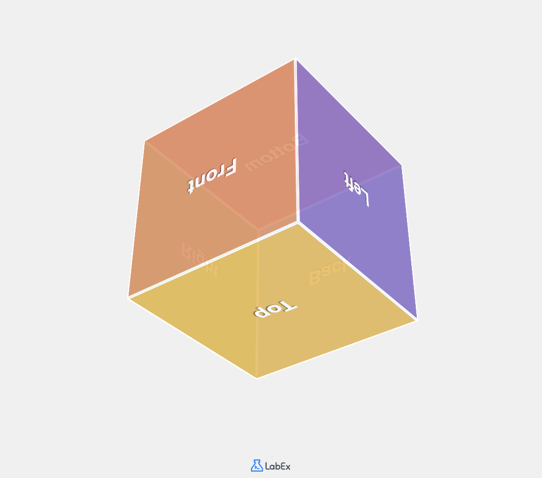
一个 3D 立方体由六个面组成:正面、背面、左面、右面、顶面和底面。我们需要创建一个 HTML 结构,以便在 3D 空间中定位这些面。
我们打开项目目录中的 index.html 文件,并添加必要的 HTML 代码来创建立方体结构。
- 通过导航到左侧的文件资源管理器面板打开 WebIDE。
- 点击
index.html文件,在编辑器中打开它。 - 将以下 HTML 代码复制并粘贴到文件中:
<!doctype html>
<html lang="en">
  <head>
    <meta charset="UTF-8" />
    <meta name="viewport" content="width=device-width, initial-scale=1.0" />
    <title>3D Rotating Cube</title>
    <link rel="stylesheet" href="style.css" />
  </head>
  <body>
    <div class="container">
      <div class="cube">
        <div class="face front">Front</div>
        <div class="face back">Back</div>
        <div class="face right">Right</div>
        <div class="face left">Left</div>
        <div class="face top">Top</div>
        <div class="face bottom">Bottom</div>
      </div>
    </div>
  </body>
</html>
让我们来理解一下这个 HTML 结构:
- 我们从标准的 HTML5 文档结构开始,包括元数据和标题。
- 我们链接到 CSS 文件 (
style.css),这个文件将在下一步创建。 - 在 body 中,我们创建了一个容器
div,用于将立方体居中显示在页面上。 - 在容器内部,有一个
cubediv,它将成为我们的 3D 对象。 - 在立方体内部,我们定义了六个 div,每个 div 都有
face类,还有一个额外的类来标识其位置(正面、背面等)。 - 每个面都包含指示其位置的文本,以便我们识别它们。
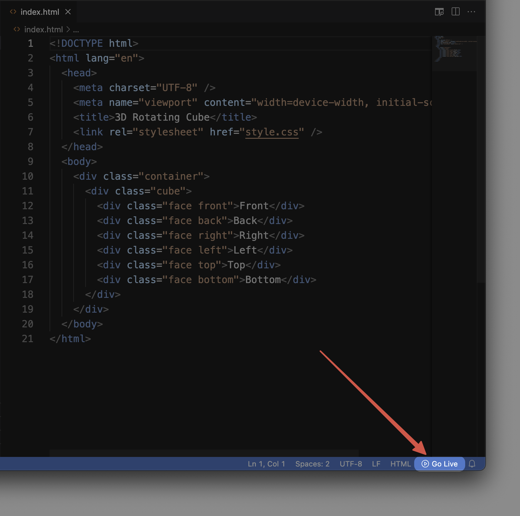
要查看当前的进度,在 WebIDE 底部找到“Go Live”按钮并点击它。这将启动一个本地 Web 服务器,并打开一个浏览器标签页显示你的页面。目前,你只会看到每个面的文本堆叠在一起,因为我们还没有应用任何样式。

下一步,我们将使用 CSS 把这些 div 转换为 3D 立方体的各个面。
创建基本的 CSS 样式
既然我们已经有了 HTML 结构,接下来需要对其进行样式设置,为 3D 立方体奠定基础。在这一步,我们将添加必要的 CSS 代码,为立方体创建一个容器并设置立方体各面的样式。
- 在 WebIDE 中,点击文件资源管理器面板中的
style.css文件将其打开。 - 将以下 CSS 代码复制并粘贴到文件中:
/* Basic reset and page styling */
* {
  margin: 0;
  padding: 0;
  box-sizing: border-box;
}

body {
  font-family: Arial, sans-serif;
  background-color: #f0f0f0;
  display: flex;
  justify-content: center;
  align-items: center;
  min-height: 100vh;
}

/* Container styling with perspective */
.container {
  perspective: 1000px;
  /* The perspective property defines how far the object is from the viewer */
  /* A smaller value creates a more intense 3D effect */
}

/* Cube container styles */
.cube {
  width: 200px;
  height: 200px;
  position: relative;
  transform-style: preserve-3d;
  /* This tells the browser that child elements should be positioned in 3D space */
}

/* Common styles for all faces */
.face {
  position: absolute;
  width: 200px;
  height: 200px;
  border: 2px solid white;
  display: flex;
  justify-content: center;
  align-items: center;
  font-size: 24px;
  font-weight: bold;
  color: white;
  text-shadow: 1px 1px 1px rgba(0, 0, 0, 0.5);
  opacity: 0.9;
}
让我们来理解一下刚刚添加的 CSS 代码:
- 首先,我们应用了一个基本的 CSS 重置,通过将边距和内边距设置为零,确保在不同浏览器中样式的一致性。
- 我们使用 flexbox 对
body元素进行样式设置,使立方体在页面上垂直和水平居中。 .container类包含perspective属性,这对于实现 3D 效果至关重要。可以将其想象成你与立方体之间的距离。1000px 的值能提供适中的 3D 效果。.cube类定义了立方体的尺寸(200px × 200px),并使用transform-style: preserve-3d。这个属性非常关键,它告诉浏览器子元素应该在 3D 空间中定位,而不是被扁平化。.face类包含了六个面共享的样式:position: absolute允许各个面在同一空间中定位。- 每个面的尺寸与立方体相同(200px × 200px)。
- 我们使用 flexbox 将每个面上的文本居中显示。
- 我们添加了白色边框和带阴影的文本,以提高可见性。
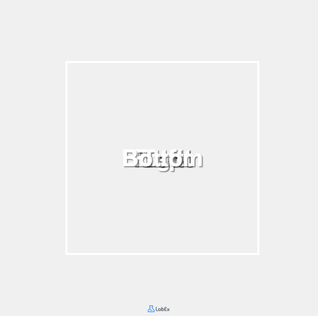
现在,如果你刷新“Go Live”浏览器标签页,应该会看到一些变化,但各个面仍然堆叠在一起。这是因为我们还没有在 3D 空间中对它们进行定位。我们将在下一步完成这个操作。
在 3D 空间中定位立方体的面
现在,我们需要在 3D 空间中定位立方体的每个面。要创建一个立方体,我们需要将每个面从中心沿六个不同方向放置,距离为立方体宽度的一半(100px)。
我们将使用 CSS 3D 变换来实现这一点:
translateZ()可使元素沿 Z 轴向前或向后移动rotateX()可使元素绕水平 X 轴旋转rotateY()可使元素绕垂直 Y 轴旋转
让我们添加 CSS 代码来定位每个面:
- 在 WebIDE 中,保持
style.css文件处于打开状态,在文件末尾添加以下 CSS 代码:
/* Position each face of the cube */
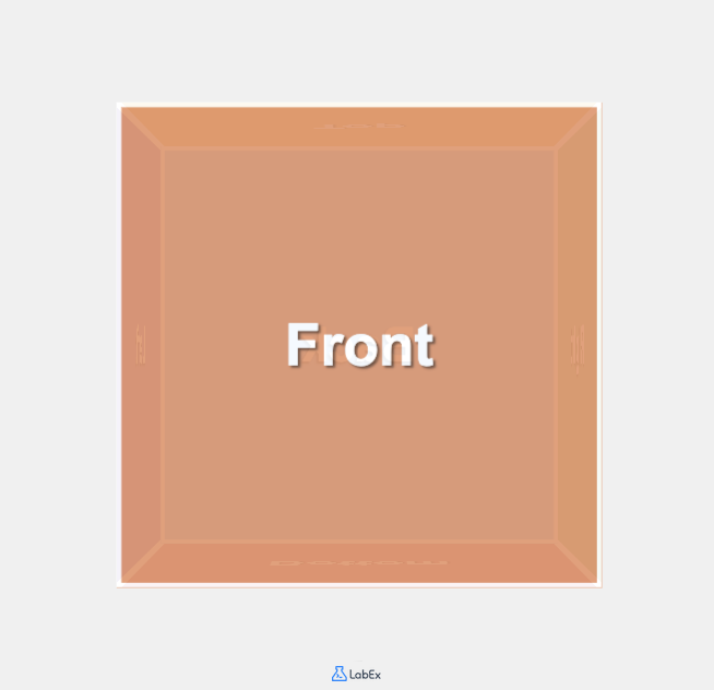
.front {
background-color: #ff8a65; /* Coral */
transform: translateZ(100px);
/* Moves the front face 100px towards the viewer */
}
.back {
background-color: #4fc3f7; /* Light Blue */
transform: rotateY(180deg) translateZ(100px);
/* Rotates 180° around Y-axis and moves 100px forward */
}
.right {
background-color: #81c784; /* Light Green */
transform: rotateY(90deg) translateZ(100px);
/* Rotates 90° right around Y-axis and moves 100px forward */
}
.left {
background-color: #9575cd; /* Purple */
transform: rotateY(-90deg) translateZ(100px);
/* Rotates 90° left around Y-axis and moves 100px forward */
}
.top {
background-color: #ffb74d; /* Orange */
transform: rotateX(90deg) translateZ(100px);
/* Rotates 90° upward around X-axis and moves 100px forward */
}
.bottom {
background-color: #f06292; /* Pink */
transform: rotateX(-90deg) translateZ(100px);
/* Rotates 90° downward around X-axis and moves 100px forward */
}
让我们来理解这段 CSS 代码的作用:
- 我们为每个面设置了不同的背景颜色,以便在视觉上区分它们。
- 对于每个面,我们应用了特定的变换来正确定位它:
- 正面直接沿 Z 轴朝观察者移动 100px。
- 背面绕 Y 轴旋转 180°,然后向前移动 100px。
- 右面绕 Y 轴顺时针旋转 90°,然后向前移动 100px。
- 左面绕 Y 轴逆时针旋转 90°,然后向前移动 100px。
- 顶面绕 X 轴向上旋转 90°,然后向前移动 100px。
- 底面绕 X 轴向下旋转 90°,然后向前移动 100px。
现在,刷新你的浏览器标签页以查看更改。你应该能够看到立方体的正面。不过,立方体还没有旋转,所以你看不到其他面。我们将在下一步添加旋转动画。
3D 变换的工作原理:
- 当我们应用
rotateY(90deg)变换时,实际上是将元素绕 Y 轴(垂直轴)旋转 90 度,使其面向右侧。 - 旋转之后,当我们应用
translateZ(100px)时,是将元素沿其当前面向的方向向前移动 100px(具体方向取决于之前的旋转)。 - 通过组合这些变换,我们可以将每个面放置在正确的位置和方向,从而形成一个立方体。
添加动画使立方体旋转
我们的立方体现在已经搭建好了,但它是静止的。为了让它更有趣,我们将添加一个动画,使立方体在 3D 空间中持续旋转。
CSS 动画允许我们在不使用 JavaScript 的情况下在网页上创建动态效果。我们将定义一个关键帧动画,并将其应用到我们的立方体上。
- 在 WebIDE 中,将以下 CSS 代码添加到你的
style.css文件末尾:
/* Define the rotation animation */
@keyframes rotate {
  0% {
    transform: rotateX(0deg) rotateY(0deg);
  }
  25% {
    transform: rotateX(90deg) rotateY(90deg);
  }
  50% {
    transform: rotateX(180deg) rotateY(180deg);
  }
  75% {
    transform: rotateX(270deg) rotateY(270deg);
  }
  100% {
    transform: rotateX(360deg) rotateY(360deg);
  }
}

/* Apply the animation to the cube */
.cube {
  width: 200px;
  height: 200px;
  position: relative;
  transform-style: preserve-3d;
  animation: rotate 20s infinite linear;
  /* 20s defines the duration of one complete rotation */
  /* infinite means the animation will repeat forever */
  /* linear means the animation speed is constant */
}
让我们来理解一下这段 CSS 代码:
@keyframes规则定义了一个名为rotate的动画。- 它指定了元素在动画的各个阶段应该呈现的样子。
- 在 0% 时,立方体没有旋转。
- 在 25% 时,立方体在 X 轴和 Y 轴上都旋转了 90 度。
- 在 50% 时,立方体在两个轴上都旋转了 180 度。
- 在 75% 时,立方体在两个轴上都旋转了 270 度。
- 在 100% 时,立方体在两个轴上都完成了 360 度的完整旋转。
我们更新
.cube选择器来应用这个动画:animation: rotate 20s infinite linear应用了rotate动画。- 动画每完成一次完整旋转持续 20 秒。
- 动画会无限重复。
- 线性计时函数确保旋转速度恒定。
现在刷新你的浏览器标签页。你应该会看到你的立方体在 3D 空间中平稳旋转,旋转时会展示出六个彩色的面。
理解 CSS 动画:
- CSS 动画由两个部分组成:描述动画的样式,以及一组定义动画在不同时间点状态的关键帧。
animation属性是几个动画属性的简写:animation-name:指定@keyframes规则的名称。animation-duration:指定动画完成一个周期所需的时间。animation-timing-function:定义动画在一个周期内的进展方式。animation-iteration-count:指定动画应该重复的次数。
你现在已经仅使用 HTML 和 CSS 成功创建了一个旋转的 3D 立方体。这个示例展示了 CSS 3D 变换和动画在创建视觉上引人入胜的网页元素方面的强大功能,而无需使用 JavaScript。
你可以尝试试验不同的动画持续时间、不同的旋转轴,甚至添加额外的变换,看看它们会如何影响你的立方体。
总结
恭喜你完成了 3D 旋转立方体实验。在这个实验中,你做到了以下几点:
- 为 3D 立方体创建了一个包含六个面的 HTML 结构
- 应用 CSS 样式在 3D 空间中定位元素
- 使用 CSS 3D 变换将每个面正确放置在 3D 空间中
- 添加 CSS 动画以创建一个持续旋转的立方体
这个项目向你介绍了几个重要的 CSS 概念:
- CSS 3D 变换(平移、旋转)
- 用于 3D 效果的
perspective属性 - 用于保留 3D 定位的
transform-style属性 - CSS 关键帧动画
这些概念是创建引人入胜的交互式网页界面的强大工具,无需依赖 JavaScript。你可以应用这些技术来创建各种 3D 元素,从简单的旋转卡片到复杂的 3D 模型。
作为这个项目的扩展,你可以考虑:
- 添加悬停效果,当用户将鼠标悬停在立方体上时暂停动画
- 为每个面添加图像或更复杂的内容
- 通过修改关键帧创建不同的动画路径
- 尝试不同的尺寸、颜色和旋转速度
请记住,现代 CSS 在创建视觉效果方面非常强大,许多以前需要 JavaScript 实现的动画现在仅用 CSS 就可以完成,从而带来更好的性能和更简洁的代码。


