
소개
이 프로젝트에서는 우주 테마 콘텐츠를 특징으로 하는 시각적으로 매력적인 캐러셀 레이아웃을 갖춘 Swiper 캐러셀 웹 앱을 만드는 방법을 배우게 됩니다. 이 앱을 통해 사용자는 다양한 슬라이드를 탐색하고 우주에 대한 흥미로운 사실이 담긴 카드를 볼 수 있습니다.
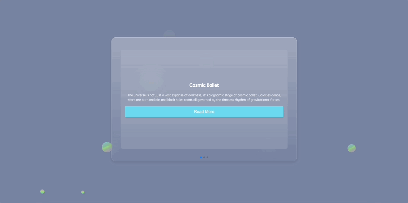
Swiper 캐러셀의 미리보기는 다음과 같습니다.
🎯 과제
이 프로젝트에서 다음을 배우게 됩니다.
- 웹 앱의 HTML 골격을 구성하는 방법
- Swiper 캐러셀을 HTML 구조에 임베딩하는 방법
- 앱 배경에 원과 애니메이션 플로팅 원을 추가하는 방법
- 브라우저 간 일관된 스타일링을 보장하기 위해 기본적인 CSS 리셋을 구현하는 방법
- 앱의 주요 섹션과 콘텐츠 홀더의 스타일을 지정하는 방법
- 배경에 플로팅 원을 디자인하고 애니메이션화하는 방법
- Swiper 캐러셀 및 해당 구성 요소의 스타일을 지정하는 방법
- JavaScript 를 사용하여 Swiper 캐러셀을 초기화하는 방법
🏆 성과
이 프로젝트를 완료하면 다음을 수행할 수 있습니다.
- 우주 테마 콘텐츠를 갖춘 시각적으로 매력적인 Swiper 캐러셀 웹 앱을 생성할 수 있습니다.
- 웹 앱의 HTML 구조 및 레이아웃을 구현할 수 있습니다.
- 사용자 인터페이스를 향상시키기 위해 CSS 스타일링 및 애니메이션을 적용할 수 있습니다.
- JavaScript 를 사용하여 Swiper 캐러셀을 초기화하고 구성할 수 있습니다.
HTML 골격 구성
요구 사항:
- 문자 집합 및 뷰포트 설정을 정의하기 위해 필수 메타 태그를 포함합니다.
- 외부 스타일시트 및 스크립트에 연결합니다.
기능:
- 기반이 될 기본적인 HTML 레이아웃을 생성합니다.
단계:
<!doctype html>
<html lang="en">
  <head>
    <meta charset="UTF-8" />
    <meta name="viewport" content="width=device-width, initial-scale=1.0" />
    <title>Swiper Carousel</title>
    <link rel="stylesheet" href="./style.css" />
    <link
      rel="stylesheet"
      href="https://cdn.jsdelivr.net/npm/swiper@8/swiper-bundle.min.css"
    />
  </head>
  <body>
    <!-- partial -->
    <script src="https://cdnjs.cloudflare.com/ajax/libs/Swiper/8.4.5/swiper-bundle.min.js"></script>
    <!-- We'll slot in our Swiper carousel structure next -->
    <!-- Scripts: Swiper library and our custom logic -->
    <script src="./script.js"></script>
  </body>
</html>
Swiper 캐러셀을 HTML 에 삽입
요구 사항:
- 캐러셀의 콘텐츠를 담을 HTML 내의 구조적 위치.
- 탐색을 위한 페이지네이션 요소.
기능:
- 스타일을 지정하고 상호 작용할 수 있는 캐러셀 레이아웃을 임베딩합니다.
단계:
index.html 의 <body> 태그 내에 다음을 추가합니다.
<section>
  <div class="content">
    <div class="swiper">
      <div class="swiper-container">
        <div class="swiper-wrapper">
          <div class="swiper-slide">
            <div class="card">
              <h1>Cosmic Ballet</h1>
              <p>
                The universe is not just a vast expanse of darkness; it's a
                dynamic stage of cosmic ballet. Galaxies dance, stars are born
                and die, and black holes roam, all governed by the timeless
                rhythm of gravitational forces.
              </p>
              <button class="read-more">Read More</button>
            </div>
          </div>
          <div class="swiper-slide">
            <div class="card">
              <h1>Dark Secrets</h1>
              <p>
                For all its luminous stars and galaxies, the universe hides more
                than it reveals. Dark matter and dark energy, invisible and
                mysterious, make up 95% of the universe, holding the cosmos
                together and driving its expansion.
              </p>
              <button class="read-more">Read More</button>
            </div>
          </div>
          <div class="swiper-slide">
            <div class="card">
              <h1>Time's Relativity</h1>
              <p>
                In the vast cosmos, time is relative. Near massive objects like
                black holes, time seems to slow down. What feels like minutes
                there could equate to years elsewhere, making the universe a
                theater of time's elasticity.
              </p>
              <button class="read-more">Read More</button>
            </div>
          </div>
        </div>
        <!-- Add Pagination -->
        <div class="swiper-pagination"></div>
      </div>
    </div>
  </div>
</section>
HTML 에 원 (Circles) 삽입
요구 사항:
- 많은 둥근 버블을 얻으려면
<ul>및<li>를 추가합니다.
기능:
- 다양한 크기의 많은 버블이 페이지 배경에서 애니메이션됩니다.
단계:
<section>
  <!--swiper content...-->
  <ul class="circles">
    <li></li>
    <li></li>
    <li></li>
    <li></li>
    <li></li>
    <li></li>
    <li></li>
    <li></li>
    <li></li>
    <li></li>
  </ul>
</section>
기본 CSS 리셋 구현
요구 사항:
- 서로 다른 브라우저에서 일관된 모양을 얻습니다.
- 브라우저 기본 마진, 패딩 및 박스 치수를 리셋합니다.
기능:
- 다양한 브라우저에서 스타일링이 일관되게 유지되도록 브라우저 기본 스타일을 무효화합니다.
단계:
*,
*::before,
*::after {
  margin: 0;
  padding: 0;
  box-sizing: border-box;
}
메인 섹션 및 콘텐츠 홀더 스타일링
요구 사항:
- 전체 뷰포트를 차지하는 메인 섹션.
- 특정 치수와 스타일을 가진 시각적으로 매력적인 콘텐츠 홀더.
기능:
- 메인 섹션과 콘텐츠 홀더의 스타일을 지정하여 둘 다 가운데 정렬되도록 하고 우주 테마의 모양을 부여합니다.
단계:
section {
  position: relative;
  display: flex;
  justify-content: center;
  align-items: center;
  background: #7883a1;
  min-height: 100vh;
  overflow: hidden;
}

.content {
  display: flex;
  flex-direction: row;
  justify-content: center;
  align-items: center;
  background: linear-gradient(
    180deg,
    rgba(255, 255, 255, 0.28) 0%,
    rgba(255, 255, 255, 0) 100%
  );
  backdrop-filter: blur(30px);
  border-radius: 20px;
  width: min(900px, 100%);
  z-index: 10;
}
애니메이션 플로팅 원 디자인
요구 사항:
- 메인 섹션에 대한 동적 배경.
- 시간이 지남에 따라 움직이고 모양이 변하는 떠다니는 원.
기능:
- 사용자 참여를 향상시키기 위해 떠오르고, 회전하며, 불투명도가 변경되는 애니메이션 그라데이션 원으로 배경을 풍부하게 합니다.
단계:
.circles {
  position: absolute;
  top: 0;
  left: 0;
  width: 100%;
  height: 100%;
  overflow: hidden;
}

.circles li {
  position: absolute;
  display: block;
  list-style: none;
  width: 20px;
  height: 20px;
  background-color: #0f75c3;
  background-image: linear-gradient(
    225deg,
    #67d0f6 0%,
    #a7ec67 50%,
    #c27ee4 100%
  );
  animation: animate 10s linear infinite;
  bottom: -150px;
}

.circles li:nth-child(1) {
  left: 25%;
  width: 50px;
  height: 50px;
  animation-delay: 0s;
}

.circles li:nth-child(2) {
  left: 10%;
  width: 20px;
  height: 20px;
  animation-delay: 2s;
  animation-duration: 10s;
}

.circles li:nth-child(3) {
  left: 70%;
  width: 30px;
  height: 30px;
  animation-delay: 4s;
}

.circles li:nth-child(4) {
  left: 40%;
  width: 60px;
  height: 60px;
  animation-delay: 0s;
  animation-duration: 15s;
}

.circles li:nth-child(5) {
  left: 65%;
  width: 20px;
  height: 20px;
  animation-delay: 0s;
}

.circles li:nth-child(6) {
  left: 75%;
  width: 25px;
  height: 25px;
  animation-delay: 3s;
}

.circles li:nth-child(7) {
  left: 35%;
  width: 80px;
  height: 80px;
  animation-delay: 7s;
}

.circles li:nth-child(8) {
  left: 50%;
  width: 25px;
  height: 25px;
  animation-delay: 15s;
  animation-duration: 35s;
}

.circles li:nth-child(9) {
  left: 20%;
  width: 15px;
  height: 15px;
  animation-delay: 2s;
  animation-duration: 35s;
}

.circles li:nth-child(10) {
  left: 85%;
  width: 40px;
  height: 40px;
  animation-delay: 0s;
  animation-duration: 10s;
}

@keyframes animate {
  0% {
    transform: translateY(0) rotate(0deg);
    opacity: 1;
    border-radius: 100%;
  }

  100% {
    transform: translateY(-1000px) rotate(720deg);
    opacity: 0;
    border-radius: 100%;
  }
}
Swiper 캐러셀 스타일링
요구 사항:
- 사용자 친화적인 캐러셀 구조.
- 탐색하기 쉬운 세련된 슬라이드 및 콘텐츠 카드.
기능:
- Swiper 캐러셀과 해당 구성 요소를 장식하여 반응형, 직관적이며 미적으로 만족스럽도록 합니다.
단계:
.swiper-slide {
  display: flex;
  justify-content: center;
  align-items: center;
}

.swiper {
  width: 100%;
  /* Adjusted to occupy the full width of its container */
  height: 600px;
  /* Adjusted height */
  padding: 50px 0;
  display: flex;
  justify-content: center;
  align-items: center;
}

.swiper-container {
  width: 90%;
  /* Adjusted to occupy most of its container's width */
  height: 80%;
  /* Adjusted to occupy most of its container's height */
}

.card {
  background: rgba(255, 255, 255, 0.1);
  padding: 20px;
  border-radius: 10px;
  text-align: center;
  width: 100%;
  /* Adjusted to occupy full width */
  height: 100%;
  /* Adjusted to occupy full height */
  display: flex;
  flex-direction: column;
  justify-content: center;
  /* Center the card content vertically */
}

.card h1 {
  margin-bottom: 20px;
  font-size: 1.5em;
  color: #fff;
}

.card p {
  margin-bottom: 20px;
  color: rgba(255, 255, 255, 0.8);
}

.read-more {
  background-color: #6bd6ee;
  font-size: 20px;
  border: none;
  border-radius: 5px;
  color: #fff;
  padding: 15px 15px;
  cursor: pointer;
  transition: background-color 0.3s;
}

.read-more:hover {
  background-color: #9bd92f;
}
Swiper 캐러셀 초기화
요구 사항:
- 사용자 입력을 처리하는 캐러셀.
- 슬라이드 간의 부드러운 전환.
- 탐색을 위한 기능적인 페이지네이션 (pagination).
기능:
- JavaScript 를 사용하여 Swiper 캐러셀에 생명을 불어넣어 콘텐츠 카드 간의 동적 전환 및 탐색을 가능하게 합니다.
단계:
const swiper = new Swiper(".swiper-container", {
  speed: 400,
  spaceBetween: 100,
  pagination: {
    el: ".swiper-pagination",
    clickable: true
  }
});
앱 실행
- 웹 브라우저에서
index.html을 엽니다.
- 지출을 추가하고 지출 목록과 요약이 올바르게 업데이트되는지 확인하여 애플리케이션을 테스트합니다.
- 페이지의 효과는 다음과 같습니다:
요약
축하합니다! 이제 처음부터 훌륭한 Swiper 캐러셀을 만들었습니다. 이 프로젝트는 필수 파일을 설정하고, HTML 구조를 다듬고, 상세한 CSS 스타일을 엮고, JavaScript 마법을 뿌리고, 마지막으로 프로젝트를 시작하는 단계를 안내했습니다. 더 많은 슬라이드를 통합하고, 디자인을 맞춤 설정하거나, 추가 Swiper 기능을 추가하여 이 기반을 확장하십시오. 계속 빛나고 즐거운 코딩 되세요!