소개
금융 데이터를 시각화할 때, 축을 통화 기호와 함께 적절하게 형식화하는 것이 필수적입니다. Matplotlib 은 시각화를 생성하기 위한 강력한 Python 라이브러리이지만, 기본적으로 축에 통화 기호를 표시하지 않습니다.
이 Lab 에서는 Matplotlib 플롯을 사용자 정의하여 y 축 레이블에 달러 기호를 표시하는 방법을 배우겠습니다. 이 기술은 금융 데이터, 판매 수치, 예산 또는 통화 형식이 필요한 기타 데이터 세트를 다룰 때 유용합니다.
VM 팁
VM 시작이 완료되면, 왼쪽 상단을 클릭하여 Notebook 탭으로 전환하여 실습을 위한 Jupyter Notebook 에 접근하십시오.
Jupyter Notebook 이 로딩을 완료하는 데 몇 초 정도 기다려야 할 수 있습니다. Jupyter Notebook 의 제한으로 인해 작업의 유효성 검사는 자동화될 수 없습니다.
Lab 진행 중 문제가 발생하면 언제든지 Labby 에게 문의하십시오. 세션 후 피드백을 제공해주시면 즉시 문제를 해결해 드리겠습니다.
라이브러리 설정 및 샘플 데이터 생성
이 첫 번째 단계에서는 필요한 라이브러리를 가져오고 플롯을 위한 샘플 금융 데이터를 생성합니다. 시각화를 위해 Matplotlib 을, 데이터 생성을 위해 NumPy 를 가져와야 합니다.
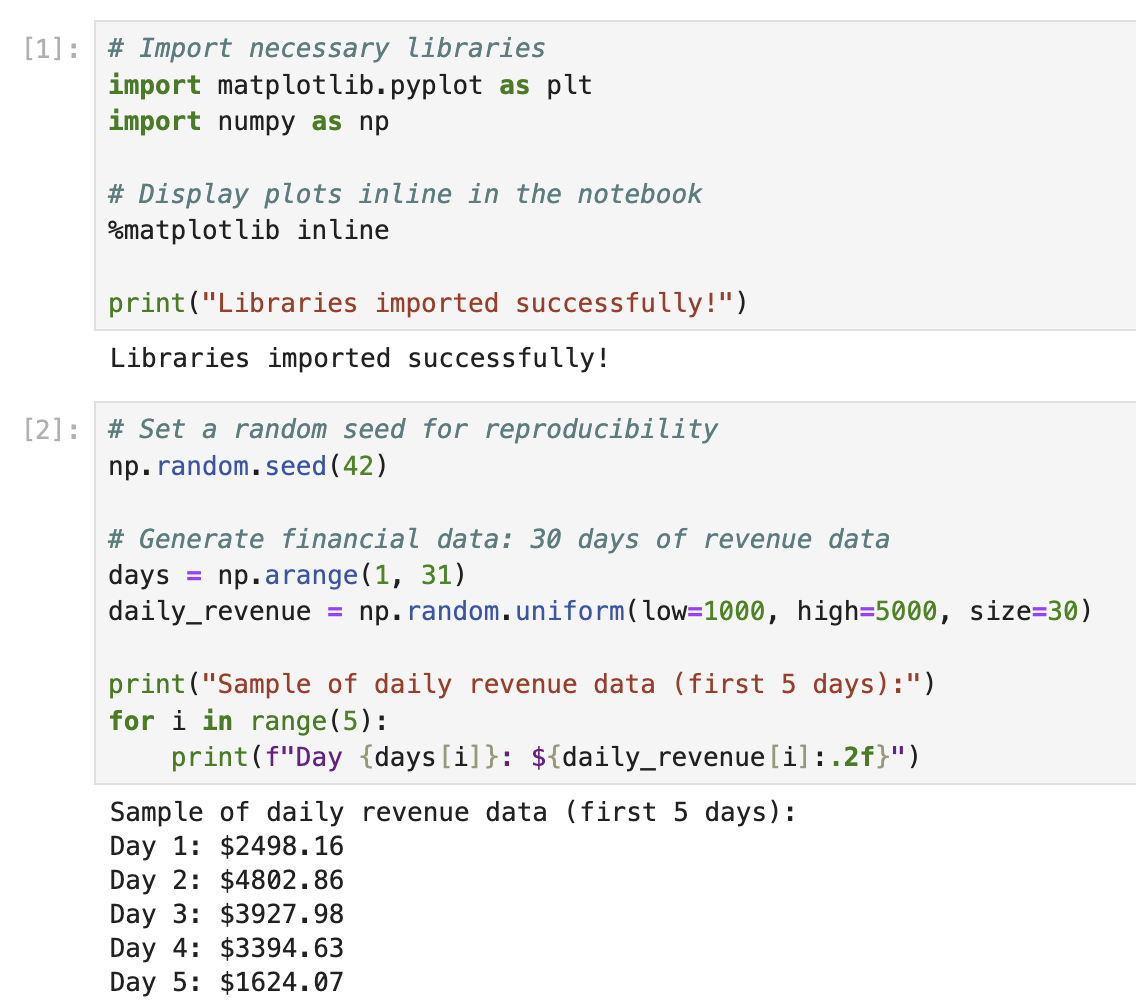
노트북의 첫 번째 셀에 다음 코드를 입력하고 실행하여 필요한 라이브러리를 가져오십시오.
## Import necessary libraries
import matplotlib.pyplot as plt
import numpy as np

## Display plots inline in the notebook
%matplotlib inline

print("Libraries imported successfully!")
코드를 실행한 후 (Shift+Enter 를 누르십시오) 다음 출력을 볼 수 있습니다.
Libraries imported successfully!
이제 시각화할 샘플 금융 데이터를 생성해 보겠습니다. 금융 데이터는 종종 시간에 따른 값을 나타내므로, 기간 동안의 일일 수익을 나타낼 수 있는 간단한 데이터 세트를 생성합니다.
새 셀에 다음 코드를 추가하고 실행합니다.
## Set a random seed for reproducibility
np.random.seed(42)

## Generate financial data: 30 days of revenue data
days = np.arange(1, 31)
daily_revenue = np.random.uniform(low=1000, high=5000, size=30)

print("Sample of daily revenue data (first 5 days):")
for i in range(5):
    print(f"Day {days[i]}: ${daily_revenue[i]:.2f}")
이 코드를 실행하면 샘플 수익 데이터의 처음 5 일을 볼 수 있습니다.
Sample of daily revenue data (first 5 days):
Day 1: $3745.40
Day 2: $3992.60
Day 3: $2827.45
Day 4: $4137.54
Day 5: $1579.63
이 샘플 데이터는 30 일 동안 $1,000 에서 $5,000 사이의 일일 수익 값을 나타냅니다. 다음 단계에서 이 데이터를 사용하여 플롯을 생성합니다.
기본 금융 플롯 생성
이제 데이터를 준비했으니, 일일 수익을 시각화하기 위한 기본 플롯을 생성해 보겠습니다. 30 일 기간 동안의 수익 추세를 보여주는 간단한 선 그래프로 시작합니다.
노트북의 새 셀에 다음 코드를 추가하고 실행합니다.
## Create a figure and axes
fig, ax = plt.subplots(figsize=(10, 6))

## Plot the daily revenue data
ax.plot(days, daily_revenue, marker='o', linestyle='-', color='blue', linewidth=2, markersize=6)

## Add labels and title
ax.set_xlabel('Day', fontsize=12)
ax.set_ylabel('Revenue', fontsize=12)
ax.set_title('Daily Revenue Over 30 Days', fontsize=14, fontweight='bold')

## Add grid for better readability
ax.grid(True, linestyle='--', alpha=0.7)

## Display the plot
plt.tight_layout()
plt.show()

print("Basic plot created successfully!")
이 코드를 실행하면 일일 수익 추세를 보여주는 선 그래프가 표시됩니다. 다음과 유사하게 보일 것입니다 (실제 값은 무작위 생성으로 인해 약간 다를 수 있습니다).
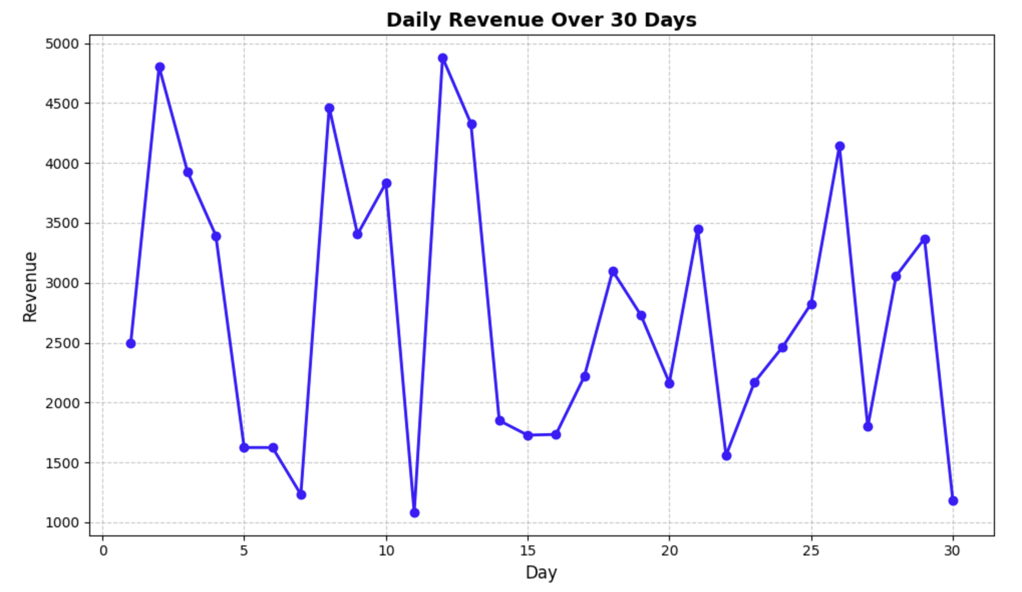
이 코드에서 수행한 작업을 자세히 살펴보겠습니다.
fig, ax = plt.subplots(figsize=(10, 6))- 10×6 인치 크기의 figure 와 axes 를 생성했습니다.ax.plot(days, daily_revenue, ...)- x 축에 날짜, y 축에 수익을 사용하여 데이터를 플롯했습니다.ax.set_xlabel(),ax.set_ylabel(),ax.set_title()- 플롯에 레이블과 제목을 추가했습니다.ax.grid()- 데이터를 더 쉽게 읽을 수 있도록 그리드를 추가했습니다.plt.tight_layout()- 모든 것이 잘 맞도록 패딩을 조정했습니다.plt.show()- 플롯을 표시했습니다.
현재 y 축에는 달러 기호 없이 일반 숫자가 표시되어 있습니다. 다음 단계에서는 y 축에 적절한 통화 형식을 표시하도록 플롯을 수정합니다.
달러 기호로 Y 축 레이블 서식 지정
이제 기본 플롯이 준비되었으므로, y 축 레이블의 서식을 지정하여 달러 기호를 표시해 보겠습니다. 이렇게 하면 금융 데이터를 더 읽기 쉽고 전문적으로 표현할 수 있습니다.
y 축의 눈금 레이블 서식을 지정하기 위해 Matplotlib 의 ticker 모듈을 사용합니다. 이 모듈은 다양한 서식 옵션을 제공합니다. 특히, StrMethodFormatter 클래스를 사용하여 y 축에 대한 사용자 지정 formatter 를 생성합니다.
노트북의 새 셀에 다음 코드를 추가하고 실행합니다.
## Import the necessary module for formatting
import matplotlib.ticker as ticker

## Create a figure and axes
fig, ax = plt.subplots(figsize=(10, 6))

## Plot the daily revenue data
ax.plot(days, daily_revenue, marker='o', linestyle='-', color='blue', linewidth=2, markersize=6)

## Format y-axis with dollar signs
formatter = ticker.StrMethodFormatter('${x:,.2f}')
ax.yaxis.set_major_formatter(formatter)

## Add labels and title
ax.set_xlabel('Day', fontsize=12)
ax.set_ylabel('Revenue ($)', fontsize=12)
ax.set_title('Daily Revenue Over 30 Days', fontsize=14, fontweight='bold')

## Add grid for better readability
ax.grid(True, linestyle='--', alpha=0.7)

## Display the plot
plt.tight_layout()
plt.show()

print("Plot with dollar-formatted y-axis created!")
이 코드를 실행하면 y 축 레이블에 달러 기호가 있는 새 플롯이 표시됩니다.
이 코드의 핵심 부분을 설명해 보겠습니다.
formatter = ticker.StrMethodFormatter('${x:,.2f}')
ax.yaxis.set_major_formatter(formatter)
다음은 이 서식 문자열이 수행하는 작업입니다.
$- 각 레이블의 시작 부분에 달러 기호를 추가합니다.{x:,.2f}- 다음을 사용하여 숫자의 서식을 지정합니다.,- 천 단위 구분 기호로 쉼표를 사용합니다 (예: 1000 대신 1,000)..2f- 소수점 두 자리 (예: $1,234.56).
이 formatter 는 y 축의 모든 주요 눈금 레이블에 적용됩니다. 이제 플롯이 값이 달러로 표시됨을 명확하게 나타내어 금융 데이터 시각화에 훨씬 더 적합하게 되었음을 확인하십시오.
더 나은 금융 데이터 시각화를 위한 플롯 개선
이제 기본적인 통화 서식이 적용되었으므로, 금융 데이터 분석에 더 유용하도록 플롯을 추가로 개선해 보겠습니다. 다음과 같은 몇 가지 개선 사항을 추가합니다.
- 평균 일일 수익을 보여주는 수평선
- 최대 및 최소 수익일을 강조 표시하는 주석
- 가독성을 높이기 위한 사용자 지정 눈금 매개변수
- 더 설명적인 제목과 범례
노트북의 새 셀에 다음 코드를 추가하고 실행합니다.
## Import the necessary module for formatting
import matplotlib.ticker as ticker

## Create a figure and axes
fig, ax = plt.subplots(figsize=(12, 7))

## Plot the daily revenue data
ax.plot(days, daily_revenue, marker='o', linestyle='-', color='blue',
        linewidth=2, markersize=6, label='Daily Revenue')

## Calculate statistics
avg_revenue = np.mean(daily_revenue)
max_revenue = np.max(daily_revenue)
min_revenue = np.min(daily_revenue)
max_day = days[np.argmax(daily_revenue)]
min_day = days[np.argmin(daily_revenue)]

## Add a horizontal line for average revenue
ax.axhline(y=avg_revenue, color='r', linestyle='--', alpha=0.7,
           label=f'Average Revenue: ${avg_revenue:.2f}')

## Format y-axis with dollar signs
formatter = ticker.StrMethodFormatter('${x:,.2f}')
ax.yaxis.set_major_formatter(formatter)

## Customize tick parameters
ax.tick_params(axis='both', which='major', labelsize=10)
ax.yaxis.set_major_locator(ticker.MaxNLocator(nbins=10))
ax.xaxis.set_major_locator(ticker.MultipleLocator(base=5))

## Add annotations for max and min revenue
ax.annotate(f'Max: ${max_revenue:.2f}', xy=(max_day, max_revenue),
            xytext=(max_day+1, max_revenue+200),
            arrowprops=dict(facecolor='black', shrink=0.05, width=1.5))

ax.annotate(f'Min: ${min_revenue:.2f}', xy=(min_day, min_revenue),
            xytext=(min_day+1, min_revenue-200),
            arrowprops=dict(facecolor='black', shrink=0.05, width=1.5))

## Add labels and title
ax.set_xlabel('Day of Month', fontsize=12)
ax.set_ylabel('Revenue ($)', fontsize=12)
ax.set_title('Daily Revenue Analysis - 30 Day Period', fontsize=14, fontweight='bold')

## Set x-axis limits to show a bit of padding
ax.set_xlim(0, 31)

## Add grid for better readability
ax.grid(True, linestyle='--', alpha=0.7)

## Add legend
ax.legend(loc='upper right', fontsize=10)

## Display the plot
plt.tight_layout()
plt.show()

print("Enhanced financial plot created successfully!")
이 코드를 실행하면 다음과 같은 훨씬 더 유익한 플롯이 표시됩니다.
- y 축에 달러 기호 서식
- 평균 수익을 보여주는 수평 빨간색 점선
- 최대 및 최소 수익일을 가리키는 주석
- 더 나은 간격의 더 깨끗한 눈금 표시
- 각 요소가 무엇을 나타내는지 보여주는 범례
새로운 요소 중 일부를 설명해 보겠습니다.
ax.axhline()- 지정된 y 값 (이 경우 평균 수익) 에 수평선을 추가합니다.ax.yaxis.set_major_locator()- y 축에 표시되는 눈금 표시의 수를 제어합니다.ax.xaxis.set_major_locator()- x 축이 5 일 간격으로 눈금을 표시하도록 설정합니다.ax.annotate()- 특정 데이터 포인트를 가리키는 화살표가 있는 텍스트 주석을 추가합니다.ax.legend()- 플롯의 다른 요소를 설명하는 범례를 추가합니다.
이러한 개선 사항은 주요 통계를 강조 표시하고 데이터를 더 쉽게 해석할 수 있도록 하여 금융 분석에 플롯을 훨씬 더 유용하게 만듭니다.
플롯 저장 및 재사용 가능한 함수 생성
이 마지막 단계에서는 통화 서식이 지정된 플롯을 생성하고 시각화를 파일에 저장하는 재사용 가능한 함수를 만들 것입니다. 이 접근 방식을 사용하면 향후 다른 금융 데이터 세트에 동일한 서식을 쉽게 적용할 수 있습니다.
노트북의 새 셀에 다음 코드를 추가하고 실행합니다.
def create_currency_plot(x_data, y_data, title='Financial Data',
                         xlabel='X-Axis', ylabel='Amount ($)',
                         filename=None, show_stats=True):
    """
    Create a plot with currency formatting on the y-axis.

    Parameters:
    -----------
    x_data : array-like
        Data for the x-axis
    y_data : array-like
        Data for the y-axis (currency values)
    title : str
        Title of the plot
    xlabel : str
        Label for the x-axis
    ylabel : str
        Label for the y-axis
    filename : str, optional
        If provided, save the plot to this filename
    show_stats : bool
        Whether to show statistics (average, min, max)

    Returns:
    --------
    fig, ax : tuple
        The figure and axes objects
    """
    ## Import the necessary module for formatting
    import matplotlib.ticker as ticker

    ## Create a figure and axes
    fig, ax = plt.subplots(figsize=(12, 7))

    ## Plot the data
    ax.plot(x_data, y_data, marker='o', linestyle='-', color='blue',
            linewidth=2, markersize=6, label='Data')

    if show_stats:
        ## Calculate statistics
        avg_value = np.mean(y_data)
        max_value = np.max(y_data)
        min_value = np.min(y_data)
        max_x = x_data[np.argmax(y_data)]
        min_x = x_data[np.argmin(y_data)]

        ## Add a horizontal line for average value
        ax.axhline(y=avg_value, color='r', linestyle='--', alpha=0.7,
                   label=f'Average: ${avg_value:.2f}')

        ## Add annotations for max and min values
        ax.annotate(f'Max: ${max_value:.2f}', xy=(max_x, max_value),
                    xytext=(max_x+1, max_value+200),
                    arrowprops=dict(facecolor='black', shrink=0.05, width=1.5))

        ax.annotate(f'Min: ${min_value:.2f}', xy=(min_x, min_value),
                    xytext=(min_x+1, min_value-200),
                    arrowprops=dict(facecolor='black', shrink=0.05, width=1.5))

    ## Format y-axis with dollar signs
    formatter = ticker.StrMethodFormatter('${x:,.2f}')
    ax.yaxis.set_major_formatter(formatter)

    ## Customize tick parameters
    ax.tick_params(axis='both', which='major', labelsize=10)

    ## Add labels and title
    ax.set_xlabel(xlabel, fontsize=12)
    ax.set_ylabel(ylabel, fontsize=12)
    ax.set_title(title, fontsize=14, fontweight='bold')

    ## Add grid for better readability
    ax.grid(True, linestyle='--', alpha=0.7)

    ## Add legend
    if show_stats:
        ax.legend(loc='best', fontsize=10)

    ## Adjust layout
    plt.tight_layout()

    ## Save the plot if filename is provided
    if filename:
        plt.savefig(filename, dpi=300, bbox_inches='tight')
        print(f"Plot saved as '{filename}'")

    return fig, ax

## Use our function to create and save a plot
fig, ax = create_currency_plot(
    days,
    daily_revenue,
    title='Monthly Revenue Report',
    xlabel='Day of Month',
    ylabel='Daily Revenue ($)',
    filename='revenue_plot.png'
)

## Display the plot
plt.show()

print("Function created and plot saved successfully!")
이 코드를 실행하면 다음이 표시됩니다.
- 이전 단계에서 생성한 것과 유사하지만 사용자 지정 함수를 사용하여 생성된 플롯
- 플롯이
revenue_plot.png라는 파일에 저장되었음을 확인하는 메시지
우리가 만든 함수는 다음과 같습니다.
- x 및 y 축에 대한 데이터를 사용합니다.
- 레이블 및 제목 사용자 지정을 허용합니다.
- 플롯을 파일에 저장하는 옵션이 있습니다.
- 평균, 최소값 및 최대값과 같은 통계를 표시하거나 숨길 수 있습니다.
- 필요한 경우 추가 사용자 지정을 위해 figure 및 axes 객체를 반환합니다.
이 재사용 가능한 함수를 사용하면 향후 일관된 형식의 금융 플롯을 쉽게 만들 수 있습니다. 다른 데이터 세트로 이 함수를 호출하기만 하면 모든 통화 서식 및 통계 주석을 자동으로 처리합니다.
플롯이 올바르게 저장되었는지 확인하기 위해 파일이 있는지 확인해 보겠습니다.
import os
if os.path.exists('revenue_plot.png'):
    print("Plot file exists! Size:", os.path.getsize('revenue_plot.png'), "bytes")
else:
    print("Plot file was not saved correctly.")
파일이 존재하고 크기가 표시되는 메시지가 표시됩니다.
축하합니다! Matplotlib 를 사용하여 달러 기호로 플롯의 서식을 지정하고 전문적인 금융 시각화를 만드는 방법을 성공적으로 배웠습니다.
요약
이 랩에서는 Matplotlib 를 사용하여 적절한 통화 서식이 있는 금융 플롯을 만드는 방법을 배웠습니다. 우리는 몇 가지 중요한 개념을 다루었습니다.
- 샘플 금융 데이터 생성 및 작업
- Matplotlib 를 사용하여 기본 플롯 생성
StrMethodFormatter클래스를 사용하여 달러 기호로 y 축 레이블 서식 지정- 통계, 주석 및 향상된 스타일링으로 플롯 개선
- 일관된 통화 서식이 지정된 플롯을 생성하기 위한 재사용 가능한 함수 생성
이러한 기술은 금융 데이터 시각화 작업을 하는 모든 사람에게 필수적입니다. 이를 통해 통화 가치를 명확하게 전달하는 전문적이고 유익한 차트를 만들 수 있습니다.
배운 기술은 다음과 같은 다양한 금융 데이터 세트에 적용할 수 있습니다.
- 판매 및 수익 보고서
- 예산 분석
- 투자 성과 추적
- 비용 분석
- 지출 추적
축에 통화 기호를 적절하게 서식 지정하면 시각화를 더 직관적이고 전문적으로 만들고 데이터 커뮤니케이션의 효율성을 높일 수 있습니다.