
소개
이 Lab 에서는 HTML 과 CSS3 를 사용하여 애니메이션 소셜 공유 버튼을 만드는 방법을 배웁니다. 이 버튼들은 아이콘을 위해 Font Awesome 라이브러리를 사용하며, 부드러운 호버 (hover) 전환 효과를 제공하기 위해 CSS 로 스타일링됩니다. 이 가이드가 끝나면, 모든 웹사이트에 통합할 수 있는 아름답고 반응형 소셜 버튼 세트를 갖게 될 것입니다.
아이콘 소개
Font Awesome 아이콘을 사용하려면, 아이콘 이름 앞에 "fa" 접두사를 사용하면 됩니다.
특정 형식은 다음과 같습니다: <i class="fa ICON_NAME"></i>
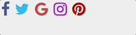
아이콘 라이브러리에서 필요한 아이콘을 도입하려면, index.html 파일에 다음 코드를 작성합니다:
<!doctype html>
<html lang="en">
  <head>
    <meta charset="UTF-8" />
    <title>Animated Social Sharing Buttons</title>

    <!--Icon Library-->
    <link
      rel="stylesheet"
      href="https://cdn.jsdelivr.net/npm/font-awesome@4.7.0/css/font-awesome.min.css"
    />
  </head>
  <body>
    <div>
      <i class="fa fa-facebook"></i>
      <i class="fa fa-twitter"></i>
      <i class="fa fa-google"></i>
      <i class="fa fa-instagram"></i>
      <i class="fa fa-pinterest"></i>
    </div>
  </body>
</html>
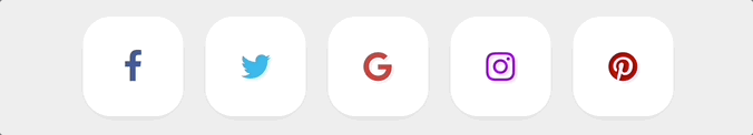
결과는 다음과 같습니다:

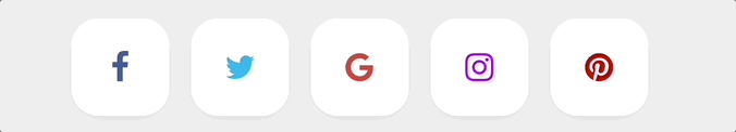
의사 클래스 선택자 (pseudo-class selectors) 를 사용하면 마우스가 링크된 객체 위로 호버 (hover) 될 때 스타일이 변경될 수 있습니다. 따라서 아이콘에 빈 링크를 추가하거나, 각 소셜 홈페이지로 연결할 수 있습니다.
의사 클래스 구문: selector:pseudo-class {property:value;}
a:hover {property:value;}는 마우스가 링크 위로 호버될 때 표시되는 스타일을 설정합니다.
각 버튼의 후속 스타일 지정을 용이하게 하기 위해 필요한 클래스 선택자를 설정합니다.
<div class="social-btns">
  <a class="btn facebook" href="#"><i class="fa fa-facebook"></i></a>
  <a class="btn twitter" href="#"><i class="fa fa-twitter"></i></a>
  <a class="btn google" href="#"><i class="fa fa-google"></i></a>
  <a class="btn instagram" href="#"><i class="fa fa-instagram"></i></a>
  <a class="btn pinterest" href="#"><i class="fa fa-pinterest"></i></a>
</div>
효과 미리보기:
Font Awesome 아이콘이 파란색으로 변하는 이유는 <a> 태그를 적용한 후 기본 글꼴 색상이 파란색이기 때문입니다.
아이콘 스타일 설정
아이콘 스타일을 설정하기 전에, index.html의 <head> 태그에 style.css 스타일시트를 추가합니다.
<link rel="stylesheet" href="style.css" />
전반적인 스타일을 표준화하기 위해, style.css에서 전역 스타일을 설정합니다.
/* Global style settings */
* {
  margin: 0;
  padding: 0;
}
a,
img {
  border: 0;
}
body {
  background: #eee;
}
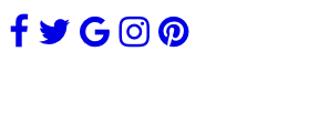
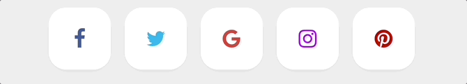
Font Awesome 폰트에서 제공하는 벡터 아이콘을 예쁘게 만들기 위해, 먼저 색상을 설정해 보겠습니다.
.social-btns .btn.facebook .fa {
  color: #3b5998;
}
.social-btns .btn.twitter .fa {
  color: #00aff0;
}
.social-btns .btn.google .fa {
  color: #dc4a38;
}
.social-btns .btn.instagram .fa {
  color: #bf00ff;
}
.social-btns .btn.pinterest .fa {
  color: #cc0000;
}
효과 미리보기:
다음으로, 터치 시 아이콘이 즉시 확대되고 색상이 변경되도록 설정합니다. 즉시 확대 효과를 위해, transform: scale(0.8)을 사용하여 아이콘을 원래 크기의 80% 로 축소하고, 터치 이벤트가 발생하면 transform: scale(1)을 사용하여 원래 크기로 다시 조정할 수 있습니다.
style.css 파일에 다음 코드를 입력합니다:
.social-btns .btn .fa {
  /* Set the default link display style */
  -webkit-transform: scale(0.8);
  transform: scale(0.8);
}
.social-btns .btn:focus .fa, /* Select the focused button style */
.social-btns .btn:hover .fa {
  /* Set the mouse-over link display style */
  color: #fff; /* Change its color */
  -webkit-transform: scale(1);
  transform: scale(1);
}
.social-btns .btn .fa {
  /* Set the size and vertical alignment of the icons provided by Font Awesome */
  font-size: 38px;
  vertical-align: middle;
}
효과 미리보기:
버튼 스타일 설정
페이지 레이아웃을 위해, 버튼을 페이지 중앙에 배치하고, 블록 레벨 인라인 요소로 설정한 다음, 버튼을 꾸밉니다.
display 속성은 생성할 요소의 유형을 지정합니다:
display:inline은 다른 요소와 행을 공유하는 인라인 요소로 설정합니다. 즉, 독점적으로 행을 차지하지 않습니다.display:block은 블록 레벨 요소로 설정하고 독점적으로 행을 차지합니다.display:inline-block은 위의 두 가지 방법을 결합하여 독점적으로 행을 차지하지 않는 블록 레벨 요소로 설정합니다.
.social-btns {
  height: 90px;
  margin: 80px auto;
  font-size: 0;
  text-align: center; /* horizontally centering */
}
.social-btns .btn {
  display: inline-block; /* set the button as a block-level element that does not occupy a row exclusively */
  background-color: #fff;
  width: 90px;
  height: 90px;
  line-height: 90px; /* set line height */
  margin: 0 10px;
  text-align: center;
  position: relative; /* set to relative positioning */
  overflow: hidden; /* hide overflow content */
  border-radius: 28%; /* round the corners of the DIV */
  box-shadow: 0 5px 15px -5px rgba(0, 0, 0, 0.1); /* add shadow to the DIV element */
  opacity: 0.99; /* specify opacity. From 0.0 transparent to 1.0 completely opaque */
}
효과 미리보기:
버튼을 터치하면 아이콘과 버튼 배경이 모두 흰색으로 표시되어 명확하게 보이지 않는 것을 알 수 있습니다. 따라서 버튼 배경의 터치 스타일을 설정해야 합니다. 먼저, transform: rotate(45deg)를 사용하여 btn:before를 시계 방향으로 45° 회전시켜야 합니다. 그런 다음 btn:before의 초기 및 최종 위치를 조정합니다.
before 선택자: 요소의 내용 앞에 새로운 내용을 삽입합니다.
.social-btns .btn:before {
  /*Set the top and left values before the content of each btn element, i.e. the position of the btn when not touched*/
  top: 90%;
  left: -110%;
}
.social-btns .btn:focus:before,
.social-btns .btn:hover:before {
  /*Adjusts the position of the button when touched*/
  top: -10%;
  left: -10%;
}
.social-btns .btn:before {
  content: "";
  width: 120%;
  height: 120%;
  position: absolute;
  /*Flip btn:before by 45° clockwise*/
  -webkit-transform: rotate(45deg);
  transform: rotate(45deg);
}
/*Set the btn:before color, i.e. the button's background color after touching*/
.social-btns .btn.facebook:before {
  background-color: #3b5998;
}
.social-btns .btn.twitter:before {
  background-color: #00aff0;
}
.social-btns .btn.instagram:before {
  background-color: #bf00ff;
}
.social-btns .btn.google:before {
  background-color: #dc4a38;
}
.social-btns .btn.pinterest:before {
  background-color: #cc0000;
}
효과 미리보기:
마지막으로, 버튼에 전환 (transition) 조정을 수행합니다. 주로 transition-timing-function 속성을 사용하여 전환 효과의 속도 곡선을 설정하여 시각적으로 더 부드럽게 만듭니다.
transition-timing-function 구문:
<cubic-bezier-easing-function> =
  ease                                                |
  ease-in                                             |
  ease-out                                            |
  ease-in-out                                         |
  cubic-bezier( <number [0,1]> , <number> , <number [0,1]> , <number> )
style.css에 다음 스타일을 추가합니다:
.social-btns .btn,
.social-btns .btn:before,
.social-btns .btn .fa {
  transition: all 0.35s; /* all styles 0.35 seconds easing */
  transition-timing-function: cubic-bezier(
    0.31,
    -0.105,
    0.43,
    1.59
  ); /* specify the speed of the transition effect */
}
효과 미리보기:
참고: 웹 서비스를 포트 8080 에서 실행하려면 오른쪽 하단의 'Go Live'를 클릭하십시오. 그런 다음 Web 8080 탭을 새로 고쳐 웹 페이지를 미리 볼 수 있습니다.
지식 확장
하이퍼링크 위에 마우스를 올렸을 때의 효과뿐만 아니라, 의사 클래스 선택자를 사용하여 방문하지 않은, 방문한, 선택된 하이퍼링크에 대한 효과를 설정할 수도 있습니다.
a:link {attribute: value;}는 방문하지 않은 하이퍼링크에 대한 효과를 설정합니다.a:visited {attribute: value;}는 방문한 하이퍼링크에 대한 효과를 설정합니다.a:active {attribute: value;}는 선택된 하이퍼링크에 대한 효과를 설정합니다.
요약
이번 Lab 에서 다음을 배웠습니다:
- Font Awesome 아이콘 라이브러리 참조
- CSS 의사 클래스 선택자 (pseudo-class selectors)
- CSS 변환 속성 (transform properties)
- display 속성
- before 선택자
이 Lab 에서는 CSS 를 사용하여 정적 아이콘을 동적 효과가 있는 버튼으로 변환했습니다. CSS 는 반복적인 스타일에 대한 통일된 스타일을 설정하여 웹 개발의 효율성을 향상시킬 수 있을 뿐만 아니라, 웹 페이지의 필요에 따라 다양한 요소를 설정하여 웹 페이지를 아름답게 꾸미고 사용자의 사용감을 향상시키는 목적을 달성할 수 있습니다.