소개
데이터 시각화는 이상치 (outlier) 를 다룰 때 종종 어려움을 겪습니다. 이러한 극단적인 값들은 대부분의 데이터 포인트를 압축하여 중요한 패턴이나 세부 사항을 관찰하기 어렵게 만듭니다. 끊어진 축 플롯 (broken axis plot) 은 축을 "끊어" 서로 다른 값 범위를 표시하여 우아한 해결책을 제공하며, 주 데이터 분포와 이상치를 동시에 볼 수 있게 해줍니다.
이 튜토리얼에서는 Python 의 Matplotlib 을 사용하여 끊어진 축 플롯을 만드는 방법을 배웁니다. 이 기술은 상당한 값 차이가 있는 데이터 세트를 시각화할 때 특히 유용하며, 일반 데이터와 극단적인 값을 모두 더 명확하게 표현할 수 있습니다.
VM 팁
VM 시작이 완료되면, 왼쪽 상단 모서리를 클릭하여 Notebook 탭으로 전환하여 실습을 위해 Jupyter Notebook 에 접근하십시오.
Jupyter Notebook 이 로딩을 완료하는 데 몇 초 정도 기다려야 할 수 있습니다. Jupyter Notebook 의 제한으로 인해, 작업의 유효성 검사는 자동화될 수 없습니다.
이 랩에서 문제가 발생하면 Labby 에게 도움을 요청하십시오. 세션 후 피드백을 제공하여 경험한 문제를 신속하게 해결할 수 있도록 해주십시오.
환경 준비 및 데이터 생성
이 첫 번째 단계에서는 필요한 라이브러리를 가져오고 시각화를 위한 샘플 데이터를 생성하여 작업 환경을 설정합니다. 끊어진 축 플롯의 가치를 보여주기 위해 이상치를 포함하는 데이터를 생성하는 데 중점을 둡니다.
필요한 라이브러리 가져오기
이 튜토리얼에 필요한 라이브러리를 가져오는 것으로 시작해 보겠습니다. 시각화를 위해 Matplotlib 을 사용하고, 숫자 데이터를 생성하고 조작하기 위해 NumPy 를 사용합니다.
Jupyter Notebook 에서 새 셀을 만들고 다음 코드를 입력합니다.
import matplotlib.pyplot as plt
import numpy as np

print(f"NumPy version: {np.__version__}")
이 셀을 실행하면 다음과 유사한 출력이 표시됩니다.
NumPy version: 2.0.0
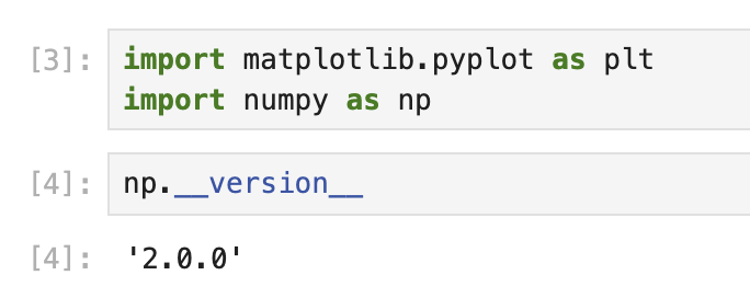
정확한 버전 번호는 환경에 따라 다를 수 있지만, 이는 라이브러리가 제대로 설치되어 사용할 준비가 되었음을 확인합니다.
이상치를 포함하는 샘플 데이터 생성
이제 이상치를 포함하는 샘플 데이터 세트를 생성해 보겠습니다. 무작위 숫자를 생성한 다음, 특정 위치에 의도적으로 더 큰 값을 추가하여 이상치를 만듭니다.
새 셀을 만들고 다음 코드를 추가합니다.
## Set random seed for reproducibility
np.random.seed(19680801)

## Generate 30 random points with values between 0 and 0.2
pts = np.random.rand(30) * 0.2

## Add 0.8 to two specific points to create outliers
pts[[3, 14]] += 0.8

## Display the first few data points to understand our dataset
print("First 10 data points:")
print(pts[:10])
print("\nData points containing outliers:")
print(pts[[3, 14]])
이 셀을 실행하면 다음과 유사한 출력이 표시됩니다.
First 10 data points:
[0.01182225 0.11765474 0.07404329 0.91088185 0.10502995 0.11190702
 0.14047499 0.01060192 0.15226977 0.06145634]

Data points containing outliers:
[0.91088185 0.97360754]
이 출력에서 인덱스 3 과 14 의 값이 다른 값보다 훨씬 크다는 것을 명확하게 볼 수 있습니다. 이것이 바로 이상치입니다. 대부분의 데이터 포인트는 0.2 미만이지만, 이 두 개의 이상치는 0.9 이상으로, 데이터 세트에 상당한 불균형을 만듭니다.
이러한 종류의 데이터 분포는 끊어진 축 플롯의 유용성을 보여주기에 완벽합니다. 다음 단계에서는 플롯 구조를 만들고 주 데이터와 이상치를 모두 제대로 표시하도록 구성합니다.
끊어진 축 플롯 생성 및 구성
이 단계에서는 실제 끊어진 축 플롯 구조를 생성합니다. 끊어진 축 플롯은 동일한 데이터의 서로 다른 범위를 보여주는 여러 개의 서브플롯으로 구성됩니다. 주 데이터와 이상치를 효과적으로 표시하도록 이러한 서브플롯을 구성합니다.
서브플롯 생성
먼저, 수직으로 정렬된 두 개의 서브플롯을 생성해야 합니다. 상단 서브플롯은 이상치를 표시하고, 하단 서브플롯은 대부분의 데이터 포인트를 표시합니다.
노트북에서 새 셀을 만들고 다음 코드를 추가합니다.
## Create two subplots stacked vertically with shared x-axis
fig, (ax1, ax2) = plt.subplots(2, 1, sharex=True, figsize=(8, 6))

## Add a main title to the figure
fig.suptitle('Broken Axis Plot Example', fontsize=16)

## Plot the same data on both axes
ax1.plot(pts, 'o-', color='blue')
ax2.plot(pts, 'o-', color='blue')

## Display the figure to see both subplots
plt.tight_layout()
plt.show()
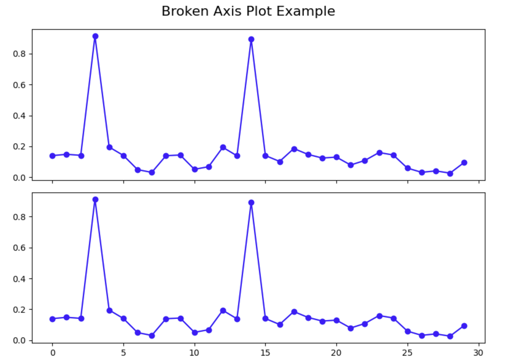
이 셀을 실행하면 두 개의 서브플롯이 있는 그림이 표시되며, 두 서브플롯 모두 동일한 데이터를 표시합니다. 이상치가 두 플롯 모두에서 나머지 데이터를 압축하여 대부분의 데이터 포인트의 세부 정보를 보기 어렵게 만드는 것을 확인하십시오. 이것이 바로 끊어진 축 플롯으로 해결하려는 문제입니다.
Y 축 제한 구성
이제 각 서브플롯이 특정 y 값 범위에 집중하도록 구성해야 합니다. 상단 서브플롯은 이상치 범위에 집중하고, 하단 서브플롯은 주 데이터 범위에 집중합니다.
새 셀을 만들고 다음 코드를 추가합니다.
## Create two subplots stacked vertically with shared x-axis
fig, (ax1, ax2) = plt.subplots(2, 1, sharex=True, figsize=(8, 6))

## Plot the same data on both axes
ax1.plot(pts, 'o-', color='blue')
ax2.plot(pts, 'o-', color='blue')

## Set y-axis limits for each subplot
ax1.set_ylim(0.78, 1.0)    ## Top subplot shows only the outliers
ax2.set_ylim(0, 0.22)      ## Bottom subplot shows only the main data

## Add a title to each subplot
ax1.set_title('Outlier Region')
ax2.set_title('Main Data Region')

## Display the figure with adjusted y-axis limits
plt.tight_layout()
plt.show()
이 셀을 실행하면 각 서브플롯이 이제 서로 다른 y 값 범위에 집중하는 것을 볼 수 있습니다. 상단 플롯은 이상치만 표시하고, 하단 플롯은 주 데이터만 표시합니다. 이것은 이미 시각화를 개선하지만, 제대로 된 끊어진 축 플롯을 만들려면 몇 가지 더 많은 구성을 추가해야 합니다.
스파인 숨기기 및 눈금 조정
"끊어진" 축의 환상을 만들기 위해 두 서브플롯 사이의 연결 스파인을 숨기고 눈금 위치를 조정해야 합니다.
새 셀을 만들고 다음 코드를 추가합니다.
## Create two subplots stacked vertically with shared x-axis
fig, (ax1, ax2) = plt.subplots(2, 1, sharex=True, figsize=(8, 6))

## Plot the same data on both axes
ax1.plot(pts, 'o-', color='blue')
ax2.plot(pts, 'o-', color='blue')

## Set y-axis limits for each subplot
ax1.set_ylim(0.78, 1.0)    ## Top subplot shows only the outliers
ax2.set_ylim(0, 0.22)      ## Bottom subplot shows only the main data

## Hide the spines between ax1 and ax2
ax1.spines.bottom.set_visible(False)
ax2.spines.top.set_visible(False)

## Adjust the position of the ticks
ax1.xaxis.tick_top()          ## Move x-axis ticks to the top
ax1.tick_params(labeltop=False)  ## Hide x-axis tick labels at the top
ax2.xaxis.tick_bottom()       ## Keep x-axis ticks at the bottom

## Add labels to the plot
ax2.set_xlabel('Data Point Index')
ax2.set_ylabel('Value')
ax1.set_ylabel('Value')

plt.tight_layout()
plt.show()
이 셀을 실행하면 이제 두 서브플롯 사이에 숨겨진 스파인이 있어 더 깔끔한 모양을 만드는 플롯을 볼 수 있습니다. x 축 눈금은 이제 올바르게 배치되어 있으며, 레이블은 하단에만 있습니다.
이 시점에서 기본 끊어진 축 플롯을 성공적으로 만들었습니다. 다음 단계에서는 시청자가 축이 끊어졌음을 명확하게 알 수 있도록 마무리 작업을 추가합니다.
끊어진 축 플롯에 마무리 작업 추가
이 마지막 단계에서는 y 축이 끊어졌음을 명확하게 하기 위해 끊어진 축 플롯에 마무리 작업을 추가합니다. 서브플롯 사이에 대각선을 추가하여 끊어진 부분을 표시하고, 적절한 레이블과 그리드를 사용하여 플롯의 전반적인 모양을 개선합니다.
대각선 끊기 선 추가
축이 끊어졌음을 시각적으로 나타내기 위해 두 서브플롯 사이에 대각선을 추가합니다. 이는 축의 일부가 생략되었음을 시청자가 이해하는 데 도움이 되는 일반적인 관례입니다.
새 셀을 만들고 다음 코드를 추가합니다.
## Create two subplots stacked vertically with shared x-axis
fig, (ax1, ax2) = plt.subplots(2, 1, sharex=True, figsize=(8, 6))

## Plot the same data on both axes
ax1.plot(pts, 'o-', color='blue')
ax2.plot(pts, 'o-', color='blue')

## Set y-axis limits for each subplot
ax1.set_ylim(0.78, 1.0)    ## Top subplot shows only the outliers
ax2.set_ylim(0, 0.22)      ## Bottom subplot shows only the main data

## Hide the spines between ax1 and ax2
ax1.spines.bottom.set_visible(False)
ax2.spines.top.set_visible(False)

## Adjust the position of the ticks
ax1.xaxis.tick_top()          ## Move x-axis ticks to the top
ax1.tick_params(labeltop=False)  ## Hide x-axis tick labels at the top
ax2.xaxis.tick_bottom()       ## Keep x-axis ticks at the bottom

## Add diagonal break lines
d = 0.5  ## proportion of vertical to horizontal extent of the slanted line
kwargs = dict(marker=[(-1, -d), (1, d)], markersize=12,
              linestyle='none', color='k', mec='k', mew=1, clip_on=False)
ax1.plot([0, 1], [0, 0], transform=ax1.transAxes, **kwargs)
ax2.plot([0, 1], [1, 1], transform=ax2.transAxes, **kwargs)

## Add labels and a title
ax2.set_xlabel('Data Point Index')
ax2.set_ylabel('Value')
ax1.set_ylabel('Value')
fig.suptitle('Dataset with Outliers', fontsize=16)

## Add a grid to both subplots for better readability
ax1.grid(True, linestyle='--', alpha=0.7)
ax2.grid(True, linestyle='--', alpha=0.7)

plt.tight_layout()
plt.subplots_adjust(hspace=0.1)  ## Adjust the space between subplots
plt.show()
이 셀을 실행하면 y 축의 끊어진 부분을 나타내는 대각선이 있는 완전한 끊어진 축 플롯을 볼 수 있습니다. 이제 플롯에는 가독성을 향상시키기 위한 제목, 축 레이블 및 그리드 선이 있습니다.
끊어진 축 플롯 이해
끊어진 축 플롯의 주요 구성 요소를 잠시 살펴보겠습니다.
- 두 개의 서브플롯: y 값의 서로 다른 범위에 각각 집중하는 두 개의 개별 서브플롯을 만들었습니다.
- 숨겨진 스파인: 시각적 분리를 만들기 위해 서브플롯 사이의 연결 스파인을 숨겼습니다.
- 대각선 끊기 선: 축이 끊어졌음을 나타내기 위해 대각선을 추가했습니다.
- Y 축 제한: 데이터의 특정 부분에 집중하기 위해 각 서브플롯에 대해 서로 다른 y 축 제한을 설정했습니다.
- 그리드 선: 가독성을 높이고 값을 더 쉽게 추정할 수 있도록 그리드 선을 추가했습니다.
이 기술은 그렇지 않으면 대부분의 데이터 포인트의 시각화를 압축할 이상치가 데이터에 있는 경우에 특히 유용합니다. 축을 "끊음"으로써 단일 그림에서 이상치와 주 데이터 분포를 모두 명확하게 표시할 수 있습니다.
플롯 실험
이제 끊어진 축 플롯을 만드는 방법을 이해했으므로 다양한 구성으로 실험할 수 있습니다. y 축 제한을 변경하거나, 플롯에 더 많은 기능을 추가하거나, 이 기술을 자체 데이터에 적용해 보십시오.
예를 들어, 이전 코드를 수정하여 범례를 포함하거나, 색상 구성을 변경하거나, 마커 스타일을 조정할 수 있습니다.
## Create two subplots stacked vertically with shared x-axis
fig, (ax1, ax2) = plt.subplots(2, 1, sharex=True, figsize=(8, 6))

## Plot the same data on both axes with different styles
ax1.plot(pts, 'o-', color='darkblue', label='Data Points', linewidth=2)
ax2.plot(pts, 'o-', color='darkblue', linewidth=2)

## Mark the outliers with a different color
outlier_indices = [3, 14]
ax1.plot(outlier_indices, pts[outlier_indices], 'ro', markersize=8, label='Outliers')

## Set y-axis limits for each subplot
ax1.set_ylim(0.78, 1.0)    ## Top subplot shows only the outliers
ax2.set_ylim(0, 0.22)      ## Bottom subplot shows only the main data

## Hide the spines between ax1 and ax2
ax1.spines.bottom.set_visible(False)
ax2.spines.top.set_visible(False)

## Adjust the position of the ticks
ax1.xaxis.tick_top()          ## Move x-axis ticks to the top
ax1.tick_params(labeltop=False)  ## Hide x-axis tick labels at the top
ax2.xaxis.tick_bottom()       ## Keep x-axis ticks at the bottom

## Add diagonal break lines
d = 0.5  ## proportion of vertical to horizontal extent of the slanted line
kwargs = dict(marker=[(-1, -d), (1, d)], markersize=12,
              linestyle='none', color='k', mec='k', mew=1, clip_on=False)
ax1.plot([0, 1], [0, 0], transform=ax1.transAxes, **kwargs)
ax2.plot([0, 1], [1, 1], transform=ax2.transAxes, **kwargs)

## Add labels and a title
ax2.set_xlabel('Data Point Index')
ax2.set_ylabel('Value')
ax1.set_ylabel('Value')
fig.suptitle('Dataset with Outliers - Enhanced Visualization', fontsize=16)

## Add a grid to both subplots for better readability
ax1.grid(True, linestyle='--', alpha=0.7)
ax2.grid(True, linestyle='--', alpha=0.7)

## Add a legend to the top subplot
ax1.legend(loc='upper right')

plt.tight_layout()
plt.subplots_adjust(hspace=0.1)  ## Adjust the space between subplots
plt.show()
이 향상된 코드를 실행하면 이상치가 특별히 표시되고 데이터 포인트를 설명하는 범례가 있는 개선된 시각화를 볼 수 있습니다.
축하합니다! Matplotlib 을 사용하여 Python 에서 끊어진 축 플롯을 성공적으로 만들었습니다. 이 기술은 이상치를 포함하는 데이터를 처리할 때 더 효과적인 시각화를 만드는 데 도움이 됩니다.
요약
이 튜토리얼에서는 Python 의 Matplotlib 을 사용하여 끊어진 축 플롯을 만드는 방법을 배웠습니다. 이 시각화 기술은 이상치를 포함하는 데이터를 처리할 때 유용하며, 단일 그림에서 주 데이터 분포와 이상치를 모두 명확하게 표시할 수 있습니다.
다음은 수행한 작업에 대한 요약입니다.
환경 설정 및 데이터 생성: 개념을 시연하기 위해 필요한 라이브러리를 가져오고 이상치를 포함하는 샘플 데이터를 생성했습니다.
기본 플롯 구조 생성: 서로 다른 값 범위에 집중하기 위해 서로 다른 y 축 제한이 있는 두 개의 서브플롯을 만들고 축의 모양을 구성했습니다.
시각화 향상: 끊어진 축을 나타내기 위해 대각선 끊기 선을 추가하고, 레이블과 그리드를 사용하여 플롯의 모양을 개선했으며, 시각화를 추가로 사용자 정의하는 방법을 배웠습니다.
끊어진 축 기술은 이상치가 일반적으로 대부분의 데이터 포인트의 시각화를 압축하는 경우에도 시청자가 전체 구조와 데이터 세부 정보를 동시에 볼 수 있도록 하여 일반적인 데이터 시각화 문제를 해결합니다.
명확하고 효과적인 방식으로 상당히 다른 값 범위를 가진 데이터를 표현해야 할 때마다 이 기술을 자체 데이터 분석 및 시각화 작업에 적용할 수 있습니다.