简介
在处理离群值时,数据可视化常常会面临挑战。这些极端值可能会压缩大部分数据点,使你难以观察到重要的模式或细节。断轴图(broken axis plot)通过“断开”坐标轴来显示不同范围的值,提供了一种优雅的解决方案,让你能够同时关注主要的数据分布和离群值。
在本教程中,你将学习如何使用 Python 中的 Matplotlib 创建断轴图。当可视化具有显著数值差异的数据集时,这种技术特别有用,它能更清晰地呈现正常数据和极端值。
虚拟机提示
虚拟机启动完成后,点击左上角切换到 Notebook 标签页,即可访问 Jupyter Notebook 进行练习。

你可能需要等待几秒钟,让 Jupyter Notebook 加载完成。由于 Jupyter Notebook 的限制,操作验证无法实现自动化。
如果你在本次实验中遇到任何问题,随时向 Labby 寻求帮助。请在实验结束后提供反馈,以便我们及时解决你遇到的问题。
准备环境并创建数据
在第一步中,我们将通过导入必要的库并创建用于可视化的示例数据来设置工作环境。我们将重点生成包含一些离群值的数据,以此展示使用断轴图(broken axis plot)的价值。
导入所需库
让我们从导入本教程所需的库开始。我们将使用 Matplotlib 进行可视化,使用 NumPy 生成和处理数值数据。
在 Jupyter Notebook 中创建一个新的单元格,并输入以下代码:
import matplotlib.pyplot as plt
import numpy as np

print(f"NumPy version: {np.__version__}")
运行此单元格时,你应该会看到类似以下的输出:
NumPy version: 2.0.0
确切的版本号可能会因你的环境而异,但这确认了库已正确安装并可以使用。
生成包含离群值的示例数据
现在,让我们创建一个包含一些离群值的示例数据集。我们将生成随机数,然后故意在某些位置添加较大的值来创建离群值。
创建一个新的单元格并添加以下代码:
## Set random seed for reproducibility
np.random.seed(19680801)

## Generate 30 random points with values between 0 and 0.2
pts = np.random.rand(30) * 0.2

## Add 0.8 to two specific points to create outliers
pts[[3, 14]] += 0.8

## Display the first few data points to understand our dataset
print("First 10 data points:")
print(pts[:10])
print("\nData points containing outliers:")
print(pts[[3, 14]])
运行此单元格时,你应该会看到类似以下的输出:
First 10 data points:
[0.01182225 0.11765474 0.07404329 0.91088185 0.10502995 0.11190702
 0.14047499 0.01060192 0.15226977 0.06145634]

Data points containing outliers:
[0.91088185 0.97360754]
在这个输出中,你可以清楚地看到索引 3 和 14 处的值比其他值大得多。这些就是我们的离群值。我们的大多数数据点都低于 0.2,但这两个离群值高于 0.9,在我们的数据集中造成了显著的差异。
这种数据分布非常适合展示断轴图的实用性。在下一步中,我们将创建绘图结构并对其进行配置,以便正确显示主要数据和离群值。
创建并配置断轴图
在这一步中,我们将创建实际的断轴图(broken axis plot)结构。断轴图由多个子图组成,用于展示同一数据的不同范围。我们将对这些子图进行配置,以有效地展示主要数据和离群值。
创建子图
首先,我们需要创建两个垂直排列的子图。上方的子图将展示离群值,而下方的子图将展示大部分数据点。
在你的 Notebook 中创建一个新的单元格,并添加以下代码:
## Create two subplots stacked vertically with shared x-axis
fig, (ax1, ax2) = plt.subplots(2, 1, sharex=True, figsize=(8, 6))

## Add a main title to the figure
fig.suptitle('Broken Axis Plot Example', fontsize=16)

## Plot the same data on both axes
ax1.plot(pts, 'o-', color='blue')
ax2.plot(pts, 'o-', color='blue')

## Display the figure to see both subplots
plt.tight_layout()
plt.show()
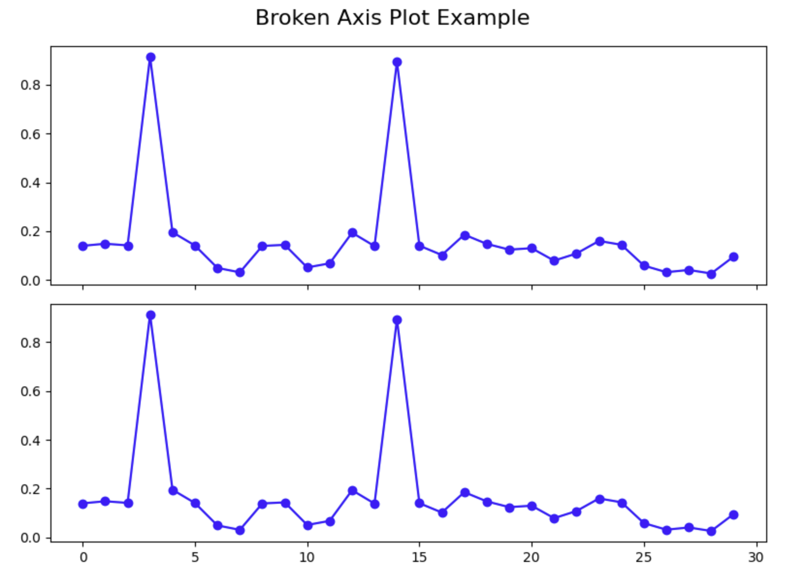
运行此单元格时,你应该会看到一个包含两个子图的图形,两个子图都展示了相同的数据。注意,离群值如何压缩了两个图中其余的数据,使得很难看清大部分数据点的细节。这正是我们试图用断轴图解决的问题。
配置 Y 轴范围
现在,我们需要对每个子图进行配置,使其专注于特定的 y 值范围。上方的子图将专注于离群值范围,而下方的子图将专注于主要数据范围。
创建一个新的单元格并添加以下代码:
## Create two subplots stacked vertically with shared x-axis
fig, (ax1, ax2) = plt.subplots(2, 1, sharex=True, figsize=(8, 6))

## Plot the same data on both axes
ax1.plot(pts, 'o-', color='blue')
ax2.plot(pts, 'o-', color='blue')

## Set y-axis limits for each subplot
ax1.set_ylim(0.78, 1.0)    ## Top subplot shows only the outliers
ax2.set_ylim(0, 0.22)      ## Bottom subplot shows only the main data

## Add a title to each subplot
ax1.set_title('Outlier Region')
ax2.set_title('Main Data Region')

## Display the figure with adjusted y-axis limits
plt.tight_layout()
plt.show()
运行此单元格时,你应该会看到每个子图现在都专注于不同的 y 值范围。上方的图仅展示离群值,下方的图仅展示主要数据。这已经改善了可视化效果,但要使其成为一个合适的断轴图,我们还需要进行一些额外的配置。
隐藏边框并调整刻度
为了营造出“断开”坐标轴的效果,我们需要隐藏两个子图之间相连的边框,并调整刻度的位置。
创建一个新的单元格并添加以下代码:
## Create two subplots stacked vertically with shared x-axis
fig, (ax1, ax2) = plt.subplots(2, 1, sharex=True, figsize=(8, 6))

## Plot the same data on both axes
ax1.plot(pts, 'o-', color='blue')
ax2.plot(pts, 'o-', color='blue')

## Set y-axis limits for each subplot
ax1.set_ylim(0.78, 1.0)    ## Top subplot shows only the outliers
ax2.set_ylim(0, 0.22)      ## Bottom subplot shows only the main data

## Hide the spines between ax1 and ax2
ax1.spines.bottom.set_visible(False)
ax2.spines.top.set_visible(False)

## Adjust the position of the ticks
ax1.xaxis.tick_top()          ## Move x-axis ticks to the top
ax1.tick_params(labeltop=False)  ## Hide x-axis tick labels at the top
ax2.xaxis.tick_bottom()       ## Keep x-axis ticks at the bottom

## Add labels to the plot
ax2.set_xlabel('Data Point Index')
ax2.set_ylabel('Value')
ax1.set_ylabel('Value')

plt.tight_layout()
plt.show()
运行此单元格时,你应该会看到图中两个子图之间的边框已被隐藏,外观更加简洁。x 轴刻度现在位置正确,标签仅显示在底部。
此时,我们已经成功创建了一个基本的断轴图。在下一步中,我们将添加一些修饰,让观看者清楚地知道坐标轴是断开的。
为断轴图添加最后的修饰
在这最后一步,我们将为断轴图(broken axis plot)添加最后的修饰,以明确显示 y 轴是断开的。我们会在子图之间添加对角线来表示断点,并通过合适的标签和网格线来提升图表的整体外观。
添加对角断线
为了直观地表明坐标轴是断开的,我们将在两个子图之间添加对角线。这是一种常见的做法,有助于观看者理解坐标轴的某些部分被省略了。
创建一个新的单元格并添加以下代码:
## Create two subplots stacked vertically with shared x-axis
fig, (ax1, ax2) = plt.subplots(2, 1, sharex=True, figsize=(8, 6))

## Plot the same data on both axes
ax1.plot(pts, 'o-', color='blue')
ax2.plot(pts, 'o-', color='blue')

## Set y-axis limits for each subplot
ax1.set_ylim(0.78, 1.0)    ## Top subplot shows only the outliers
ax2.set_ylim(0, 0.22)      ## Bottom subplot shows only the main data

## Hide the spines between ax1 and ax2
ax1.spines.bottom.set_visible(False)
ax2.spines.top.set_visible(False)

## Adjust the position of the ticks
ax1.xaxis.tick_top()          ## Move x-axis ticks to the top
ax1.tick_params(labeltop=False)  ## Hide x-axis tick labels at the top
ax2.xaxis.tick_bottom()       ## Keep x-axis ticks at the bottom

## Add diagonal break lines
d = 0.5  ## proportion of vertical to horizontal extent of the slanted line
kwargs = dict(marker=[(-1, -d), (1, d)], markersize=12,
              linestyle='none', color='k', mec='k', mew=1, clip_on=False)
ax1.plot([0, 1], [0, 0], transform=ax1.transAxes, **kwargs)
ax2.plot([0, 1], [1, 1], transform=ax2.transAxes, **kwargs)

## Add labels and a title
ax2.set_xlabel('Data Point Index')
ax2.set_ylabel('Value')
ax1.set_ylabel('Value')
fig.suptitle('Dataset with Outliers', fontsize=16)

## Add a grid to both subplots for better readability
ax1.grid(True, linestyle='--', alpha=0.7)
ax2.grid(True, linestyle='--', alpha=0.7)

plt.tight_layout()
plt.subplots_adjust(hspace=0.1)  ## Adjust the space between subplots
plt.show()
运行此单元格时,你应该会看到完整的断轴图,其中对角线表示 y 轴的断点。图表现在有了标题、坐标轴标签和网格线,以提高可读性。
理解断轴图
让我们花点时间来理解断轴图的关键组成部分:
- 两个子图:我们创建了两个独立的子图,每个子图专注于不同的 y 值范围。
- 隐藏边框:我们隐藏了子图之间相连的边框,以形成视觉上的分隔。
- 对角断线:我们添加了对角线来表示坐标轴是断开的。
- Y 轴范围:我们为每个子图设置了不同的 y 轴范围,以专注于数据的特定部分。
- 网格线:我们添加了网格线,以提高可读性并便于估算数值。
当你的数据中存在离群值,否则会压缩大部分数据点的可视化效果时,这种技术特别有用。通过“断开”坐标轴,你可以在一个图表中清晰地展示离群值和主要数据分布。
对图表进行实验
现在你已经了解了如何创建断轴图,你可以尝试不同的配置。尝试更改 y 轴范围、为图表添加更多功能,或者将此技术应用到你自己的数据上。
例如,你可以修改之前的代码,以包含图例、更改配色方案或调整标记样式:
## Create two subplots stacked vertically with shared x-axis
fig, (ax1, ax2) = plt.subplots(2, 1, sharex=True, figsize=(8, 6))

## Plot the same data on both axes with different styles
ax1.plot(pts, 'o-', color='darkblue', label='Data Points', linewidth=2)
ax2.plot(pts, 'o-', color='darkblue', linewidth=2)

## Mark the outliers with a different color
outlier_indices = [3, 14]
ax1.plot(outlier_indices, pts[outlier_indices], 'ro', markersize=8, label='Outliers')

## Set y-axis limits for each subplot
ax1.set_ylim(0.78, 1.0)    ## Top subplot shows only the outliers
ax2.set_ylim(0, 0.22)      ## Bottom subplot shows only the main data

## Hide the spines between ax1 and ax2
ax1.spines.bottom.set_visible(False)
ax2.spines.top.set_visible(False)

## Adjust the position of the ticks
ax1.xaxis.tick_top()          ## Move x-axis ticks to the top
ax1.tick_params(labeltop=False)  ## Hide x-axis tick labels at the top
ax2.xaxis.tick_bottom()       ## Keep x-axis ticks at the bottom

## Add diagonal break lines
d = 0.5  ## proportion of vertical to horizontal extent of the slanted line
kwargs = dict(marker=[(-1, -d), (1, d)], markersize=12,
              linestyle='none', color='k', mec='k', mew=1, clip_on=False)
ax1.plot([0, 1], [0, 0], transform=ax1.transAxes, **kwargs)
ax2.plot([0, 1], [1, 1], transform=ax2.transAxes, **kwargs)

## Add labels and a title
ax2.set_xlabel('Data Point Index')
ax2.set_ylabel('Value')
ax1.set_ylabel('Value')
fig.suptitle('Dataset with Outliers - Enhanced Visualization', fontsize=16)

## Add a grid to both subplots for better readability
ax1.grid(True, linestyle='--', alpha=0.7)
ax2.grid(True, linestyle='--', alpha=0.7)

## Add a legend to the top subplot
ax1.legend(loc='upper right')

plt.tight_layout()
plt.subplots_adjust(hspace=0.1)  ## Adjust the space between subplots
plt.show()
运行这段增强后的代码时,你应该会看到一个改进后的可视化图表,其中离群值被特别标记出来,并且有一个图例解释数据点。
恭喜!你已经使用 Matplotlib 在 Python 中成功创建了一个断轴图。当处理包含离群值的数据时,这种技术将帮助你创建更有效的可视化图表。
总结
在本教程中,你学习了如何使用 Python 中的 Matplotlib 创建断轴图(broken axis plot)。当处理包含离群值的数据时,这种可视化技术非常有用,因为它能让你在一个图表中清晰地展示主要数据分布和离群值。
以下是你所完成内容的回顾:
- 环境设置和数据创建:你导入了必要的库,并创建了包含离群值的示例数据,以演示这一概念。
- 创建基本图表结构:你创建了两个具有不同 y 轴范围的子图,以专注于不同的值范围,并配置了坐标轴的外观。
- 增强可视化效果:你添加了对角断线来表示坐标轴的断开,通过标签和网格线改善了图表的外观,并学习了如何进一步自定义可视化效果。
断轴技术解决了一个常见的数据可视化问题,它能让观看者同时看到数据集的整体结构和细节,即使离群值通常会压缩大部分数据点的可视化效果。
无论何时你需要以清晰有效的方式展示具有显著不同值范围的数据,都可以将此技术应用到你自己的数据分析和可视化任务中。