
介绍
在本实验中,你将学习如何使用 Matplotlib 创建和自定义直方图。Matplotlib 是 Python 中最流行的数据可视化库之一。直方图是一种可视化数值数据集分布的强大工具。它将数字分组到不同的范围(或“箱”),并显示落入每个箱的数据点的频率。
你将完成以下步骤:
- 使用 NumPy 生成样本数据。
- 创建一个基础直方图。
- 自定义箱的数量。
- 更改直方图条形的颜色和边缘样式。
- 对直方图进行归一化以显示概率密度。
在本实验结束时,你将能够为你的数据分析项目生成信息丰富且具有视觉吸引力的直方图。所有图表都将保存为图像文件,你可以在 LabEx WebIDE 中直接查看它们。
使用 numpy.random 生成样本数据
在本步骤中,你将生成一组样本数据,用于绘制直方图。我们将使用 NumPy 库,它是 Python 中科学计算的基础包。它提供了一个高性能的多维数组对象以及处理这些数组的工具。
我们将使用 numpy.random.normal() 函数生成服从正态(或高斯)分布的数据。这是许多现实场景中常见的 数据分布类型。
首先,从 WebIDE 左侧的文件浏览器中打开 main.py 文件。然后,将以下代码添加到其中。这段代码将导入 numpy 库,并生成 1000 个均值为 0、标准差为 1 的随机数。
import numpy as np

## Generate 1000 data points from a normal distribution
## with a mean (loc) of 0 and a standard deviation (scale) of 1.
data = np.random.normal(loc=0, scale=1, size=1000)

print("Sample data generated successfully.")
要运行脚本,请在 WebIDE 中打开终端(Terminal -> New Terminal),然后执行以下命令。你的工作目录已经是 /home/labex/project。
python3 main.py
你将在终端中看到一条确认消息。
Sample data generated successfully.
你的脚本中的 data 变量现在包含一个包含 1000 个数字的数组,已准备好在下一步进行可视化。
使用 plt.hist(data) 绘制直方图
在本步骤中,你将创建你的第一个直方图。我们将使用 matplotlib.pyplot 模块,它提供了一个简单的绘图接口。它通常以别名 plt 导入。
创建直方图的核心函数是 plt.hist()。最简单的用法是,它接受一个参数:你想要绘制的数据数组。
由于我们处于非交互式环境,无法直接使用 plt.show() 显示绘图。相反,我们必须使用 plt.savefig() 将绘图保存到文件。
使用以下代码更新你的 main.py 文件。它将 Matplotlib 绘图逻辑添加到上一步的数据生成代码中。
import numpy as np
import matplotlib.pyplot as plt

## Generate sample data
data = np.random.normal(loc=0, scale=1, size=1000)

## Create a histogram
plt.hist(data)

## Save the plot to a file
plt.savefig('/home/labex/project/histogram.png')

print("Basic histogram saved to histogram.png")
现在,再次从终端运行脚本:
python3 main.py
你应该会看到以下输出:
Basic histogram saved to histogram.png
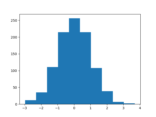
一个名为 histogram.png 的新文件将出现在左侧的文件浏览器中。双击它即可打开并查看你的第一个直方图。它将显示你生成的随机数据的频率分布。
使用 bins 参数设置 bin 数量
在本步骤中,你将学习如何通过设置 bin 的数量来控制直方图的粒度。“bin”是一个表示数据范围的区间。bin 的数量会显著影响对分布的解读。过少的 bin 可能会隐藏重要细节,而过多的 bin 则可能导致绘图噪点过多。
Matplotlib 的 plt.hist() 函数有一个 bins 参数,允许你指定 bin 的数量。默认情况下,Matplotlib 会选择一个合理的数量,但你通常需要调整它。
让我们修改代码,创建一个包含 30 个 bin 的直方图。我们还将它保存到一个新文件 histogram_bins.png,以便与之前的绘图进行比较。
按以下方式更新你的 main.py 文件:
import numpy as np
import matplotlib.pyplot as plt

## Generate sample data
data = np.random.normal(loc=0, scale=1, size=1000)

## Create a histogram with 30 bins
plt.hist(data, bins=30)

## Save the plot to a new file
plt.savefig('/home/labex/project/histogram_bins.png')

print("Histogram with 30 bins saved to histogram_bins.png")
在终端中运行脚本:
python3 main.py
输出将是:
Histogram with 30 bins saved to histogram_bins.png
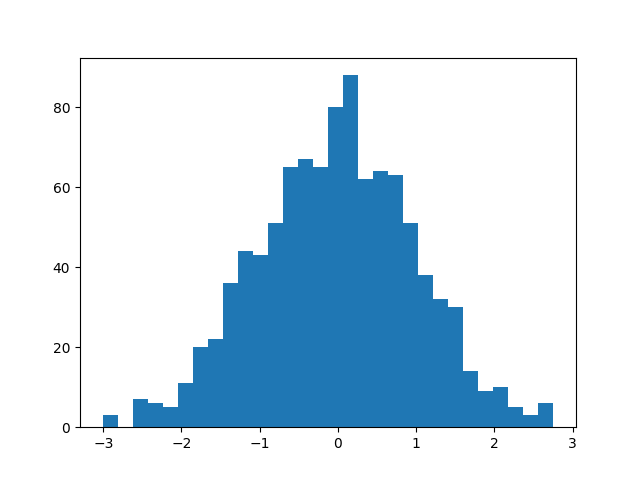
现在,在文件浏览器中找到 histogram_bins.png 并打开它。将其与第一个直方图进行比较。你应该会注意到条形更窄,提供了数据分布更详细的视图。
自定义直方图颜色和边框颜色
在本步骤中,你将自定义直方图的视觉外观。一个风格良好的绘图更容易阅读且更专业。plt.hist() 函数提供了几个用于风格设置的参数,包括用于条形填充的 color 和用于条形边框的 edgecolor。
让我们将条形颜色更改为浅蓝色,并添加黑色边框,使每个 bin 更清晰地突出。
修改你的 main.py 文件以包含这些新参数。我们将把这个自定义的绘图保存到 histogram_color.png。
import numpy as np
import matplotlib.pyplot as plt

## Generate sample data
data = np.random.normal(loc=0, scale=1, size=1000)

## Create a histogram with 30 bins, custom color, and edgecolor
plt.hist(data, bins=30, color='skyblue', edgecolor='black')

## Save the plot to a new file
plt.savefig('/home/labex/project/histogram_color.png')

print("Styled histogram saved to histogram_color.png")
在终端中执行脚本:
python3 main.py
你将看到此消息:
Styled histogram saved to histogram_color.png
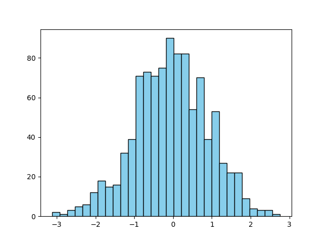
打开新创建的 histogram_color.png 文件。你将看到一个更加精致的直方图,带有浅蓝色条形和清晰的黑色轮廓。
使用 density=True 归一化直方图
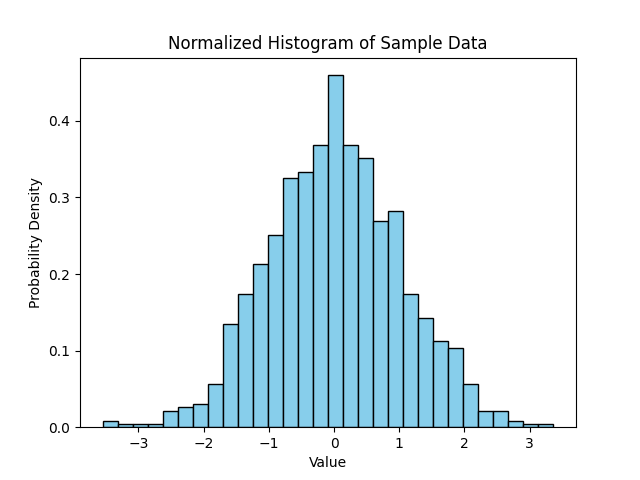
在本步骤中,你将学习如何创建归一化直方图。默认情况下,直方图的 y 轴表示每个 bin 中的数据点数量。然而,有时将分布视为概率密度会更有用。在归一化直方图中,每个条形的高度会进行调整,使得所有条形的总面积等于 1。
这可以通过在 plt.hist() 函数中将 density 参数设置为 True 来实现。同时,为绘图添加标签和标题,使其具有自解释性也是一个好习惯。
让我们更新脚本以创建归一化直方图并添加描述性标签。
import numpy as np
import matplotlib.pyplot as plt

## Generate sample data
data = np.random.normal(loc=0, scale=1, size=1000)

## Create a normalized histogram
plt.hist(data, bins=30, color='skyblue', edgecolor='black', density=True)

## Add title and labels
plt.title('Normalized Histogram of Sample Data')
plt.xlabel('Value')
plt.ylabel('Probability Density')

## Save the plot to a new file
plt.savefig('/home/labex/project/histogram_normalized.png')

print("Normalized histogram saved to histogram_normalized.png")
运行脚本的最终版本:
python3 main.py
输出将是:
Normalized histogram saved to histogram_normalized.png
打开 histogram_normalized.png。请注意,y 轴的值现在小了很多。它们代表概率密度,而不是原始计数。分布的整体形状保持不变,但现在尺度已标准化,这对于比较不同大小数据集的分布非常有用。
总结
恭喜你完成了本次实验!你已经掌握了使用 Python 中的 Matplotlib 创建和自定义直方图的基本技能。
在本次实验中,你:
- 使用
numpy.random.normal()生成了样本数据。 - 使用
plt.hist()绘制了基础直方图。 - 使用
bins参数控制了 bin 的数量。 - 使用
color和edgecolor参数对直方图进行了样式设置。 - 使用
density=True创建了归一化的概率密度直方图。 - 为绘图添加了标题和标签以提供更好的上下文。
直方图是数据探索和分析中的一个基本工具。你在这里学到的技术将使你能够有效地可视化自己数据集的分布。你可以继续尝试 Matplotlib 中的其他参数和绘图类型。