
介绍
在这个循序渐进的项目中,我们将使用 HTML、CSS 和 JavaScript 创建一个现代且视觉上吸引人的费用分摊网络应用程序。这个应用程序将允许你在一群人之间分摊费用,并计算谁欠谁多少钱。我们将从头开始,逐步涵盖构建项目的每个步骤。
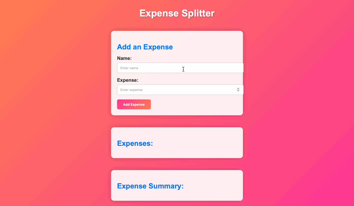
👀 预览
🎯 任务
在这个项目中,你将学习:
- 如何使用 HTML 和 CSS 创建响应式网页布局
- 如何使用 JavaScript 实现交互式功能来计算费用和余额
- 如何设计网页样式以拥有现代且视觉上吸引人的设计
- 如何处理用户输入以添加费用并动态显示结果
- 如何实现错误处理以确保数据准确性并防止问题
🏆 成果
完成这个项目后,你将能够:
- 创建项目文件并为网络应用程序设置基本结构
- 为费用分摊器应用程序构建 HTML 结构,包括输入字段和占位符
- 使用 CSS 设计网络应用程序的样式以实现现代且丰富多彩的设计
- 实现 JavaScript 功能以处理添加费用、更新费用列表和计算费用摘要
- 添加事件监听器以使应用程序具有交互性
- 在 JavaScript 中创建函数以执行特定任务,例如添加费用和更新摘要
创建 HTML 结构
要求:
- 在
index.html的<body>标签内,为你的应用创建 HTML 结构。 - 包含用于添加费用、显示费用列表和展示费用摘要的占位符。
功能:
- 使用输入字段和按钮为应用创建可视化结构。
步骤:
打开 index.html 并按如下方式更新 HTML 结构:
<!-- 在 <body> 标签内 -->

<div class="container">
  <h1>费用分摊器</h1>

  <div class="input-card">
    <h2>添加费用</h2>
    <div class="input-group">
      <label for="name">姓名:</label>
      <input type="text" id="name" placeholder="输入姓名" />
    </div>
    <div class="input-group">
      <label for="expense">费用:</label>
      <input type="number" id="expense" placeholder="输入费用" />
    </div>
    <button id="addExpense">添加费用</button>
  </div>

  <div class="expense-card">
    <h2>费用:</h2>
    <ul id="expenses"></ul>
  </div>

  <div class="summary-card">
    <h2>费用摘要:</h2>
    <ul id="summary"></ul>
  </div>
</div>
使用 CSS 为应用程序添加样式
要求:
- 在
styles.css中添加 CSS 规则来为应用设计样式。 - 使用 CSS 创建一个现代且色彩丰富的设计。
功能: 应用 CSS 样式以使应用在视觉上更具吸引力。
步骤:
打开 styles.css 并添加以下 CSS 代码:
body {
  font-family: Arial, sans-serif;
  background: linear-gradient(135deg, #ff7f50, #ff3399);
  margin: 0;
  padding: 0;
  color: #333;
}

.container {
  display: flex;
  flex-direction: column;
  align-items: center;
  min-height: 100vh;
  padding: 20px;
}

h1 {
  font-size: 2rem;
  margin: 20px 0;
  color: #fff;
  text-shadow: 2px 2px 4px rgba(0, 0, 0, 0.2);
}

.input-card,
.expense-card,
.summary-card {
  background: rgba(255, 255, 255, 0.9);
  box-shadow: 0px 0px 20px rgba(0, 0, 0, 0.2);
  border-radius: 10px;
  padding: 20px;
  margin: 20px 0;
  width: 100%;
  max-width: 400px;
  text-align: left;
}

.input-card h2,
.expense-card h2,
.summary-card h2 {
  color: #007bff;
  font-size: 1.5rem;
  margin-bottom: 15px;
}

.input-group {
  margin-bottom: 15px;
}

label {
  display: block;
  margin-bottom: 5px;
  font-weight: bold;
}

input[type="text"],
input[type="number"] {
  width: 100%;
  padding: 10px;
  border: 1px solid #ccc;
  border-radius: 5px;
}

button {
  background: linear-gradient(135deg, #ff3399, #ff7f50);
  color: #fff;
  padding: 10px 20px;
  border: none;
  border-radius: 5px;
  cursor: pointer;
  font-weight: bold;
  transition: background 0.3s ease;
}

button:hover {
  background: linear-gradient(135deg, #ff7f50, #ff3399);
}

ul {
  list-style: none;
  padding: 0;
  margin: 0;
}

li {
  margin-bottom: 10px;
}

/* 卡片动画 */
@keyframes fade-in {
  from {
    opacity: 0;
    transform: translateY(-10px);
  }

  to {
    opacity: 1;
    transform: translateY(0);
  }
}

.input-card,
.expense-card,
.summary-card {
  animation: fade-in 0.5s ease;
}
添加事件监听器
现在,是时候使用 JavaScript 为我们的费用分摊器应用程序添加功能了。我们将处理添加费用、更新费用列表以及计算费用摘要。
要求:
- 为 HTML 中的按钮添加事件监听器。
- 确保当用户与应用程序交互时,事件监听器能触发相应的操作。
功能:
- 通过监听按钮点击使应用程序具有交互性。
步骤:
打开 script.js 并添加以下代码来处理按钮点击:
// “添加费用”按钮的事件监听器
document.getElementById("addExpense").addEventListener("click", addExpense);
实现添加费用函数
要求:
- 在
script.js中创建一个名为addExpense的 JavaScript 函数。 - 此函数应从输入字段中提取值,进行验证,并将费用添加到一个数组中。
功能: 允许用户向应用程序中添加费用。
步骤:
打开 script.js 并添加以下代码:
const expenses = [];
// 实现 addExpense 函数
function addExpense() {
  const name = document.getElementById("name").value;
  const amount = parseFloat(document.getElementById("expense").value);

  if (name && amount) {
    // 将费用添加到 expenses 数组中
    expenses.push({ name, amount });

    // 更新费用列表和摘要
    updateExpenseList();
    document.getElementById("name").value = "";
    document.getElementById("expense").value = "";
  }
}
实现更新费用列表函数
要求:
- 在
script.js中创建一个名为updateExpenseList的 JavaScript 函数。 - 此函数应更新网页上显示的费用列表。
功能: 当用户添加费用时,在网页上显示费用列表。
步骤:
打开 script.js 并添加以下代码:
// 实现 updateExpenseList 函数
function updateExpenseList() {
  const expensesList = document.getElementById("expenses");
  expensesList.innerHTML = "";

  for (const expense of expenses) {
    const li = document.createElement("li");
    li.textContent = `${expense.name}: $${expense.amount.toFixed(2)}`;
    expensesList.appendChild(li);
  }

  // 调用 updateSummary 函数
  updateSummary();
}
实现更新摘要函数
要求:
- 在
script.js中创建一个名为updateSummary的 JavaScript 函数。 - 此函数应计算并显示费用摘要,包括谁欠谁多少钱。
功能:
- 为用户提供费用摘要的概述。
步骤:
打开 script.js 并添加以下代码:
// 实现 updateSummary 函数
function updateSummary() {
  const summaryList = document.getElementById("summary");
  summaryList.innerHTML = "";

  const totalExpense = expenses.reduce(
    (total, expense) => total + expense.amount,
    0
  );
  const averageExpense = totalExpense / expenses.length;

  for (const expense of expenses) {
    const balance = expense.amount - averageExpense;
    const li = document.createElement("li");

    if (balance > 0) {
      li.textContent = `${expense.name} owes $${balance.toFixed(2)} to others.`;
    } else if (balance < 0) {
      li.textContent = `${expense.name} is owed $${(-balance).toFixed(
        2
      )} by others.`;
    } else {
      li.textContent = `${expense.name} is settled up.`;
    }

    summaryList.appendChild(li);
  }
}
实现更新摘要函数
- 在网页浏览器中打开
index.html。
- 通过添加费用并验证费用列表和摘要是否正确更新来测试应用程序。
- 页面效果如下:
总结
在这个项目中,我们逐步构建了一个现代化的费用分摊网络应用程序。我们创建了项目文件,设置了 HTML 结构,添加了 CSS 样式,并实现了 JavaScript 功能。该应用程序现在允许你添加费用、查看费用列表以及查看费用摘要。你可以进一步自定义样式并添加更多功能,以增强应用程序的功能和外观。