
Introduction
In this project, you will learn how to create a flexible card layout using CSS Flexbox. The flexible card layout is a common design pattern used in web pages and applications, where content is displayed in a responsive and adaptable grid-like structure.
👀 Preview

🎯 Tasks
In this project, you will learn:
- How to select the elements to be laid out as flexible boxes
- How to control the wrapping of flex items within the flexible container
- How to control the positioning of flex items on the main axis
🏆 Achievements
After completing this project, you will be able to:
- Use CSS Flexbox to create a responsive and flexible layout
- Apply techniques for controlling the behavior of flex items within a flexible container
- Implement strategies for positioning and distributing flex items along the main axis
Set Up the Project Structure
In this step, you will learn how to set up the project structure.
To get started, open the editor. You should see two files — flexible_card.html and flexible_card.css from your editor.
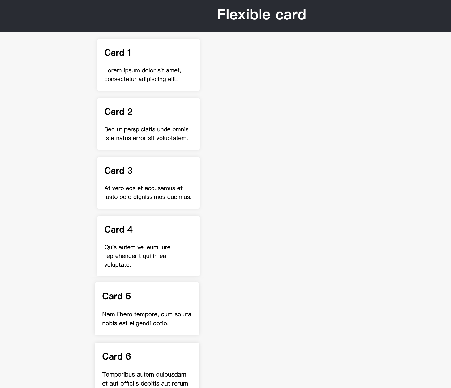
Click "Go Live" in the bottom right corner to open port 8080 to preview the flexible_card.html page in the browser, the effect will be as follows:
Setting Up Flexible Layouts
In this step, you will learn how to use flex elements for layout to hit the desired effect. Please follow the steps below to complete this step:
- Open the
flexible_card.cssfile in your editor. - Locate the
sectionselector in the CSS file. - Add the
display: flex;property to thesectionselector to make the<section>element a flexible container.
The updated CSS code should look like this:
section {
  display: flex; /* Make the section a flexible container */
  /* Other styles */
}
- Add the
flex-wrap: wrap;property to thesectionselector to allow the flex items to wrap to the next line if they don't fit on the same line.
The updated CSS code should look like this:
section {
  display: flex;
  flex-wrap: wrap; /* Allow the flex items to wrap to the next line */
  /* Other styles */
}
- Add the
justify-content: space-between;property to thesectionselector to distribute the flex items evenly along the main axis, with equal space between them.
The updated CSS code should look like this:
section {
  display: flex;
  flex-wrap: wrap;
  justify-content: space-between; /* Distribute the flex items evenly along the main axis */
  /* Other styles */
}
After completing these three steps, your flexible_card.css file should look like this:
section {
  display: flex;
  flex-wrap: wrap;
  justify-content: space-between;

  max-width: 900px;
  margin: 0 auto;
  padding: 20px;
}
Now, your flexible card layout should be complete and match the finished result shown in the example.
Summary
Congratulations! You have completed this project. You can practice more labs in LabEx to improve your skills.


