
Introduction
In this project, you will learn how to create a responsive dice layout using Flexbox CSS. The goal is to arrange a set of dice with different patterns of dots, following specific layout requirements.
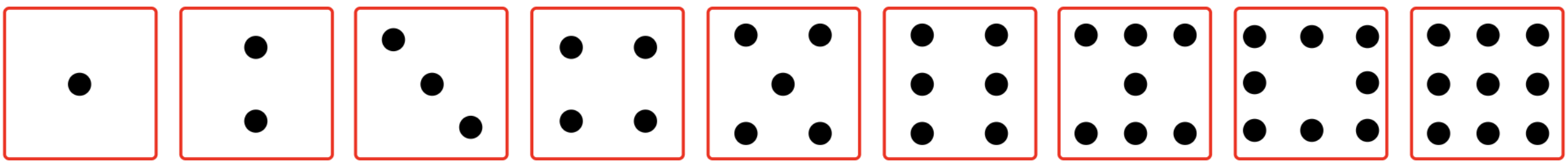
👀 Preview
🎯 Tasks
In this project, you will learn:
- How to set up the basic structure of the dice layout using HTML and CSS
- How to use Flexbox properties like
justify-content,align-items,flex-direction, andalign-selfto position the dots inside each dice - How to implement advanced Flexbox techniques like
flex-wrapandflex-basisto create the desired layout
🏆 Achievements
After completing this project, you will be able to:
- Use Flexbox to create complex and responsive layouts
- Understand the different Flexbox properties and how to apply them effectively
- Develop problem-solving skills by following step-by-step instructions and implementing the required layout
Layout Dice 1
To get started, open the editor. You should see a file — index.html from your editor.
Click "Go Live" in the bottom right corner to open port 8080 to preview the index.html page in the browser, the effect will be as follows:

In this step, you will use the justify-content and align-items properties to position the dots inside the first dice.
- Open the
index.htmlfile in your code editor. - In the
<style>section, add the following rules for the.div1class:
.div1 {
  justify-content: center;
  align-items: center;
}
The justify-content: center centers the dot horizontally, and align-items: center centers it vertically.
Layout Dice 2
In this step, you will use the justify-content, flex-direction, and align-items properties to position the dots inside the second dice.
- In the
<style>section, add the following rules for the.div2class:
.div2 {
  justify-content: space-around;
  flex-direction: column;
  align-items: center;
}
The justify-content: space-around distributes the dots evenly along the main axis (horizontally), flex-direction: column stacks the dots vertically, and align-items: center centers them within the dice.
Layout Dice 3
In this step, you will use the justify-content, align-self, and align-items properties to position the dots inside the third dice.
- In the
<style>section, add the following rules for the.div3class:
.div3 {
  justify-content: space-around;
  align-items: center;
  padding: 10px;
}

.div3 p:first-child {
  align-self: flex-start;
}

.div3 p:last-child {
  align-self: flex-end;
}
The justify-content: space-around distributes the dots evenly along the main axis (horizontally), align-items: center centers them vertically, and padding: 10px adds some spacing around the dice.
The align-self property is used to position the first and last dots at the top and bottom of the dice, respectively.
Layout Dice 4, 5, 6, 7, and 9
In this step, you will use the justify-content, align-self, flex-direction, and align-items properties to position the dots inside the remaining dice.
- In the
<style>section, add the following rules for the.div4class:
.div4 {
  justify-content: space-around;
  flex-direction: column;
  align-items: center;
}

.div4 div {
  display: flex;
  width: 100%;
  justify-content: space-around;
}

.div4 p {
  align-self: center;
}
The justify-content: space-around distributes the dots evenly along the main axis (horizontally), flex-direction: column stacks the dots vertically, and align-items: center centers them within the dice.
The inner <div> elements are used to group the dots horizontally, with justify-content: space-around distributing them evenly. The align-self: center property is used to center the individual dots within their respective rows.
Layout Dice 8
In this final step, you will use the justify-content, align-self, flex-wrap, and flex-basis properties to position the dots inside the eighth dice.
- In the
<style>section, add the following rules for the.div8class:
.div8 {
  flex-wrap: wrap;
  padding: 2px;
}

.div8 div {
  display: flex;
  justify-content: space-between;
  align-items: center;
  flex-basis: 100%;
}
The flex-wrap: wrap property allows the dots to wrap to the next line if they don't fit on a single line. The padding: 2px adds some spacing around the dice.
The inner <div> elements are used to group the dots horizontally, with justify-content: space-between distributing them evenly and align-items: center centering them vertically. The flex-basis: 100% ensures that each row takes up the full width of the dice.
By following these steps, you have successfully implemented the Flex Dice Layout as per the requirements.
Summary
Congratulations! You have completed this project. You can practice more labs in LabEx to improve your skills.


