
Introduction
In this project, you will learn how to use Flexbox CSS properties to arrange a layout of fresh vegetables in a specific design. By the end of this project, you will be able to create a visually appealing layout using Flexbox, which is a powerful tool for creating responsive and dynamic web designs.
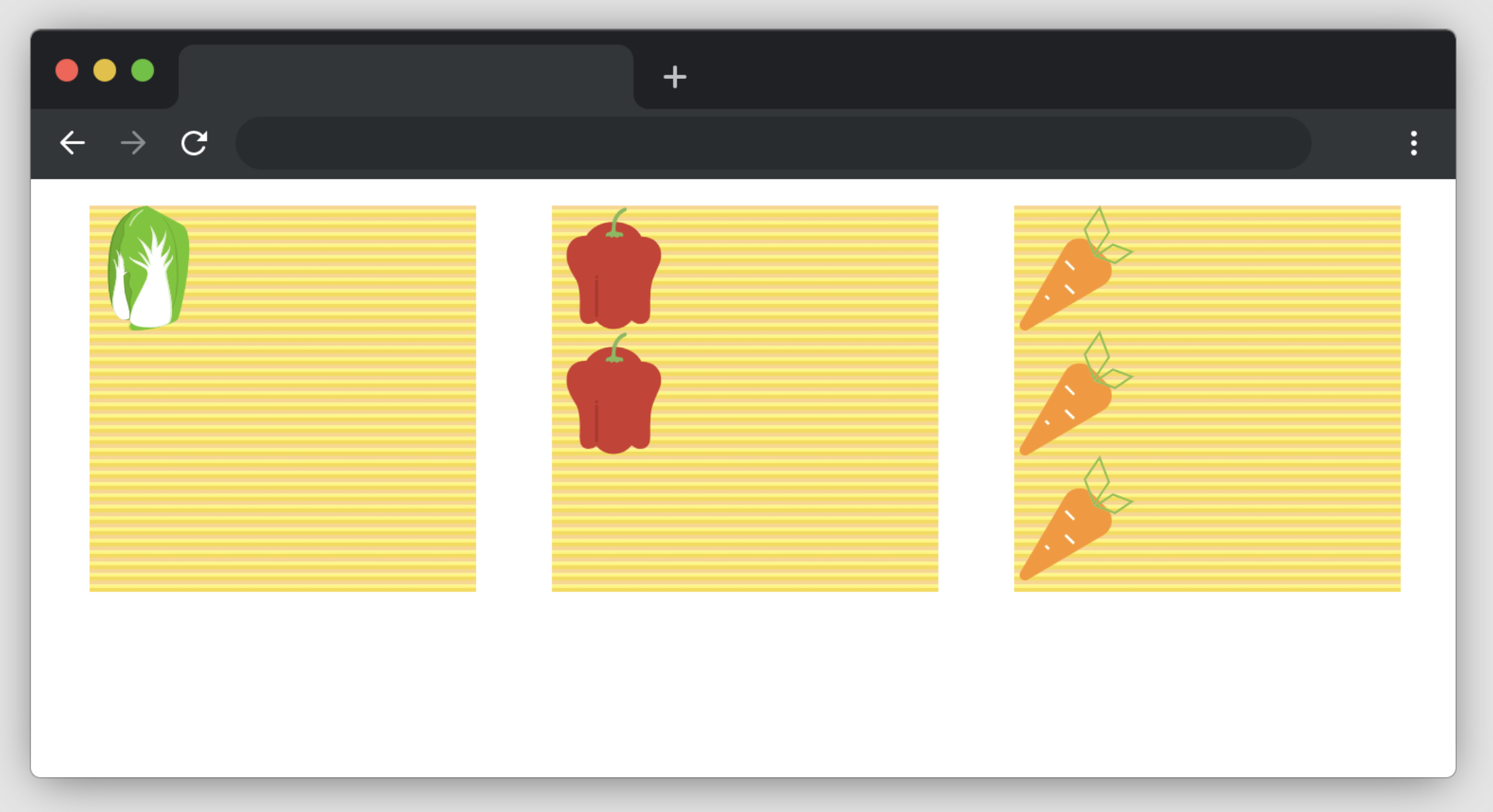
👀 Preview

🎯 Tasks
In this project, you will learn:
- How to set up the layout using Flexbox CSS properties
- How to arrange the vegetables in the desired positions within the layout
- How to use Flexbox properties like
display,justify-content,align-items, andalign-selfto achieve the desired layout
🏆 Achievements
After completing this project, you will be able to:
- Create a visually appealing layout using Flexbox, a powerful tool for creating responsive and dynamic web designs
- Understand how to use Flexbox CSS properties to create a flexible and responsive layout
- Apply techniques for aligning and distributing elements within a Flexbox container
- Implement strategies for positioning elements within a Flexbox layout to achieve a specific design
Set Up the Project
In this step, you will set up the project files and structure. Follow the steps below to complete this step:
Open the project folder, which contains the following files and directories:
css/style.cssindex.html
Click on Go Live button in the bottom right corner of WebIDE, to run the project.
Open "Web 8080" on the top of the VM and refresh it manually and you will see the page.
Set Up the Layout
In this step, you will learn how to use Flexbox CSS properties to set up the layout for the vegetable arrangement.
Open the
style.cssfile in your editor.Inside the
#box1selector, add the following CSS properties:#box1 { display: flex; justify-content: center; align-items: center; }This will center the content both horizontally and vertically within the
#box1container.Inside the
#box2selector, add the following CSS properties:#box2 { display: flex; justify-content: space-between; }This will distribute the items in the
#box2container evenly with space between them.Inside the
#box2 .item:nth-child(2)selector, add the following CSS property:#box2 .item:nth-child(2) { align-self: flex-end; }This will align the second item in
#box2to the bottom of the container.
Arrange the Vegetables
In this step, you will learn how to use Flexbox CSS properties to arrange the vegetables in the desired positions.
Inside the
#box3selector, add the following CSS properties:#box3 { display: flex; flex-direction: row; justify-content: space-between; }This will create a row layout for the items in
#box3and distribute them evenly with space between them.Inside the
#box3 .item:nth-child(2)selector, add the following CSS property:#box3 .item:nth-child(2) { align-self: center; }This will align the second item in
#box3to the center of the container.Inside the
#box3 .item:nth-child(3)selector, add the following CSS property:#box3 .item:nth-child(3) { align-self: flex-end; }This will align the third item in
#box3to the bottom of the container.
After completing these steps, your style.css file should match the solution provided, and the layout of the vegetables should match the finished example.
The finished result is as follows:
Summary
Congratulations! You have completed this project. You can practice more labs in LabEx to improve your skills.


