# Introduction In this project, you will learn how to create a data visualization chart using the ECharts library. The project aims to help Lucy, an online learning platform user, to better visualize her daily study time. ## 👀 Preview 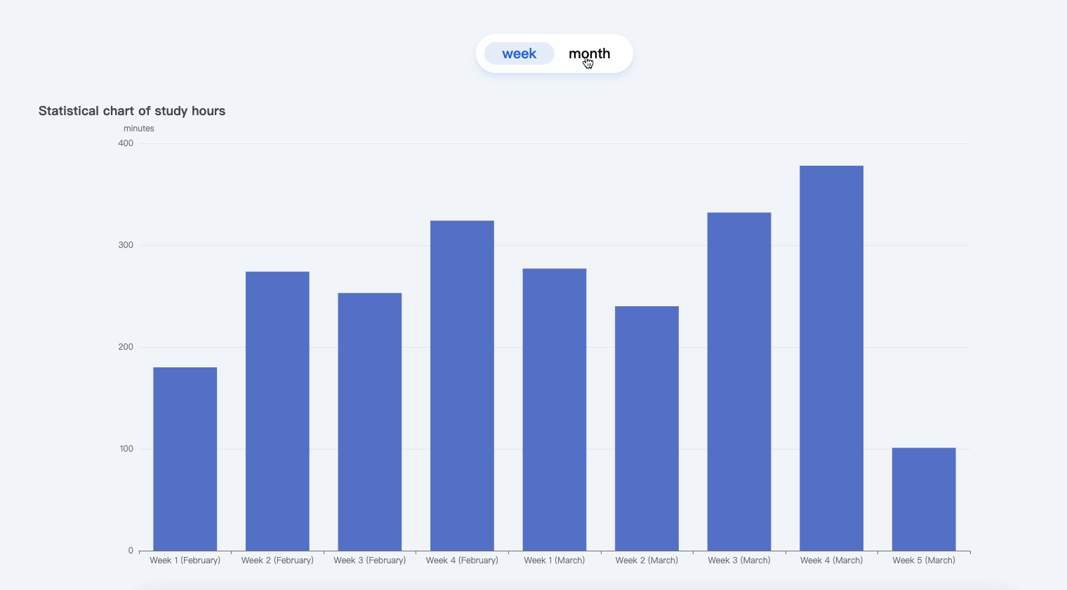 ## 🎯 Tasks In this project, you will learn: - How to fetch data from a JSON file and process it to extract the necessary information. - How to use the ECharts library to create a bar chart that displays the weekly and monthly study duration statistics. - How to implement interactivity to allow the user to switch between the weekly and monthly views. - How to resize the chart dynamically when the window is resized. ## 🏆 Achievements After completing this project, you will be able to: - Fetch data from a JSON file and manipulate it for visualization. - Configure and customize an ECharts bar chart to display study duration statistics. - Add interactivity to the chart and handle user interactions. - Ensure the chart remains responsive and adapts to window resizing.
Click the virtual machine below to start practicing