# Introduction In this project, you will learn how to create a statistical chart of crop yields in a city over the past five years using ECharts. The project aims to demonstrate how practical problems can be analyzed through statistics on crop yields, which directly affect people's livelihood. ## 👀 Preview 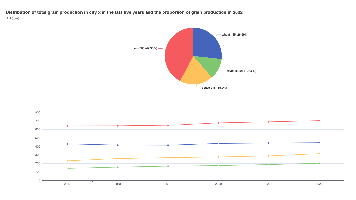 ## 🎯 Tasks In this project, you will learn: - How to set up the project environment and understand the provided files - How to fetch the data from a JSON file and process it to update the ECharts visualization - How to customize the appearance and layout of the line chart and pie chart ## 🏆 Achievements After completing this project, you will be able to: - Use the Axios library to fetch data from a JSON file - Manipulate the ECharts option object to update the visualization - Customize the charts by adjusting the title, layout, and other properties
Click the virtual machine below to start practicing