
はじめに
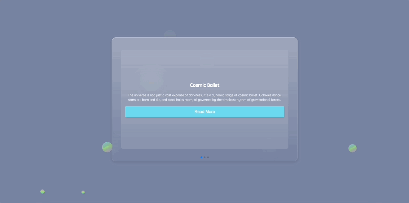
このプロジェクトでは、宇宙をテーマとした魅力的なキャルーセルレイアウトを備えた Swiper キャルーセルの Web アプリを作成する方法を学びます。このアプリでは、ユーザーが異なるスライドをナビゲートし、宇宙に関する興味深い事実を表示するカードを見ることができます。
以下は、Swiper キャルーセルのプレビューです。
🎯 タスク
このプロジェクトでは、以下を学びます。
- Web アプリの HTML の骨格を構築する方法
- Swiper キャルーセルを HTML 構造に埋め込む方法
- アプリの背景に円とアニメーション付きの浮遊円を追加する方法
- ブラウザ間で一貫したスタイリングを保証するための基本的な CSS リセットを実装する方法
- アプリのメインセクションとコンテンツホルダーをスタイリングする方法
- 背景の浮遊円をデザインしてアニメーションさせる方法
- Swiper キャルーセルとそのコンポーネントをスタイリングする方法
- JavaScript を使用して Swiper キャルーセルを初期化する方法
🏆 成果
このプロジェクトを完了すると、以下のことができるようになります。
- 宇宙をテーマとした魅力的な Swiper キャルーセルの Web アプリを作成する
- Web アプリの HTML 構造とレイアウトを実装する
- CSS のスタイリングとアニメーションを適用してユーザーインターフェイスを向上させる
- JavaScript を使用して Swiper キャルーセルを初期化して設定する
HTML の骨格を構築する
要件:
- 文字セットとビューポート設定を定義するための必須のメタタグを埋め込む。
- 外部のスタイルシートとスクリプトへのリンクを貼る。
機能:
- 構築の基盤となる基本的な HTML レイアウトを生成する。
手順:
<!doctype html>
<html lang="en">
  <head>
    <meta charset="UTF-8" />
    <meta name="viewport" content="width=device-width, initial-scale=1.0" />
    <title>Swiperキャルーセル</title>
    <link rel="stylesheet" href="./style.css" />
    <link
      rel="stylesheet"
      href="https://cdn.jsdelivr.net/npm/swiper@8/swiper-bundle.min.css"
    />
  </head>
  <body>
    <!-- 一部 -->
    <script src="https://cdnjs.cloudflare.com/ajax/libs/Swiper/8.4.5/swiper-bundle.min.js"></script>
    <!-- 次に Swiper キャルーセルの構造を挿入します -->
    <!-- スクリプト:Swiper ライブラリと独自のロジック -->
    <script src="./script.js"></script>
  </body>
</html>
HTML に Swiper キャルーセルを埋め込む
要件:
- キャルーセルのコンテンツを収容する HTML 内の構造的な場所。
- ナビゲーション用のページネーション要素。
機能:
- スタイリング可能でインタラクティブにできるキャルーセルレイアウトを埋め込む。
手順:
index.html の<body>タグ内にこれを追加する:
<section>
  <div class="content">
    <div class="swiper">
      <div class="swiper-container">
        <div class="swiper-wrapper">
          <div class="swiper-slide">
            <div class="card">
              <h1>宇宙のバレエ</h1>
              <p>
                宇宙はただの広大な暗黒の広がりではなく、宇宙のバレエのダイナミックな舞台です。銀河が踊り、星が生まれ死に、ブラックホールが徘徊し、すべてが重力の力の永遠のリズムに支配されています。
              </p>
              <button class="read-more">詳細を読む</button>
            </div>
          </div>
          <div class="swiper-slide">
            <div class="card">
              <h1>暗黒の秘密</h1>
              <p>
                その輝く星や銀河にもかかわらず、宇宙は明かすよりも隠すものが多い。目に見えなくて神秘的な暗黒物質と暗黒エネルギーは、宇宙の
                95%を占め、宇宙を結びつけ、その拡大を促している。
              </p>
              <button class="read-more">詳細を読む</button>
            </div>
          </div>
          <div class="swiper-slide">
            <div class="card">
              <h1>時間の相対性</h1>
              <p>
                広大な宇宙では、時間は相対的である。ブラックホールのような巨大な物体の近くでは、時間が遅くなるように見える。そこで数分と感じられることは、他の場所では数年に相当するかもしれず、宇宙を時間の弾力性の劇場にしている。
              </p>
              <button class="read-more">詳細を読む</button>
            </div>
          </div>
        </div>
        <!-- ページネーションを追加 -->
        <div class="swiper-pagination"></div>
      </div>
    </div>
  </div>
</section>
HTML に円を埋め込む
要件:
- たくさんの丸いバブルを取得するには、
<ul>と<li>を追加します。
機能:
- さまざまなサイズの多数のバブルがページの背景でアニメーション化されます。
手順:
<section>
  <!--swiper コンテンツ...-->
  <ul class="circles">
    <li></li>
    <li></li>
    <li></li>
    <li></li>
    <li></li>
    <li></li>
    <li></li>
    <li></li>
    <li></li>
    <li></li>
  </ul>
</section>
基本的な CSS リセットの実装
要件:
- 異なるブラウザで一貫した見た目を実現する。
- ブラウザの既定のマージン、パディング、およびボックス寸法をリセットする。
機能:
- ブラウザの既定のスタイルを無効にして、さまざまなブラウザでのスタイリングを一貫させる。
手順:
*,
*::before,
*::after {
  margin: 0;
  padding: 0;
  box-sizing: border-box;
}
メインセクションとコンテンツホルダーのスタイリング
要件:
- ビューポート全体を占めるメインセクション。
- 特定の寸法とスタイリングを備えた視覚的に魅力的なコンテンツホルダー。
機能:
- メインセクションとコンテンツホルダーをスタイリングして、両方とも中央揃えにし、宇宙をテーマにした外観を与える。
手順:
section {
  position: relative;
  display: flex;
  justify-content: center;
  align-items: center;
  background: #7883a1;
  min-height: 100vh;
  overflow: hidden;
}

.content {
  display: flex;
  flex-direction: row;
  justify-content: center;
  align-items: center;
  background: linear-gradient(
    180deg,
    rgba(255, 255, 255, 0.28) 0%,
    rgba(255, 255, 255, 0) 100%
  );
  backdrop-filter: blur(30px);
  border-radius: 20px;
  width: min(900px, 100%);
  z-index: 10;
}
アニメーション付きの浮動円のデザイン
要件:
- メインセクションのダイナミックな背景。
- 時間の経過とともに移動し、外観を変える浮き上がる円。
機能:
- 浮き上がり、回転し、不透明度を変えるアニメーション付きのグラデーション円で背景を豊かにし、ユーザーの関与度を高める。
手順:
.circles {
  position: absolute;
  top: 0;
  left: 0;
  width: 100%;
  height: 100%;
  overflow: hidden;
}

.circles li {
  position: absolute;
  display: block;
  list-style: none;
  width: 20px;
  height: 20px;
  background-color: #0f75c3;
  background-image: linear-gradient(
    225deg,
    #67d0f6 0%,
    #a7ec67 50%,
    #c27ee4 100%
  );
  animation: animate 10s linear infinite;
  bottom: -150px;
}

.circles li:nth-child(1) {
  left: 25%;
  width: 50px;
  height: 50px;
  animation-delay: 0s;
}

.circles li:nth-child(2) {
  left: 10%;
  width: 20px;
  height: 20px;
  animation-delay: 2s;
  animation-duration: 10s;
}

.circles li:nth-child(3) {
  left: 70%;
  width: 30px;
  height: 30px;
  animation-delay: 4s;
}

.circles li:nth-child(4) {
  left: 40%;
  width: 60px;
  height: 60px;
  animation-delay: 0s;
  animation-duration: 15s;
}

.circles li:nth-child(5) {
  left: 65%;
  width: 20px;
  height: 20px;
  animation-delay: 0s;
}

.circles li:nth-child(6) {
  left: 75%;
  width: 25px;
  height: 25px;
  animation-delay: 3s;
}

.circles li:nth-child(7) {
  left: 35%;
  width: 80px;
  height: 80px;
  animation-delay: 7s;
}

.circles li:nth-child(8) {
  left: 50%;
  width: 25px;
  height: 25px;
  animation-delay: 15s;
  animation-duration: 35s;
}

.circles li:nth-child(9) {
  left: 20%;
  width: 15px;
  height: 15px;
  animation-delay: 2s;
  animation-duration: 35s;
}

.circles li:nth-child(10) {
  left: 85%;
  width: 40px;
  height: 40px;
  animation-delay: 0s;
  animation-duration: 10s;
}

@keyframes animate {
  0% {
    transform: translateY(0) rotate(0deg);
    opacity: 1;
    border-radius: 100%;
  }

  100% {
    transform: translateY(-1000px) rotate(720deg);
    opacity: 0;
    border-radius: 100%;
  }
}
Swiper キャルーセルのスタイリング
要件:
- ユーザーにやさしいキャルーセル構造。
- 見やすく、操作しやすいスタイリッシュなスライドとコンテンツカード。
機能:
- スワイパーキャルーセルとそのコンポーネントを装飾して、応答性が良く、直感的で、美しいようにする。
手順:
.swiper-slide {
  display: flex;
  justify-content: center;
  align-items: center;
}

.swiper {
  width: 100%;
  /* コンテナの全幅を占めるように調整 */
  height: 600px;
  /* 調整後の高さ */
  padding: 50px 0;
  display: flex;
  justify-content: center;
  align-items: center;
}

.swiper-container {
  width: 90%;
  /* コンテナの幅の大部分を占めるように調整 */
  height: 80%;
  /* コンテナの高さの大部分を占めるように調整 */
}

.card {
  background: rgba(255, 255, 255, 0.1);
  padding: 20px;
  border-radius: 10px;
  text-align: center;
  width: 100%;
  /* 全幅を占めるように調整 */
  height: 100%;
  /* 全高を占めるように調整 */
  display: flex;
  flex-direction: column;
  justify-content: center;
  /* カードのコンテンツを垂直方向に中央揃え */
}

.card h1 {
  margin-bottom: 20px;
  font-size: 1.5em;
  color: #fff;
}

.card p {
  margin-bottom: 20px;
  color: rgba(255, 255, 255, 0.8);
}

.read-more {
  background-color: #6bd6ee;
  font-size: 20px;
  border: none;
  border-radius: 5px;
  color: #fff;
  padding: 15px 15px;
  cursor: pointer;
  transition: background-color 0.3s;
}

.read-more:hover {
  background-color: #9bd92f;
}
Swiper キャルーセルの初期化
要件:
- ユーザー入力に応答するキャルーセル。
- スライド間のスムーズな遷移。
- ナビゲーション用の機能的なページネーション。
機能:
- JavaScript を使用して、スワイパーキャルーセルに動きを与え、コンテンツカード間の動的な遷移とナビゲーションを可能にする。
手順:
const swiper = new Swiper(".swiper-container", {
  speed: 400,
  spaceBetween: 100,
  pagination: {
    el: ".swiper-pagination",
    clickable: true
  }
});
アプリを実行する
- ウェブブラウザで
index.htmlを開く。
- 費用を追加し、費用リストと集計が正しく更新されることを確認することでアプリケーションをテストする。
- ページの表示は以下の通りである。
まとめ
おめでとうございます!これで、まっ白紙から素敵な Swiper キャルーセルを作り上げることができました。このプロジェクトでは、必須ファイルのセットアップ、HTML 構造の雕琢、詳細な CSS スタイルの織り込み、JavaScript の魔法をまざえ、最後にプロジェクトを起動するまでの手順をご案内しました。さらに多くのスライドを追加したり、デザインを調整したり、追加の Swiper 機能を取り入れたりすることで、この基礎を拡張していくことができます。輝き続けて、楽しいコーディングを!