Project in JavaScript Skill Tree
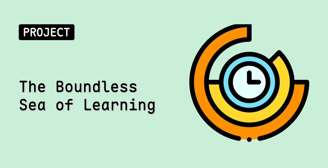
The Boundless Sea of Learning
Beginner
In this project, you will learn how to create a data visualization chart using the ECharts library. The project aims to help Lucy, an online learning platform user, to better visualize her daily study time.
javascriptweb-development
Teacher

Labby
Labby is the LabEx teacher.
Upgrade to Get Certificate
Join Our Discord and Learn Together
Join NowUser Reviews
" I like that i shows you what you need to be looking for and tell you when you wrong and also were you can look for it. I'm loving this so far."
— Nicholas Cox
" Me encanta los ejercicios que si ponen en práctica lo aprendido es muy interesante "
— fran pini