Project in CSS Skill Tree
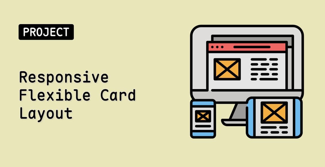
Responsive Flexible Card Layout
Beginner
In this project, you will learn how to create a flexible card layout using CSS Flexbox. The flexible card layout is a common design pattern used in web pages and applications, where content is displayed in a responsive and adaptable grid-like structure.
cssweb-development
Teacher

Labby
Labby is the LabEx teacher.
Share to Google Classroom
Join Our Discord and Learn Together
Join NowUser Reviews
" Yo soy hablante español y conozco muy poco el inglés, pero se me facilito mucho este curso. "
— Israel Espinoza Romero
" good way for practiceing comands "
— Sreenath Reddy